What is the difference between warm and cool colors?
Short answer
Warm colors, including red, orange, and yellow, evoke energy, passion, and sunshine, while cool colors like blue, green, and purple suggest calmness, tranquility, and nature. This distinction relies on the psychological associations and temperature metaphors linked to the color wheel, influencing how we perceive depth, mood, and spatial dimensions in design.
On this page
What defines warm and cool colors
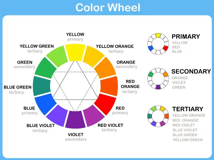
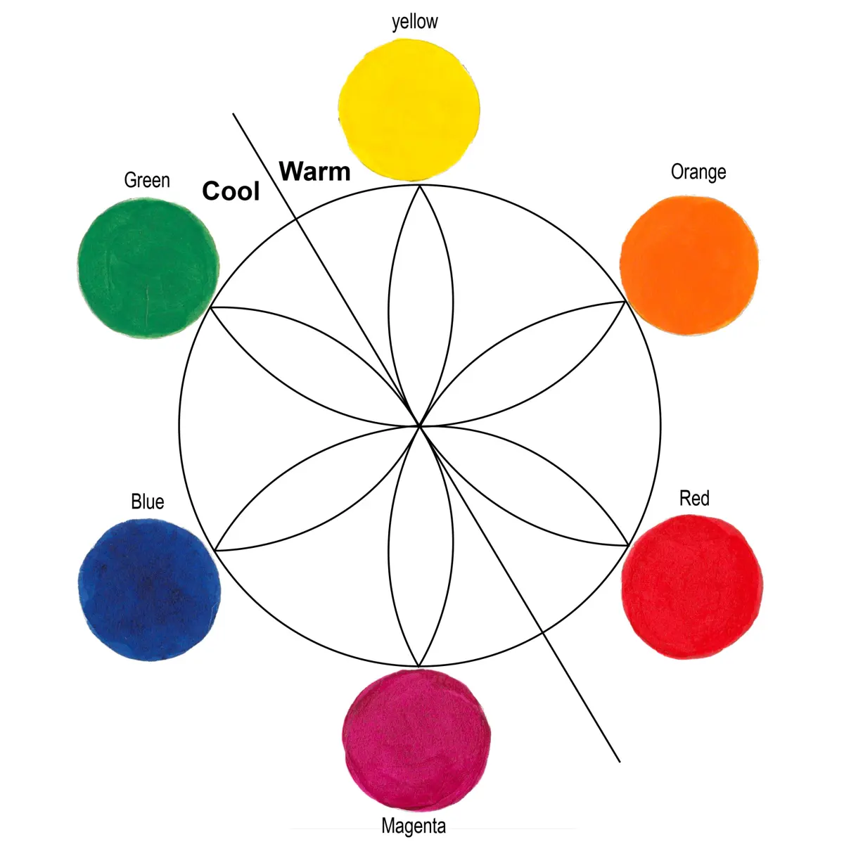
The color wheel is traditionally divided into two distinct halves based on the emotional and physical associations of the hues. Warm colors are those that sit on the side of the spectrum containing red, orange, and yellow. These colors are often associated with sunlight, fire, and heat, which explains why they feel vibrant and stimulating to the human eye. They tend to appear as if they are advancing toward the viewer, making them feel closer and more intense.
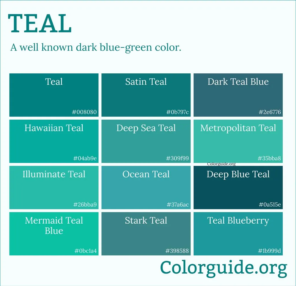
In contrast, cool colors occupy the side of the spectrum featuring blue, green, and violet. These hues are linked to elements like water, ice, sky, and vegetation, which evoke feelings of serenity, stability, and professional distance. Cool colors are perceived as receding, meaning they appear to move away from the viewer, which can create an illusion of increased space. Understanding this fundamental split is the first step for artists and designers looking to manipulate the mood of a composition.
How to use color temperature in design
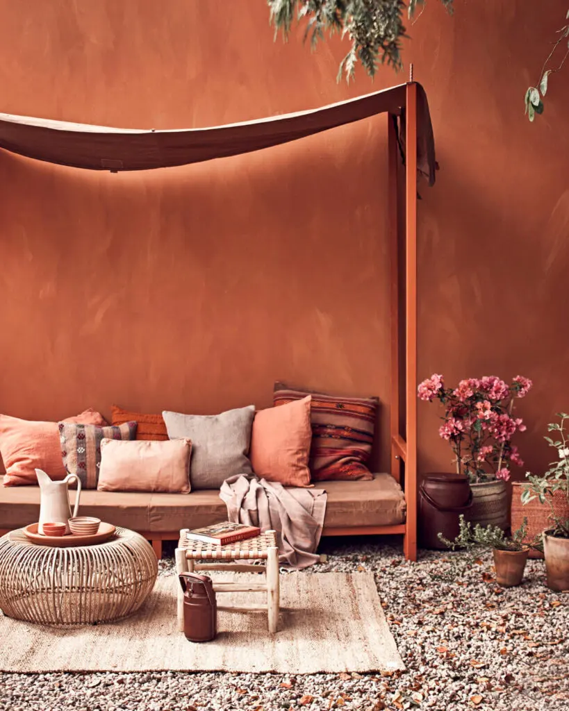
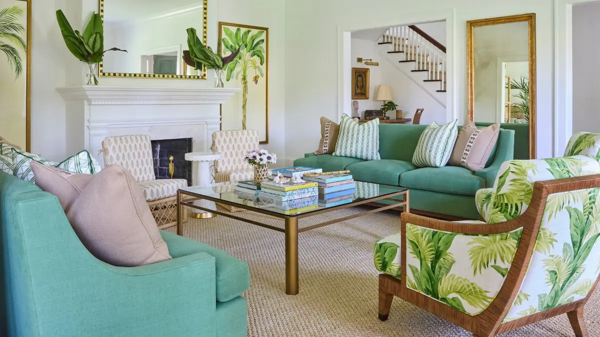
Color temperature is a powerful tool for creating specific atmospheres in interior design, graphic arts, and painting. Warm colors are best used in spaces where you want to encourage social interaction and activity, such as kitchens or dining rooms. Because they are high-energy, they can make a large, empty room feel more intimate and cozy. However, using them in excess can lead to visual fatigue or a sense of agitation.
Cool colors are ideal for environments where relaxation or focus is the primary goal, such as bedrooms, offices, or bathrooms. They help lower the perceived temperature of a room and provide a sense of cleanliness and order. To balance a space effectively, designers often use the following strategies:
- Use a warm accent wall in a cool-toned room to create a focal point.
- Apply cool neutral tones as a base to make warm furniture pieces stand out.
- Utilize the 60-30-10 rule, where 60% is a dominant neutral, 30% is a secondary color, and 10% is an accent.
Why color temperature affects perception
The way our brains interpret color temperature is rooted in both evolutionary biology and cultural conditioning. Warm colors trigger a physiological response that can increase heart rate and appetite, which is why many fast-food brands utilize red and yellow in their logos. These colors grab attention quickly and demand immediate engagement from the consumer.
Cool colors, conversely, are often associated with lower arousal levels. Blue, in particular, is frequently cited in psychological studies as the most preferred color globally because of its consistent association with the clear sky and calm water. When you place a warm color next to a cool color, the contrast is heightened, making the warm color appear even more vibrant and the cool color appear even more subdued. This phenomenon, known as simultaneous contrast, is a critical concept for painters who want to create depth without relying solely on light and shadow.
Common mistakes when mixing colors
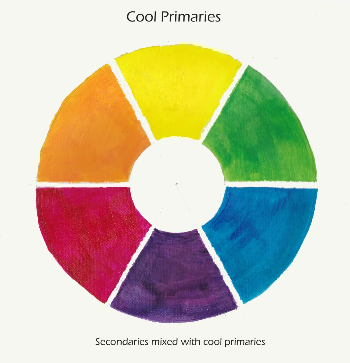
One of the most frequent errors beginners make is failing to account for the "undertone" of a color. A red can be "cool" if it has a blue base, or "warm" if it has an orange or yellow base. If you mix colors with conflicting undertones, the resulting blend often looks muddy or dull. Always test your pigments on a scrap surface before applying them to a final project to ensure the temperatures harmonize correctly.
Another common mistake is overloading a design with only one temperature. A room painted entirely in bright, warm colors can feel claustrophobic, while a room with only cool colors can feel sterile or uninviting. To avoid these issues, follow these steps:
- Identify the dominant mood you want to achieve for the space or canvas.
- Select a primary temperature based on that mood.
- Introduce at least one opposite-temperature accent to provide visual relief.
- Adjust the saturation levels to ensure the colors do not clash.
Best practices for color temperature balance
Achieving a professional look requires a disciplined approach to color selection. Start by choosing a primary color scheme and then evaluate the temperature of each component. If your design feels too "heavy" or aggressive, swap a warm accent for a cooler, desaturated tone. If the design feels boring or lifeless, add a pop of warm color to inject energy and movement into the composition.
Remember that lighting conditions significantly alter how we perceive temperature. Natural sunlight, which is warm, will make cool colors appear slightly more neutral and warm colors appear more intense. Artificial lighting, such as cool LED bulbs, can make warm colors look washed out or sickly. Always evaluate your color choices under the specific lighting conditions where the final work will be displayed. By mastering these interactions, you can control the viewer's experience and create environments that feel intentional, balanced, and visually compelling for any intended purpose.
Key facts
- Warm colors include red, orange, and yellow, which are associated with heat, fire, and sunlight.
- Cool colors include blue, green, and purple, which are linked to water, ice, and lush vegetation.
- On a standard 12-hue color wheel, warm colors occupy one side and cool colors occupy the opposite side.
- Warm colors tend to advance toward the viewer, making objects appear larger or closer than they are.
- Cool colors tend to recede, creating a sense of distance or depth in a composition.
- To balance a design, mix a dominant color temperature with small accents of the opposite temperature to create visual interest.
The bottom line
Understanding color temperature is essential for effective visual communication. By utilizing the advancing nature of warm hues and the receding quality of cool tones, you can manipulate space, mood, and focus in any project. Whether you are painting a room or designing a graphic, balancing these temperatures ensures your work feels harmonious, professional, and emotionally resonant, ultimately allowing you to control how your audience experiences your visual content.
People also ask
Can a color be both warm and cool?
Yes, colors are relative; for instance, a blue with a high yellow content is considered a "warm blue," while a red with a blue base is a "cool red."
How do color temperatures affect room size?
Warm colors can make a large room feel cozy but might make a small space feel cramped. Conversely, cool colors make small rooms appear larger and more open.
Which color temperature is better for a bedroom?
Cool colors are generally preferred for bedrooms because they are perceived as calming and restful. Warm colors are often avoided in sleeping areas as they may be too stimulating.
Why do artists use warm and cool colors together?
Combining them creates "temperature contrast," which adds depth and prevents a painting from looking flat. This technique helps guide the viewer's eye to specific focal points.
Do warm colors really increase appetite?
Many interior designers and psychologists believe colors like red and orange stimulate the appetite. This is why these colors are frequently used in restaurant branding and dining room decor.
How can I tell if a color is warm or cool?
Compare the color to a neutral gray or white; if it leans toward yellow, orange, or red, it is warm. If it leans toward blue or green, it is cool.
This answer was created with the help of AI research tools and reference sources. Spotted an error? Let us know — we correct mistakes quickly. See our editorial policy.