How do you make colors darker without black?
Short answer
You can darken colors without using black by mixing in a color’s complement, which creates a rich, neutral shadow. Alternatively, add a small amount of a darker hue from the same color family, such as deep violet into blue or burnt umber into red, to lower the value while maintaining chromatic intensity.
On this page
How to darken colors using complementary colors
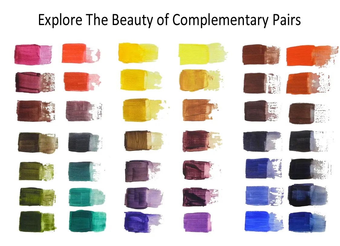
The most effective way to darken a hue without relying on black paint is to introduce its complement—the color directly opposite it on the traditional color wheel. When you mix a color with its opposite, the two pigments neutralize each other, effectively lowering the saturation and creating a deep, complex shadow tone. For example, adding a touch of green to red produces a muted, earthy maroon, while mixing orange into blue results in a sophisticated, slate-like navy. This technique is favored by professional painters because it prevents the "muddy" appearance that often occurs when black is introduced to a color mixture.
To achieve the best results with this method, you should follow these steps:
- Start with a small amount of your base color on your palette.
- Add a very tiny amount of the complementary color, as opposites are potent and can quickly overwhelm the original hue.
- Mix thoroughly and evaluate the value shift before adding more.
- Continue adding the complement until you reach the desired depth, ensuring you stop before the mixture turns entirely gray or brown.
Why adding black makes colors look muddy
Many beginners reach for black to darken a color because it is the most intuitive solution, but this often leads to dull, lifeless results. Black paint is typically composed of a heavy concentration of carbon or iron oxide pigments, which possess a high degree of opacity and a cool, often blue or green undertone. When mixed with vibrant colors, these pigments do not just lower the value; they actively strip away the chroma, leaving the color looking "dead" or chalky. This phenomenon happens because black pigment absorbs almost all wavelengths of light, effectively killing the light-reflecting properties that give colors their characteristic glow.
By avoiding black, you preserve the luminosity of your work. Using chromatic darks—colors that are already dark in value, such as dark blues, purples, or deep browns—allows you to shift the value toward black while maintaining the underlying temperature of the original hue. This creates shadows that appear transparent and vibrant rather than flat and opaque. If you look at the works of Impressionist painters like Claude Monet, you will notice that they famously avoided pure black in their shadows, opting instead for deep violets and blues to capture the true essence of light.
Best dark colors to use for mixing
If you want to darken a color while keeping it clean and vibrant, you should invest in specific "dark" pigments that function as natural shadows. These colors are already low in value but retain a strong hue identity, making them perfect for modifying other colors without turning them into gray. For instance, Phthalo Blue or Prussian Blue can darken almost any warm color without making it appear muddy, while Burnt Umber provides a warm, organic darkness that mimics natural shadow patterns found in nature.
Consider keeping these versatile dark pigments in your collection:
- Alizarin Crimson: A deep, cool red that adds intensity to shadows.
- Ultramarine Blue: Excellent for cooling down warm colors while darkening them.
- Burnt Umber: A rich, dark brown that acts as a neutral base for darkening warm tones.
- Dioxazine Purple: A powerful, near-black violet that is perfect for darkening blues and reds.
- Viridian Green: A deep, transparent green that works well for cooling shadows in skin tones.
Common mistakes when darkening colors
One of the most frequent mistakes artists make is adding too much darkening agent at once. Because pigments have different tinting strengths, a small amount of a dark color like Phthalo Blue can completely overpower a large pile of yellow or orange. Always work in small increments, testing your mixture on a scrap piece of paper or canvas before applying it to your main work. Another common error is failing to account for the temperature shift that occurs during mixing. When you add a cool color to a warm one, the resulting dark will naturally feel cooler, which might not be the intended effect for your light source.
Additionally, many people forget that colors dry differently than they appear when wet. Acrylics tend to dry slightly darker, while oils may remain consistent, and watercolors often lighten significantly. If you are trying to achieve a very specific dark value, perform a test swatch and allow it to dry completely before finalizing your mixture. This prevents the frustration of having to rework an entire section because the shadow turned out much darker or lighter than you originally anticipated.
How to adjust color value through layering
If mixing directly on the palette proves difficult, you can achieve darker values through the process of glazing or layering. This technique involves applying a thin, transparent wash of a dark, cool color over a lighter, dried base layer. Because the light must travel through the glaze and reflect off the lighter layer underneath, the resulting color appears deep, luminous, and rich. This method is particularly effective in fine art, as it mimics the way light interacts with surfaces in the real world, creating a sense of depth that opaque mixing simply cannot replicate.
To master layering for value control, ensure your base layer is completely dry to avoid lifting the paint. Use a medium to thin your dark pigment, making it transparent enough that the color beneath remains visible. By applying multiple thin glazes, you can gradually build up the darkness of an area until you achieve the desired effect. This approach gives you maximum control over the final outcome, allowing you to stop at any point when the shadow looks perfect. By mastering these techniques, you will find that your color palettes become more sophisticated, vibrant, and professional in appearance.
Key facts
- Complementary colors, which sit opposite each other on the color wheel, effectively neutralize and darken one another when mixed.
- Adding a small amount of a color's direct complement creates a "chromatic black" or a deep, muddy tone that retains more visual interest than pure black.
- Burnt umber is a classic artist's choice for darkening warm tones because it provides depth without the dull, flat quality of carbon black.
- Mixing a dark blue, such as ultramarine or Prussian blue, into a lighter color creates a sophisticated, cool-toned shadow effect.
- The principle of "value" refers to the lightness or darkness of a color; reducing the light-reflecting quality of a pigment is the primary goal of darkening.
- Transparent glazes of a darker, cooler pigment layered over a lighter base can create the illusion of depth and shadow without physically mixing the paints.
The bottom line
To darken colors effectively without relying on black, utilize the color wheel to identify complementary opposites. Mixing these pairs creates rich, chromatic shadows that preserve the vibrancy of your palette. Experimenting with deep blues, purples, or earthy browns allows you to control the temperature of your shadows, resulting in more professional, nuanced, and visually dynamic compositions than those achieved through the flat neutrality of black pigment.
People also ask
Why does adding black paint often make colors look "muddy" or "dead"?
Black pigments often have a high concentration of carbon, which can desaturate a color and strip it of its vibrancy. This results in a flat, lifeless appearance that lacks the complex undertones found in natural shadows.
What is the best color to darken yellow?
To darken yellow, mix in a small amount of violet or purple, as these are its direct complements. Start with a tiny drop, as yellow is highly sensitive and can quickly turn into an olive or brown shade.
Can I use brown to darken colors instead of black?
Yes, brown is an excellent alternative because it is essentially a desaturated orange or red. It darkens a color while maintaining a warm, earthy undertone that feels more natural in landscape or portrait painting.
How do complementary colors work on the color wheel?
Complementary colors are located directly across from one another, such as red and green, blue and orange, or yellow and purple. When mixed, they cancel each other's intensity, resulting in a neutral dark that shifts depending on the ratio of the two pigments.
What is a chromatic black?
A chromatic black is a dark color created by mixing two or more highly pigmented colors, such as burnt umber and ultramarine blue. It provides a richer, more luminous depth than a single tube of black paint.
How does light affect my choice of darkening agent?
If you are painting a scene with cool, moonlight shadows, use a blue or violet to darken your colors. For warm, sun-drenched shadows, use a deep red, brown, or burnt sienna to keep the color temperature consistent.
This answer was created with the help of AI research tools and reference sources. Spotted an error? Let us know — we correct mistakes quickly. See our editorial policy.