What are warm colors?
Short answer
Warm colors are a group of hues on the color wheel that evoke feelings of heat, sunlight, and energy. Primarily consisting of reds, oranges, and yellows, these colors appear to advance toward the viewer, creating a sense of intimacy and vibrancy. They are effectively used to stimulate appetite, excitement, and emotional warmth.
On this page
What colors are considered warm?
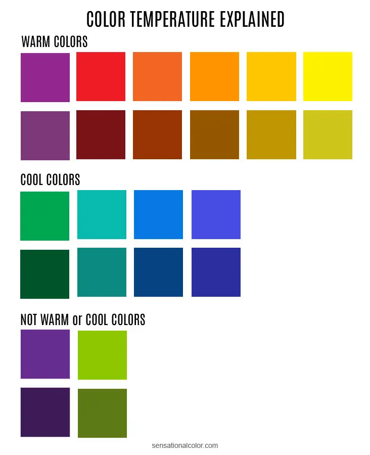
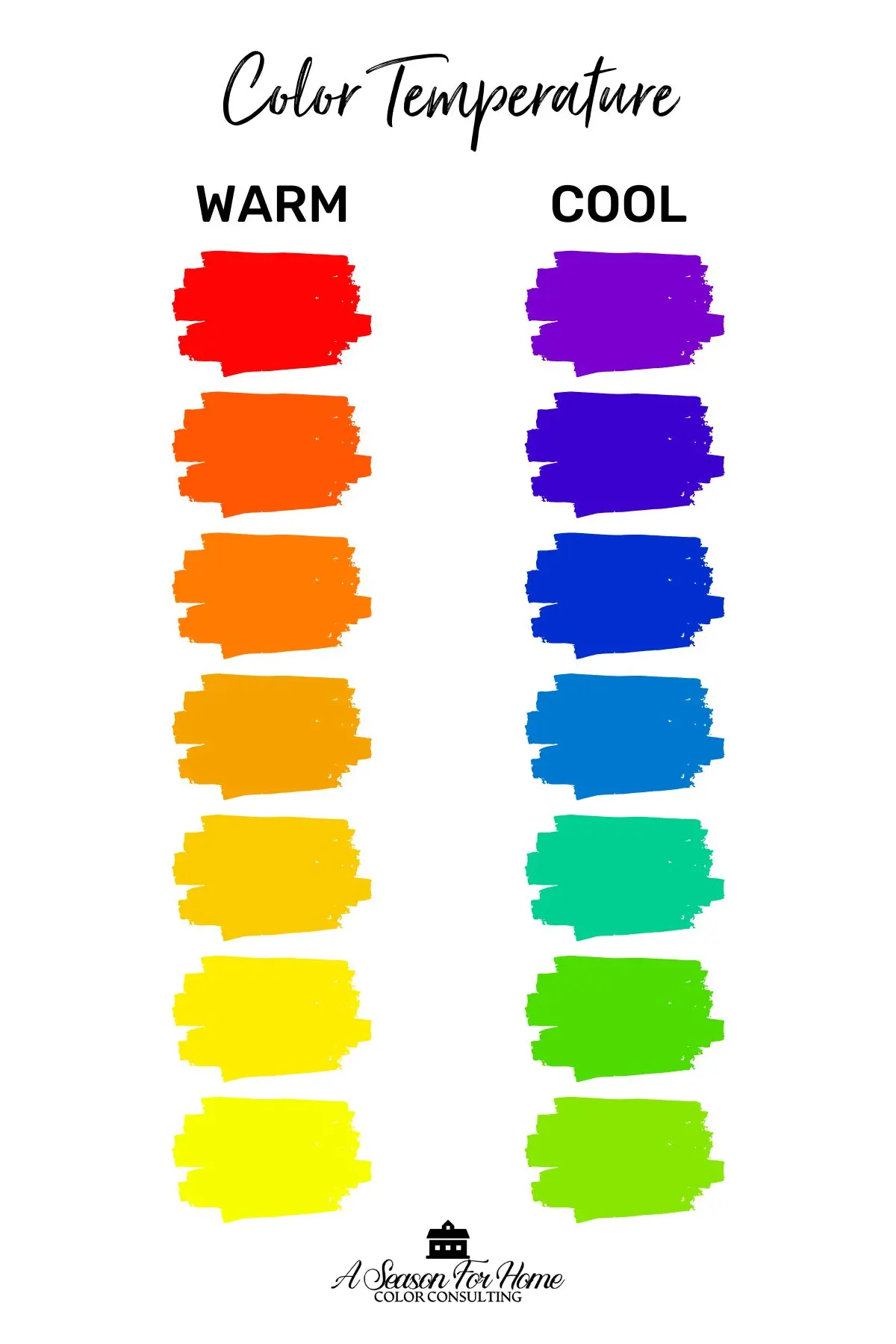
Warm colors occupy the section of the color wheel that spans from red-violet to yellow-green. At the core of this spectrum are the primary colors red and yellow, along with their secondary offspring, orange. These hues are visually associated with natural phenomena that generate heat, such as fire, sunsets, and autumn foliage. Because of their high intensity, these colors tend to dominate a visual field, making objects appear closer than they actually are.
The psychological impact of these colors is profound and well-documented in color theory. While cool colors like blue and green are often linked to tranquility and distance, warm colors are linked to arousal and stimulation. Designers and artists utilize these hues to draw the eye toward a specific focal point or to create an atmosphere of comfort and social engagement. Understanding this spectrum is the first step toward mastering color balance in any creative project.
How to use warm colors in interior design
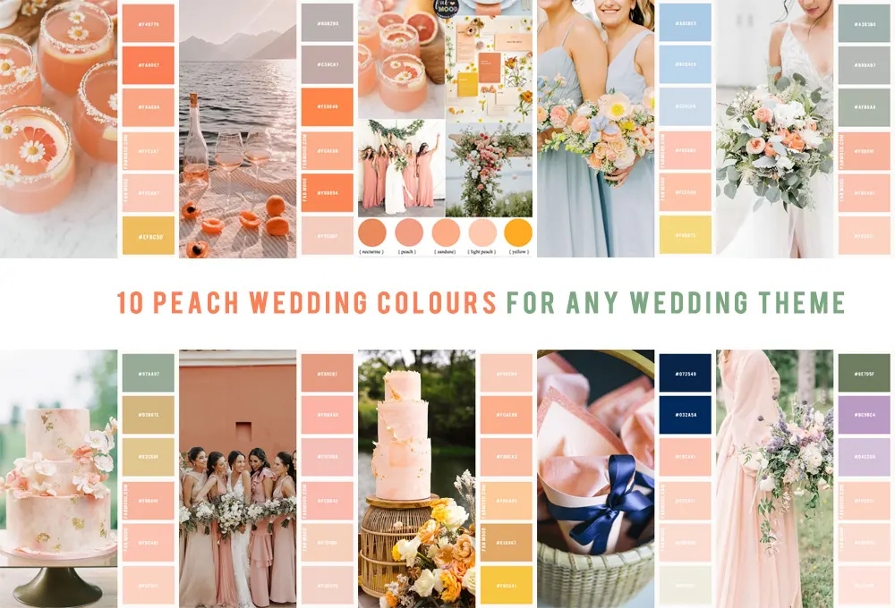
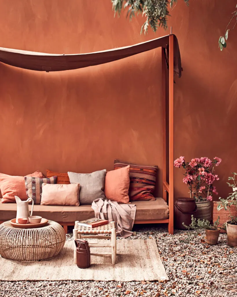
Incorporating warm colors into a living space can transform a cold, sterile room into a welcoming sanctuary. When using these shades, it is important to consider the size of the room and the amount of natural light it receives. A deep terracotta or mustard yellow can add depth to a large space, while lighter shades like cream or peach can prevent a small room from feeling claustrophobic.
To effectively balance warm colors in your home, consider these practical steps:
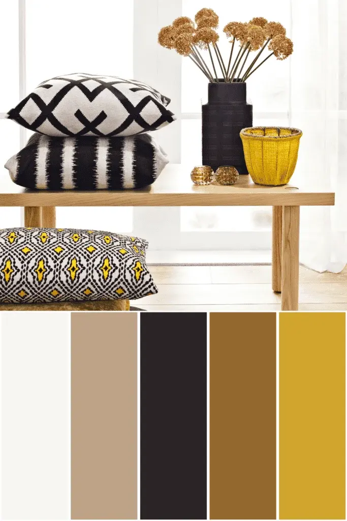
- Start with neutral walls and introduce warm tones through textiles like rugs, throw pillows, and curtains.
- Use a 60-30-10 rule: 60% of the room should be a dominant neutral, 30% a secondary color, and 10% a bold, warm accent color.
- Incorporate natural wood tones, which inherently carry warm undertones, to ground the space.
- Use warm-spectrum light bulbs (2700K to 3000K) to enhance the richness of your chosen color palette.
Why warm colors influence human behavior
The physiological response to warm colors is often attributed to evolutionary biology. Historically, the colors of fire and ripe fruit signaled safety, survival, and sustenance to early humans. Consequently, these colors are known to increase heart rates and stimulate the appetite, which is why many fast-food chains and restaurants utilize red and yellow in their branding. These colors create a sense of urgency and excitement that encourages quick consumption and engagement.
In professional settings, warm colors can foster a sense of collaboration and creative energy. However, too much of a warm hue can lead to irritability or overstimulation. It is essential to manage the saturation of these colors carefully. By pairing a vibrant red or orange with a grounding neutral like slate gray or white, you can harness the energy of the color without overwhelming the environment or the people within it.
Common mistakes when using warm colors
The most frequent error when working with warm colors is failing to account for color temperature and saturation. Beginners often combine too many high-intensity colors at once, which can lead to a chaotic or jarring aesthetic. Another common pitfall is ignoring the lighting conditions of a space; a warm color that looks inviting in the bright, natural light of midday may appear muddy or aggressive under harsh, artificial fluorescent lights.
To avoid these common design traps, follow these guidelines:
- Avoid using multiple high-saturation warm colors as primary wall colors, as this can make a room feel smaller and more intense.
- Do not ignore the undertones; ensure that your chosen warm colors share a common base to maintain visual harmony.
- Steer clear of using warm colors exclusively in rooms intended for rest, such as bedrooms, where a more balanced or cool palette is usually preferred.
- Always test paint samples on your walls for at least 24 hours to see how they react to changing light throughout the day.
How to balance warm and cool colors
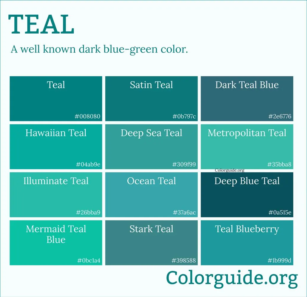
Achieving a professional look often requires a mix of both warm and cool tones to create visual interest and equilibrium. A space filled entirely with warm colors can feel stifling, while one with only cool colors can feel detached. The key is to use one temperature as the dominant force and the other as a subtle accent. For example, a room painted in a cool, soft blue can be brought to life with warm copper accents or honey-toned wood furniture.
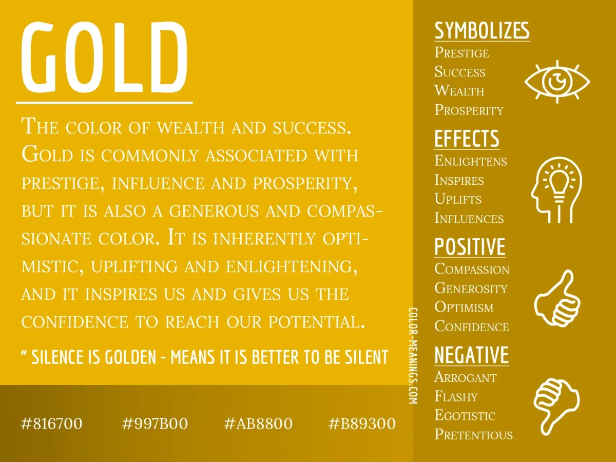
By layering these temperatures, you create a dynamic environment that feels curated rather than accidental. If you feel a room is too "hot," introduce elements of blue, green, or violet to cool the temperature down. Conversely, if a space feels clinical, add a splash of gold, ochre, or burnt sienna to inject warmth. Mastering this interplay allows you to control the mood and functionality of any environment with precision and confidence.
Key facts
- Warm colors are located on the red-orange-yellow side of the color wheel.
- These hues are associated with sunlight, fire, and heat, often evoking feelings of comfort or intensity.
- In color theory, warm colors appear to advance or move toward the viewer, making spaces feel smaller and more intimate.
- The visible light spectrum places warm colors at the longer wavelengths, starting around 570 to 700 nanometers.
- Artists often use warm colors as highlights to create a sense of energy, excitement, or passion in a composition.
- When painting, avoid overusing warm colors in large areas without cool-toned balance, as they can quickly overwhelm the eye and cause visual fatigue.
The bottom line
Warm colors are defined by their vibrant, energetic connection to the sun and fire, occupying the red to yellow spectrum of the color wheel. By understanding that these hues advance visually and stimulate psychological excitement, you can effectively use them to create intimacy or focal points in design. Always balance these intense shades with neutral tones to ensure your space remains inviting rather than visually exhausting.
People also ask
Do warm colors make a room look bigger or smaller?
Warm colors tend to make a room feel smaller and more enclosed because they visually advance toward the observer. If you want a small space to feel cozy, warm tones work well, but they may make a tiny room feel cramped.
How do I balance warm colors in interior design?
Use the 60-30-10 rule to maintain harmony by keeping warm colors as accents rather than the primary focus of every surface. Pair them with neutral tones like beige, gray, or white to prevent the space from feeling chaotic or overly aggressive.
Are warm colors better for bedrooms or offices?
Warm colors are generally better suited for social spaces like dining rooms or living areas because they stimulate conversation and energy. For bedrooms or offices, cooler tones are often preferred to promote relaxation and deep focus.
Can warm colors affect human appetite?
Yes, colors like red and orange are frequently used in restaurant branding because they are believed to stimulate the appetite. These vibrant tones create a sense of urgency and warmth that encourages diners to feel comfortable and hungry.
What is the difference between warm and cool colors?
Warm colors consist of reds, oranges, and yellows, while cool colors include blues, greens, and purples. The distinction is based on the psychological associations humans have with temperature and light sources in the natural environment.
Read the full answer →How can I tell if a color has a warm undertone?
You can identify a warm undertone by comparing a color to a pure neutral; if it leans toward yellow, red, or gold, it is warm. Most paint swatches or fabric samples will reveal their undertones when placed next to a cool blue or true gray.
This answer was created with the help of AI research tools and reference sources. Spotted an error? Let us know — we correct mistakes quickly. See our editorial policy.