What are cool colors?
Short answer
Cool colors are a group of hues on the color wheel that evoke feelings of calmness, serenity, and distance. This spectrum primarily includes blues, greens, and purples. These shades are associated with natural elements like water, sky, and foliage, often appearing to recede visually when used in design or artistic compositions.
On this page
What are the cool colors on the color wheel?
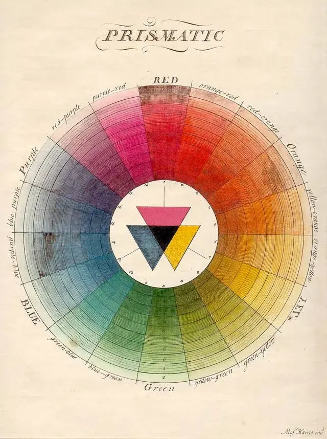
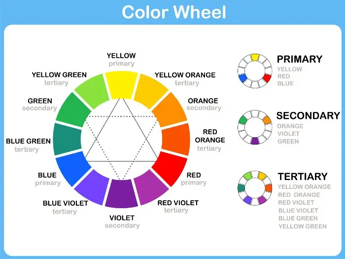
The color wheel is a circular diagram that organizes colors based on their chromatic relationship. Cool colors occupy the side of the wheel containing blue, green, and violet. While warm colors like red, orange, and yellow vibrate with intensity, cool colors are characterized by their lower visual temperature and soothing influence on the human eye.
These colors are derived from blue, which is the only primary color in the cool spectrum. When blue is mixed with yellow, it creates green; when mixed with red, it creates purple. Because these colors sit opposite the warm spectrum, they are often used to create contrast or balance in visual arts. Designers frequently rely on these hues to establish a specific mood or to guide the viewer's focus toward more active elements within a composition.
Why do cool colors create a calming effect?
The psychological impact of cool colors is rooted in evolutionary biology and cultural associations. Humans naturally link these shades to the environment, such as the vastness of the ocean, the clarity of the sky, or the shade of a forest. These associations trigger a physiological response that can lower heart rates and reduce stress levels, making these colors ideal for spaces intended for rest.
In interior design and marketing, cool colors are utilized to suggest reliability, professionalism, and cleanliness. Because they appear to recede, they can make small rooms feel larger and more open. This optical illusion is a fundamental tool for architects and painters alike. When working with these palettes, consider the following effects:
- Blue: Promotes trust, stability, and intellectual focus.
- Green: Represents growth, health, and environmental harmony.
- Purple: Evokes luxury, creativity, and spiritual depth.
How to use cool colors in interior design
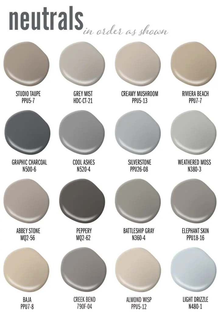
Using cool colors effectively requires an understanding of light and space. If you paint a room entirely in deep blue, it may feel cave-like unless you incorporate adequate natural or artificial lighting. To achieve a balanced look, experts often recommend using the 60-30-10 rule: 60 percent of the room is a neutral base, 30 percent is a secondary color, and 10 percent is an accent.
If you are looking to refresh your living space, follow these steps to integrate cool tones:
- Assess the natural light in your room; cool colors work best in rooms with southern exposure.
- Select a primary cool shade for the walls, such as a soft sage green or a pale sky blue.
- Incorporate textures like wood or metallic accents to prevent the room from feeling too sterile.
- Layer in warmer textiles or lighting fixtures to ensure the space remains inviting rather than cold.
Common mistakes when using cool colors
A frequent error is overloading a space with too many cool tones, which can result in a sterile or "chilly" atmosphere. Without the inclusion of neutral tones or occasional warm accents, a room can feel uninviting or clinical. Another mistake is ignoring the undertones of a paint color; a blue might have a hidden green or gray base that shifts significantly depending on the time of day.
To avoid these pitfalls, always test paint samples on your walls before committing to a full renovation. Observe how the color changes from morning to evening as the light shifts. Additionally, avoid using only cool colors in high-activity areas like kitchens or dining rooms, where a bit of warmth can stimulate appetite and social interaction. Balancing the temperature of your environment is the key to creating a space that feels both professional and comfortable.
Best cool color combinations for beginners
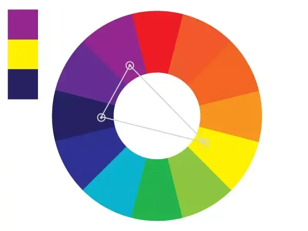
For those new to color theory, starting with monochromatic or analogous schemes is the safest approach. A monochromatic scheme uses various shades and tints of a single cool color, such as navy, royal blue, and baby blue. This creates a sophisticated, cohesive look that is difficult to get wrong. Alternatively, an analogous scheme uses colors that sit side-by-side on the wheel, such as blue, blue-green, and green.
If you want to experiment with more dynamic pairings, try these combinations:
- Blue and crisp white: A classic, nautical-inspired look that emphasizes cleanliness.
- Green and earthy brown: A grounded, organic pairing that mimics a forest floor.
- Purple and soft gray: A modern, elegant combination that feels luxurious and calm.
- Teal and coral: A bold contrast where the cool teal tempers the intensity of the warm coral.
By sticking to these structured palettes, you can confidently explore the depth of the cool color spectrum while maintaining visual harmony in your creative projects or home environment.
Key facts
- Cool colors occupy the blue, green, and purple side of the color wheel.
- These hues are associated with calmness, serenity, and professional stability.
- Cool colors appear to recede visually, making small rooms feel larger and more open.
- Blue is the only primary color in the cool spectrum, while green and violet are secondary.
- Designers use cool tones to lower the perceived temperature of a space or composition.
- Avoid using exclusively cool colors in large, dim rooms to prevent a feeling of clinical isolation.
The bottom line
Cool colors—ranging from deep blues to vibrant greens and soft violets—are essential tools for creating environments that feel calm, spacious, and professional. By understanding their psychological effects and their ability to visually expand a room, you can effectively balance your home or design projects. Use these hues to invite tranquility, but remember to introduce warm accents to ensure your space remains inviting and comfortable.
People also ask
Do cool colors make a room look bigger?
Yes, because cool colors have a receding quality, they trick the eye into perceiving walls as being further away than they actually are. This makes them an ideal choice for small apartments or narrow hallways.
How do cool colors affect human mood?
Research in color psychology suggests that cool colors like blue and green lower the heart rate and reduce feelings of anxiety. They are frequently used in bedrooms and bathrooms to foster a sense of relaxation.
Can you mix cool and warm colors together?
Mixing warm and cool colors creates visual contrast and balance within a design scheme. A common technique is to use a cool base color and add warm accents to prevent the space from feeling too sterile.
Are cool colors better for office spaces?
Cool colors are often preferred in professional environments because they promote focus and clear communication. Blue, in particular, is associated with authority and intelligence, making it a popular choice for corporate branding.
What is the difference between cool and warm undertones?
Undertones refer to the subtle hue beneath a color's surface. Cool undertones lean toward blue or violet, while warm undertones lean toward yellow, orange, or red, which significantly changes how a paint or fabric interacts with light.
Why do artists use cool colors for shadows?
Painters often use cool colors to depict shadows because shadows are typically devoid of direct, warm light. Adding a touch of blue or purple to a shadow creates a more realistic and atmospheric depth in an artwork.
This answer was created with the help of AI research tools and reference sources. Spotted an error? Let us know — we correct mistakes quickly. See our editorial policy.