What colors go with turquoise?
Short answer
Turquoise pairs beautifully with crisp white, warm metallics, earthy neutrals, and bold complementary shades like coral or magenta. Because it sits between blue and green on the color wheel, it functions as both a calming base and a vibrant accent. The best choice depends on whether you want high-contrast drama or serene balance.
On this page
How to pair turquoise with neutrals
Neutral colors provide a sophisticated backdrop that allows turquoise to stand out without overwhelming a space. Crisp white is the most popular choice, as it mimics the aesthetic of coastal Mediterranean homes, creating a clean, airy, and refreshing atmosphere. When paired with white, turquoise feels lighter and more energetic, making it ideal for bathrooms, kitchens, or sun-drenched living rooms.
If you prefer a softer, more grounded look, consider pairing turquoise with shades of beige, cream, or light gray. These earthy tones temper the intensity of the blue-green hue, preventing it from appearing too artificial. For a more dramatic, modern aesthetic, charcoal gray or deep black acts as a sharp contrast that makes turquoise appear more saturated and luxurious. Consider these combinations for your next design project:
- Turquoise and crisp white for a coastal, breezy vibe.
- Turquoise and charcoal gray for a sophisticated, modern look.
- Turquoise and warm beige for a balanced, organic feel.
Best metallic accents for turquoise
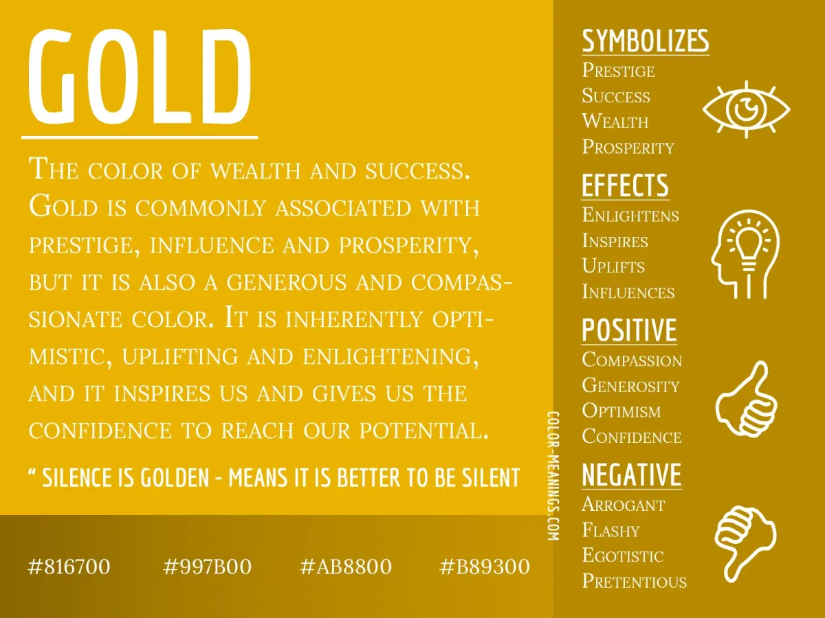
Metallics are essential for adding depth and a touch of glamour to a turquoise color scheme. Gold and brass are the most effective partners because their warm, yellow undertones create a beautiful visual contrast against the cool, blue-green pigments of turquoise. This combination is a staple in Art Deco and Hollywood Regency design styles, where opulence and bold color choices are celebrated.
Silver and chrome, by contrast, lean into the cool temperature of turquoise. These metals create a sleek, futuristic, or industrial look that feels very polished and clinical. If you are unsure which metal to choose, follow these simple steps to determine the right fit for your space:
- Assess the natural light in the room; warm gold works best in rooms with north-facing, cooler light.
- Determine the desired mood; choose brass for a cozy, vintage feel or chrome for a minimalist, modern edge.
- Use a 70/30 ratio, where turquoise is the primary color and the metallic serves as a refined accent on hardware or lighting.
Why turquoise works with complementary colors
Understanding color theory helps explain why turquoise pairs so effectively with colors on the opposite side of the spectrum. Turquoise is a tertiary color, sitting between blue and green. Its direct complement is a reddish-orange or coral shade. When placed side by side, these colors vibrate against each other, creating a high-energy, dynamic visual experience that feels both balanced and exciting.
Magenta and hot pink are also excellent partners for turquoise. Because these colors share similar levels of saturation, they create a playful, tropical, or bohemian aesthetic. This pairing is particularly effective in textiles, such as throw pillows, rugs, or artwork, where you want to inject personality into a room. To avoid visual fatigue, use these bold complementary colors sparingly. A common strategy is to use turquoise as the dominant color for walls or large furniture and reserve the coral or magenta for smaller accessories like vases, candles, or patterned fabrics.
Common mistakes when decorating with turquoise
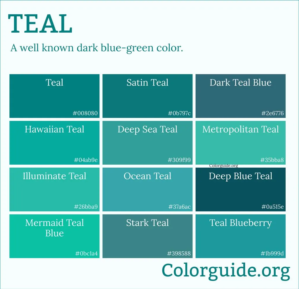
One of the most frequent errors is using too many shades of turquoise in a single room. While monochromatic schemes can be elegant, mixing different undertones—such as a green-leaning teal with a blue-leaning aqua—can make a space feel disjointed and messy. Stick to one primary turquoise shade and vary the textures rather than the hues to create visual interest.
Another mistake is neglecting the impact of lighting on the color. Turquoise is highly sensitive to light; it can look bright and cheerful in the morning sun but appear dark and muddy in the evening under artificial warm lighting. Always test paint swatches or fabric samples at different times of the day before committing to a large purchase. Finally, avoid pairing turquoise with too many other bright colors simultaneously, as this can quickly turn a room into a chaotic environment that is difficult to relax in.
How to balance turquoise in a room
Achieving balance requires a strategic approach to color distribution. A popular design rule is the 60-30-10 ratio: 60 percent of the room should be a dominant neutral, 30 percent a secondary color, and 10 percent a bold accent like turquoise. This ensures that the turquoise provides a focal point without becoming the only thing the eye sees, allowing the rest of the room's design elements to shine.
If you are intimidated by using turquoise on large surfaces like walls, start with small, removable elements. Incorporate the color through curtains, artwork, or decorative bowls. As you become more comfortable with the intensity of the shade, you can gradually introduce larger pieces like a velvet armchair or a patterned area rug. By following these guidelines, you can successfully integrate turquoise into any design scheme while maintaining a cohesive and professional look throughout your home.
Key facts
- Pair turquoise with crisp white to create a clean, nautical aesthetic that makes the color pop.
- Combine turquoise with warm metallic tones like gold or brass to add a sense of luxury and sophistication.
- Use charcoal gray or deep navy as a grounding neutral to balance the high energy of turquoise.
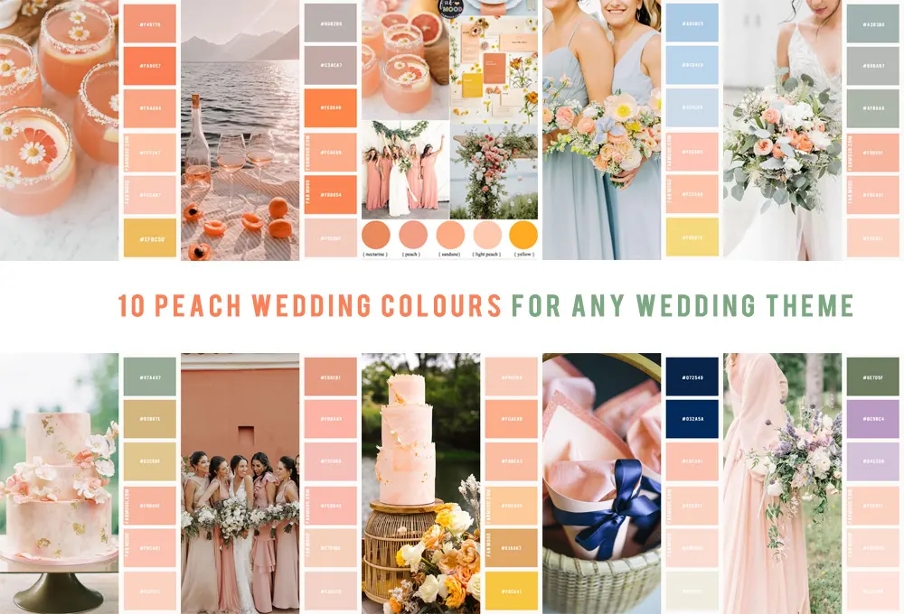
- Incorporate coral or soft peach for a vibrant, complementary color scheme inspired by tropical palettes.
- Avoid using too many bright, saturated colors at once, as this can make a room feel chaotic rather than curated.
- Test paint samples in different lighting conditions, as turquoise can shift significantly between appearing blue or green depending on the time of day.
The bottom line
Turquoise is a dynamic, versatile hue that functions best when balanced by thoughtful color pairings. Whether you choose to ground it with deep neutrals like charcoal or energize it with warm metallics and corals, the key is moderation. By using turquoise as a deliberate accent rather than an overwhelming primary color, you can create a sophisticated, inviting environment that feels both vibrant and professionally curated.
People also ask
Does turquoise look better with cool or warm colors?
Turquoise is a versatile color that sits between blue and green, allowing it to bridge both temperature spectrums. It pairs beautifully with cool tones like silver and navy or warm tones like copper and terracotta.
Is turquoise considered a neutral color in interior design?
While turquoise is a bold accent, it can act as a neutral in spaces filled with natural textures like jute, rattan, and light wood. When used in muted, desaturated tones, it provides a calming backdrop for other furniture.
What is the best way to introduce turquoise into a neutral room?
Start with small accessories such as throw pillows, ceramic vases, or artwork to gauge the impact. This allows you to integrate the color without overwhelming the existing design of your space.
Can turquoise be used in a professional or office setting?
Yes, turquoise can be used effectively in offices when paired with darker, professional tones like slate gray or espresso brown. It is known to promote clear thinking and communication when used in moderation.
How do I choose the right shade of turquoise?
Consider the amount of natural light in your room; lighter, brighter versions of turquoise work well in low-light areas, while deeper, teal-leaning shades add drama to sun-drenched, airy spaces.
What common mistake should I avoid when decorating with turquoise?
A frequent error is over-saturating a room by using turquoise on every wall and piece of furniture. Instead, use the 60-30-10 rule, where turquoise serves as the 10 percent accent color to maintain visual harmony.
This answer was created with the help of AI research tools and reference sources. Spotted an error? Let us know — we correct mistakes quickly. See our editorial policy.