What colors go with lavender?
Short answer
Lavender pairs best with soft neutrals like cream, white, and gray, or sophisticated metallics such as silver and gold. For a bolder look, combine it with complementary shades like sage green, mustard yellow, or deep navy. These combinations balance lavender’s cool, floral undertones while creating visual interest in any design space.
On this page
Which colors complement lavender in interior design
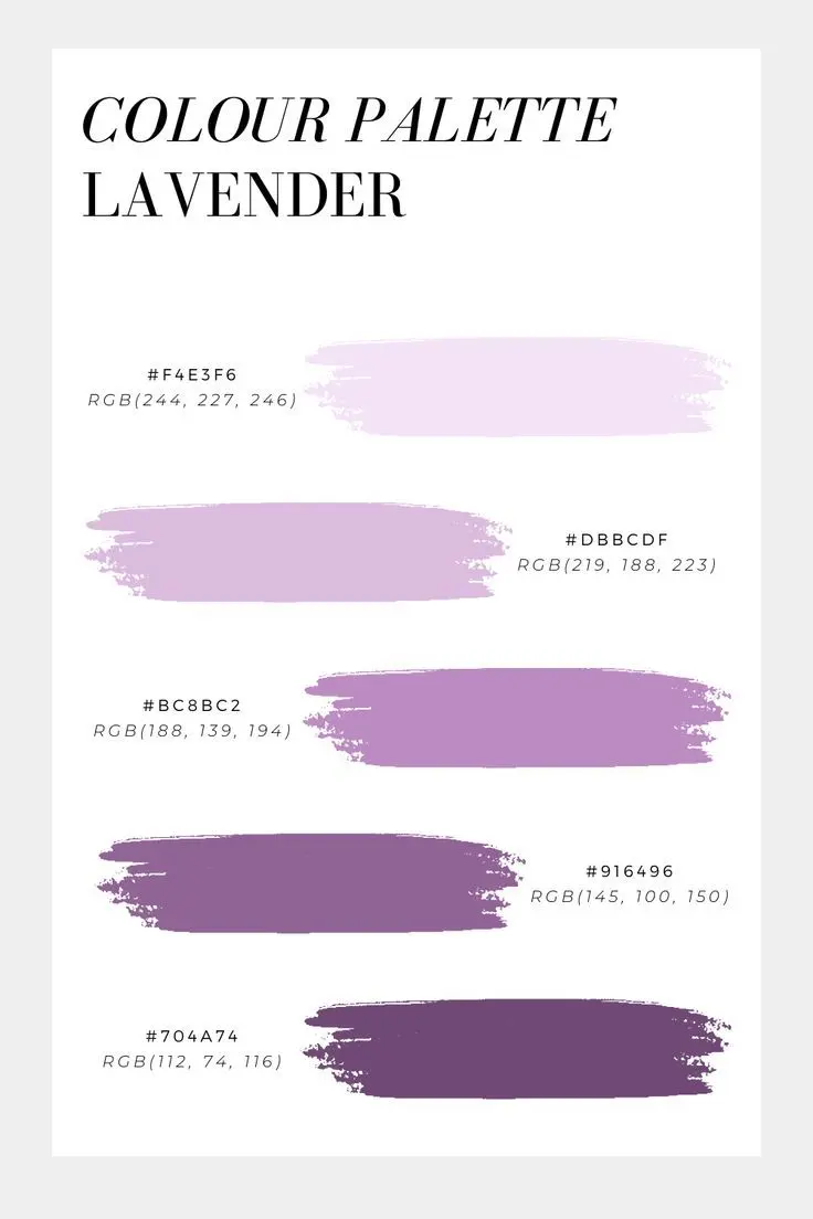
Lavender is a versatile, muted purple that functions as a bridge between cool and warm palettes. To create a balanced room, pair it with colors that ground its airy quality. Creamy whites and soft beiges provide a clean backdrop that allows the lavender to stand out without feeling overwhelming. If you prefer a more modern aesthetic, charcoal gray or slate blue can add depth and maturity to the space.
When selecting secondary colors, consider the mood you wish to evoke. Using a monochromatic scheme with deeper shades of violet or plum creates a sophisticated, layered look. Alternatively, introducing high-contrast colors can make the room feel energetic and curated. Consider these pairings for your next project:
- Cream and ivory for a soft, traditional look.
- Charcoal or graphite for a contemporary, masculine edge.
- Sage green for a natural, garden-inspired atmosphere.
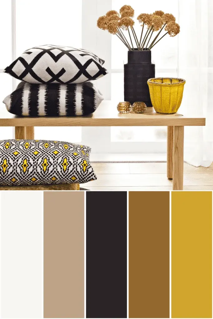
- Mustard yellow for a vibrant, retro-inspired contrast.
How to use lavender in professional fashion
In fashion, lavender is often treated as a neutral, making it surprisingly easy to integrate into a professional or casual wardrobe. For a polished office appearance, combine a lavender blouse with a tailored navy blue blazer or trousers. The deep, authoritative tone of navy balances the delicacy of the lavender, creating a look that is both approachable and professional.
If you are styling an outfit for a social event, consider metallic accents. Silver jewelry highlights the cool blue undertones in lavender, while gold provides a warm, luxurious contrast. When choosing shoes or handbags, stick to nude, white, or metallic tones to avoid distracting from the main color. Follow these steps to build a cohesive outfit:
- Select a base piece in lavender, such as a dress or a knit sweater.
- Choose a neutral anchor color like white, gray, or camel for your jacket or skirt.
- Add a pop of interest with a metallic accessory or a contrasting shoe color like olive green or soft rose.
Why lavender works well with earthy tones
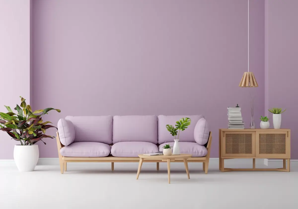
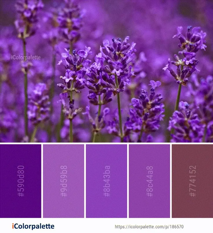
The effectiveness of lavender in design often stems from its relationship to nature. Because lavender is a floral color, it naturally pairs well with organic, earthy shades. Sage green, in particular, is a classic partner because it mimics the natural foliage of the lavender plant. This combination creates a sense of harmony and tranquility, making it ideal for bedrooms, bathrooms, or meditation spaces.
Beyond greens, earthy browns and terracottas can add unexpected warmth to a lavender-dominated space. A light lavender wall paired with dark wood furniture creates a grounded, grounded aesthetic that prevents the room from feeling too "sweet" or juvenile. This balance is crucial for designers who want to use pastel tones without sacrificing the overall sophistication of the room. By mixing textures—such as linen, wool, or raw wood—you can further enhance the organic feel of these color pairings.
Common mistakes when pairing colors with lavender
One of the most frequent errors is pairing lavender with colors that are too similar in intensity, which can result in a washed-out or muddy appearance. For example, combining lavender with a pale, dusty pink often lacks enough contrast to define the shapes in a room or an outfit. This can make a space feel flat or an outfit look uncoordinated. Always aim for a mix of light and dark values to ensure each color has its own distinct space.
Another common mistake is overusing lavender in a small, poorly lit room. Because lavender is a cool-toned color, it can feel chilly if it lacks natural sunlight. If you are painting a north-facing room, ensure you pair your lavender with warm-toned neutrals like soft gold or cream to counteract the coolness. Avoid these pitfalls by testing your color swatches in different lighting conditions throughout the day before committing to a permanent design choice.
Best color palettes for different seasons
Color palettes often shift with the seasons, and lavender is uniquely suited to adapt to these changes. In the spring, lavender looks best when paired with pastels like mint green, lemon yellow, or sky blue. These combinations celebrate the renewal of the season and feel fresh and light. As the year progresses into summer, you can intensify these pairings by choosing slightly more saturated versions of these colors.
For autumn and winter, transition your lavender palette by incorporating richer, deeper tones. Pairing lavender with plum, burgundy, or dark charcoal creates a moody, elegant look that feels appropriate for colder months. This seasonal flexibility makes lavender an excellent investment color, as it can be easily refreshed with new accessories throughout the year. Remember that the key to success is maintaining a consistent balance between the light, airy nature of lavender and the weight of your chosen secondary colors.
Key facts
- Pair lavender with crisp white to create a clean, airy aesthetic that emphasizes the softness of the purple hue.
- Use charcoal gray or slate to ground lavender, providing a sophisticated contrast that prevents the room from feeling overly juvenile.
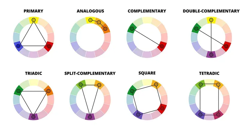
- Combine lavender with mustard yellow or gold for a complementary color scheme that adds warmth and high-energy visual interest.
- Incorporate metallic accents like brushed brass or rose gold to elevate lavender, adding a touch of luxury to the muted tone.
- Choose sage green or olive as a secondary color to evoke a natural, garden-inspired palette that feels organic and balanced.
- Avoid pairing lavender with neon or overly saturated primary colors, as these can easily overwhelm its delicate, dusty undertones.
The bottom line
Lavender is a versatile, calming shade that thrives when balanced with the right counterparts. To achieve a professional look, anchor the color with neutrals like charcoal or white for sophistication, or introduce metallic accents for a touch of glamour. By avoiding overly bright primary colors and focusing on natural, muted tones, you can create a harmonious environment that feels both refreshing and timelessly elegant.
People also ask
Is lavender considered a warm or cool color?
Lavender is generally classified as a cool color because it is derived from blue and purple undertones. However, its specific temperature can shift depending on how much red or pink is mixed into the pigment.
What is the best way to use lavender in a small room?
Use lavender as an accent color through throw pillows, artwork, or a single statement chair to avoid shrinking the visual space. Pairing it with light, neutral walls keeps the room feeling open while adding a distinct personality.
Can lavender work in a masculine interior design?
Yes, lavender can be masculine when paired with dark, moody tones like navy blue, black, or espresso wood. The key is to use it sparingly against strong, structured elements to create a refined and modern look.
What shade of wood looks best with lavender?
Light woods like white oak or ash complement lavender by maintaining a soft, Scandinavian-inspired aesthetic. Conversely, deep walnut provides a striking contrast that makes the lavender appear more vibrant and intentional.
Should lavender be used as a primary wall color?
Lavender can be a beautiful wall color, but it requires careful lighting to avoid looking washed out. It works best in rooms with plenty of natural light or when balanced with dark furniture to provide necessary depth.
How do I choose the right shade of lavender?
Test paint swatches in both morning and evening light to see how the color changes throughout the day. A gray-leaning lavender is more versatile, while a pink-leaning lavender feels more playful and traditional.
This answer was created with the help of AI research tools and reference sources. Spotted an error? Let us know — we correct mistakes quickly. See our editorial policy.