What colors go with brown?
Short answer
Brown is a versatile neutral that pairs beautifully with earthy tones, crisp whites, and vibrant accents. For a classic look, combine it with cream or navy. For a modern, bold aesthetic, pair brown with forest green, mustard yellow, or terracotta. The key is balancing warm undertones with contrasting light or saturated hues.
On this page
Which colors complement brown best?
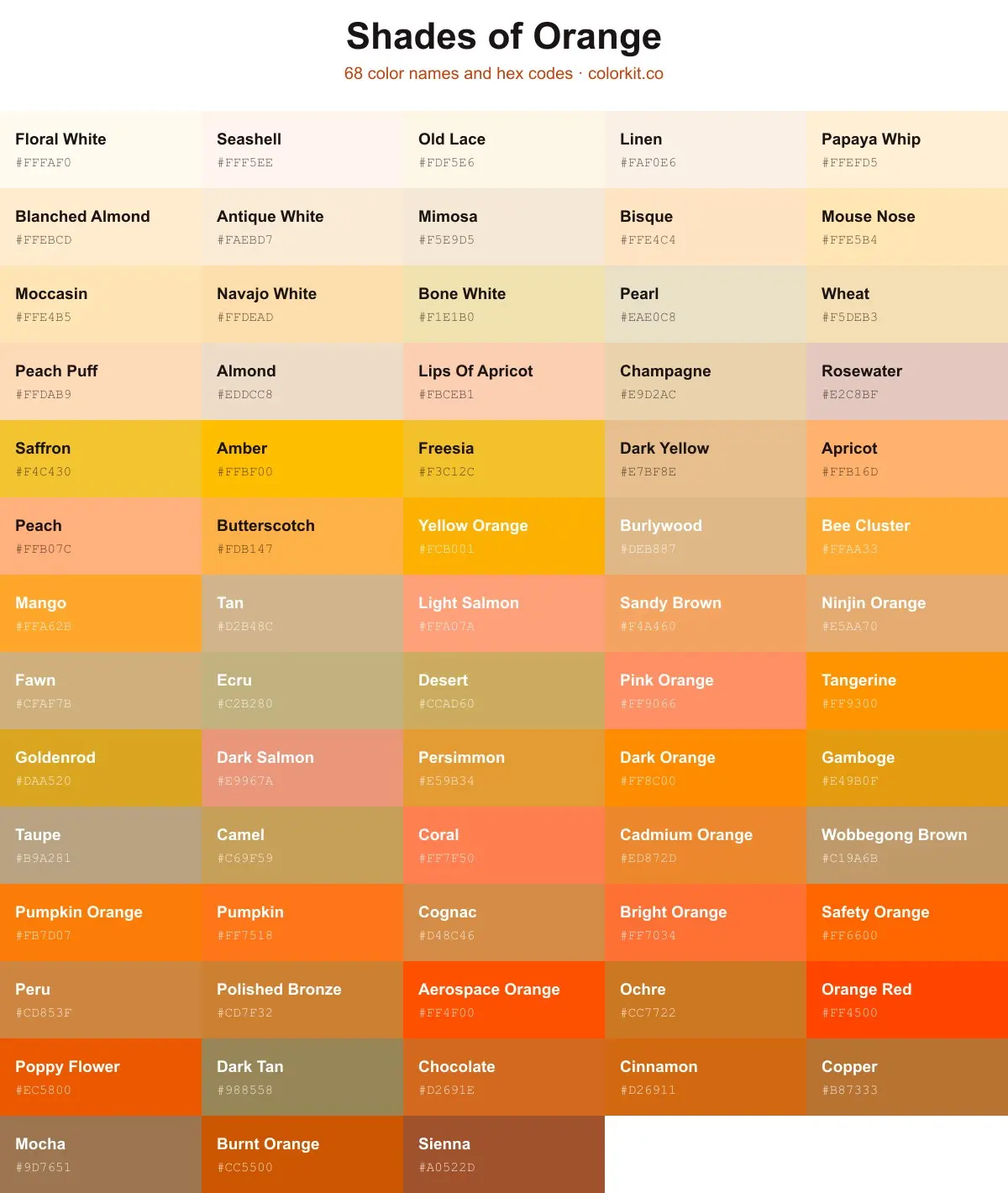
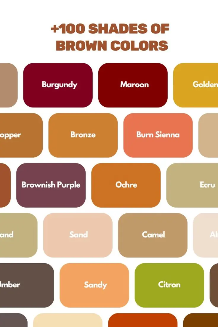
Brown is essentially a dark, warm orange on the color wheel, which makes it highly adaptable to various palettes. Because it serves as a grounded neutral, it works exceptionally well with colors that offer high contrast or those that share its organic roots. Off-white, ivory, and cream are the most reliable partners for brown, as they prevent the space or outfit from feeling too heavy or muddy. These lighter shades provide a crisp backdrop that allows the richness of the brown to stand out.
If you are looking for more depth, consider these color categories:
- Cool tones: Navy blue, slate gray, and sky blue create a sophisticated, balanced contrast.
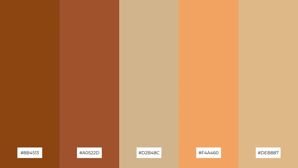
- Warm tones: Terracotta, rust, mustard yellow, and burnt orange emphasize the cozy, natural qualities of brown.
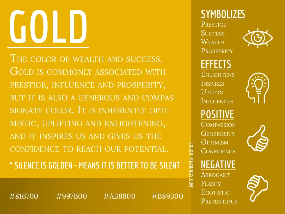
- Metallic accents: Gold, brass, and copper enhance the warmth of brown, while silver can add a sharp, modern edge.
- Jewel tones: Emerald green, deep plum, and sapphire blue add a luxurious, high-contrast feel to dark brown furniture or fabrics.
How to use brown in interior design
When incorporating brown into a room, the goal is to avoid a monochromatic "flat" look. Start by identifying the undertone of your brown—is it reddish, yellowish, or gray-toned? If your brown has red undertones, it will harmonize beautifully with warm neutrals and soft golds. If the brown is cooler or closer to a deep taupe, it will pair better with crisp whites, grays, and cool blues. Layering textures is just as important as choosing the right colors, as different materials like leather, wood, and linen reflect light differently.
To create a balanced interior space, follow these steps:
- Select a primary brown element, such as a sofa or a wood floor, to act as your anchor.
- Introduce a secondary neutral, like cream or light gray, to break up the darkness.
- Add a pop of color through accent pillows, artwork, or rugs to draw the eye.
- Incorporate natural textures like jute or wool to add visual interest without changing the color scheme.
Best color combinations for fashion
In fashion, brown is often treated as a sophisticated alternative to black. To style brown effectively, consider the formality of the occasion. For professional settings, pairing chocolate brown with light blue or soft pink creates a polished, approachable look. For casual wear, layering different shades of brown—such as tan, camel, and espresso—creates a monochromatic ensemble that feels intentional and chic. Avoid pairing brown with colors that are too close in value, such as a dark charcoal, as this can make the outfit appear unintentional or "muddy."
When building an outfit around brown, keep these tips in mind:
- Camel and cream: A timeless, elegant combination that works for any season.
- Chocolate brown and turquoise: A bold, vibrant pairing that feels modern and energetic.
- Tan and white: A fresh, clean look that is perfect for spring and summer.
- Brown and leopard print: A classic fashion pairing that uses brown as the base for a bold pattern.
Why brown can look dull in a space
Brown is frequently criticized for making rooms feel dark or dated, but this usually happens due to poor lighting or a lack of contrast. If you have dark brown walls or furniture, the space requires more light sources to prevent it from feeling like a cave. Use lamps, overhead lighting, and mirrors to bounce light around the room. Another reason brown might look dull is the absence of texture. A brown velvet sofa looks significantly different than a brown leather one; mixing these textures prevents the room from feeling one-dimensional and boring.
If your brown decor feels lifeless, try these adjustments:
- Increase the amount of natural light by using sheer curtains instead of heavy drapes.
- Add metallic accents like gold frames or brass hardware to add a reflective quality.
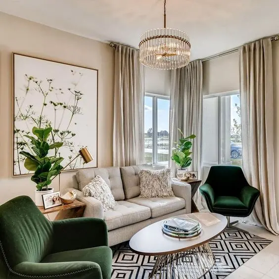
- Introduce plants to bring in vibrant green, which is the natural complement to brown.
- Use patterns that include white or cream to break up large blocks of solid brown.
Common mistakes when pairing colors with brown
One of the most common errors is ignoring the "temperature" of the brown. Mixing a warm, chocolate brown with a cool, icy gray can sometimes create a disjointed aesthetic, though this can work if executed with intention. Another mistake is using too many dark colors together. If you pair dark brown with black and navy, you lose the definition of each piece, and the room or outfit becomes visually heavy. Always ensure there is at least one light or bright element to provide a focal point and keep the eye moving.
Avoid these mistakes to maintain a professional look:
- Over-saturating: Do not use too many bright colors with brown, as it can look chaotic.
- Neglecting contrast: Ensure your accent colors are distinct enough from the brown base.
- Ignoring undertones: Always test your color swatches against your brown items to ensure the undertones do not clash.
- Overloading on neutrals: If you only use brown, beige, and tan, the space may lack personality and warmth.
Key facts
- Pair brown with cream or ivory to create a sophisticated, high-contrast look that feels timeless.
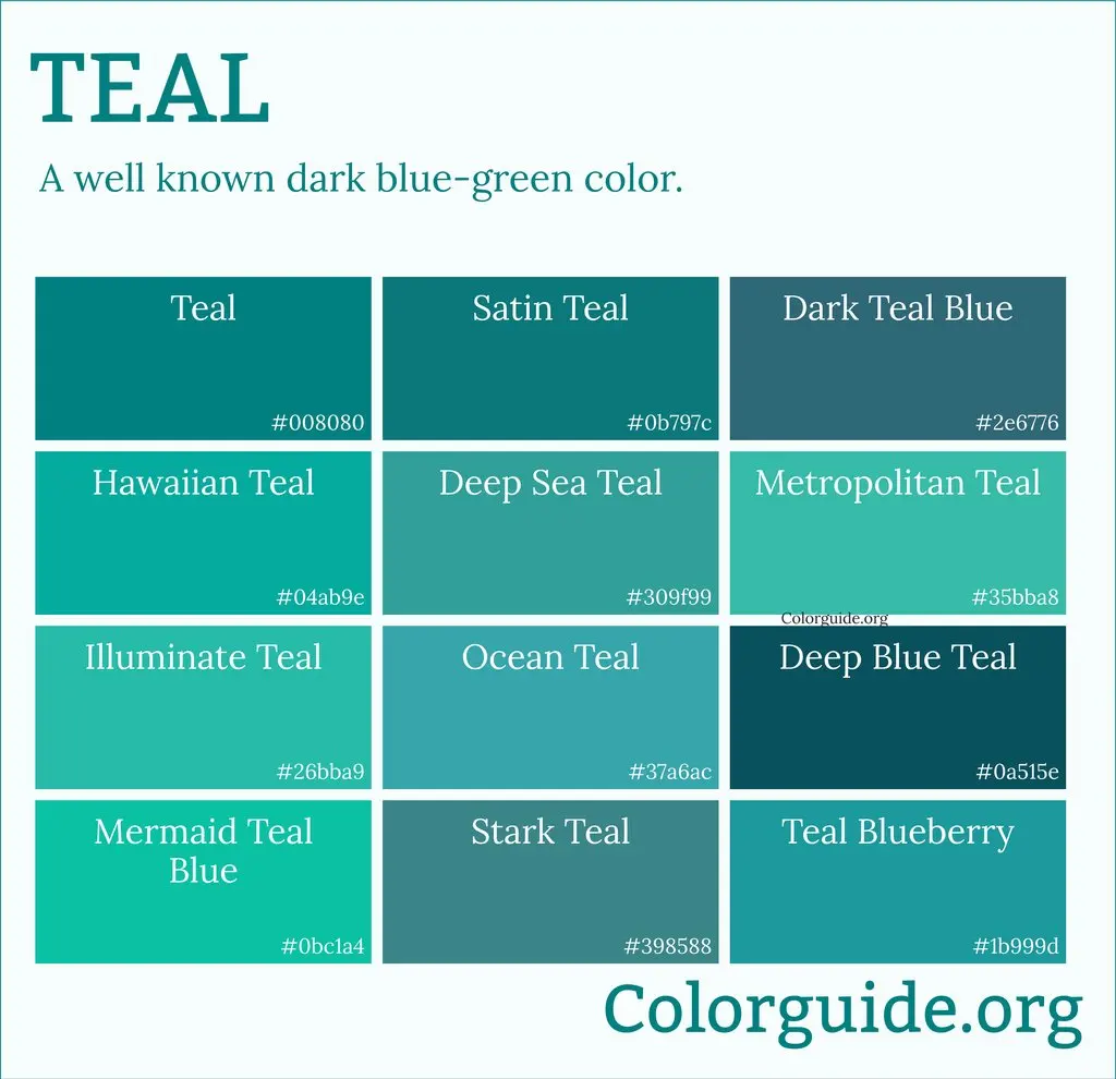
- Use soft blues or teals to balance the warmth of brown with a cool, calming complementary tone.
- Incorporate metallic accents like gold or brass to add luxury and depth to dark chocolate brown palettes.
- Combine different shades of brown, such as tan and espresso, to build a monochromatic, layered aesthetic.
- Avoid pairing brown with black unless the shades have enough contrast, as they can often look muddy together.
- Introduce vibrant colors like mustard yellow or burnt orange to energize brown and create a cozy, autumnal feel.
The bottom line
Brown is a versatile, earthy neutral that serves as a foundation for many design styles. By balancing its inherent warmth with cool tones like blue, or highlighting it with metallics and high-contrast neutrals like cream, you can achieve a polished look. Focus on varying the shades and textures within your palette to avoid a flat aesthetic, ensuring your final combination feels intentional, balanced, and visually engaging.
People also ask
Does grey go well with brown?
Yes, pairing grey with brown creates a grounded, neutral palette. To succeed, choose a cool-toned grey to contrast with a warm-toned brown, or a warm greige to create a seamless, modern transition.
Can I wear brown and navy together?
Brown and navy are a classic combination often seen in men’s tailoring and interior design. Dark navy provides a crisp, professional backdrop that makes rich tan or cognac leather accessories stand out.
What is the best way to mix brown with pastels?
Soft pinks and powder blues work exceptionally well with light brown or beige. The lightness of the pastels prevents the brown from appearing too heavy or somber in a room or outfit.
Is it okay to mix different shades of brown?
Mixing shades is highly encouraged to add visual interest. Layering light, medium, and dark tones prevents a space or outfit from looking flat and creates a sophisticated, cohesive appearance.
What colors should I avoid pairing with brown?
Avoid bright, neon colors that clash with the earthy, muted nature of brown. Additionally, be cautious with colors that are too close in value, as they can create a "washed out" look.
How do I incorporate white into a brown color scheme?
White acts as a clean, bright anchor for brown. Use crisp white for trim or shirts to make the brown elements appear sharper and more intentional.
This answer was created with the help of AI research tools and reference sources. Spotted an error? Let us know — we correct mistakes quickly. See our editorial policy.