What is a color scheme in art?
Short answer
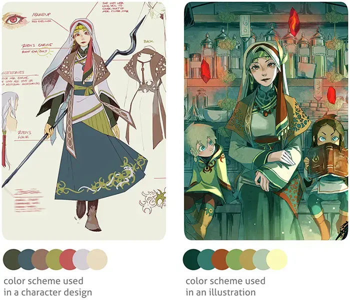
A color scheme is a deliberate selection of colors used in a design, painting, or visual composition to create a specific aesthetic or emotional effect. Based on the principles of color theory, these palettes rely on the relationships between hues on the color wheel to ensure visual harmony and balance.
On this page
What are the main types of color schemes?
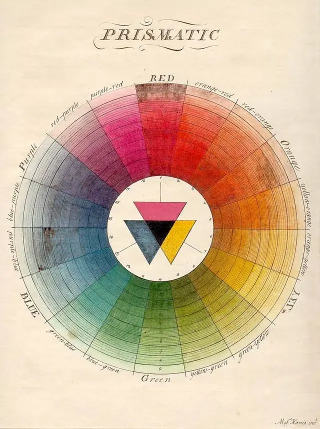
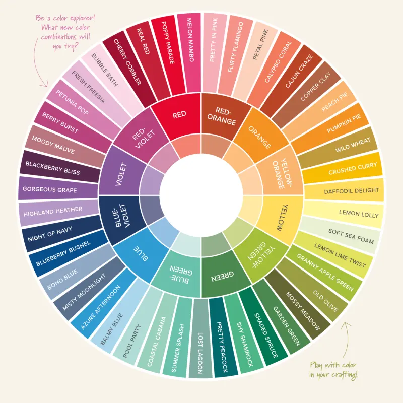
Color schemes are categorized based on how colors are positioned relative to one another on the traditional 12-part color wheel. Understanding these relationships allows artists to control the mood and clarity of their work. The most common schemes include:
- Monochromatic: Uses a single base hue extended by varying its shades, tones, and tints.
- Analogous: Uses colors that sit side-by-side on the wheel, such as blue, blue-green, and green.
- Complementary: Uses two colors directly opposite each other, like red and green, to create high contrast.
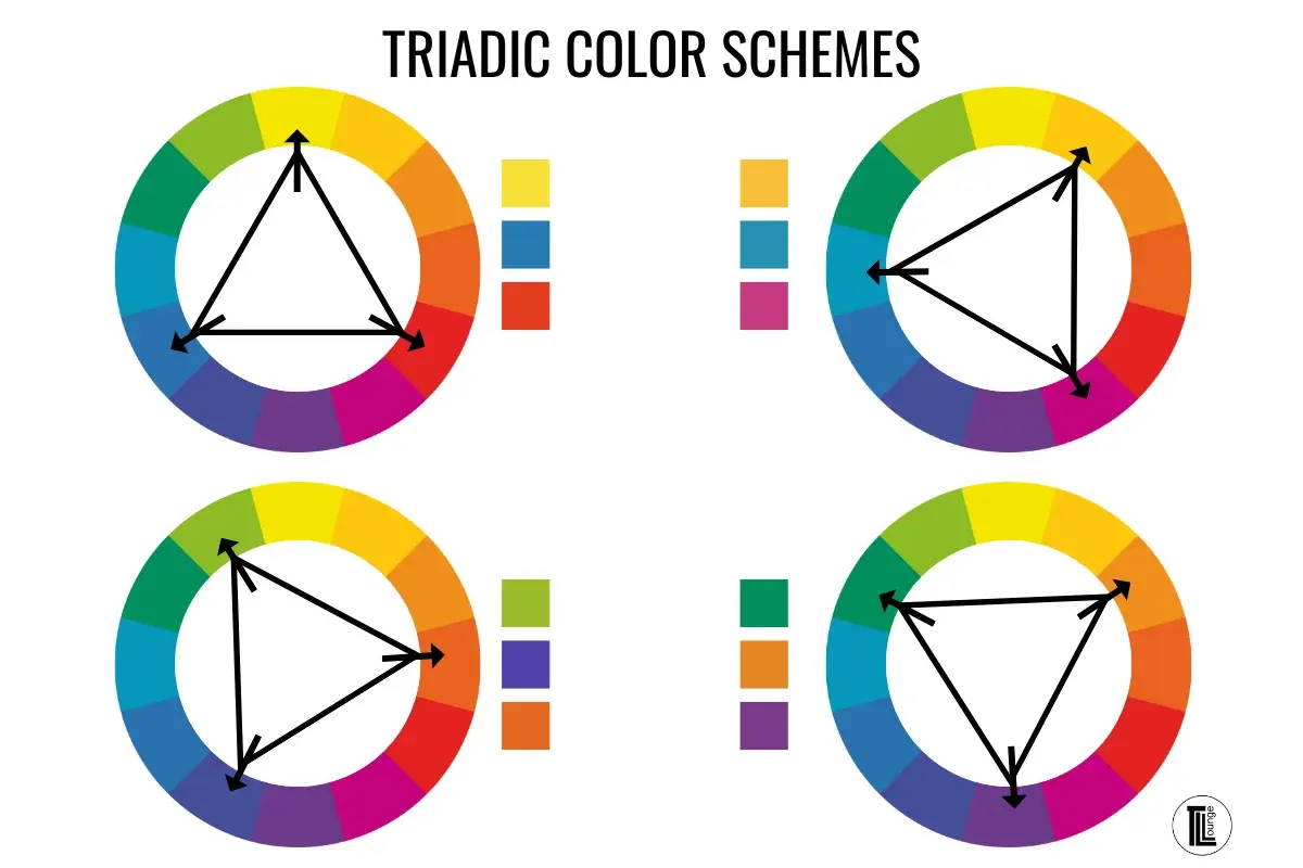
- Triadic: Uses three colors evenly spaced around the wheel, forming an equilateral triangle.
- Split-Complementary: Uses a base color and the two colors adjacent to its direct complement.
These structures provide a mathematical foundation for color selection. By limiting the palette to these specific arrangements, artists avoid visual chaos and ensure that the final composition feels intentional rather than haphazard.
How do color schemes influence mood in art?
Color psychology suggests that specific hues trigger physiological and emotional responses in viewers. Warm colors, such as reds, oranges, and yellows, often evoke feelings of energy, passion, or aggression. Conversely, cool colors like blues, purples, and greens are frequently associated with calmness, sadness, or professional detachment.
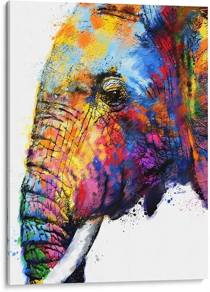
When an artist selects a color scheme, they are essentially choosing the "emotional temperature" of the piece. A monochromatic blue scheme might convey isolation or serenity, while a vibrant triadic scheme of red, yellow, and blue suggests playfulness and high energy. Understanding these associations allows creators to communicate complex themes without relying solely on subject matter. By manipulating saturation and brightness within these schemes, artists can further refine the intensity of the intended emotional impact.
How to choose a color scheme for a project
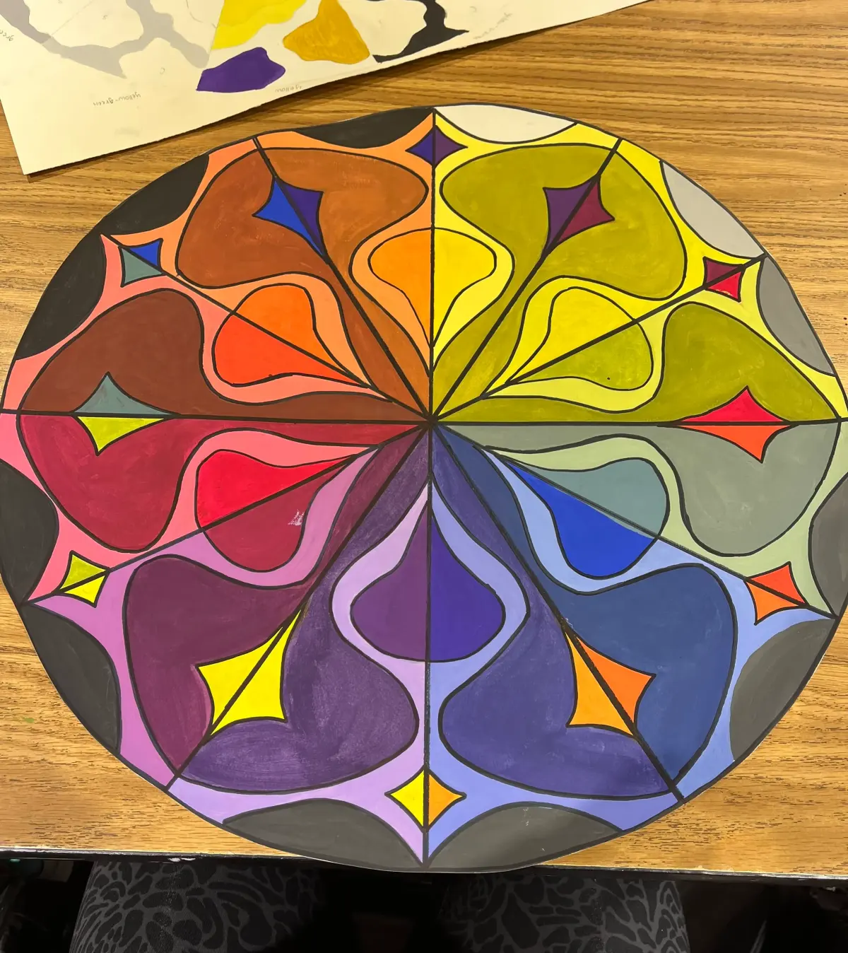
Selecting the right palette requires balancing the intended message with the principles of color harmony. Follow these steps to build an effective scheme from scratch:
- Identify the primary emotion or message you want to convey.
- Select a base color that represents that emotion.
- Choose a color scheme type, such as analogous for harmony or complementary for drama.
- Use the 60-30-10 rule: 60% of the space for a dominant color, 30% for a secondary color, and 10% for an accent.
- Adjust the lightness and saturation of your chosen colors to ensure they work well together.
Testing your palette on a small scale before applying it to a final work is essential. This process ensures that the colors do not clash and that the focal point of the art remains clear to the viewer.
Common mistakes when using color schemes
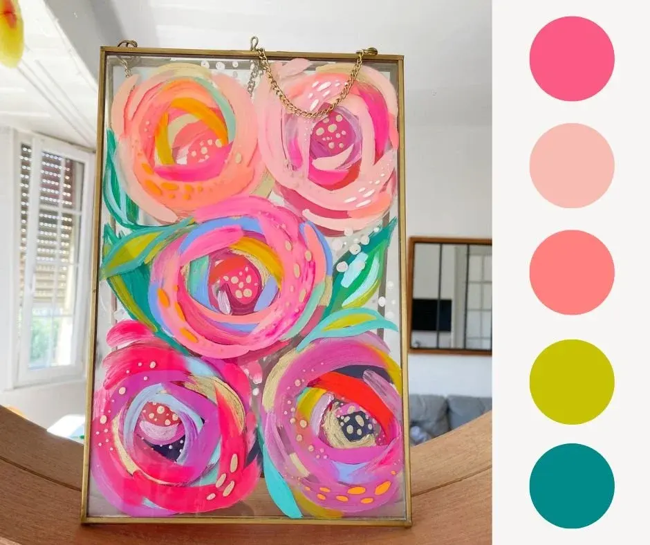
One of the most frequent errors is using too many colors without a clear hierarchy. When every color is equally bright or saturated, the viewer’s eye struggles to find a resting place, leading to visual fatigue. Another common mistake is ignoring the value—the lightness or darkness—of the colors. If all colors in a scheme have the same value, the design will appear flat and difficult to read, regardless of how well the hues harmonize on the color wheel.
- Failing to provide enough contrast between the background and the foreground elements.
- Relying too heavily on pure, high-saturation colors, which can overwhelm the viewer.
- Neglecting to use neutral colors like gray, white, or black to balance intense hues.
- Over-complicating the palette, which often results in a muddy or disorganized appearance.
Avoiding these pitfalls requires practice and a willingness to simplify. Often, the most effective color schemes are those that utilize fewer colors with greater intention.
Why color schemes are important in design
Color schemes are the backbone of visual communication, serving as a tool to guide the viewer’s attention and establish brand identity or artistic style. In professional design, consistent color usage builds recognition and trust. In fine art, a well-executed scheme can unify disparate elements of a painting, turning a collection of shapes into a cohesive narrative. Without a defined scheme, a composition risks feeling disjointed, confusing, or visually unappealing to the audience.
By mastering these rules, artists gain the freedom to experiment while maintaining professional standards. Whether you are painting a canvas or designing a digital interface, the thoughtful application of color theory transforms a simple image into a sophisticated experience. Ultimately, the goal of any color scheme is to facilitate communication between the creator and the viewer, ensuring that the intended message is delivered with clarity, impact, and aesthetic grace.
Key facts
- A color scheme is a deliberate selection of colors used in a design or artwork to create a specific visual effect or mood.
- The color wheel, developed by Isaac Newton in 1666, serves as the primary tool for understanding relationships between hues.
- Complementary schemes use colors opposite each other on the wheel, such as blue and orange, to create high contrast and energy.
- Analogous schemes utilize colors located next to each other, like yellow, yellow-orange, and orange, to produce a harmonious and serene look.
- The 60-30-10 rule is a classic interior design guideline where 60% of the space is a primary color, 30% is a secondary color, and 10% is an accent.
- A common mistake is using too many bright, saturated colors simultaneously, which can overwhelm the viewer and create visual clutter.
The bottom line
A color scheme is the foundation of visual communication, acting as a strategic framework to guide the viewer's eye and evoke specific emotional responses. By mastering relationships between hues, tints, and shades, artists can achieve balance and unity in their work. Whether you prefer the high energy of complementary colors or the peaceful nature of analogous tones, intentional selection remains the key to professional, impactful design.
People also ask
What is the difference between hue, tint, and shade?
A hue is the pure color itself, such as red or blue. A tint is created by adding white to a hue, while a shade is created by adding black to a hue.
How do warm and cool colors affect a painting?
Warm colors like red, orange, and yellow tend to advance toward the viewer and create excitement. Cool colors like blue, green, and purple recede and often evoke a sense of calm.
What is a monochromatic color scheme?
This scheme uses only one hue, incorporating various tints, tones, and shades of that single color. It is highly effective for creating a clean, sophisticated, and unified aesthetic.
Can color schemes influence human emotion?
Yes, color psychology suggests that colors trigger physiological and psychological responses. For instance, blue is often associated with trust and stability, while yellow is linked to optimism and energy.
What is a triadic color scheme?
This scheme uses three colors that are evenly spaced around the color wheel, such as red, yellow, and blue. It provides a balanced, vibrant look that is widely used in graphic design and branding.
How can I test if a color scheme works before applying it?
Create a small thumbnail sketch or a mood board using your chosen colors. If the composition feels balanced and the focal point is clear, the scheme is likely successful.
This answer was created with the help of AI research tools and reference sources. Spotted an error? Let us know — we correct mistakes quickly. See our editorial policy.