What is monochromatic art?
Short answer
Monochromatic art is a style that utilizes only one color, or hue, across an entire composition. Artists achieve variety by manipulating the saturation, tint, shade, and tone of that single base color. This technique emphasizes form, texture, and light rather than relying on the complexity of a multi-colored palette.
On this page
What is monochromatic art?
Monochromatic art is defined by its reliance on a single hue. By using only one color from the visible spectrum, artists can explore the depth and emotional resonance of that specific shade. Instead of mixing different colors, the artist incorporates white to create tints, black to create shades, and gray to create tones. This process strips away the distraction of a complex color scheme, forcing the viewer to focus on the structure and composition of the piece.
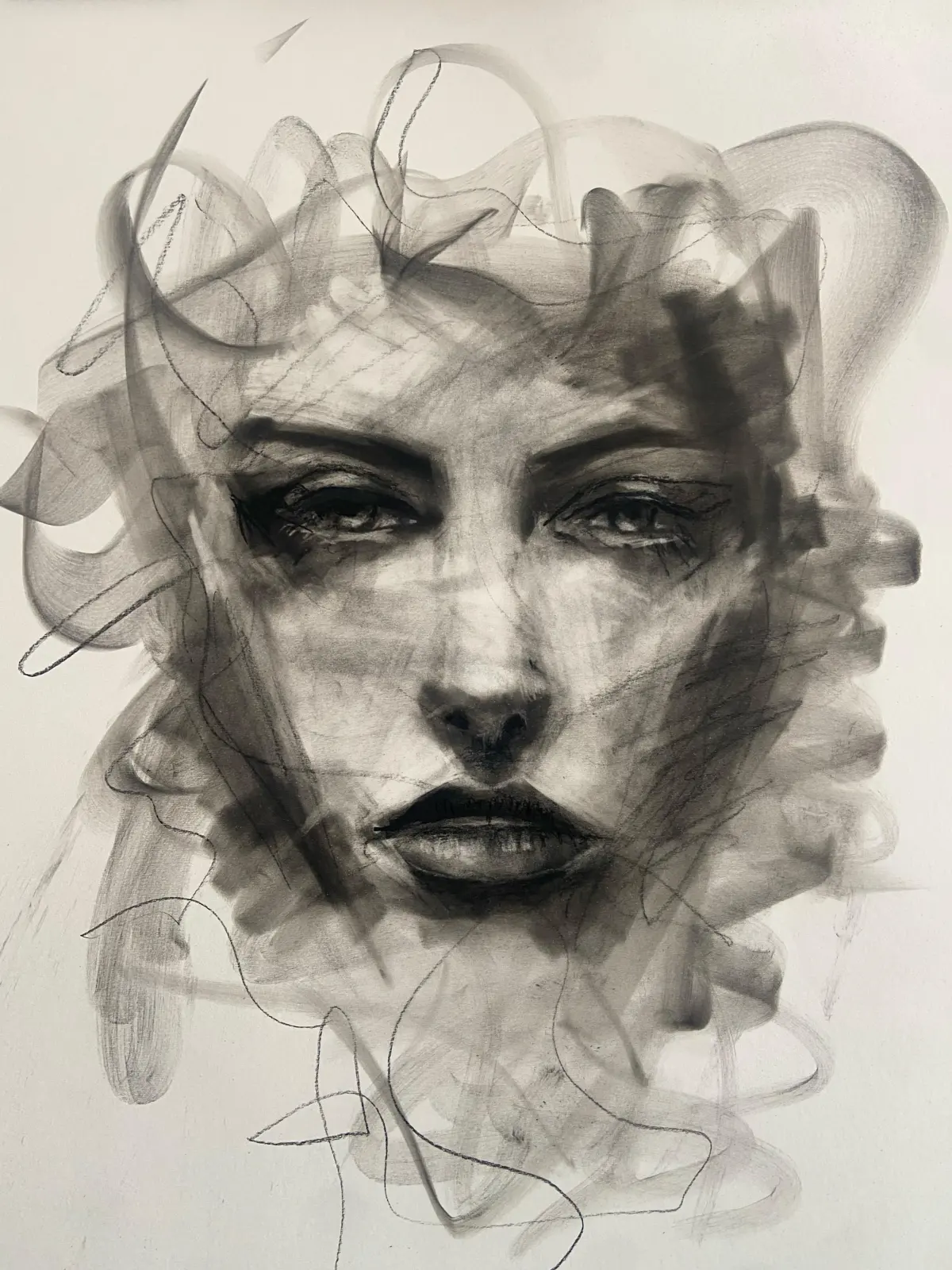
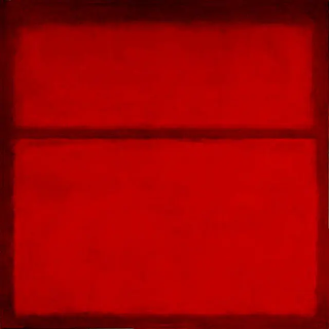
Historically, this technique has been used in various media, including charcoal drawings, ink washes, and sepia photography. In the 20th century, artists like Kazimir Malevich and Yves Klein pushed the boundaries of the style by creating works that consisted of solid, flat fields of a single color. These works challenged traditional notions of representation and paved the way for minimalist movements. By limiting the palette, the artist highlights the interplay between light and shadow, giving the work a distinct, unified atmosphere.
How to create monochromatic art
Creating a monochromatic piece requires a disciplined approach to value and contrast. Without the ability to use complementary colors to create visual interest, you must rely entirely on the lightness or darkness of your chosen hue. This focus on value ensures that the subject remains legible and dynamic despite the lack of traditional color variety.
- Select a single base color from your palette.
- Create a range of values by mixing your base color with white, black, and gray.
- Sketch your subject, focusing on the shapes and shadows rather than color details.
- Apply your lightest tints to the areas where light hits the subject.
- Use your darkest shades to define the deepest shadows and edges.
- Blend your tones to create smooth transitions between the light and dark areas.
By following these steps, you can build a composition that feels three-dimensional. The variation in value serves as the primary tool for creating depth and directing the viewer's eye across the canvas.
Why use monochromatic color schemes
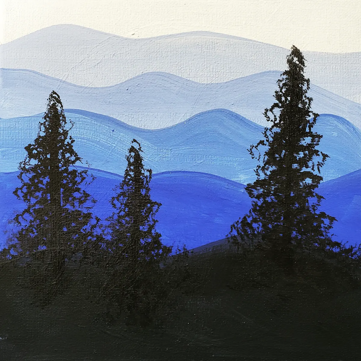
Artists choose monochromatic schemes to evoke specific moods or to simplify complex subjects. A blue monochromatic painting might convey a sense of calm, melancholy, or coldness, while a red-based work can feel intense, energetic, or aggressive. Because the viewer is not overwhelmed by competing colors, they are more likely to connect with the underlying emotion of the artwork. This psychological impact makes monochromatic art a powerful tool for visual storytelling.
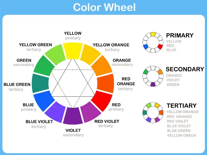
Beyond emotional resonance, this style is highly effective for learning the fundamentals of art. Beginners often struggle with the complexities of color theory, such as temperature and harmony. By working in monochrome, students can master the essential skills of shading and perspective without worrying about whether their colors clash. This technique serves as a foundational exercise that builds confidence and sharpens the ability to perceive light. Once these skills are developed, they can be applied to more complex, multi-colored projects with greater success and clarity.

Common mistakes when painting in monochrome
One of the most frequent errors is failing to achieve enough contrast between the lightest and darkest areas. If all the values are too similar, the painting will appear flat, muddy, or indistinguishable. To avoid this, always test your values on a separate piece of paper before applying them to your final work. Another common mistake is neglecting texture; since color is not available to provide visual interest, the physical application of paint or the texture of the surface becomes crucial to the overall aesthetic.
- Using too many mid-tones, which results in a lack of visual impact.
- Forgetting to incorporate pure white or deep black, which limits the dynamic range.
- Ignoring the importance of edges, which can make the subject look disconnected from the background.
- Over-blending, which can strip away the energy and movement of the brushstrokes.
By consciously varying your brushwork and ensuring a wide range of values, you can keep the viewer engaged. Always step back from your work frequently to assess the overall balance and ensure that the composition remains clear.
Famous examples of monochromatic art
Throughout history, many influential artists have utilized monochromatic techniques to define their artistic voice. Pablo Picasso’s "Blue Period," which lasted from 1901 to 1904, is perhaps the most famous example. During this time, he painted almost exclusively in shades of blue and blue-green, reflecting themes of poverty, loneliness, and despair. These works demonstrate how a single color can define the narrative and emotional weight of an entire body of work, turning simple subjects into profound, somber portraits of the human condition.
Another notable example is the work of Yves Klein, particularly his "International Klein Blue" series. Klein sought to capture the essence of the infinite and the spiritual through the use of a single, intense ultramarine pigment. His approach was less about representation and more about the experience of the color itself. By removing all other visual elements, he forced the audience to confront the color in its purest form. These historical examples illustrate that monochromatic art is not merely a technical exercise but a sophisticated method for exploring the limits of visual expression.
Key facts
- Monochromatic art uses only one color or hue, often incorporating different shades, tints, and tones of that single color.
- Artists create depth in monochromatic works by adjusting the value, which refers to the lightness or darkness of the color.
- Pablo Picasso’s "Blue Period" (1901–1904) is a famous historical example where he used almost exclusively blue and blue-green pigments.
- To create a monochromatic palette, start with a base color and mix it with white to create tints, black for shades, and gray for tones.
- A common mistake is failing to create enough contrast; without a wide range of light and dark values, the final image often appears flat.
- Using a single color helps viewers focus on the composition, texture, and subject matter rather than being distracted by complex color theory.
The bottom line
Monochromatic art is a powerful stylistic choice that emphasizes form, texture, and value over the complexity of a full color palette. By mastering the use of tints, shades, and tones of a single hue, you can create visually striking works that evoke strong emotional responses. Focus on high-contrast lighting and diverse surface textures to ensure your monochromatic project remains engaging, sophisticated, and professionally composed.
People also ask
Is black and white photography considered monochromatic?
Yes, black and white photography is the most common form of monochromatic art. It relies entirely on grayscale values to define shapes, textures, and lighting within a frame.
Can I use different colors if they are all in the same family?
Strictly speaking, monochromatic art is limited to a single hue. While using "warm" or "cool" colors together creates a harmonious palette, it is technically categorized as analogous rather than monochromatic.
Why do artists choose to work in a monochromatic style?
Artists often use this technique to evoke specific moods or to simplify complex visual information. By removing the variable of color, the artist forces the viewer to engage more deeply with the form and emotion of the work.
Does monochromatic art have to be boring?
Not at all, as the lack of color variety is compensated for by an increased emphasis on texture and contrast. Skilled artists use brushwork, lighting, and material density to create visual excitement that rivals multi-colored pieces.
What is the difference between a tint and a shade?
A tint is created by adding white to a base color, which makes it lighter and often softer. A shade is created by adding black to a base color, which deepens the hue and increases its intensity.
Can I use metallic paints in a monochromatic piece?
You can certainly incorporate metallic paints, but they will add a reflective quality that changes how light hits the surface. This adds a layer of complexity that can make the monochromatic theme feel more dynamic and modern.
This answer was created with the help of AI research tools and reference sources. Spotted an error? Let us know — we correct mistakes quickly. See our editorial policy.