What does the color red mean in art?
Short answer
Red is a powerful, high-energy color in art, traditionally representing blood, fire, passion, and authority. Because it has the longest wavelength in the visible spectrum, it commands immediate attention, often advancing toward the viewer. Artists use red to create focal points, evoke intense emotional responses, or signify danger and vitality.
On this page
Why is red used in art?
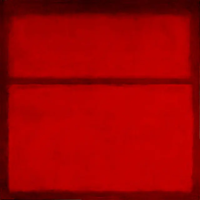
Red is biologically hardwired to trigger immediate physiological responses, as it mimics the appearance of blood and fire. In art history, it has served as a primary tool for artists to manipulate the viewer's gaze. Because red is a warm, advancing color, it appears physically closer to the eye than cooler tones like blue or green. This optical phenomenon allows artists to dictate the hierarchy of a composition by placing red in areas they want the audience to notice first.
Beyond its visual weight, red carries deep symbolic significance across various cultures. In Western tradition, it is frequently associated with love, sacrifice, and martyrdom, often seen in the robes of religious figures or the garments of royalty. In Eastern cultures, particularly in China, red symbolizes good fortune, prosperity, and joy. By choosing red, an artist instantly imbues a work with a specific emotional intensity that transcends language, making it one of the most effective tools for storytelling.
How do artists use red for composition?
Artists utilize red as a structural element to guide the viewer’s eye across a canvas. By repeating red in different areas of a painting, an artist creates a visual path that links disparate objects together. This technique, known as color echoing, ensures that the composition feels balanced and intentional. If a painting feels stagnant, a strategic splash of red can act as a catalyst, injecting life and movement into the scene.
When using red in a composition, consider these functional applications to enhance your work:
- Focal point creation: Place a bright red object in a neutral-toned scene to draw the eye immediately.
- Atmospheric depth: Use muted, desaturated reds in the background to suggest distance, as intense red tends to flatten the space.
- Emotional contrast: Pair red with its complementary color, green, to create a vibrating, high-energy tension that keeps the viewer engaged.
- Narrative emphasis: Use red to highlight characters or objects that are central to the painting’s theme, such as a heart or a weapon.
What are common mistakes when using red?
The most frequent mistake artists make when using red is over-saturation, which can overwhelm the rest of the color palette. Because red is so dominant, applying it too liberally can cause a painting to lose its sense of depth and subtlety. Beginners often use red straight from the tube, resulting in a flat, cartoonish effect that lacks the nuance found in natural light. It is essential to mix red with other tones to create a broader range of values.
Another common error is failing to consider the temperature of the red. Not all reds are identical; some have blue undertones, while others lean toward yellow. Mixing a cool, blue-based red with a warm, yellow-based green can result in a muddy, unattractive brown. To avoid this, follow these steps to manage your red pigments:
- Test your red against your other colors on a palette before applying it to the canvas.
- Use glazing techniques to layer transparent reds over other colors to build depth without losing luminosity.
- Limit the use of pure, high-intensity red to the most important areas of the composition.
How to mix red for realistic paintings?
Achieving realistic skin tones or natural landscapes requires a sophisticated understanding of red’s versatility. Pure red is rarely found in nature in its most vibrant state; instead, it is usually filtered through light, shadow, or atmospheric perspective. To paint realistic flesh, for instance, artists often mix small amounts of red with white and yellow to create subtle, lifelike undertones. This prevents the subject from appearing flat or mannequin-like.
For landscapes, red is vital for capturing the warmth of a sunset or the subtle shifts in autumn foliage. Instead of using a single tube of red, try mixing your own variations:
- For deep, moody shadows: Mix a cool red with a touch of green or burnt umber.
- For vibrant, sunlit highlights: Mix a warm, orange-based red with white or yellow.
- For muted, distant mountains: Use a desaturated, earthy red like Venetian red or Indian red.
By layering these variations, you can create a sense of three-dimensional form that a single, flat color cannot replicate.
What is the history of red pigments in art?
Red holds the distinction of being the first color used by humans in artistic expression. Paleolithic cave paintings, such as those found in the Lascaux caves in France dating back 17,000 years, utilize red ochre, a natural iron oxide pigment. This earth-based red was accessible and durable, allowing early humans to record their environment and spiritual beliefs. Throughout the Renaissance, red became a status symbol, as pigments like vermilion and carmine were expensive and difficult to produce.
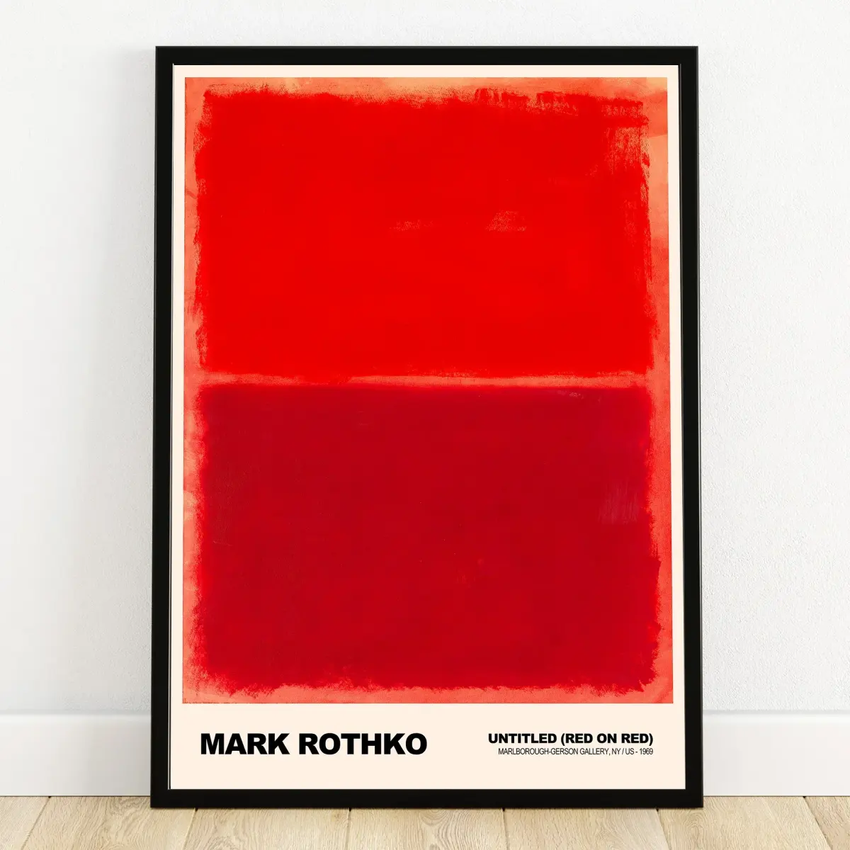
The evolution of red pigments reflects the broader history of technological advancement in art. The discovery of synthetic reds in the 19th and 20th centuries, such as cadmium red, provided artists with unprecedented intensity and lightfastness. These modern pigments allowed painters like Henri Matisse to utilize flat, bold fields of red to redefine the boundaries of expressionism. Today, the legacy of red continues to influence contemporary art, serving as both a historical anchor and a vibrant, modern tool for visual communication.
Key facts
- Red is the first color humans perceive after black and white, making it a powerful tool for grabbing immediate attention.
- In color theory, red is a primary color that advances toward the viewer, creating an illusion of depth and urgency.
- Historically, red pigments like vermilion were expensive and reserved for significant religious or royal figures in Renaissance paintings.
- Artists often use red to establish a focal point, as the human eye is biologically hardwired to notice the color quickly.
- To avoid visual fatigue, use red sparingly; saturating an entire canvas with bright red can overwhelm the viewer and flatten the composition.
- Mixing red with white creates pink, which shifts the psychological impact from aggressive passion to softness or innocence.
The bottom line
Red is a potent visual element that functions as both a psychological trigger and a structural tool in art. By understanding its ability to advance in space and command attention, artists can strategically guide the viewer's eye. Whether used for symbolic weight or to create a focal point, red requires careful balance to ensure its intensity enhances the overall composition rather than overwhelming the final piece.
People also ask
Why do artists use red to create a sense of depth?
Because red has a long wavelength, it appears to move forward in a composition. Placing warm red objects in the foreground against cool blue backgrounds creates a strong sense of three-dimensional space.
How does red influence the emotional tone of a painting?
Red is associated with intense human experiences, including love, anger, danger, and power. Its presence can heighten the emotional stakes of a scene or signal a warning to the audience.
What is the difference between cadmium red and alizarin crimson?
Cadmium red is an opaque, warm, and vibrant pigment that sits prominently on the surface. Alizarin crimson is a transparent, cooler, and deeper red often used for glazing to add complexity and shadow.
Can red be used to represent something other than passion?
Yes, red is frequently used to symbolize sacrifice, blood, or political revolution. In religious art, it often represents the blood of Christ or the fire of the Holy Spirit.
What is a common mistake when using red in a painting?
A common error is using too much high-intensity red without balancing it with neutral tones. This can cause the painting to vibrate unpleasantly and distract the viewer from the intended subject.
How can I tone down a bright red in my artwork?
You can neutralize red by mixing in a small amount of its complementary color, which is green. This creates a more sophisticated, muted earth tone that is easier to integrate into a balanced palette.
This answer was created with the help of AI research tools and reference sources. Spotted an error? Let us know — we correct mistakes quickly. See our editorial policy.