What are split complementary colors?
Short answer
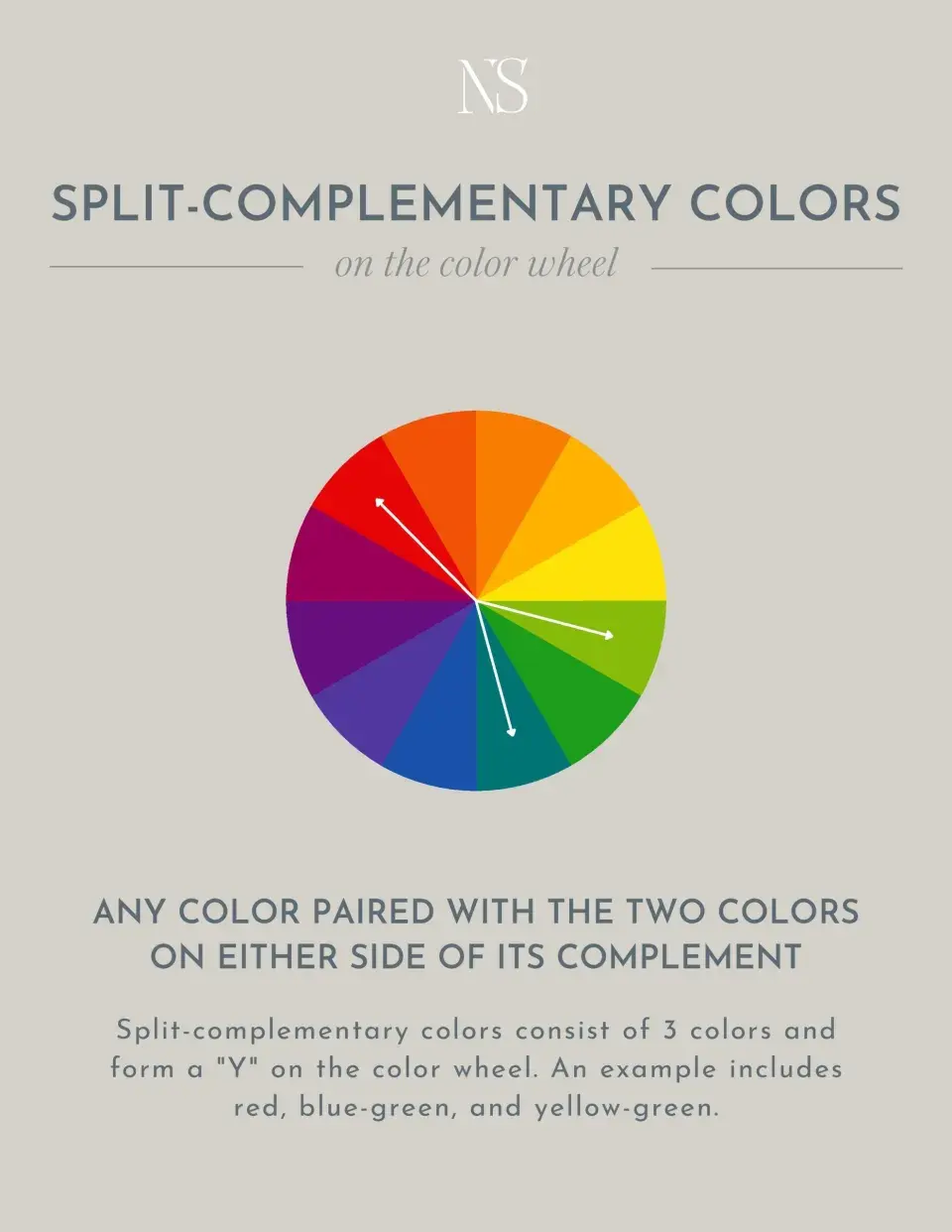
A split complementary color scheme uses a base color combined with the two colors located immediately adjacent to its direct complement on the color wheel. This approach provides high visual contrast similar to a traditional complementary scheme but with more nuance, balance, and harmony, making it a popular choice for professional design and art.
On this page
How to identify split complementary colors
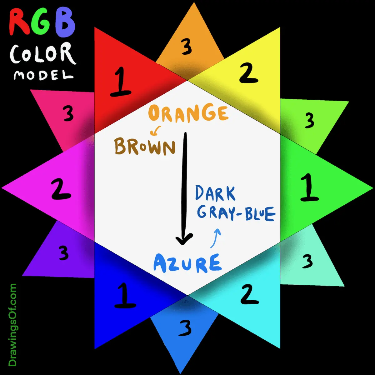
The color wheel is the primary tool for identifying these relationships. To find a split complementary palette, first select a base hue, such as blue. Locate its direct opposite on the wheel, which in this case is orange. Instead of using orange, select the two colors flanking it: yellow-orange and red-orange. This creates a three-color grouping that offers significant visual tension while remaining more approachable than a simple two-color pairing.
Understanding this structure requires familiarity with the 12-part color wheel, which consists of three primary colors, three secondary colors, and six tertiary colors. By shifting the base color, you can generate an infinite variety of these schemes. For example, starting with red leads to a combination of red, yellow-green, and blue-green. This method ensures that your color choices are grounded in mathematical relationships rather than guesswork, providing a reliable foundation for any creative project.
Why use split complementary schemes
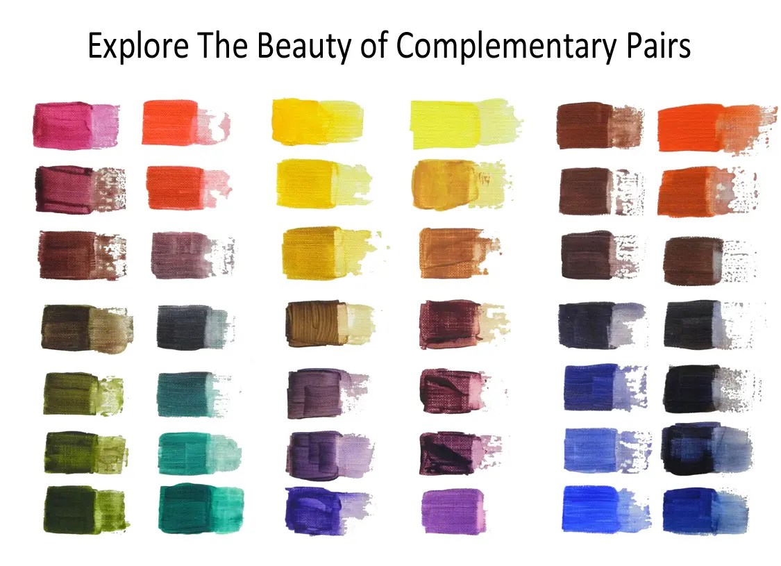
Designers favor this scheme because it balances excitement with stability. Direct complementary colors, such as blue and orange, can often feel jarring or aggressive when placed side-by-side in high saturation. By "splitting" the complement, you introduce a third hue that softens the overall effect while maintaining the energy of the original contrast. This makes the palette versatile enough for everything from interior design to digital interfaces.
The psychological impact of this scheme is also noteworthy. It creates a sense of vibrancy that draws the eye, yet the inclusion of the two adjacent colors prevents the design from feeling overly simplistic. It is often used in branding and marketing to create a focal point that feels dynamic but not chaotic. When applied correctly, it guides the viewer's gaze toward key elements without overwhelming them with clashing tones.
How to create a balanced color palette
Achieving a professional look requires careful management of color proportions. A common strategy is to use the 60-30-10 rule, where one color dominates the space, the second provides support, and the third acts as a vibrant accent. Following a structured process helps maintain visual hierarchy and prevents your design from appearing cluttered or disorganized.
- Select your primary base color to set the mood of the design.
- Identify the direct complement, then move one step to the left and right to find the two secondary hues.
- Choose a dominant color for the background or large areas.
- Assign the secondary color to mid-sized elements like furniture or text blocks.
- Use the third, most vibrant color sparingly as an accent for buttons, icons, or decorative details.
Common mistakes when using split complementary colors
The most frequent error is applying all three colors in equal amounts. If each color occupies the same visual weight, the design will lack focus and appear chaotic. Instead of treating them as equal partners, treat them as a hierarchy. A common mistake is failing to adjust the saturation or brightness of the colors, which can lead to a muddy or overly neon appearance that strains the eyes.
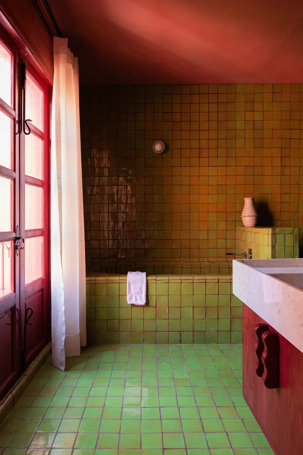
Another issue is ignoring the context of the environment. A color scheme that looks effective on a small digital screen might feel overwhelming when applied to a large wall in a living room. Always test your colors in the actual medium you intend to use. If the colors feel too intense, consider desaturating the base color or adding white, black, or gray to create tints and shades, which helps ground the palette and makes it more livable.
Best tools for choosing color combinations
Digital tools have made it significantly easier to experiment with these relationships without needing to mix physical paints. Many online color generators allow you to input a base hex code and automatically generate a split complementary palette. These tools often provide sliders to adjust the brightness and saturation, allowing for immediate feedback on how different variations interact with one another.
- Adobe Color: Offers a robust interface for exploring color rules and saving palettes for professional software.
- Coolors: A fast, user-friendly generator that allows you to lock specific colors while shuffling others to find the perfect match.
- Canva Color Wheel: An educational resource that explains the theory while providing practical, ready-to-use color codes for design projects.
- Pantone Connect: Useful for designers who need to ensure their digital color choices translate accurately to physical printing materials.
By utilizing these resources, you can experiment with various combinations until you find the perfect balance for your specific needs. Start with a neutral base and gradually introduce the split complementary hues to see how they transform your composition. With practice, you will develop an intuitive sense for how these colors interact and how to apply them effectively to any project.
Key facts
- A split complementary color scheme uses one base color and the two colors directly adjacent to its direct complement on the color wheel.
- If you choose blue as your base, the direct complement is orange, so the split complementary colors are yellow-orange and red-orange.
- This scheme offers high visual contrast similar to a complementary palette but with less tension and more color variety.
- To maintain balance, use the base color as the dominant hue and the two split colors as accents for secondary elements.
- Avoid using all three colors in equal proportions, as this often creates a chaotic or cluttered visual experience.
- Artists and designers use this method to create vibrant, harmonious compositions that feel more sophisticated than simple two-color pairings.
The bottom line
The split complementary color scheme is a versatile design tool that balances high contrast with visual harmony. By combining a base color with the two hues adjacent to its direct opposite, you achieve a sophisticated look that avoids the jarring intensity of basic complementary pairs. Use this method to create dynamic, professional layouts by letting one color dominate while using the others for subtle, effective accents.
People also ask
How does a split complementary scheme differ from a triadic scheme?
A triadic scheme uses three colors evenly spaced around the color wheel, such as red, yellow, and blue. In contrast, a split complementary scheme is narrower, focusing on one side of the wheel to create a more controlled and nuanced harmony.
Is this color scheme suitable for professional graphic design?
Yes, it is widely used in branding and web design because it provides enough contrast to highlight important buttons or text without the harshness of direct opposites. It is often considered a "safer" choice for beginners than a full complementary palette.
Can I use neutral colors with this scheme?
Incorporating neutrals like white, gray, or black is highly recommended to give the eye a place to rest. Neutrals help prevent the three vibrant colors from overwhelming the viewer.
How many colors should I use in total?
While the scheme is defined by three specific hues, you can create depth by using different tints, shades, and tones of those colors. Stick to the three core hues to ensure the design remains cohesive and intentional.
Does this scheme work for interior design?
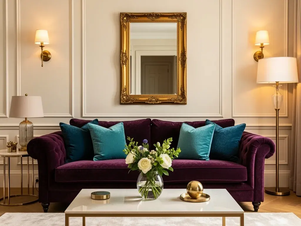
It works well in home decor, particularly when you use the base color for large items like walls or sofas. The two split colors can then be introduced through smaller accessories like pillows, artwork, or rugs.
What is the best way to choose a base color?
Start by identifying the mood you want to evoke, as colors carry psychological associations. Once you have a base, look at the color wheel to find its direct opposite, then move one step to the left and right to identify your split colors.
This answer was created with the help of AI research tools and reference sources. Spotted an error? Let us know — we correct mistakes quickly. See our editorial policy.