What is the complementary color of gold?
Short answer
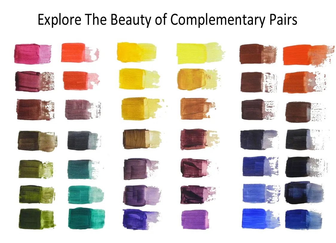
The complementary color of gold is a deep violet or dark purple. Because gold is essentially a metallic shade of yellow, it sits opposite the purple-blue spectrum on the traditional color wheel. Pairing these colors creates a high-contrast, harmonious effect often used in luxury branding, interior design, and fine art.
On this page
How to identify the complementary color of gold
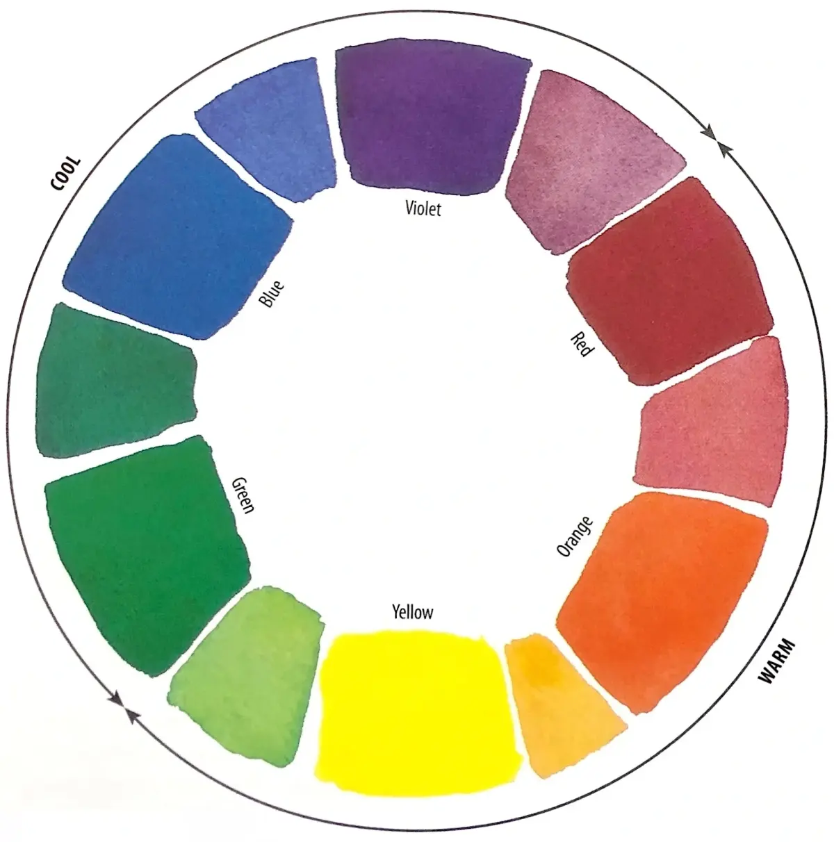
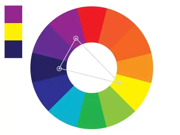
To understand why violet is the complement of gold, one must look at the color wheel. Gold is a warm, desaturated yellow, and its direct opposite on the standard RYB (red-yellow-blue) color model is purple. When these two colors are placed side by side, the human eye perceives a heightened intensity in both, as they occupy opposite positions on the visual spectrum. This relationship is a fundamental principle of color theory known as simultaneous contrast.
While pure yellow has a bright purple complement, gold’s metallic nature adds complexity. Because gold contains subtle hints of orange or brown depending on its finish, the most effective complementary shades often lean toward deep plum, eggplant, or royal violet. Using these darker, richer tones prevents the color scheme from looking like a primary school project and instead grounds the vibrancy of the gold in a sophisticated, moody backdrop.
Why designers use gold and violet together
The combination of gold and purple has historically been associated with royalty, wealth, and spiritual power. In ancient civilizations, purple dye was incredibly expensive to produce, making it a status symbol reserved for emperors and high-ranking officials. When paired with gold—the ultimate symbol of material prosperity—the two colors create an aesthetic that feels both regal and timeless. This pairing is frequently employed in luxury branding to evoke feelings of exclusivity and prestige.
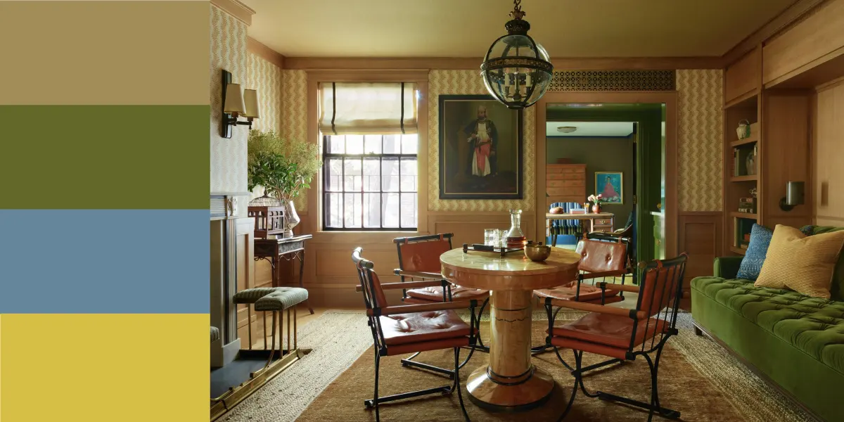
In modern interior design, this combination is used to create focal points within a room. A common approach involves using a neutral base, such as charcoal gray or cream, and introducing gold and violet as accent colors. This prevents the space from feeling overwhelming while still allowing the high-contrast duo to stand out. Designers often utilize these colors in:
- Velvet throw pillows or upholstery in deep plum.
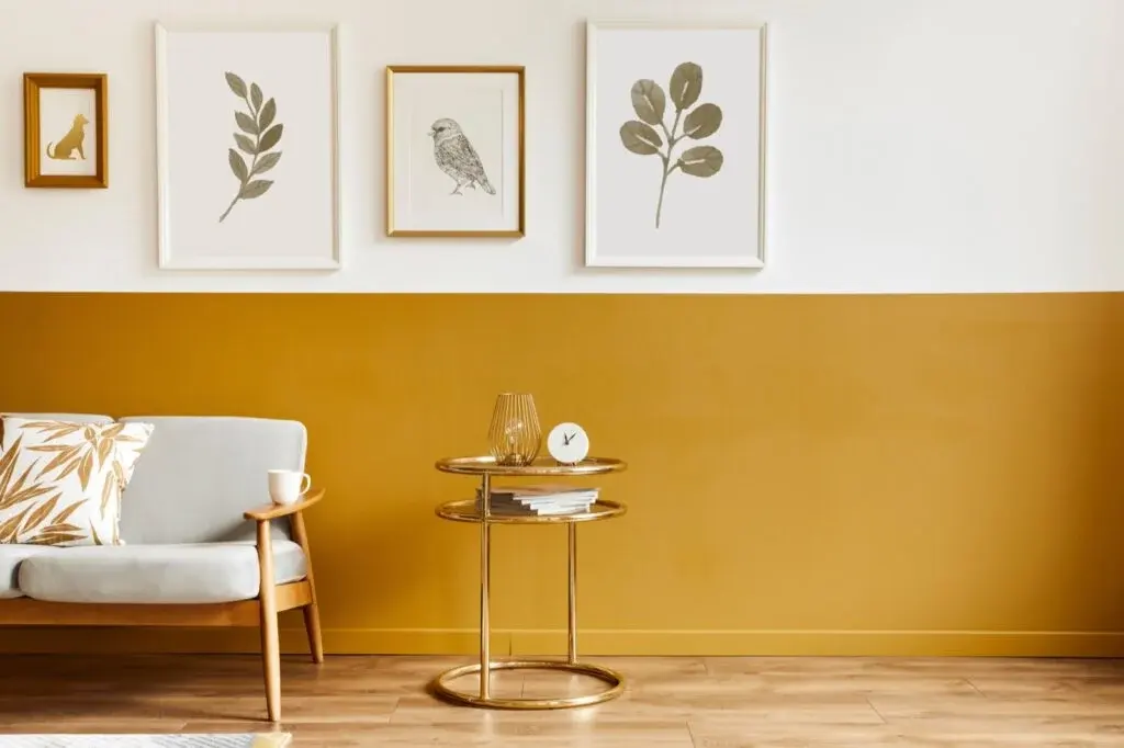
- Metallic gold picture frames or wall mirrors.
- Dark violet accent walls paired with gold lighting fixtures.
- Decorative metallic gold hardware on dark purple cabinetry.
How to balance gold and violet in your home
Achieving a balanced look with these bold colors requires careful attention to saturation and scale. If you use a very bright, reflective gold, you should pair it with a deeper, matte shade of purple to ensure the colors do not compete for dominance. Conversely, if your gold is a muted, antique brass, a brighter, more vibrant violet can provide a necessary pop of energy. The goal is to create a visual hierarchy where one color acts as the primary anchor and the other serves as a supportive accent.
To successfully incorporate these colors into a living space, follow these steps:
- Choose a dominant color for the room, such as a deep violet paint or wallpaper, to set the mood.
- Select a gold finish that matches the room's style, such as brushed brass for modern aesthetics or polished gold for traditional themes.
- Distribute the gold accents throughout the space to draw the eye across the room, ensuring they are not all clustered in one corner.
- Introduce a neutral third color, like white or slate, to act as a bridge between the two intense tones.
Common mistakes when pairing gold and purple
One of the most frequent errors people make is using colors that are too similar in value, which can make the space look muddy or chaotic. If the purple is too light and the gold is too pale, the contrast disappears, resulting in a washed-out appearance. Always aim for a significant difference in lightness and darkness between the two shades. Another mistake is overusing both colors in equal measure, which can make a room feel cramped or kitschy rather than elegant.
To avoid these common pitfalls, keep the following tips in mind:
- Avoid pairing neon purple with bright yellow-gold, as this can create a jarring, aggressive visual effect.
- Do not ignore the lighting in your room, as metallic gold changes appearance drastically under warm versus cool light bulbs.
- Ensure that the textures of the materials are varied, such as combining matte purple walls with shiny metallic gold accessories to add depth.
- Limit the use of gold to small, intentional accents rather than large furniture pieces to maintain a sense of balance.
Best ways to use gold and violet in art
Artists have utilized the complementary relationship between gold and violet for centuries to create depth and focus. In classical painting, gold leaf was often applied over or next to deep purple robes to make the figures appear divine or illuminated. Today, this technique remains effective in graphic design and digital art, where the contrast between a warm metallic glow and a cool dark background can make a subject appear to pop off the screen.
When working with these colors in a creative project, consider how the finish of the gold affects the overall composition. A metallic gold ink or pigment reflects light, which interacts with the surrounding violet tones in a dynamic way. As the viewer moves, the gold shifts, creating a sense of movement that a flat yellow color could never achieve. By understanding the science of color theory, you can harness this powerful pairing to create works that are visually striking, emotionally resonant, and perfectly balanced for any audience.
Key facts
- Gold is technically a metallic yellow, placing it in the yellow-orange section of the color wheel.
- The direct complementary color of gold is a deep, rich violet or dark purple.
- Complementary colors are located directly opposite each other on the traditional RYB (red-yellow-blue) color wheel.
- Using purple alongside gold creates high-contrast visual tension that makes the gold appear more vibrant and luxurious.
- When working with digital design, use the hex code #800080 for a standard purple to contrast against gold tones.
- Avoid using light pastels with gold, as they often wash out the metallic sheen and reduce the intended impact.
The bottom line
The complementary color of gold is violet or deep purple. By placing these shades opposite each other on the color wheel, you create a striking visual contrast that elevates the perceived value and brilliance of the gold. Whether you are designing a room or crafting a graphic, choosing a dark, saturated purple will ensure your gold accents remain the focal point of the composition.
People also ask
Does gold match well with navy blue?
Yes, navy blue is a classic pairing for gold because it provides a sophisticated, dark backdrop that allows the metallic luster to stand out. While purple is the direct mathematical complement, navy offers a more subtle and professional contrast.
Why does gold look different under various lighting conditions?
Gold is a reflective metallic surface, meaning its appearance shifts based on the color temperature of the surrounding light. Warm lighting enhances the yellow tones, while cool, blue-tinted lighting can make gold appear flatter or more greenish.
What is the best way to balance gold in interior design?
Use gold as an accent rather than a primary color to prevent it from overwhelming a space. Pair gold hardware or frames with a dominant complementary shade like deep plum or navy to create a balanced, high-end aesthetic.
Can gold be used with other warm colors like red?
Gold pairs effectively with red, but this combination often creates a festive or traditional cultural aesthetic rather than a high-contrast one. Because red and gold are both warm, they harmonize through similarity rather than the tension found in complementary pairings.
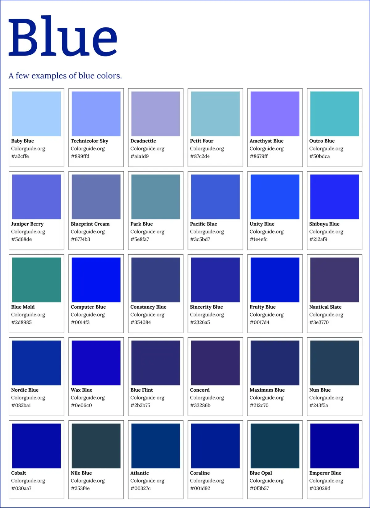
How do I choose the right shade of purple for gold?
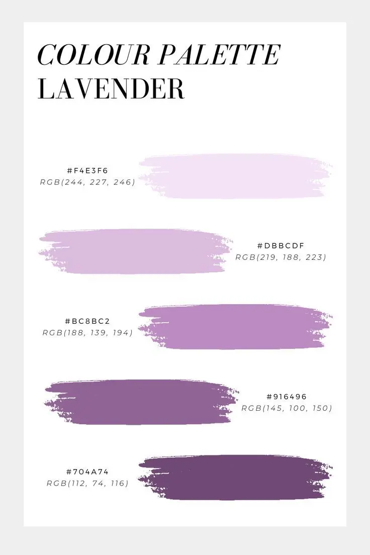
Opt for deep, saturated purples like eggplant, royal purple, or plum to achieve the best contrast. Lighter shades like lavender can look dated or overly soft, failing to provide the necessary depth to make the gold pop.
Is gold considered a neutral color?
In design, gold is often treated as a neutral because of its versatility and ability to reflect surrounding colors. However, it carries a warm undertone that requires careful consideration when placed next to cool-toned grays or stark whites.
This answer was created with the help of AI research tools and reference sources. Spotted an error? Let us know — we correct mistakes quickly. See our editorial policy.