What colors go with blue?
Short answer
Blue is a versatile primary color that pairs beautifully with neutrals like white, gray, and beige for a timeless look. For bolder aesthetics, complementary oranges, warm yellows, or rich metallics create striking contrast. The ideal choice depends on the specific shade of blue, ranging from pale sky tones to deep navy.
On this page
How to choose the right shade of blue
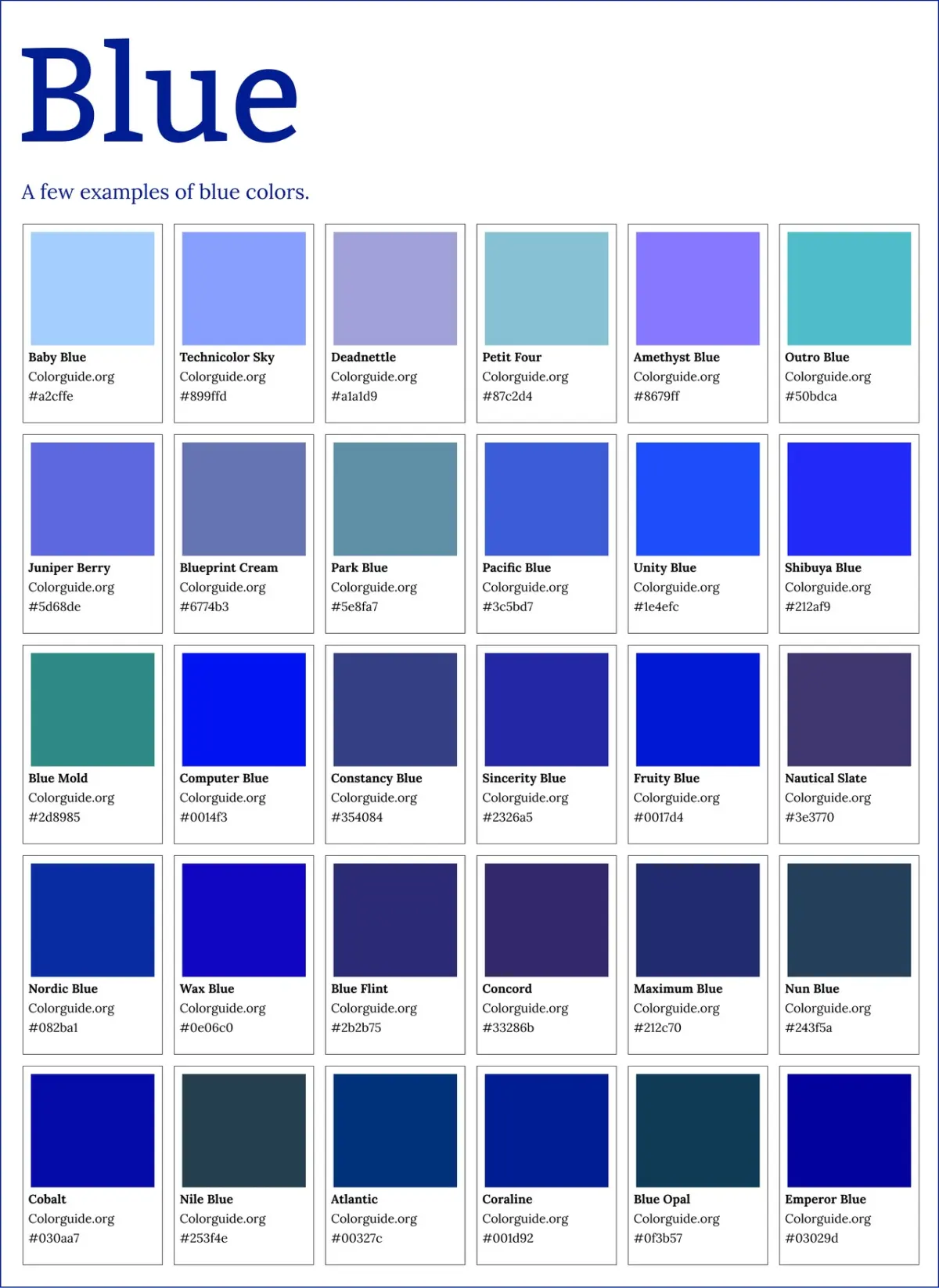
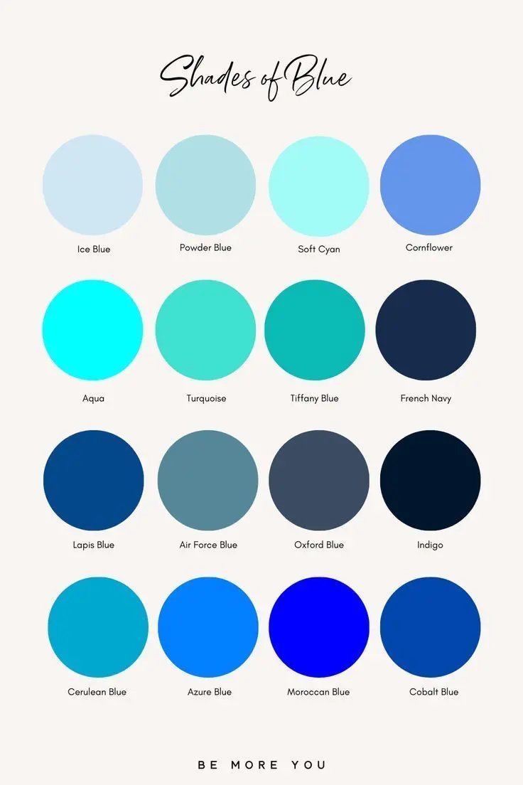
Selecting a color palette begins with identifying the undertone of your blue. Cool blues, such as cerulean or sky blue, contain green or violet undertones, while warm blues like denim or navy often lean toward gray or black. To achieve a balanced aesthetic, pair cool-toned blues with crisp, clean whites or silver accents to enhance their refreshing quality. Conversely, warmer, muted blues benefit from earthy companions like terracotta, cream, or brass, which ground the color and add depth to the overall composition.
When working with color, consider the intensity of the blue. High-saturation blues, such as royal or cobalt, act as focal points and require neutral anchors to prevent visual fatigue. In contrast, desaturated or dusty blues function almost like neutrals themselves, allowing for more flexibility when introducing secondary colors. By assessing the temperature and intensity of your base blue, you can ensure that your secondary choices harmonize rather than clash, creating a cohesive visual environment that feels intentional and well-designed.
Best color combinations for interior design
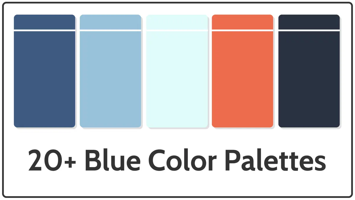
In home decor, blue serves as a foundational color that can adapt to various styles, from coastal to industrial. Pairing navy blue with crisp white is a classic nautical approach that feels clean and expansive. For a more sophisticated, moody atmosphere, consider layering different shades of blue with charcoal gray or black. If you prefer a warmer, more inviting space, integrate soft yellows or buttery creams to offset the inherent coolness of blue.
- Navy and crisp white: A timeless, high-contrast combination perfect for kitchens or bathrooms.
- Sky blue and soft peach: A gentle, airy pairing that works well in bedrooms and nurseries.
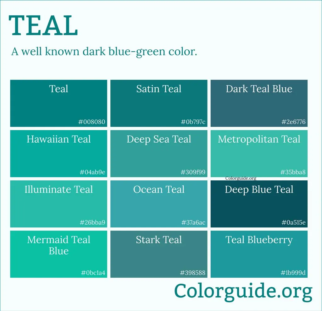
- Teal and burnt orange: A vibrant, complementary scheme that adds energy to living rooms.
- Denim blue and warm beige: A casual, grounded look that emphasizes comfort and texture.
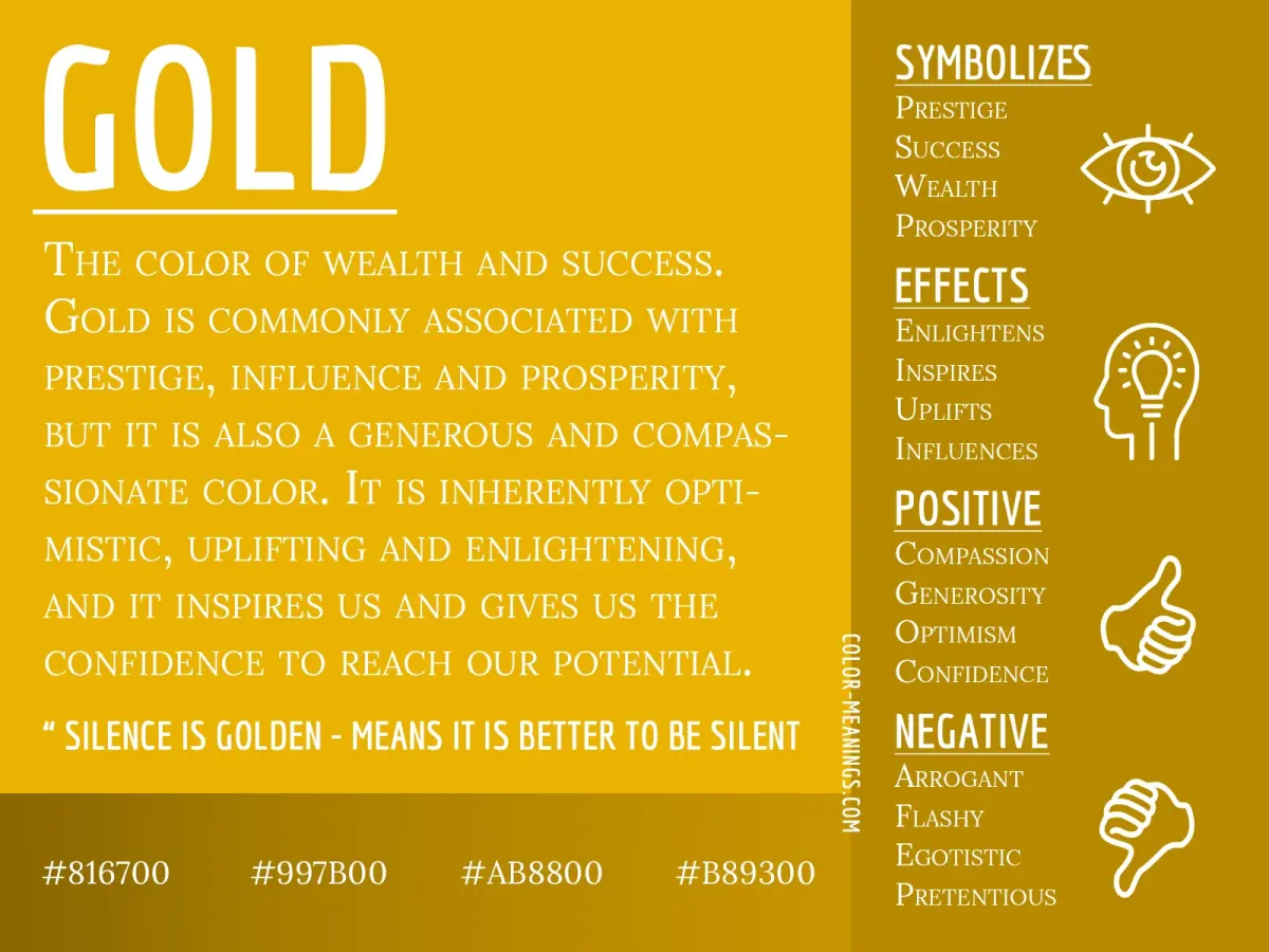
- Midnight blue and metallic gold: A luxurious, elegant choice for formal dining areas or accent walls.
Why blue works with metallic accents
Metallics are essentially neutral elements that reflect light, making them ideal partners for blue. Silver, chrome, and nickel have cool undertones that naturally align with blue, creating a sleek, modern, and professional aesthetic. These metals enhance the crispness of lighter blues and add a reflective quality to darker, matte shades. Using silver hardware in a navy room effectively brightens the space and provides a polished finish that feels both contemporary and sharp.
Gold, brass, and copper offer a different effect by providing a warm contrast to blue’s coolness. This pairing is particularly effective with deep shades like navy or indigo, as the warmth of the metal prevents the blue from feeling too cold or sterile. The juxtaposition of a deep, matte blue wall against brushed brass light fixtures or cabinet hardware creates a sense of luxury and balance. When mixing these elements, aim to repeat the metal finish in at least three places within a room to ensure the design feels purposeful.
Common mistakes when pairing colors with blue
A frequent error is overloading a space with too many competing shades of blue, which can lead to a flat or monotonous appearance. While monochromatic schemes are popular, they require careful attention to texture to avoid looking dull. Incorporating various materials—such as velvet, linen, wood, and stone—is essential to add depth and visual interest to a monochromatic blue palette. Without these textural variations, the eye has nowhere to rest, and the room may feel smaller or less dynamic than intended.
Another common mistake is ignoring the lighting conditions of the room. A blue that looks vibrant in a store or on a screen can appear muddy or dark in a room with limited natural light. Before committing to a color scheme, always test your chosen blue against your secondary colors in the actual space at different times of the day. Observe how the colors shift under artificial lighting versus natural sunlight to ensure the combination remains pleasing in all conditions.
How to balance blue in a professional wardrobe
In fashion, blue is often considered the most professional and versatile color choice. To create a polished look, pair navy trousers or skirts with white, cream, or light gray tops. For a more adventurous approach, incorporate subtle patterns or textures, such as a pinstriped shirt or a silk scarf, to break up the solid blocks of color. When adding a third color, stick to neutrals like camel, tan, or black to maintain a sophisticated and cohesive appearance throughout your work day.
- Start with a navy base for a reliable, professional foundation.
- Add a crisp white shirt to create a sharp, high-contrast look suitable for formal meetings.
- Introduce a camel-colored blazer or accessory to add warmth and a touch of luxury.
- Incorporate subtle textures, such as a tweed jacket or a knit sweater, to add depth to the outfit.
- Use silver or gold jewelry to complement the blue depending on whether you want a cooler or warmer finish.
Key facts
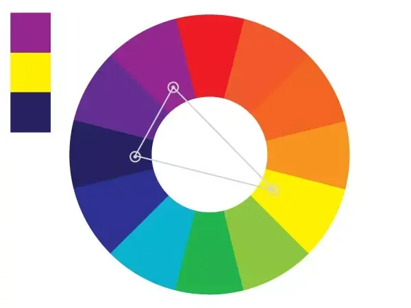
- Complementary colors, such as orange, sit directly opposite blue on the color wheel and provide the highest visual contrast.
- Analogous colors, like green and violet, sit adjacent to blue and create a harmonious, calming aesthetic.
- Neutral colors including white, gray, and beige act as a stabilizing foundation that prevents blue from overwhelming a space or outfit.
- Metallic accents like gold and brass add warmth to cool blue tones, preventing them from feeling clinical or sterile.
- The "60-30-10" rule suggests using blue as the primary 60 percent, a secondary color for 30 percent, and an accent for 10 percent.
- Avoid pairing dark navy with black, as the low contrast can make the combination appear muddy or unintentional.
The bottom line
Blue is a versatile primary color that functions as both a bold statement and a reliable neutral. Whether you choose high-contrast complementary colors like orange or serene analogous shades like green, the key is balancing intensity and temperature. By incorporating neutrals and varying textures, you can create a professional, cohesive look that avoids common pitfalls like muddy color combinations or overwhelming, one-dimensional palettes.
People also ask
Does blue go well with yellow?
Yes, blue and yellow create a vibrant, high-energy contrast. This combination is often used in interior design to evoke a cheerful, coastal, or classic aesthetic.
Can I wear blue and red together?
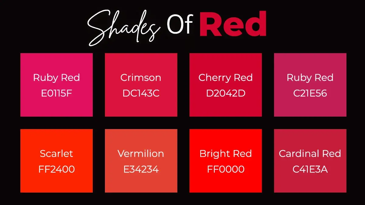
Blue and red are primary colors that create a bold, patriotic, or nautical look. To prevent the pairing from feeling too intense, incorporate white as a neutral buffer.
What shade of blue is easiest to match?
Navy blue is widely considered the most versatile neutral. It pairs seamlessly with almost any color, including pastels, brights, and metallics.
Should I mix different shades of blue?
Monochromatic schemes, which use varying shades of blue, create a sophisticated and cohesive look. Ensure you vary the textures to keep the design from appearing flat.
Does blue work with earth tones?
Blue pairs beautifully with browns, tans, and terracottas. This combination mimics natural landscapes, providing a grounded and organic feel to any environment.
What color makes blue look more expensive?
Combining blue with crisp white or metallic gold creates a luxurious, high-end appearance. These pairings rely on clean lines and reflective surfaces to elevate the overall design.
This answer was created with the help of AI research tools and reference sources. Spotted an error? Let us know — we correct mistakes quickly. See our editorial policy.