What colors go with red?
Short answer
Red is a bold primary color that pairs effectively with neutrals like white, black, gray, and beige for a balanced look. For higher contrast, pair red with complementary colors like green or analogous shades like orange and pink. Successful combinations depend on the specific undertone and the desired intensity of the space.
On this page
Which neutral colors look best with red?
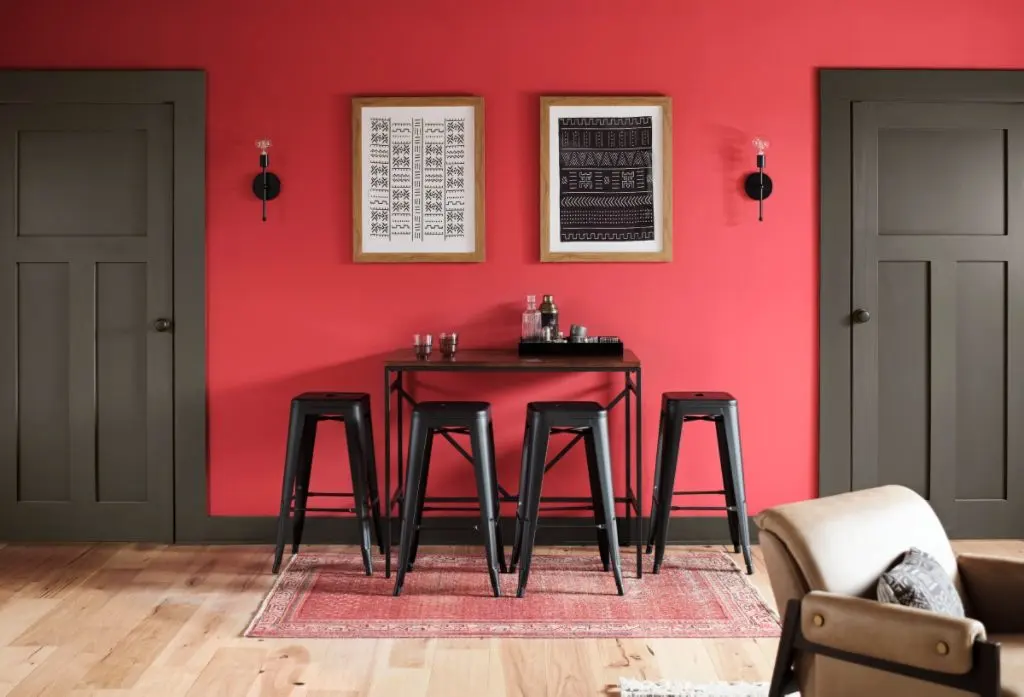
Neutrals are the most reliable partners for red because they prevent the color from overwhelming a room or an outfit. White provides the crispest contrast, creating a clean, nautical, or modern aesthetic that allows the vibrancy of red to stand out without competition. Black offers a more dramatic, sophisticated edge, often associated with luxury or industrial design, though it requires careful lighting to avoid feeling too heavy or dark.
Gray and beige serve as excellent bridge colors when you want to soften red’s intensity. A cool-toned gray can modernize a room, while a warm beige or cream creates a cozy, traditional atmosphere. When working with these neutrals, consider the undertone of your red. Bright, fire-engine reds generally pair better with stark whites and charcoals, while deeper, brick-toned reds harmonize beautifully with warm creams and taupes.
- Use white for a high-energy, clean look.
- Use black for a bold, high-contrast, and modern statement.
- Use gray to create a professional and balanced environment.
- Use beige to ground deep or rustic red shades.
How to use red with complementary colors?
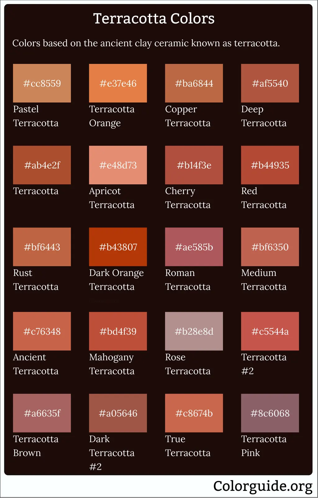
Complementary colors sit directly opposite each other on the color wheel, creating the most intense visual contrast possible. For red, the direct complement is green. While this combination is often associated with the winter holidays, it can be styled year-round by adjusting the shades. Instead of pairing bright red with bright green, opt for sophisticated variations like forest green with burgundy or olive with terracotta.
To successfully implement this pairing without making a space feel like a themed party, focus on proportion. Use one color as the dominant base and the other as a subtle accent. For example, a living room with olive walls can be energized with a single deep red armchair or a collection of throw pillows. This approach keeps the contrast intentional and artistic rather than jarring or overly festive.
- Choose a dominant shade to occupy 70 percent of the space.
- Select a secondary, muted version of the opposite color for accents.
- Incorporate a neutral bridge color like cream to break up the intensity.
- Test the combination in different lighting conditions to ensure the colors do not clash.
Why red and metallic tones work well?
Metallics act as a special category of neutrals that add depth and texture to red. Gold and brass are particularly effective because they share warm, yellow-based undertones with many shades of red, creating a sense of opulence and warmth. This combination is a staple in classic interior design and formal fashion, as it evokes a sense of history, luxury, and celebration.
Silver and chrome, by contrast, offer a cooler, more contemporary feel. These metals work best with blue-based reds, such as cherry or raspberry, to create a sleek and polished appearance. When mixing metals with red, consider the finish of the material. A brushed or matte finish feels more grounded and approachable, while high-gloss or polished finishes amplify the boldness of the red, making the overall look feel more formal and intentional.
Common mistakes when pairing colors with red
One of the most frequent errors is pairing red with too many other vibrant, competing colors. Red is a high-energy hue that naturally draws the eye; if you surround it with bright yellow, purple, or neon blue, the result is often chaotic and visually exhausting. Stick to a "one star" rule where red is the primary focal point, and all other colors serve to support or balance it.
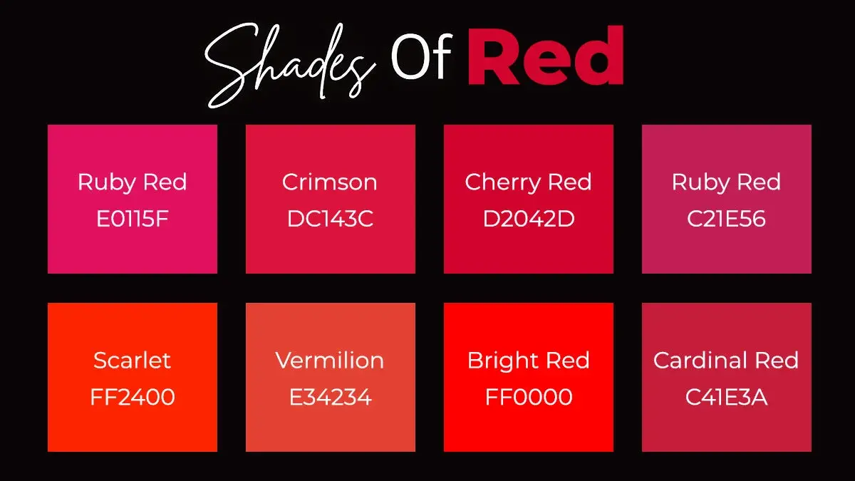
Another mistake is ignoring the undertones of the red. Not all reds are created equal; some lean toward orange, while others lean toward blue. Mixing a warm, orange-based red with a cool, blue-based pink or purple often results in a visual "vibration" that feels off-putting. Always check your swatches or fabrics side-by-side in natural daylight before committing to a permanent design choice or a complete outfit.
- Avoid mixing too many saturated colors in a single space.
- Never ignore the undertones of your primary red shade.
- Do not forget to account for the texture of the materials.
- Avoid using red in high-stress areas if you are sensitive to stimulating colors.
Best ways to balance red for beginners
If you are new to working with bold colors, start by using red in small, removable doses. Accessories such as throw pillows, artwork, or a single statement vase allow you to introduce the color without the commitment of painting a wall or buying large furniture. This method lets you observe how the red interacts with your existing color palette throughout the day as natural light changes.
Once you feel comfortable, you can move toward larger pieces, such as a rug or a piece of accent furniture. The key to success is maintaining a consistent ratio of color to neutral space. By keeping the surrounding walls and flooring in soft, muted tones, you ensure that the red remains a highlight rather than a distraction. This gradual approach builds confidence and helps you identify which specific shades of red you enjoy living with most.
Key facts
- Neutral colors like white, black, and gray provide the safest balance for red, preventing it from overwhelming a space or outfit.
- Navy blue is a classic pairing that creates a sophisticated, nautical aesthetic by cooling down red’s intense warmth.
- Gold and metallic accents enhance red’s natural vibrancy, making it appear more luxurious and formal.
- Olive green is a complementary choice that works well in interior design because it softens red’s aggressive energy.
- When using red in fashion, treat it as a focal point and limit other bold colors to avoid a chaotic visual effect.
- The "60-30-10" rule suggests using red as a 10% accent color to add personality without dominating the overall palette.
The bottom line
Red is a powerful, high-energy color that requires careful balancing to avoid overwhelming your space or wardrobe. By pairing it with neutrals like navy, black, or cream, you can harness its intensity for a sophisticated look. Use red as an accent rather than a base to maintain visual harmony, and always consider the undertones of your chosen secondary colors to ensure a cohesive, professional result.
People also ask
Does red go with pink?
Yes, pairing red with pink is a modern, high-fashion trend that creates a bold, monochromatic-adjacent look. To make it work, choose shades with similar undertones, such as pairing a warm tomato red with a coral-leaning pink.
Can I wear red with brown?
Red and brown create a warm, earthy palette that feels particularly appropriate for autumn. For the best result, pair deep, dark reds like burgundy or maroon with rich chocolate browns to maintain a cohesive, grounded appearance.
What color makes red look less bright?
If you want to tone down red, pair it with muted neutrals like charcoal gray, beige, or cream. These colors absorb some of the visual intensity, allowing the red to act as a sophisticated highlight rather than a jarring distraction.
Should I pair red with orange?
Red and orange are analogous colors, meaning they sit next to each other on the color wheel and create a vibrant, energetic scheme. This combination is common in nature and branding, but it can be visually exhausting if not balanced with a neutral white or tan.
Is red a good color for bedroom decor?
Red is a high-energy color that stimulates the pulse, which can make it challenging for sleep environments. If you use it in a bedroom, opt for deeper, muted tones like terracotta or brick rather than bright fire-engine red.
How do I mix patterns with red?
When mixing patterns with red, ensure the red is the dominant color in at least one of the prints to create a sense of unity. Avoid pairing two different high-contrast patterns, as this often leads to visual clutter.
This answer was created with the help of AI research tools and reference sources. Spotted an error? Let us know — we correct mistakes quickly. See our editorial policy.