What colors make gray?
Short answer
Gray is created by mixing complementary colors, such as blue and orange, red and green, or yellow and purple. Alternatively, mixing black and white paint produces a neutral gray. The specific shade depends on the ratio of the pigments used, with equal parts generally yielding a balanced, neutral, and achromatic gray tone.
On this page
How to mix gray using primary colors
To create gray from primary pigments, you must combine all three: red, yellow, and blue. When these colors are mixed in equal proportions, they theoretically absorb all light, resulting in a dark, neutral tone. Because most commercial paints contain subtle undertones, the resulting mixture is rarely a perfect, cool gray on the first attempt. You will often find that the mixture leans toward a brownish or greenish hue depending on the specific chemical composition of the pigments.
To achieve a cleaner gray, consider these steps:
- Start with a small amount of blue and red to create a deep violet base.
- Slowly add a tiny amount of yellow to the mixture.
- Adjust the proportions until the color loses its vibrancy and shifts toward a neutral gray.
- If the mixture appears too warm, add a touch more blue to cool it down.
Why gray sometimes looks muddy or green
The phenomenon of "muddy" color occurs when pigments are mixed in ways that create unwanted secondary or tertiary undertones. If you use a warm red—which often contains hints of yellow—and mix it with a standard blue and yellow, the excess yellow will dominate the mixture. This results in an olive or khaki green rather than a true gray. Understanding the color bias of your specific paints is essential for maintaining control over the final outcome.
Pigments are rarely pure, and their chemical makeup influences how they interact on the palette. For instance, a cadmium yellow is opaque and warm, while a lemon yellow is cool and transparent. When you mix these with various blues, the light-reflecting properties change significantly. To avoid unwanted muddy tones, artists often stick to a limited palette of high-quality, single-pigment paints, which allows for more predictable results when neutralizing colors through mixing.
Best ways to lighten or darken gray
Once you have established a base gray, you may need to adjust its value to suit your project. Adding white paint is the most common method for creating lighter shades, often referred to as tints. Conversely, adding black paint creates darker shades, known as tones. However, using pure black can sometimes make a gray appear "flat" or lifeless because black pigments often have their own strong blue or brown undertones that alter the gray's character.
For more sophisticated results, try these professional techniques:
- Use a "complementary darkening" method by adding a small amount of a dark complementary color instead of black.
- Incorporate a tiny amount of ultramarine blue into a warm gray to deepen it without losing its vibrancy.
- Experiment with transparent glazes over a white base to create a luminous, airy gray effect.
- Avoid over-mixing, as working the paint too much can cause the individual pigments to lose their clarity and turn into a dull, uniform sludge.
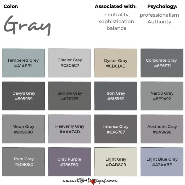
Common mistakes when mixing gray
One of the most frequent errors is adding too much paint at once, which often leads to wasting expensive materials. Beginners often try to fix a color that has gone too far in one direction by adding more of another color, creating a cycle of constant adjustment. This usually results in a massive pile of paint that becomes increasingly difficult to control. Always start with the lightest color and introduce the darker pigments in tiny, incremental amounts to maintain control.
Another common mistake is failing to test the color on a scrap surface before applying it to a final project. Paint often looks different when wet compared to when it dries, and the surface texture of your canvas or paper can also change how light reflects off the pigment. Always keep a test sheet nearby to track how your mixture looks once it has settled. This practice helps you learn the specific behavior of your paints and prevents the frustration of ruining a finished piece with an incorrect shade.
How to create cool versus warm grays
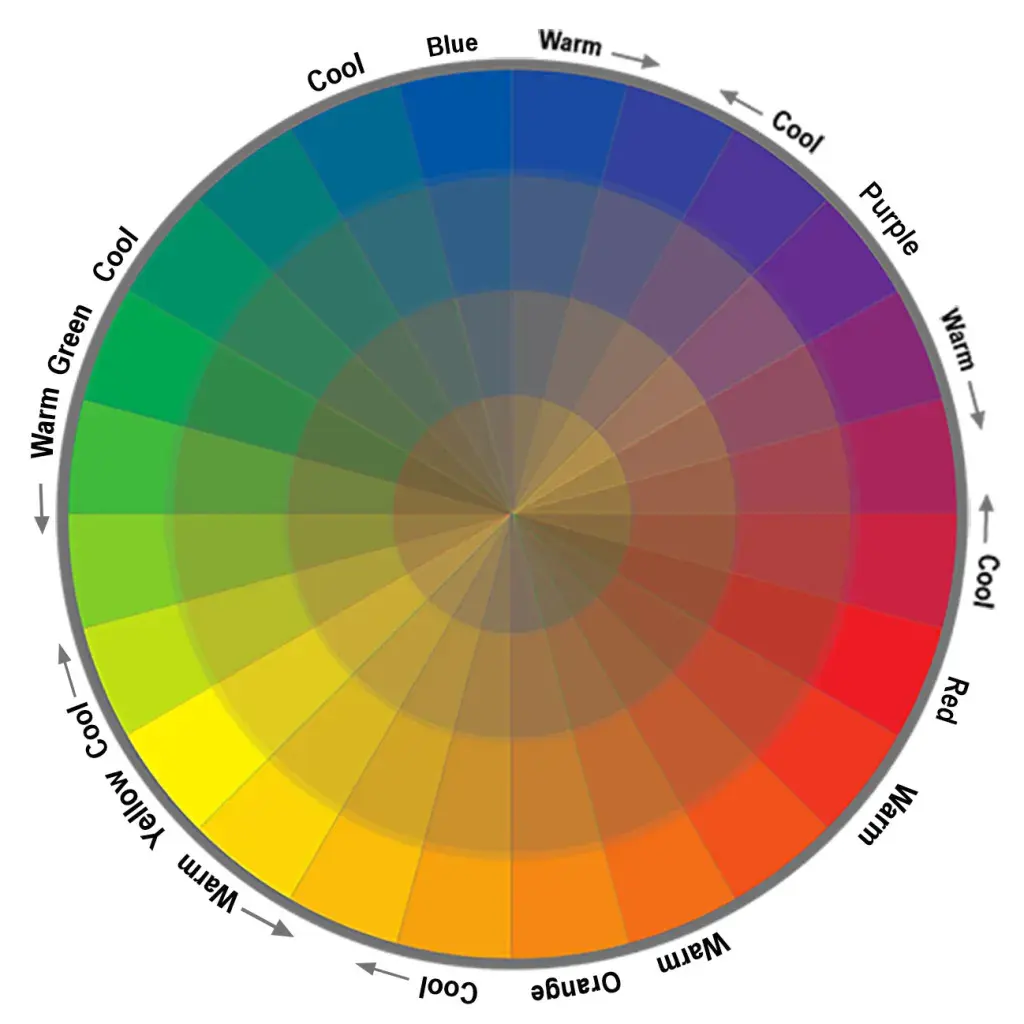
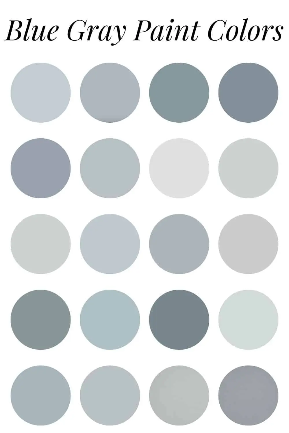
Grays are categorized by their temperature, which is determined by the dominant undertone present in the mixture. A cool gray has a blue or violet bias, making it appear crisp and professional, often used in architectural design or shadow work. A warm gray, sometimes called "taupe" or "greige," contains hints of red, yellow, or brown, providing a softer and more inviting aesthetic. Achieving the perfect temperature requires a deliberate approach to color selection during the initial mixing phase.
To master temperature control, follow these guidelines:
- For a cool gray, emphasize the blue-violet spectrum by adding a touch of phthalo blue or dioxazine purple.
- For a warm gray, introduce small amounts of burnt sienna or yellow ochre to your neutral base.
- Use cool grays for background elements to push them back visually, as they tend to recede.
- Use warm grays for foreground elements or highlights, as they tend to advance and feel more grounded in the composition.
Key facts
- Gray is a neutral color created by mixing complementary colors, such as blue and orange, red and green, or yellow and purple.
- Mixing all three primary colors—red, yellow, and blue—in equal proportions will produce a neutral gray.
- Adding white to black paint creates a "tint" of gray, which is the most common way to achieve the color in commercial applications.
- Complementary colors neutralize each other because they sit directly opposite one another on the traditional color wheel.
- If your gray mixture looks too brown, it means there is an excess of yellow or red in the blend.
- To adjust the temperature of your gray, add a tiny amount of blue for a cool tone or a touch of red for a warmer tone.
The bottom line
Creating gray is a fundamental skill in color theory that relies on balancing primary or complementary pigments. By combining equal parts of red, yellow, and blue, or pairing opposites on the color wheel, you can achieve a neutral base. Mastering the temperature of your gray requires careful adjustments with small amounts of pigment, allowing you to shift the final result from cool tones to warm, earthy variations.
People also ask
Why does my gray mixture turn out green?
This usually happens when you mix blue and yellow with too much blue, or when using a yellow that has a green undertone. To fix this, add a very small amount of red to neutralize the green tint.
Is gray considered a color or a shade?
In technical color theory, gray is a neutral, meaning it has no hue. It is often described as a shade because it is created by reducing the intensity or brightness of white light.
How do I make a "cool" gray versus a "warm" gray?
A cool gray is achieved by adding more blue or violet to your mix. A warm gray, often called "greige," is created by adding more yellow, orange, or raw umber to the base.
Can I make gray using only two colors?
Yes, mixing any two complementary colors—such as blue and orange—will result in a neutral gray. The specific shade depends on the pigment intensity of the two colors you choose.
Does the brand of paint affect the resulting gray?
Yes, different brands use different chemical pigments that vary in opacity and undertone. A "blue" from one manufacturer may contain more green than a "blue" from another, changing your final gray.
Why does my gray look different under various lights?
This phenomenon is known as metamerism, where colors appear to change based on the light source. A gray that looks neutral in sunlight may appear significantly more blue or yellow under incandescent bulbs.
This answer was created with the help of AI research tools and reference sources. Spotted an error? Let us know — we correct mistakes quickly. See our editorial policy.