What colors go with orange?
Short answer
Orange pairs effectively with neutral tones like cream, gray, and navy for balance, or complementary colors like blue for high-contrast energy. Earth tones such as olive green and brown ground the vibrancy of orange. When selecting palettes, consider the intensity of the shade, as bright citrus requires different companions than muted terracotta.
On this page
What colors complement orange in design?
In color theory, orange is a secondary color created by mixing red and yellow. Its direct complement on the traditional color wheel is blue. Pairing orange with blue creates a high-contrast, dynamic aesthetic that feels energetic and bold. Because these colors sit opposite each other, they naturally balance the warmth of orange with the cool, calming qualities of blue, making the combination a staple in graphic design and interior styling.
Beyond the standard color wheel, many designers look to the "split-complementary" scheme to create visual interest without the intensity of a direct opposite. This involves pairing orange with the two colors adjacent to its complement, which are blue-green and blue-violet. This approach softens the overall look while maintaining a sophisticated, professional appearance. When working with these pairings, consider these effective combinations:
- Navy blue and burnt orange for a classic, grounded look.
- Teal and bright tangerine for a modern, tropical vibe.
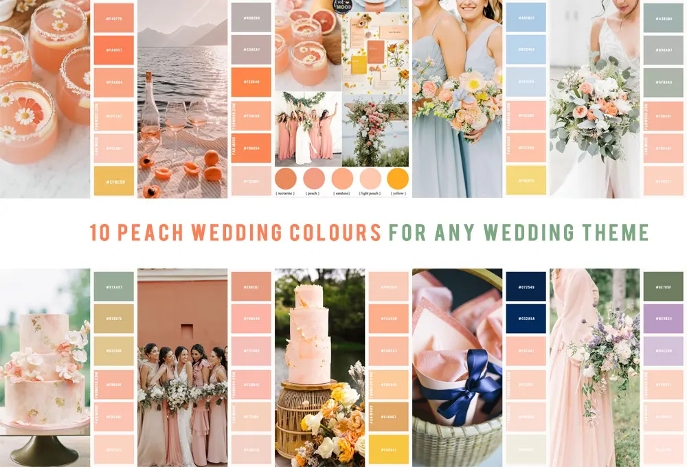
- Sky blue and peach for a soft, airy, and feminine palette.
How to use neutrals with orange
Neutrals act as the essential anchor for orange, preventing the color from overwhelming a space or design. Because orange is high-energy, it often requires a quiet backdrop to feel intentional rather than chaotic. White, cream, and ivory provide a clean, crisp contrast that allows the orange to pop as a focal point. These lighter neutrals are particularly effective in smaller rooms or minimalist designs where you want to maintain a sense of openness.
Darker neutrals, specifically charcoal gray and black, create a more dramatic and sophisticated mood. When orange is placed against black, it gains a sense of luxury and edge, often seen in high-end branding or industrial interior design. To successfully integrate neutrals, follow these steps:
- Identify the undertone of your orange; warm, reddish-oranges pair best with cream, while cooler, yellow-based oranges pair well with stark white.
- Use a 60-30-10 rule: 60% neutral, 30% secondary color, and 10% accent orange.
- Incorporate textures like wood, stone, or metal to add depth to the neutral base.
Best earth tones for a natural look
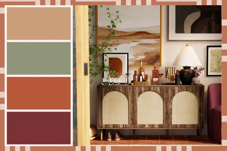
Orange naturally exists in the environment, making it a perfect candidate for earth-toned palettes. Pairing orange with shades of brown, olive green, or terracotta creates a cozy, organic aesthetic that feels warm and inviting. This combination is frequently used in seasonal decor, particularly during autumn, but it works year-round in spaces that prioritize comfort and natural textures. The key is to select muted versions of orange, such as rust or copper, to maintain the earthy theme.
Olive green is perhaps the most effective partner for orange because it shares a similar warmth while offering enough contrast to remain distinct. When you combine these colors with natural materials like jute rugs, leather furniture, or unpainted wood, you create a cohesive, grounded look. Avoid using overly neon shades of orange in this context, as they can clash with the muted, natural tones of the earth-inspired palette. Instead, lean into matte finishes and textured fabrics to enhance the organic feel of the room.
Why color temperature matters with orange
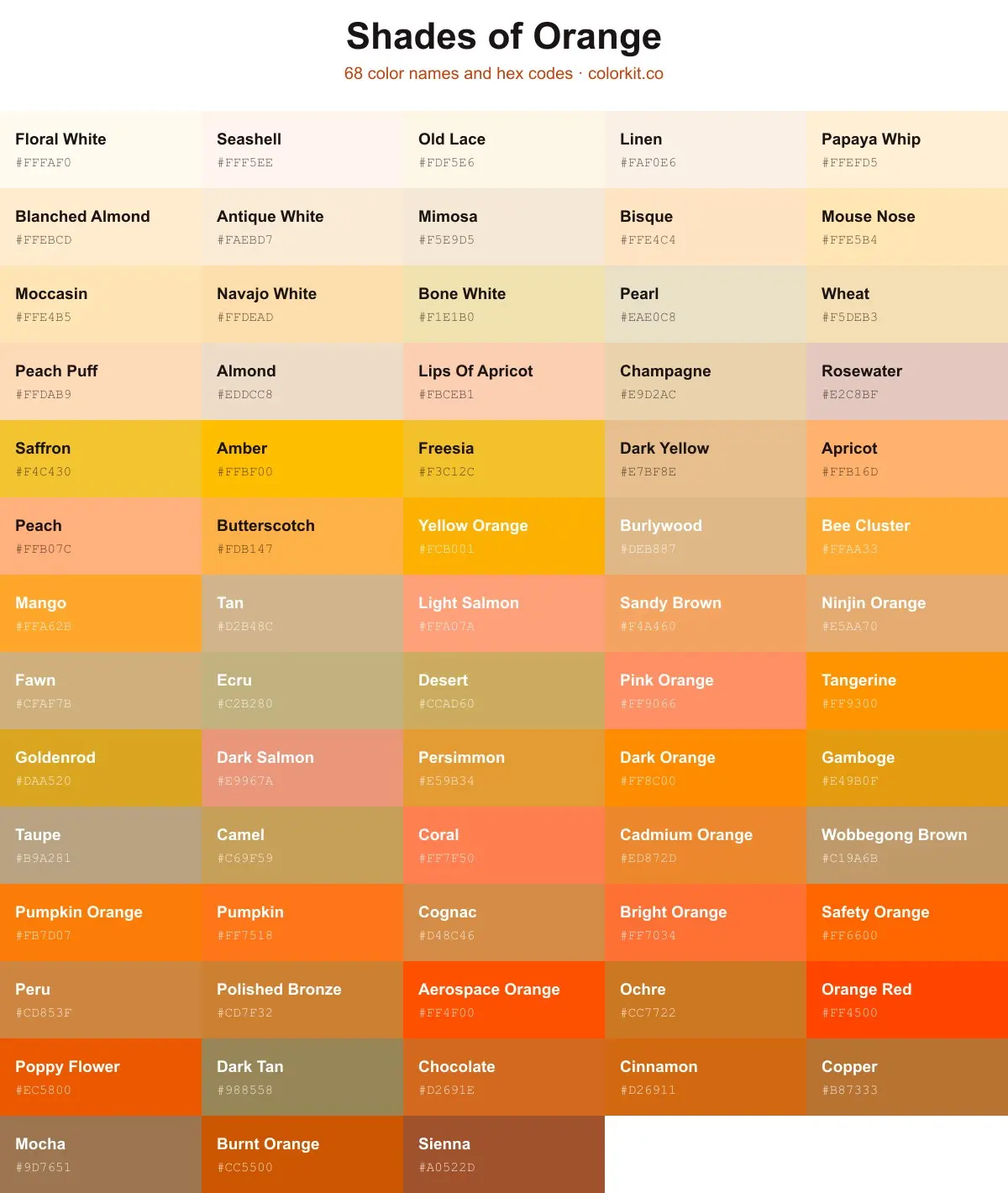
Understanding color temperature is critical when working with orange, as it can lean toward either red or yellow. A red-orange, such as poppy or vermillion, carries a different energy than a yellow-orange, like marigold or amber. If you pair a warm, yellow-based orange with a cool, blue-based gray, the result can feel disjointed or jarring. To achieve a professional look, you must ensure that the undertones of your chosen colors harmonize with the temperature of your orange.
If you are unsure about the temperature, test your swatches in the specific lighting conditions where they will be used. Natural light from the north often makes colors appear cooler, while southern light enhances warmth. If your room is already quite warm due to sunlight, you may want to pair your orange with cooler neutrals or blues to balance the intensity. Conversely, in a dimly lit room, pairing orange with warm creams and browns can help create an inviting, cozy atmosphere that feels intentional and well-curated.
Common mistakes when pairing orange
One of the most frequent mistakes is using too many high-intensity colors at once. Because orange is inherently vibrant, pairing it with other saturated colors like bright purple or neon green often leads to visual fatigue. This creates a "clashing" effect that makes a design feel disorganized. Instead, if you want to use multiple bold colors, ensure that you provide enough negative space or neutral transition areas to allow the eye to rest between the different hues.
Another common error is ignoring the scale of the orange element. A small accent, such as a throw pillow or a piece of artwork, can handle a very bright, saturated orange. However, if you are painting an entire wall or selecting a large sofa, you should opt for a more muted or desaturated tone, such as burnt orange or terracotta. By choosing a softer shade for large surfaces, you ensure that the orange remains a pleasant feature rather than an aggressive, overwhelming presence in the space.
Key facts
- Complementary colors like blue sit directly opposite orange on the color wheel, creating the highest visual contrast.
- Analogous colors such as yellow and red create a warm, harmonious palette that mimics a sunset.
- Neutrals like cream, beige, and soft gray ground bright orange, preventing it from overwhelming a space.
- Navy blue is a classic pairing that balances orange’s energy with professional, sophisticated stability.
- Using the 60-30-10 rule helps maintain balance: 60% neutral, 30% secondary color, and 10% orange as an accent.
- Avoid pairing orange with too many other vibrant neons, as this often creates a chaotic or jarring aesthetic.
The bottom line
Orange is a versatile, high-energy color that thrives when balanced with the right counterparts. By using the 60-30-10 rule, you can successfully integrate this bold hue into any environment. Whether you choose the high contrast of navy blue or the cozy, analogous warmth of earthy reds and yellows, the key is moderation. Use orange as a deliberate accent to add personality without overwhelming your space.
People also ask
Does orange go well with black?
Yes, orange and black are a high-contrast combination often associated with autumn and Halloween. To keep it from looking like a holiday decoration, use black as the primary base and orange only for small, intentional accents.
Can orange work in a professional office setting?
Orange can work in offices when used in muted or burnt tones like terracotta or rust. These earthy shades provide warmth without the distracting intensity of bright, neon-style orange.
What is the best way to incorporate orange into a neutral room?
Start with textiles such as throw pillows, blankets, or decorative vases to introduce orange. This allows you to test the color's impact without committing to large, expensive furniture pieces.
Should I pair orange with cool or warm colors?
Both work depending on your goal, but they achieve different results. Cool colors like teal or blue create a vibrant, energetic contrast, while warm colors like gold or brown create a cozy, inviting atmosphere.
What common mistake should I avoid when decorating with orange?
The most common mistake is using too much saturated orange in a small or poorly lit room. This can make the space feel cramped and visually exhausting rather than warm and inviting.
Does orange match with green?
Orange and green can look beautiful together, especially when using nature-inspired shades like olive or sage. Avoid pairing bright lime green with neon orange, as this combination is often too intense for the human eye.
This answer was created with the help of AI research tools and reference sources. Spotted an error? Let us know — we correct mistakes quickly. See our editorial policy.