What is the complementary color of brown?
Short answer
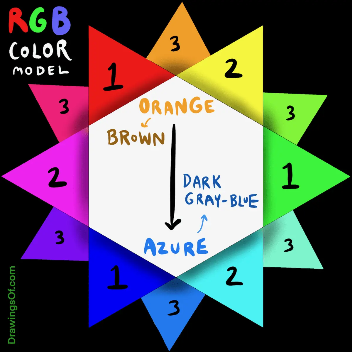
The complementary color of brown is blue. Because brown is a dark, desaturated shade of orange, its complement is found directly across the color wheel from orange. While pure orange pairs with pure blue, brown requires a range of blue tones—from deep navy to bright sky blue—to achieve visual balance.
On this page
Why is blue the complementary color of brown?
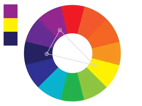
Color theory defines complementary colors as those located directly opposite one another on a standard color wheel. Brown is technically a dark, low-saturation version of orange. Since orange sits directly across from blue on the traditional RYB (red, yellow, blue) color model, blue serves as the natural complement to brown. When these two colors are placed side by side, they create a high-contrast relationship that makes both hues appear more vibrant and distinct.
Understanding this relationship requires looking at how light and pigment interact. Brown is a tertiary color created by mixing all three primary colors, but it remains anchored in the orange-red spectrum. When you introduce blue, you satisfy the eye's need for the missing primary color, creating a sense of visual equilibrium. This pairing is foundational in art and design because it mimics natural environments, such as the earth against the sky or wood against water.
How to use brown and blue in interior design
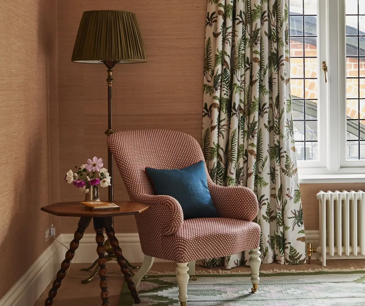
Using brown and blue together creates a sophisticated, grounded aesthetic that works in almost any room. The key to success is adjusting the intensity and shade of each color to ensure they complement rather than clash. For instance, a dark espresso brown provides a strong, masculine anchor, while a soft, dusty blue adds a sense of calm and airiness.
To effectively style these colors in your home, consider these steps:
- Identify your dominant shade: Choose a primary brown for large furniture pieces like sofas or wooden cabinetry.
- Select a secondary blue: Introduce blue through textiles like curtains, throw pillows, or area rugs to break up the heaviness of the brown.
- Add a neutral bridge: Incorporate white or cream elements to prevent the room from feeling too dark or enclosed.
- Experiment with texture: Use leather, velvet, and linen to add depth, as the interaction between different materials changes how the colors reflect light.
Common mistakes when pairing brown and blue
One of the most frequent errors when working with brown and blue is failing to account for color temperature. Brown can lean toward warm, reddish undertones or cool, greenish undertones. If you pair a warm, chocolate brown with a very cool, icy blue, the contrast can feel jarring rather than harmonious. Always test swatches in the specific lighting of your space before committing to large-scale changes.
Another common mistake is neglecting the balance of saturation. If you use a bright, electric blue with a muted, muddy brown, the blue will overwhelm the space and make the brown look dirty. Conversely, using two very dark, desaturated tones—such as navy and dark chocolate—can make a room feel oppressive or "heavy." Aim for a mix of light and dark values to ensure the eye has a clear path through the color scheme.
Best blue shades for different brown tones
Selecting the right blue depends entirely on the specific brown you are working with. Not all browns are created equal, and the undertones in wood stains or fabrics dictate which blue will look most professional. A simple guide to matching these tones can help you achieve a polished look:
- For warm, reddish-browns (like mahogany or cherry): Choose cool, slate blues or teal-leaning blues to neutralize the warmth.
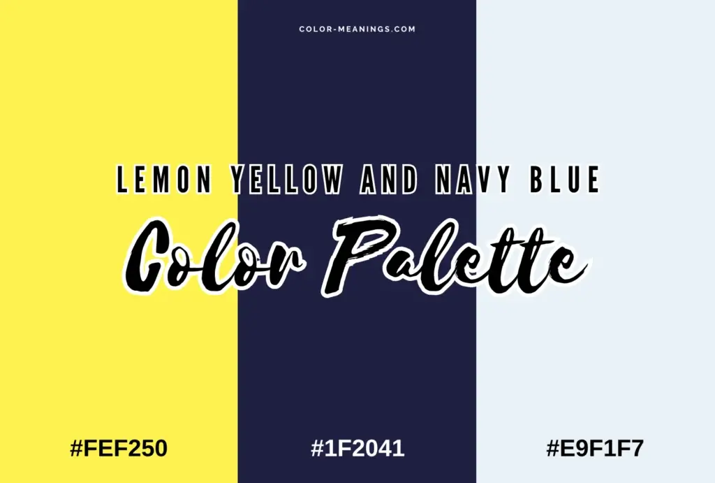
- For neutral, medium-browns (like walnut or taupe): Opt for classic navy or mid-tone cerulean to provide a crisp, clean contrast.
- For light, yellowish-browns (like oak or beige): Select soft, sky blues or periwinkle to enhance the natural, airy feel of the wood.
- For dark, espresso browns: Use bright, vibrant blues like cobalt or turquoise to prevent the dark colors from blending into a single, muddy mass.
How to mix brown and blue in art and fashion
Artists and designers often use the brown-blue relationship to create focal points or emotional resonance. In painting, placing a small amount of blue against a brown background creates a "pop" that draws the viewer's eye immediately. In fashion, this combination is a staple for creating a look that is both professional and approachable. A navy blazer paired with brown leather shoes is a classic example of this complementary balance in action.
When incorporating these colors into your own style or creative projects, follow these rules:
- Start with a neutral base to avoid over-saturation.
- Use the 60-30-10 rule: 60% of the space is the main color, 30% is the secondary color, and 10% is an accent.
- Pay attention to the finish: Matte textures absorb light and make brown look softer, while glossy finishes make blue look more intense.
- Avoid adding too many other colors; stick to a monochromatic or neutral palette alongside the brown and blue to keep the focus on their natural, complementary tension.
Key facts
- Brown is technically a dark shade of orange, meaning its complementary color on the color wheel is blue.
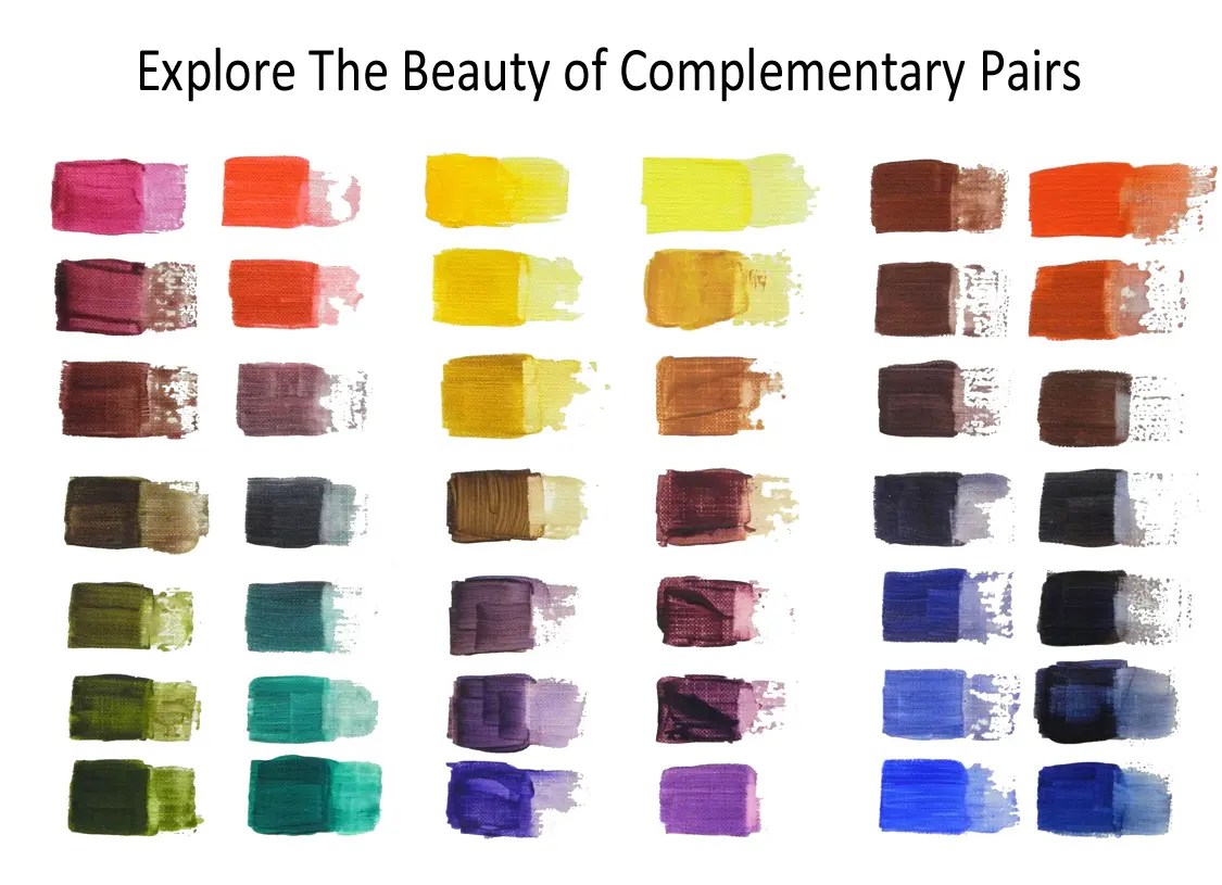
- Artists create brown by mixing complementary colors together, such as red and green, or yellow and purple.
- Adding blue to a brown pigment will neutralize it, turning the color toward a cool gray or charcoal.
- Complementary colors appear most vibrant when placed side-by-side, creating a high-contrast visual effect.
- In interior design, pairing brown furniture with blue accents creates a balanced, earthy, and sophisticated aesthetic.
- You can adjust the "temperature" of brown by adding varying shades of blue to shift it from warm to cool.
The bottom line
Brown is essentially a dark, desaturated orange, which makes blue its direct complementary color on the color wheel. Understanding this relationship is essential for artists and designers looking to neutralize tones or create striking, balanced palettes. By adding blue to brown, you can cool its temperature, while placing these two colors together creates a timeless, high-contrast look that works beautifully in both fashion and interior design.
People also ask
Why is brown not found on a standard color wheel?
Brown is considered a composite or "earth" color rather than a pure hue. It is formed by desaturating a primary or secondary color with its complement, which places it in the center of the color wheel rather than on the outer rim.
How do I make brown lighter without changing its hue?
To lighten brown, add small amounts of white or a very pale yellow. Avoid adding too much white, as this can turn the brown into a muddy tan or a chalky, desaturated beige.
What happens if I mix too much blue into brown?
Mixing excessive blue into brown will eventually result in a dark, murky gray or black. To avoid this, introduce blue in tiny increments until you achieve the desired shade.
Is brown considered a warm or cool color?
Brown is generally warm because it is derived from orange, but it can be made cool by adding blue. A "cool brown" often appears closer to taupe or slate, while a "warm brown" leans toward mahogany or terracotta.
Can I use brown as a neutral in painting?
Yes, brown is an excellent neutral that provides more depth than black. It is often used to ground a composition or to create shadows that look more natural than pure black.
Does the complementary color of brown change if it is a reddish-brown?
Yes, the specific complement shifts based on the undertone of the brown. A reddish-brown will have a complement closer to a blue-green or teal rather than a pure primary blue.
This answer was created with the help of AI research tools and reference sources. Spotted an error? Let us know — we correct mistakes quickly. See our editorial policy.