What is the complementary color of green?
Short answer
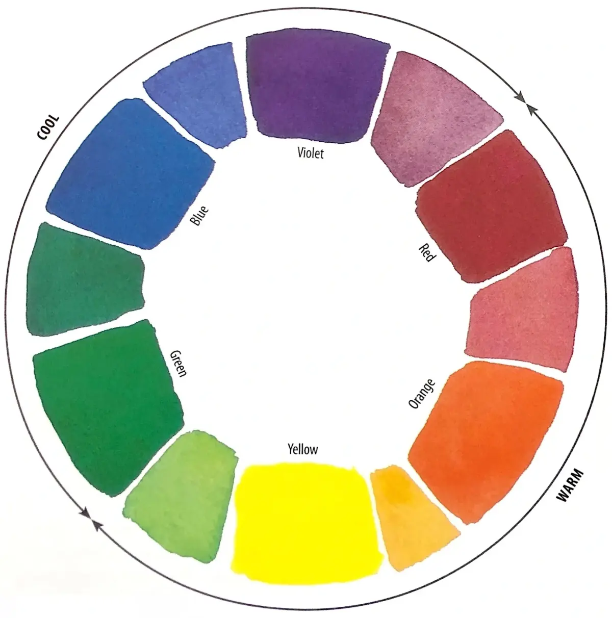
The complementary color of green is red. In traditional color theory, based on the RYB color model, red sits directly opposite green on the color wheel. When placed side-by-side, these two hues create the strongest possible visual contrast, making each appear more vibrant and intense to the human eye.
On this page
What is the color wheel and how does it work?
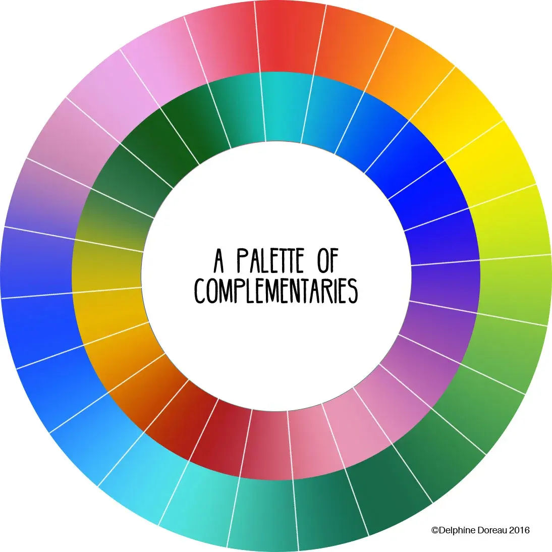
The color wheel is a circular diagram that represents the relationships between colors. It is primarily used by artists, designers, and scientists to understand how hues interact. The wheel is organized into primary, secondary, and tertiary colors, with complementary pairs positioned directly across from one another to show their inherent contrast.
In the traditional RYB (red, yellow, blue) model used in painting, green is a secondary color created by mixing blue and yellow. Because red is the primary color not used to create green, it occupies the opposite position on the wheel. This geometric relationship is the foundation for color harmony, as these pairs provide a balanced yet high-energy visual experience that artists have utilized for centuries.
How to use complementary colors in design
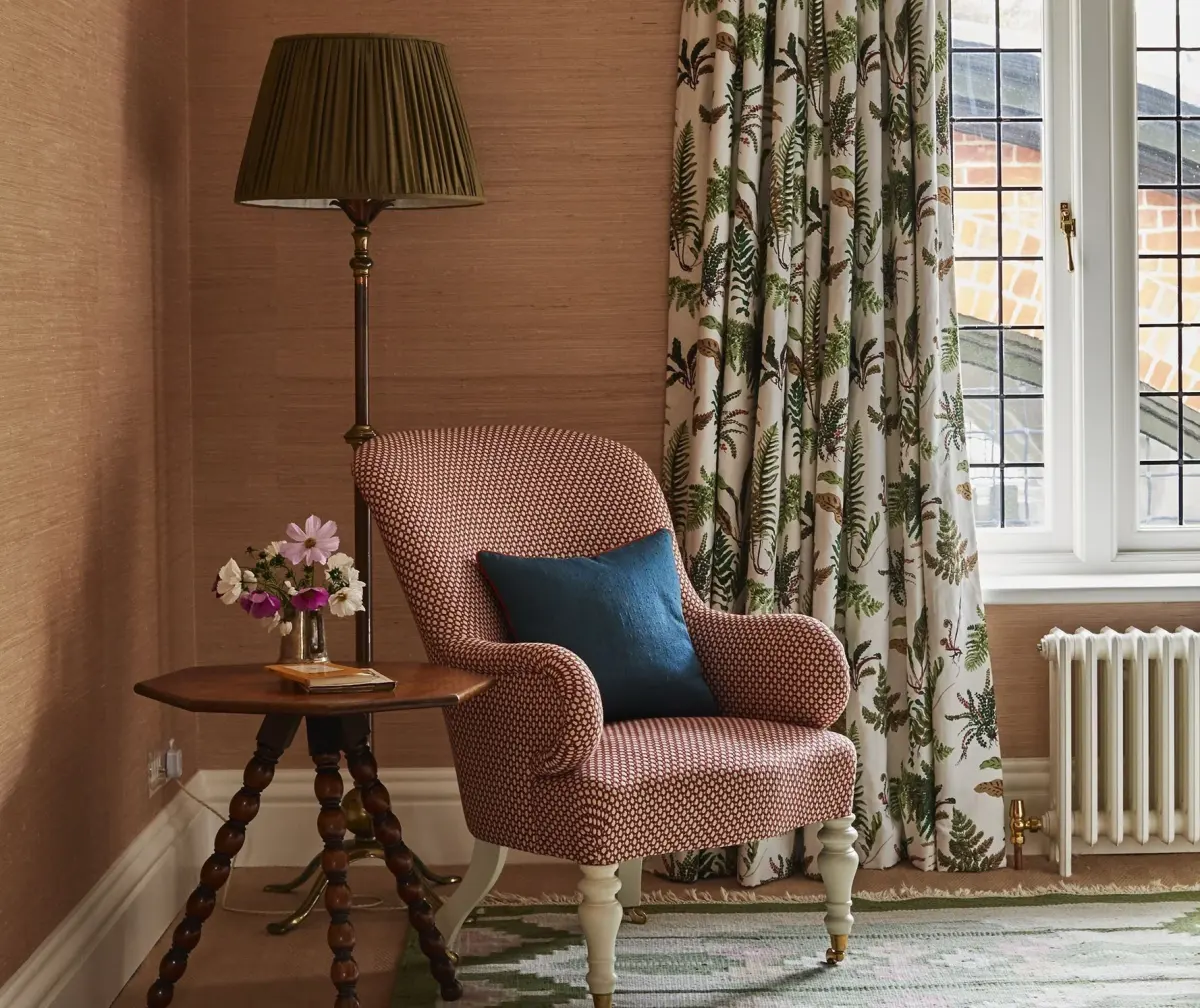
Using complementary colors is an effective way to create a focal point or add energy to a composition. Because red and green are opposites, they naturally draw the eye when placed together. Designers often use this combination to create a sense of urgency or to make specific elements stand out against a background.
To successfully integrate these colors into your projects, consider the following strategies:
- Use one color as the dominant background and the other as a small accent to avoid visual fatigue.
- Adjust the saturation or brightness of one color to make the pairing feel more sophisticated rather than jarring.
- Incorporate neutral tones like white, gray, or black to provide a "breathing space" between the two intense colors.
- Use tints (adding white) or shades (adding black) to soften the intensity of the red-green relationship.
Why do complementary colors look so bright together?
The phenomenon of color contrast occurs because of how the human eye and brain process light. When you stare at a saturated green object for an extended period, your photoreceptors become fatigued. If you then shift your gaze to a white surface, your eyes will temporarily perceive a "ghost image" of the color's complement, which is red.
This effect, known as successive contrast, demonstrates that our visual system is constantly seeking balance. When red and green are placed side-by-side, they reinforce each other's intensity. This is why red text on a green background can appear to vibrate or shimmer, as the brain struggles to reconcile the high-frequency contrast between the two hues. Understanding this biological response allows creators to manipulate viewer perception effectively.
Common mistakes when using red and green
A frequent error when working with red and green is applying them in equal proportions. Because both colors are highly saturated and visually demanding, using them in a 50/50 split often results in a chaotic or overwhelming design. This balance can cause the colors to compete for attention, leading to a visual effect that is difficult for the viewer to process.
Another common mistake is ignoring the cultural associations of these colors. In many Western cultures, the pairing of red and green is inextricably linked to Christmas. If your project is not intended to be holiday-themed, using these colors together may unintentionally evoke seasonal imagery. To avoid this, consider these adjustments:
- Shift the hue of the red toward a deep burgundy or a bright coral.
- Change the green to a muted sage, olive, or forest tone to move away from "holiday" shades.
- Use a different color palette if the specific red-green combination feels too restrictive for your intended message or brand identity.
Best tools for finding color combinations
Modern digital tools have made it significantly easier to experiment with color theory without needing a physical paint set. Most graphic design software includes built-in color wheels that automatically calculate complementary, analogous, and triadic schemes based on a single selected color. These tools ensure mathematical accuracy, which is helpful when you are trying to achieve a specific aesthetic balance.
If you are looking for professional resources to refine your color choices, explore these options:
- Adobe Color: An industry-standard web tool that allows you to extract themes from images or build custom palettes from a wheel.
- Coolors: A fast, user-friendly generator that helps you lock in one color and find its perfect complement or matching shades.
- Pantone Connect: A resource for designers who need to match specific ink colors to ensure consistency across print and digital media.
- Canva Color Wheel: A simplified, accessible tool that provides immediate feedback on how different color harmonies function in real-world layouts.
Key facts
- In the traditional RYB (red-yellow-blue) color model used by artists, the complementary color of green is red.
- Complementary colors are defined as pairs that sit directly opposite each other on a standard color wheel.
- When placed side-by-side, complementary colors create the strongest possible visual contrast, making both colors appear more vibrant.
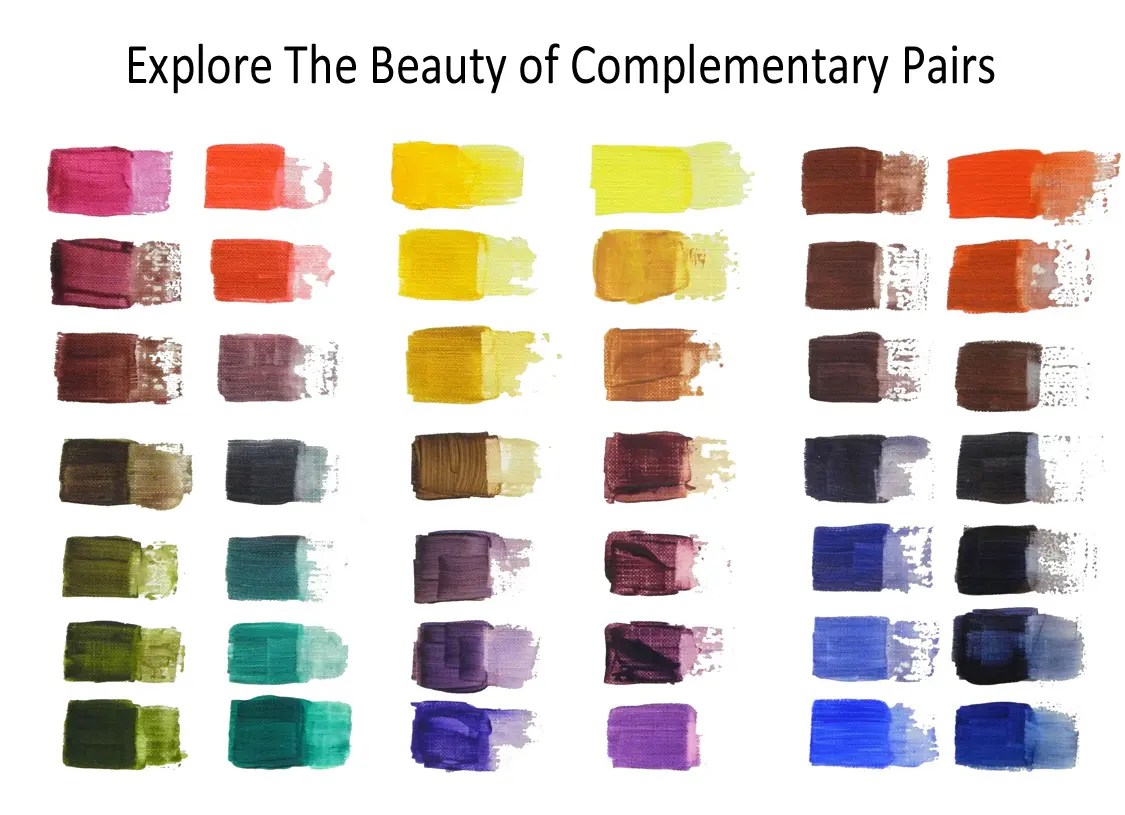
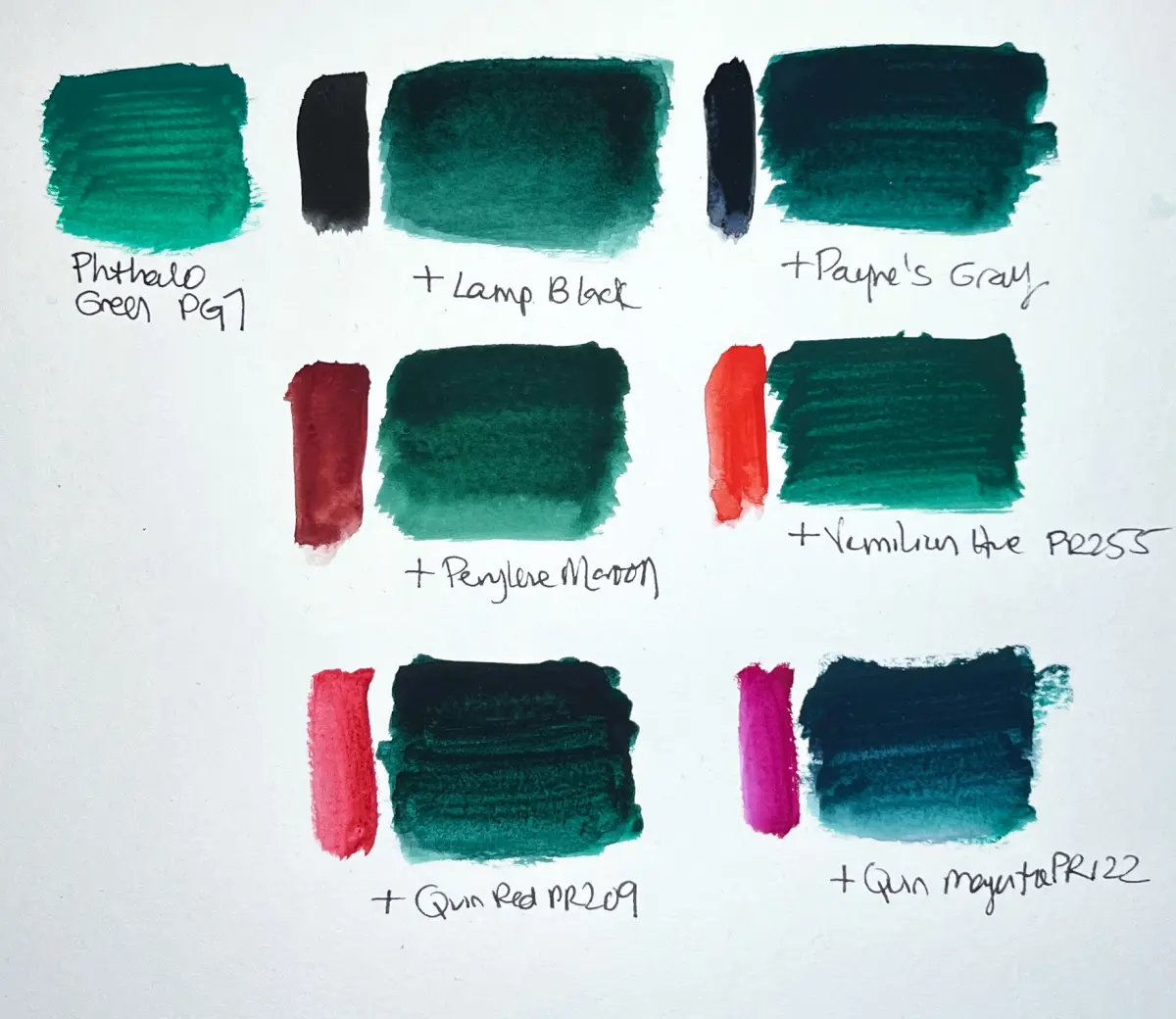
- Mixing two complementary colors together in equal proportions results in a neutral brown or gray, a process known as desaturation.
- In the RGB (red-green-blue) color model used for digital screens, the complement of green is magenta.
- A common mistake is choosing a shade that is too close to the original color; for maximum impact, ensure the tones share similar levels of saturation.
The bottom line
The complementary color of green is red in traditional art, while digital screens identify it as magenta. Understanding these relationships allows you to master visual contrast, whether you are painting on canvas, designing a website, or decorating a room. By balancing these opposites, you can create dynamic compositions that capture attention. Always remember that adjusting the brightness and saturation is key to achieving a sophisticated, professional result.
People also ask
Why do complementary colors look good together?
They create high visual contrast because they occupy opposite positions on the color spectrum. This interaction stimulates the human eye and makes the colors appear more intense than when viewed in isolation.
How can I use green and red together without it looking like Christmas?
Adjust the values and saturation of the colors to avoid the stereotypical holiday palette. Instead of bright primary red and green, try using muted tones like olive and burgundy or sage and terracotta.
Do complementary colors work the same way in light as they do in paint?
No, the results differ based on the color model. Artists use subtractive mixing (pigments), while digital displays use additive mixing (light), leading to different complementary pairs like green and magenta.
What is the best way to mix a neutral color?
Combine a color with its complement in small, incremental amounts. If you add too much of the opposite color at once, you may end up with a muddy brown that is difficult to correct.
Are there more than two complementary colors?
No, a complementary color is strictly defined as the single color directly opposite another on the wheel. However, you can use "split-complementary" schemes, which use the two colors adjacent to the direct complement for a softer effect.
Can I use a color wheel to find complementary colors for interior design?
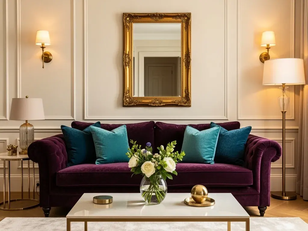
Yes, a standard 12-hue color wheel is a reliable tool for identifying these pairings. Professionals use it to balance rooms by using a dominant color and using its complement as a small, impactful accent.
This answer was created with the help of AI research tools and reference sources. Spotted an error? Let us know — we correct mistakes quickly. See our editorial policy.