What is the complementary color of cyan?
Short answer
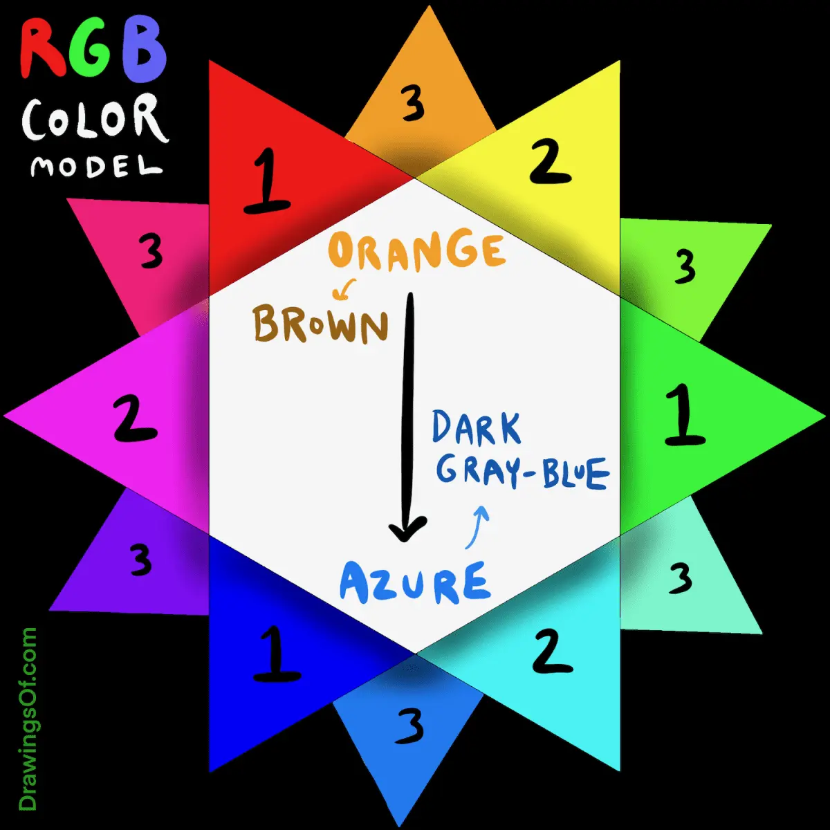
The complementary color of cyan is red. In the additive color model used for digital displays, cyan is created by mixing green and blue light. Because red is the primary color missing from this combination, it serves as the direct opposite on the color wheel, creating the highest possible visual contrast.
On this page
What is the color wheel and how does it work?
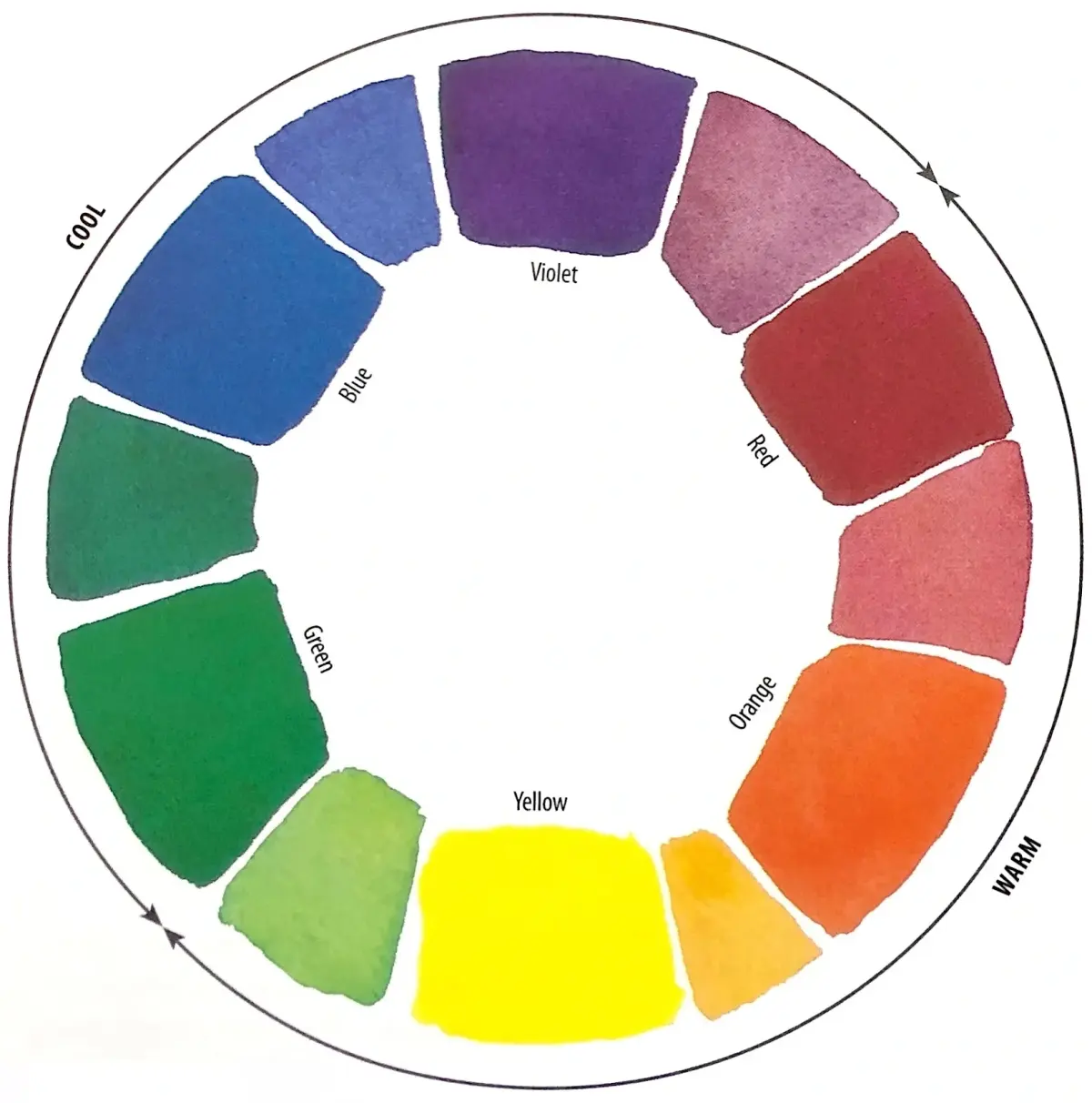
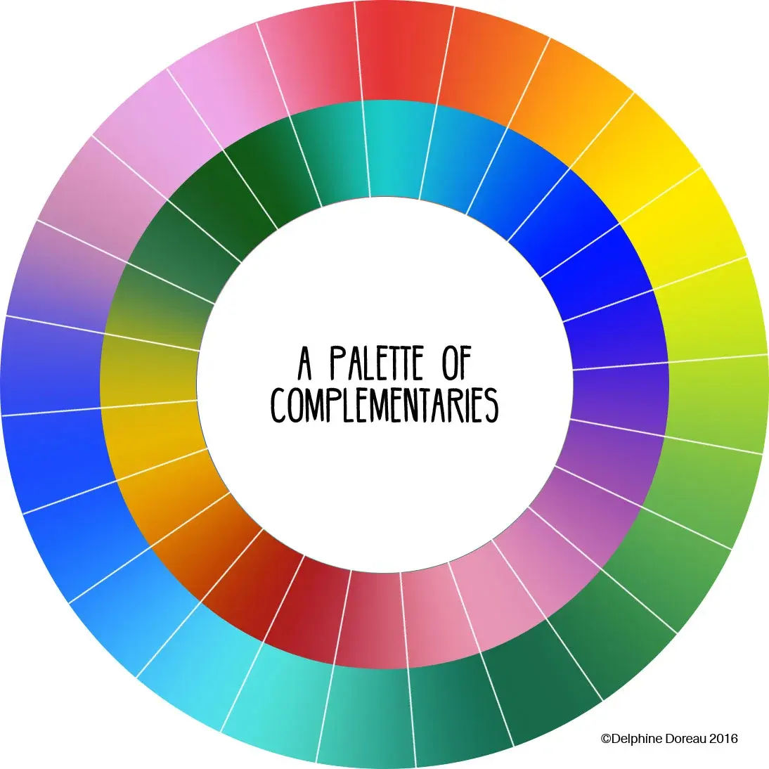
The color wheel is a circular diagram that represents the relationships between colors based on their hue. It serves as a fundamental tool for artists, designers, and scientists to understand how colors interact. The wheel is typically divided into primary, secondary, and tertiary colors. Primary colors are the building blocks, while secondary colors are created by mixing two primaries.
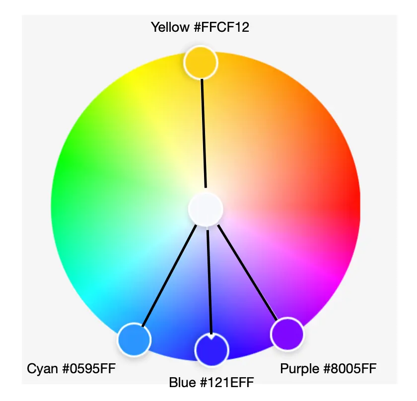
Complementary colors are positioned directly across from one another on this wheel. When placed side-by-side, these pairs create a strong visual vibration and maximum contrast. Understanding this geometry allows creators to balance compositions effectively. By identifying the position of a specific hue, you can immediately determine its opposite by drawing a straight line through the center of the wheel.
- Primary colors: Red, Yellow, Blue (in traditional art) or Red, Green, Blue (in light).
- Secondary colors: Green, Orange, Purple.
- Complementary pairs: Red and Green, Blue and Orange, Yellow and Purple, Cyan and Red.
Why is red the complement of cyan?
The relationship between cyan and red is rooted in the physics of light and the way human eyes perceive color. In the RGB (Red, Green, Blue) color model, cyan is a secondary color produced by combining green and blue light at full intensity. Because red is the only primary color not present in this mix, it acts as the perfect counterbalance.
When you combine a color with its complement, the result is achromatic, meaning it moves toward white or gray. If you were to shine red light and cyan light onto a white surface simultaneously, the mixture would neutralize the color, resulting in white light. This phenomenon is essential for color correction in photography and video production, where professionals use these opposing values to remove unwanted color casts from images.
How to use complementary colors in design
Using complementary colors like cyan and red can make a design feel energetic and bold. Because they provide the highest level of contrast, they are frequently used in marketing to draw attention to specific elements, such as "call to action" buttons on websites. However, caution is required to ensure the design remains readable and aesthetically pleasing.
- Select a dominant color to cover the majority of your space.
- Use the complementary color sparingly as an accent to highlight key information.
- Adjust the saturation or brightness of the colors to soften the intensity if the contrast feels too aggressive.
- Use a neutral color like white, gray, or black to separate the two competing hues.
Following these steps prevents the colors from "vibrating" against each other, which can cause eye strain for the viewer.
Common mistakes when pairing colors
A frequent error is applying complementary colors in equal proportions. Because cyan and red are both highly saturated, using them in a 50/50 split creates a chaotic visual experience that is difficult for the human eye to process. Instead of creating harmony, an equal split often makes the design feel disjointed and overwhelming.
Another common mistake is ignoring the context of the environment. A color combination that works on a computer screen may look drastically different when printed on paper. This occurs because screens use additive light (RGB), while printers use subtractive ink (CMYK). When working for print, cyan is a primary ink, and its complement is actually a shade of red ink known as magenta or process red. Always verify your color profile before finalizing a project to ensure the intended contrast is maintained.
Best tools for finding color harmonies
Digital tools have made it easier than ever to find the perfect complementary match for any project. Most professional design software includes built-in color wheels that automatically calculate the complement of any selected hue. These tools allow you to input specific hex codes or RGB values to find the exact opposite, ensuring mathematical precision in your color palette.
- Adobe Color: An online tool that allows you to generate palettes based on various harmony rules.
- Coolors.co: A fast generator for creating and saving color schemes.
- Canva Color Wheel: A user-friendly interface for beginners to explore color relationships.
- Procreate: A digital illustration app that provides a color wheel with built-in harmony modes.
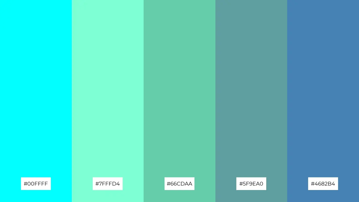
By utilizing these resources, you can experiment with variations of cyan and red, such as desaturated teals or deep maroons, to achieve a sophisticated look while still benefiting from the powerful impact of complementary contrast.
Key facts
- The complementary color of cyan is red.
- In the CMYK color model, cyan is a primary subtractive color used in printing.
- Complementary colors are located directly opposite each other on the traditional color wheel.
- When cyan and red light are mixed in equal intensity, they produce white light.
- Designers use complementary colors to create high-contrast, visually striking compositions.
- To neutralize a cyan tint in an image, you can add a small amount of red to the color balance.
The bottom line
The complementary color of cyan is red, a relationship defined by their opposing positions on the color wheel. Understanding this pairing is essential for artists and designers aiming to create balanced, high-contrast visuals. By placing these colors together, you can draw focus to specific elements, while mixing them allows you to neutralize unwanted color casts or create complex, desaturated tones for more sophisticated digital and print projects.
People also ask
What is the difference between additive and subtractive color models?
Additive models like RGB create color by combining light, while subtractive models like CMYK create color by absorbing specific wavelengths of light from a surface.
Why do complementary colors look good together?
They create maximum visual contrast because they share no common wavelengths, causing the human eye to perceive them as distinct and vibrant when placed side-by-side.
How do I find the complement of any color?
You can identify a complement by looking at a standard 12-hue color wheel and selecting the color directly across from your starting point.
Can I use complementary colors for text?
While they provide high contrast, using pure complementary colors for text can cause "vibration" or eye strain, so it is better to adjust the saturation or brightness of one color.
Does the complement of cyan change in different color spaces?
The specific hue of the complement remains consistent in theory, but the exact digital values will vary depending on whether you are working in sRGB, Adobe RGB, or CMYK.
What happens if I mix cyan and red paint?
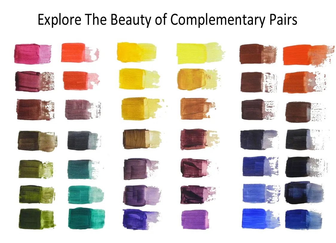
Mixing cyan and red pigments typically results in a muddy brown or gray color because the pigments absorb most of the visible light spectrum.
This answer was created with the help of AI research tools and reference sources. Spotted an error? Let us know — we correct mistakes quickly. See our editorial policy.