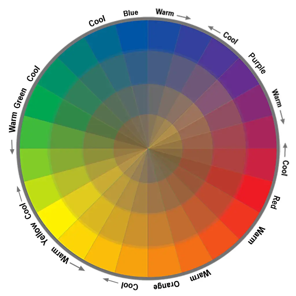
What is the color wheel?
Short answer
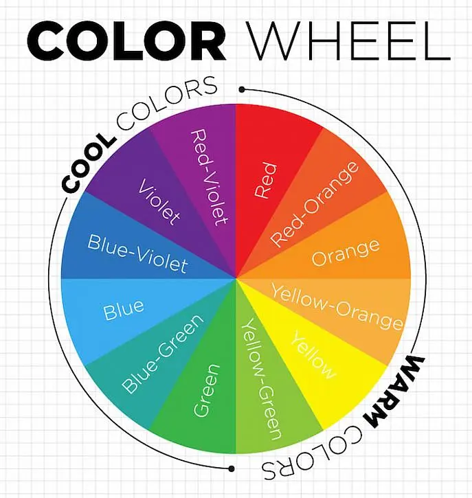
The color wheel is a circular diagram representing the relationships between colors based on their chromatic sequence. It organizes primary, secondary, and tertiary hues to help artists, designers, and scientists visualize color theory. By mapping these relationships, the wheel serves as a fundamental tool for creating balanced, harmonious, and visually effective color schemes.
On this page
What is the history of the color wheel?
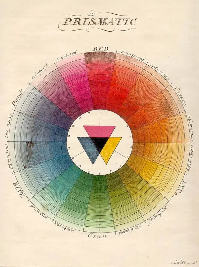
The development of the color wheel is rooted in the scientific observations of Sir Isaac Newton. In 1666, Newton discovered that white light could be split into a spectrum of colors using a prism. He joined the two ends of this linear spectrum to form a circle, creating the first color wheel to demonstrate the natural progression of hues. This breakthrough established the concept that colors exist in a continuous, cyclical relationship.
Over the following centuries, other theorists expanded on Newton’s initial model to suit specific artistic needs. In 1810, Johann Wolfgang von Goethe published "Theory of Colours," which focused on the psychological impact of color and introduced the concept of complementary pairs. Later, in the 20th century, Johannes Itten, a teacher at the Bauhaus school, refined the wheel into the 12-hue model used in art education today. These historical contributions shifted the wheel from a purely scientific experiment into a practical instrument for visual communication and artistic expression.
How do colors work on the wheel?
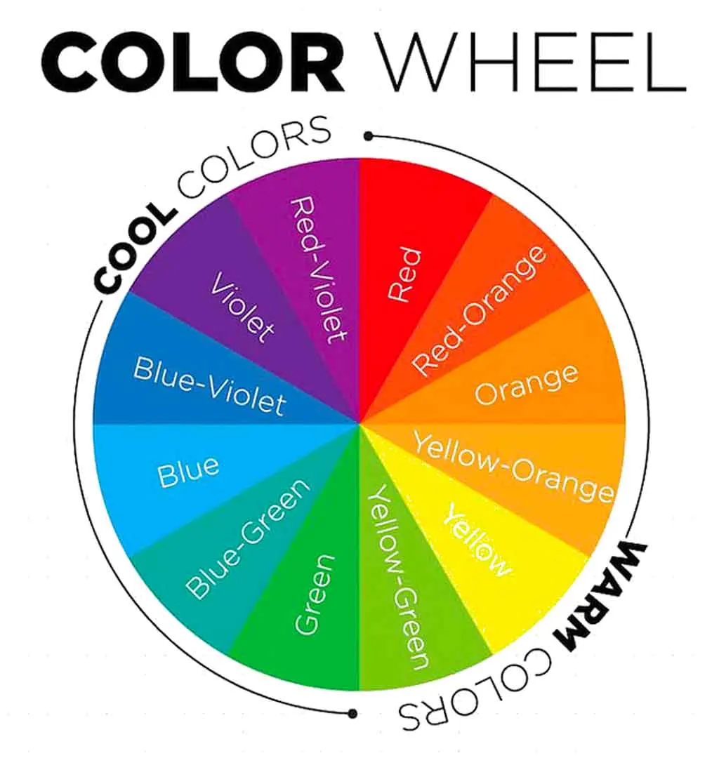
The standard 12-hue color wheel is built upon three distinct categories of color that define how they interact. These categories provide the logic behind every color combination used in design and painting. Understanding these groups allows users to predict how colors will behave when placed next to each other.
- Primary colors: Red, yellow, and blue are the base pigments that cannot be created by mixing other colors.
- Secondary colors: Green, orange, and purple are created by mixing two primary colors together in equal parts.
- Tertiary colors: These are created by mixing a primary color with an adjacent secondary color, such as blue-green or red-orange.
Beyond these categories, the wheel also accounts for color properties like saturation and value. Saturation refers to the intensity or purity of a hue, while value describes its relative lightness or darkness. By adding white, black, or gray to a hue, artists create tints, shades, and tones, which expand the basic 12-hue wheel into a complex spectrum of thousands of variations.
How to create color schemes using the wheel?
Using the color wheel to select a palette ensures that colors work well together rather than clashing. Designers utilize specific geometric relationships on the wheel to find harmonious combinations. These formulas act as a reliable guide for everything from interior design to digital graphics.
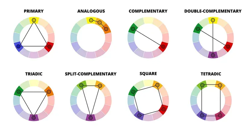
- Complementary: Colors located directly opposite each other on the wheel, such as blue and orange.
- Analogous: Three colors that sit side-by-side on the wheel, creating a serene and comfortable look.
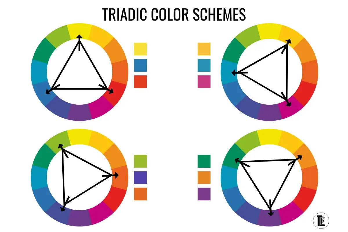
- Triadic: Three colors evenly spaced around the wheel, forming a triangle that provides high contrast and balance.
- Split-complementary: A base color plus the two colors adjacent to its direct complement, offering contrast without the tension of a simple complementary pair.
When applying these schemes, consider the 60-30-10 rule. This design principle suggests using a dominant color for 60 percent of the space, a secondary color for 30 percent, and an accent color for the final 10 percent. This prevents any single color from overwhelming the composition and maintains visual interest.
Common mistakes when using the color wheel
One frequent error is failing to account for the impact of lighting on color perception. Colors that appear harmonious on a screen or a printed wheel may look drastically different under warm incandescent light versus cool daylight. Always test your chosen color palette in the actual environment where it will be displayed. Another common mistake is ignoring the value of the colors chosen. If you select three colors that all have the same level of darkness, the design will lack depth and appear flat.
Users often make the mistake of using too many colors at once, which can lead to visual clutter. While the color wheel encourages experimentation, a successful design usually relies on restraint. If a palette feels chaotic, try removing one color or shifting the saturation of the accent colors. Remember that the color wheel is a tool for guidance, not a rigid set of laws. If a combination feels right for your specific project, prioritize your artistic intuition over strict adherence to the geometric formulas.
Best ways to practice color theory
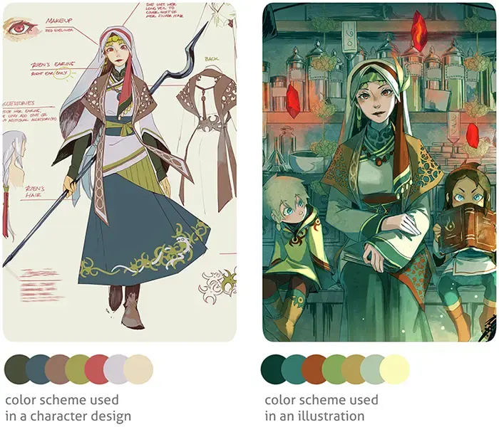
The most effective way to master the color wheel is through hands-on practice. Start by painting your own 12-hue wheel using only primary pigments. This exercise forces you to understand the nuance of mixing colors, such as how adding a tiny amount of blue can drastically change a yellow-green. Once you have a physical wheel, use it to analyze existing designs you admire. Try to identify which color scheme—such as triadic or analogous—the artist used to achieve their specific effect.
- Create a color study: Pick a simple object and paint it in three different color schemes to see how the mood changes.
- Use digital tools: Many online apps allow you to drag a cursor around a wheel to generate palettes automatically.
- Observe nature: Look for natural color harmonies in landscapes or flowers and map them back to the wheel.
By consistently applying these methods, you will develop an intuitive sense for color relationships. Practice helps move your understanding from theoretical knowledge to a practical skill that informs every creative decision you make. Consistent observation and experimentation are the keys to becoming proficient with the color wheel.
Key facts
- The traditional color wheel, known as the RYB model, uses red, yellow, and blue as its primary colors.
- Sir Isaac Newton developed the first circular color diagram in 1666 by mapping the visible spectrum onto a wheel.
- Primary colors cannot be created by mixing other colors, while secondary colors are made by mixing two primaries.
- Complementary colors sit directly opposite each other on the wheel, creating the highest possible visual contrast.
- Analogous colors are located next to each other on the wheel and create a harmonious, low-contrast look.
- When mixing paint, avoid combining all three primary colors in equal amounts, as this typically results in a muddy brown or gray.
The bottom line
The color wheel is an essential tool for artists, designers, and decorators to understand the relationships between hues. By organizing colors based on their chromatic properties, it provides a logical framework for creating balanced, professional-looking palettes. Whether you are painting a canvas or choosing furniture, mastering the wheel helps you manipulate contrast, harmony, and mood effectively, ensuring your final composition is visually engaging and intentional.
People also ask
What is the difference between primary, secondary, and tertiary colors?
Primary colors are the base hues that cannot be created by mixing. Secondary colors are formed by mixing two primaries, while tertiary colors are created by mixing a primary with an adjacent secondary color.
How do I use the color wheel to create a balanced color scheme?
You can use a "triadic" scheme by picking three colors evenly spaced around the wheel. This provides a vibrant, balanced look that is often used in graphic design and interior decorating.
Why do digital screens use a different color wheel than painters?
Screens use the RGB (red, green, blue) model, which relies on light. Painters use the RYB model, which relies on pigments that absorb and reflect different wavelengths of light.
What are warm and cool colors?
Warm colors include reds, oranges, and yellows, which evoke feelings of heat and energy. Cool colors include blues, greens, and purples, which are generally perceived as calming and receding.
Is black and white included on the color wheel?
No, black and white are considered neutrals rather than hues. They are used to change the value of a color by creating tints when adding white or shades when adding black.
What is the most common mistake when using the color wheel?
A common error is using too many colors at once, which can make a composition feel chaotic. Beginners should stick to a simple two or three-color scheme to ensure visual clarity.
This answer was created with the help of AI research tools and reference sources. Spotted an error? Let us know — we correct mistakes quickly. See our editorial policy.