What colors make cream?
Short answer
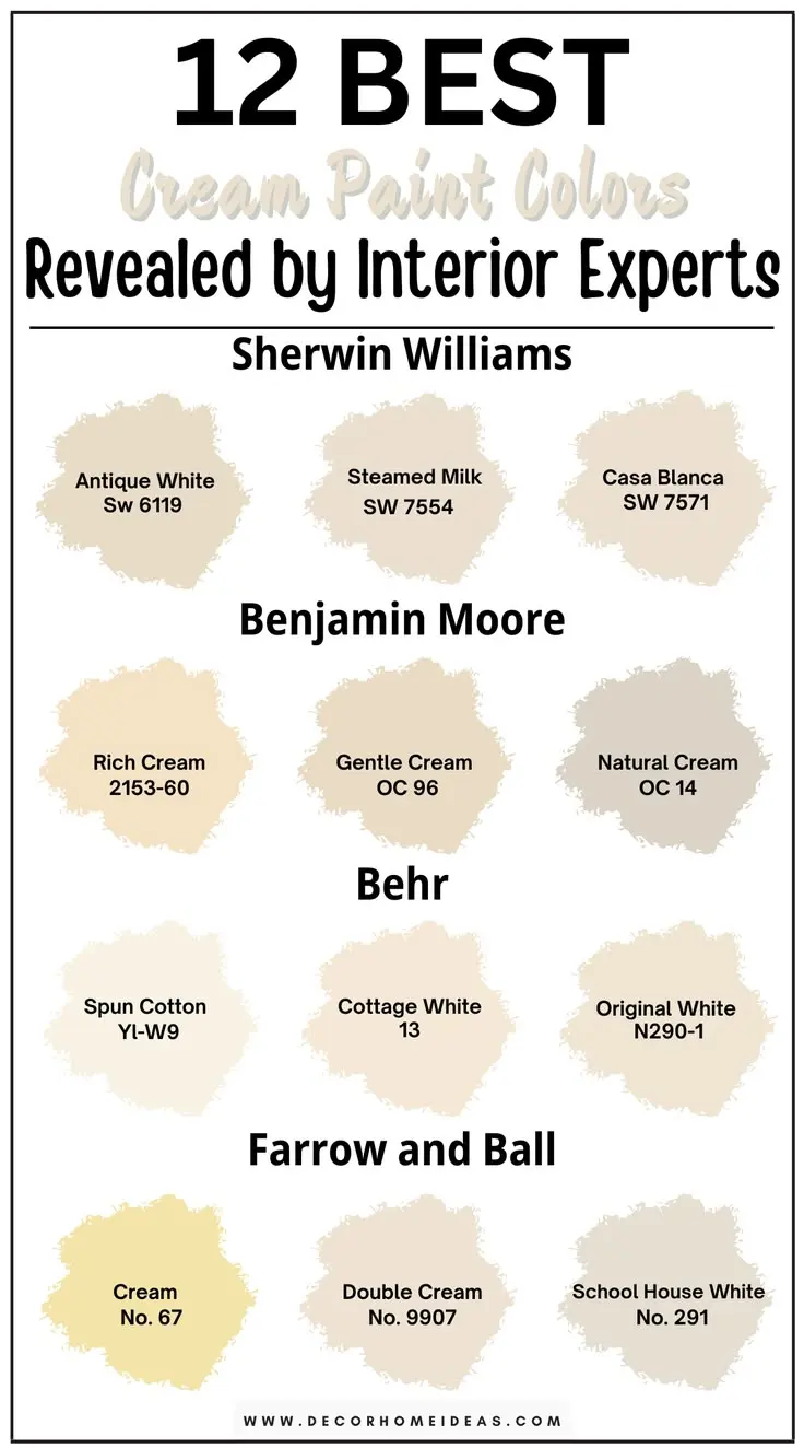
Cream is created by mixing white paint with a very small amount of yellow, and occasionally a tiny touch of brown or orange. The white acts as the base, while the yellow provides the warm, off-white undertone. Adjusting the ratio allows you to shift the hue from a cool ivory to a rich, buttery shade.
On this page
How to mix cream paint colors
To achieve the perfect cream shade, start with a high-quality white base, such as titanium white. Because white is highly opaque, it acts as the primary volume for your mixture. You should then introduce a concentrated yellow pigment, such as cadmium yellow or yellow ochre, in very small increments. It is much easier to add more color than it is to lighten a mixture that has become too dark or saturated.
When mixing, use a palette knife to ensure the pigment is fully incorporated into the white base. If the color appears too neon or bright, you can neutralize it by adding a minuscule amount of raw umber or burnt sienna. These earth tones provide the subtle warmth associated with natural cream colors. Always test the mixture on a scrap piece of material before applying it to your final project, as the color will often shift slightly as it dries.
Best tools for mixing colors
Using the right equipment ensures consistency and prevents wasted materials. A glass or plastic palette is ideal because it does not absorb paint and is easy to clean between sessions. For mixing, a stainless steel palette knife is superior to a brush, as it allows for a more thorough blend and prevents pigment from getting trapped in bristles.
- Select a high-quality white base paint or medium.
- Use a palette knife to pull a small amount of yellow pigment into the white.
- Mix thoroughly until the streakiness disappears.
- Add a tiny dot of brown or orange if the shade is too bright.
- Compare the wet paint against a reference sample.
Always keep a paper towel nearby to wipe your palette knife between additions. This prevents cross-contamination of your primary tubes, which can ruin the purity of your base colors over time.
Why cream colors look different in light
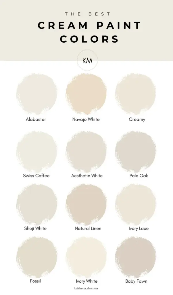
Cream is a neutral color that is highly sensitive to its environment. Because it contains yellow undertones, it interacts uniquely with ambient light sources. In a room with cool, north-facing light, a cream wall may appear slightly gray or sterile. Conversely, in south-facing light, the same color will take on a golden, warm glow that feels inviting and soft.
You must also consider the light temperature measured in Kelvins. Warm-toned light bulbs, typically around 2700K, will exaggerate the yellow in your cream mixture, potentially making it look more like butter or gold. Cool-toned LED lights, often 4000K or higher, will neutralize the yellow and make the cream appear closer to a stark white. Always view your test swatches at different times of the day to see how the color behaves under varying natural and artificial conditions.
Common mistakes when mixing cream
One of the most frequent errors is adding too much yellow pigment at once. Because yellow is a highly visible color, even a single drop can drastically shift your white base toward a lemon or mustard shade. Always start with an amount no larger than a grain of rice. If you accidentally make the mixture too yellow, you will need a significant amount of extra white paint to dilute it, which can lead to having much more paint than you originally intended to use.
Another common mistake is neglecting to mix the paint thoroughly. Streaks of unmixed pigment can appear after the paint has been applied, leading to an uneven finish. Ensure that the pigment is fully integrated into the base so that the color remains consistent across the entire surface. If you are using acrylics, remember that they often dry darker than they appear when wet, so aim for a shade that looks slightly lighter than your target color.
How to adjust cream tones for specific styles
You can customize your cream shade to fit specific design aesthetics by altering the secondary pigments. For a modern, minimalist look, keep the cream cool by adding a tiny amount of blue or violet to the white and yellow base. This subtle shift prevents the color from looking too "yellowed" or aged, keeping it crisp and clean. For a traditional or rustic aesthetic, lean into the warmth by adding more earth tones like raw sienna or burnt umber.
- For a "French Vanilla" look: Increase the yellow and add a touch of orange.
- For a "Cool Ivory" look: Add a microscopic amount of blue to the white-yellow mix.
- For a "Vintage Parchment" look: Increase the brown pigment to create a deeper, antique aesthetic.
Experimenting with these ratios allows you to create a custom palette that complements your existing decor. By documenting the number of drops or the volume of pigment used for each successful batch, you can replicate your favorite shades for future projects with perfect accuracy.
Key facts
- Cream is primarily created by mixing white paint with a small amount of yellow.
- Adding a tiny touch of brown or raw umber helps achieve a more natural, vintage cream tone.
- Start with a large base of white and add the secondary colors gradually to avoid over-darkening.
- If the mixture looks too yellow, add a minuscule amount of blue or violet to neutralize the brightness.
- Use titanium white for a clean, opaque base, as it provides the best coverage for mixing.
- Always mix colors in good lighting to ensure the subtle undertones of the cream are visible.
The bottom line
Creating the perfect cream color is a simple process of tinting a white base with warm pigments. By starting with a generous amount of white and slowly incorporating small drops of yellow and a hint of brown, you can achieve a soft, buttery finish. Always prioritize gradual additions to maintain control over the final hue, ensuring your custom shade remains light, inviting, and perfectly balanced.
People also ask
Is cream the same color as off-white?
While often used interchangeably, cream typically has warmer, yellow-based undertones, whereas off-white can lean toward gray or beige. Cream is specifically defined by its buttery, soft appearance.
How do I make cream darker?
Add a very small amount of burnt umber or a darker yellow ochre to your existing cream mixture. Add the pigment in tiny increments, as dark colors overpower white paint very quickly.
Can I make cream using red and green?
Mixing red and green creates a neutral brown or gray, which can be used to tint white paint. However, this will result in a muted, earthy tone rather than the classic bright cream.
What happens if I add too much yellow to my white?
You will end up with a vibrant lemon or buttercup yellow rather than a soft cream. To fix this, add more white paint to dilute the intensity until the desired shade is reached.
Why does my cream paint look different on the wall?
Paint colors change based on surrounding light, wall texture, and the colors of nearby furniture. Always test a small sample on the wall and observe it at different times of the day.
Is cream a primary or secondary color?
Cream is a tertiary or neutral tint, not a primary color. It is a derivative shade created by modifying white, which is considered an achromatic color in most mixing systems.
This answer was created with the help of AI research tools and reference sources. Spotted an error? Let us know — we correct mistakes quickly. See our editorial policy.