What colors make hot pink?
Short answer
Hot pink is created by mixing a primary magenta pigment with a small amount of white. Because magenta is a subtractive primary color, it cannot be made by mixing other hues. To achieve the vibrant, neon-like quality of hot pink, you must use a high-saturation magenta base rather than standard red.

On this page
What colors make hot pink in paint?
In the world of physical pigments, you cannot create the specific hue of hot pink by mixing red and white. If you mix standard red with white, you will consistently produce a soft, pastel baby pink rather than a vivid, electric shade. Hot pink requires a base of magenta, which is a cool-toned, blue-leaning red that sits between red and violet on the color wheel.
To achieve the precise look of hot pink, follow these steps to adjust your palette:
- Start with a high-quality magenta acrylic or oil paint as your primary base.
- Add a very small amount of titanium white to increase the opacity and luminosity of the color.
- If the color appears too dull, introduce a tiny drop of fluorescent or neon pink pigment to boost the saturation.
- Test the mixture on a white surface, as the base color of your canvas or paper significantly affects how the hot pink appears to the human eye.
How to mix hot pink with digital colors
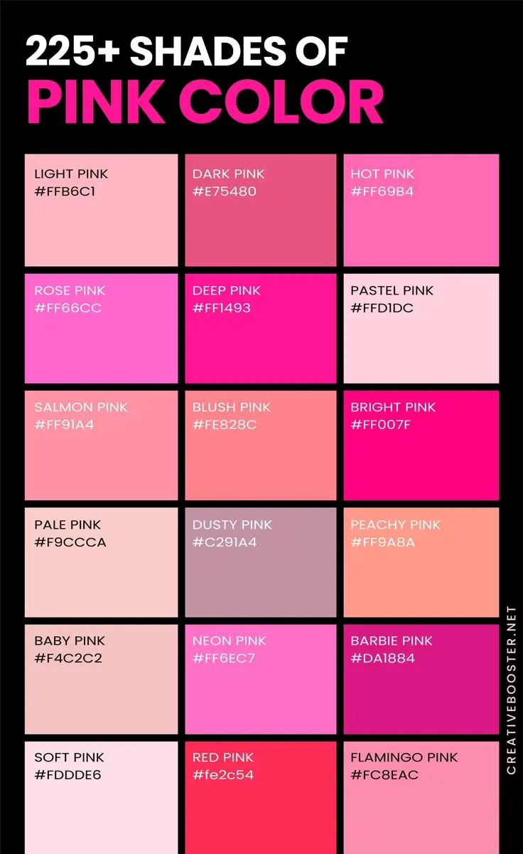
Digital displays utilize the RGB color model, which creates colors by mixing red, green, and blue light. In this system, hot pink is defined by high values of red and blue with very little green. The specific hex code for a standard hot pink is #FF69B4, which represents a precise balance of color intensity.
If you are working in design software like Adobe Photoshop or Illustrator, you can create hot pink by adjusting your color sliders to the following specifications:
- Red: Set to maximum intensity (255).
- Green: Set to a low value (105) to reduce warmth.
- Blue: Set to a mid-range value (180) to maintain the cool, vibrant undertone.
By manipulating these light-based values, you can shift the shade from a softer rose to a more aggressive, neon-leaning hot pink. Always ensure your monitor is calibrated correctly, as digital colors can shift significantly depending on your screen settings and brightness levels.
Why hot pink looks different than standard pink
The primary reason hot pink stands out from other shades is its high chroma and cool temperature. Standard pinks are often warm, leaning toward orange or peach, which makes them appear muted or "dusty." Hot pink, by contrast, contains a significant amount of blue, which gives it a sharp, energetic quality that commands visual attention.
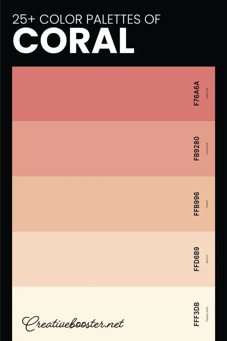
This distinction is rooted in color theory, specifically the concept of spectral colors. Hot pink is essentially a tint of magenta, a color that does not exist as a single wavelength of light in the visible spectrum. Instead, the human brain perceives magenta and its derivatives like hot pink when our eyes detect both red and violet light simultaneously. This unique physiological reaction is why hot pink appears more "electric" than colors like coral, salmon, or blush, which are simply variations of red mixed with yellow or brown.
Common mistakes when mixing hot pink
One of the most frequent errors artists make when attempting to mix hot pink is adding yellow or orange to the mixture. Because hot pink relies on a cool, blue-based red, adding any warm-toned pigment will immediately shift the color toward a coral or salmon hue. Once you have introduced yellow into your magenta base, it is extremely difficult to reverse the process without using an excessive amount of paint.
Another common mistake is over-mixing the white pigment. Titanium white is highly opaque and can quickly turn a vibrant magenta into a flat, chalky pastel. To avoid this, always add your white in small, incremental amounts, stirring thoroughly between each addition. If you find that your mixture has become too light or pale, you will need to add more magenta to restore the intensity. Always keep your brushes clean, as even a tiny amount of leftover dark color, such as black or brown, can muddy the vibrant tone of the hot pink.
Best tools for achieving vibrant pinks
When working with physical media, the quality of your paint significantly influences the final result. Professional-grade paints contain higher concentrations of pigment, which allows for greater saturation and better light reflection. If you are struggling to get a true hot pink, consider using a "process magenta" or "quinacridone magenta" pigment, as these are the most accurate starting points for creating neon-style shades.
To ensure your hot pink remains vibrant over time, keep these professional tips in mind:
- Use a white primer or gesso on your canvas to ensure the pink reflects light effectively.
- Avoid mixing your pinks on a dirty palette, as residual colors will contaminate the brightness.
- Consider using fluorescent additives if you are painting for a specific aesthetic effect, though note that these are often less lightfast than standard pigments.
- Experiment with layering thin glazes of magenta over a bright white underpainting to create a glowing, translucent effect that mimics the intensity of digital screens.
By selecting the right base pigments and maintaining a clean workspace, you can master the creation of this bold, high-energy color for any project.
Key facts
- Hot pink is a high-saturation, vibrant shade of magenta created by mixing pure red with a small amount of blue or violet.
- To achieve the brightness characteristic of hot pink, use a primary magenta pigment rather than a dull, muted red.
- Adding white to the mixture is essential to increase the value and achieve the characteristic "electric" glow of the color.
- Avoid mixing in yellow, as it will shift the hue toward coral or orange, neutralizing the pink intensity.
- In digital design, hot pink is represented by the hex code #FF69B4, which consists of maximum red, moderate green, and significant blue.
- If mixing with acrylic or oil paints, start with a large amount of white and slowly introduce magenta to prevent the color from becoming too dark.
The bottom line
Creating the perfect hot pink requires a balance of high-intensity magenta and white. By avoiding yellow and complementary tones, you maintain the color's signature vibrancy. Whether you are mixing paints or adjusting digital hues, the secret lies in the ratio of red to blue components. Mastering this bright, energetic shade allows for striking visual impact in both artistic projects and professional design work across various media.
People also ask
Is hot pink a primary color?
No, hot pink is a secondary or tertiary color depending on the specific color model being used. It is not found on the traditional RYB color wheel as a primary color but is a key component in the CMYK printing process.
How does hot pink differ from fuchsia?
While the terms are often used interchangeably, fuchsia is typically defined as a more purple-leaning shade. Hot pink is generally considered to be slightly warmer and more saturated than standard fuchsia.
Why does my pink paint look muddy when I mix it?
Muddy colors occur when you accidentally introduce a complementary color, such as green or brown, into your mixture. Ensure your brushes are clean and your mixing surface is free of leftover pigments before starting.
Can I make hot pink by mixing red and white?
Mixing red and white will only result in a soft, pastel baby pink. To achieve the intensity of hot pink, you must incorporate a blue-toned pigment or a specific magenta base to cool the red.
What is the best way to lighten hot pink without losing intensity?
Use a high-quality titanium white to lighten the mixture. Avoid adding too much white at once, as it can quickly turn the vibrant hot pink into a pale, chalky bubblegum shade.
Does hot pink look different on screens versus paper?
Yes, screens use light-based RGB color, which can display extremely vivid, glowing versions of hot pink. Printed paper uses ink-based CMYK, which often results in a slightly flatter, less luminous appearance.
This answer was created with the help of AI research tools and reference sources. Spotted an error? Let us know — we correct mistakes quickly. See our editorial policy.