What colors make scarlet?
Short answer
Scarlet is a brilliant, intense red color with a subtle orange undertone. To create it, mix a primary red—such as cadmium red or naphthol red—with a small amount of bright yellow or orange. The precise hue depends on the ratio, requiring more red than yellow to maintain its dominant scarlet character.
On this page
How to mix scarlet paint
Creating the perfect scarlet requires starting with a high-quality red pigment that already leans toward the warm side of the color spectrum. Cool reds, which often contain blue undertones, will result in a muted or muddy color when mixed with yellow, so they should be avoided. Instead, select a warm red like cadmium red light or vermilion as your base.
To achieve the characteristic vibrancy of scarlet, slowly incorporate a warm yellow or a transparent orange into your red base. Because yellow is significantly lighter than red, it can quickly overpower the mixture if added too aggressively. You should aim for a ratio of approximately four parts red to one part yellow to maintain the deep, fiery intensity that defines the scarlet spectrum.
- Begin with a dollop of warm red on your palette.
- Add a tiny amount of cadmium yellow or orange to the side.
- Gradually pull small amounts of the yellow into the red.
- Mix thoroughly until the color shifts from a deep red to a bright, warm scarlet.
Why scarlet looks different than other reds
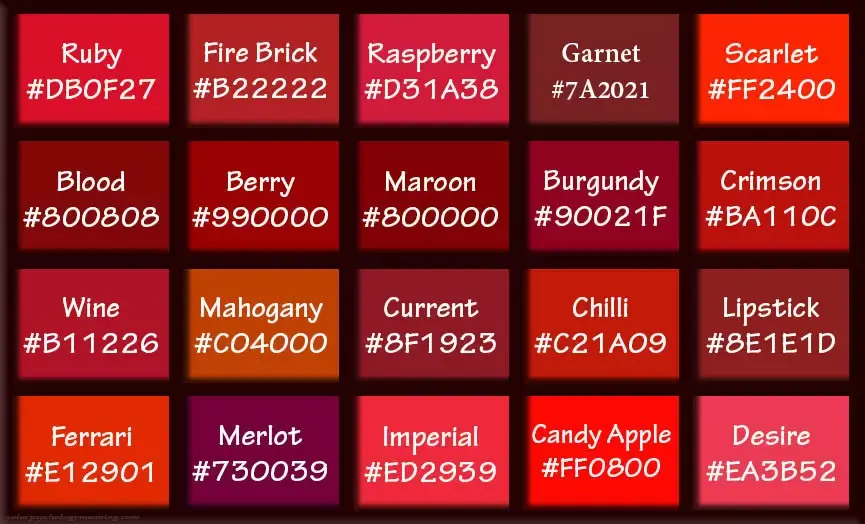
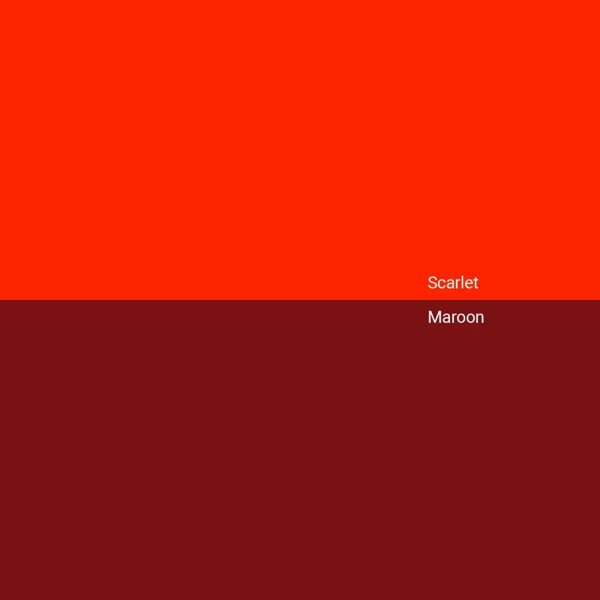
Scarlet occupies a specific position on the color wheel between pure red and orange. Unlike crimson, which contains a hint of blue or purple, scarlet is defined by its warm, sunny undertone. This distinction is vital because the presence of even a trace amount of blue will neutralize the brightness of the red, turning it into a duller maroon or burgundy shade.
The perception of scarlet is also heavily influenced by the light source under which it is viewed. In natural daylight, the orange components of the color become highly visible, giving the hue its signature glow. Under artificial, cooler lighting, the color may appear darker or more subdued. Understanding these optical properties helps artists adjust their mixtures depending on the intended final environment of their work.
- Scarlet: A bright, warm red with strong orange undertones.
- Crimson: A deep, cool red with subtle blue or violet undertones.
- Vermilion: A historically significant, opaque, and intense orange-red pigment.
- Maroon: A dark, brownish-red created by adding black or blue to red.
Best tools for color mixing
For those new to color theory, using professional-grade artist paints provides the most predictable results. Student-grade paints often contain fillers or weaker pigments that can make achieving a pure scarlet difficult. High-pigment paints, such as heavy body acrylics or professional oils, allow for cleaner color shifts and more vibrant final tones.
When mixing, the surface of your palette matters as much as the paint quality. A white or neutral gray palette is essential for accurately judging the color as you adjust the ratios. Using a palette knife rather than a brush for the initial mixing process helps keep the bristles clean and prevents the colors from becoming overworked or muddy during the blending stage.
- Use a palette knife to ensure a consistent, streak-free mixture.
- Keep a clean cloth or paper towel nearby to wipe the knife between additions.
- Test the color on a scrap piece of canvas before applying it to your final project.
- Work in a well-lit area to ensure the color balance is accurate to your eyes.
Common mistakes when mixing scarlet
The most frequent error when attempting to create scarlet is adding too much yellow, which results in a dull orange rather than a vibrant red. If the mixture starts to look like a pumpkin or a bright tangerine, you have likely exceeded the necessary amount of yellow. To correct this, simply add more of your original warm red to bring the hue back toward the red side of the spectrum.
Another common mistake is mixing colors that are not chemically compatible or are of different opacities. If you mix a transparent red with an opaque yellow, the resulting scarlet may have an uneven, streaky finish. Always try to use paints with similar consistency and opacity levels to ensure the mixture remains smooth, uniform, and easy to apply across your painting surface or project.
- Adding yellow too quickly and overshooting the desired scarlet shade.
- Introducing blue or black, which immediately kills the brightness of the red.
- Failing to mix the pigments completely, leading to visible streaks of red and yellow.
- Using cool-toned reds, which creates a muddy or brownish result instead of a clear scarlet.
How to use scarlet in design
Scarlet is a high-energy color that commands immediate attention, making it an excellent choice for focal points in design and art. Because it is so visually stimulating, it is often best used as an accent rather than a dominant background color. In interior design or graphic work, pairing scarlet with neutral tones like charcoal gray, cream, or off-white allows the color to pop without overwhelming the viewer.
When working with scarlet, consider the psychological impact of the hue. It is associated with passion, urgency, and excitement. If you want to create a sophisticated look, pair scarlet with deep navy blue or forest green to create a high-contrast, complementary scheme. By balancing the intensity of the scarlet with cooler, darker tones, you can create a professional and visually balanced composition that remains exciting while avoiding visual fatigue.
Key facts
- Scarlet is a brilliant red color that contains a subtle, secondary hint of orange.
- To mix scarlet using paint, combine a bright, warm red with a small amount of yellow.
- Use a ratio of approximately four parts red to one part yellow to achieve the correct hue.
- Avoid adding blue or black, as these will turn the scarlet into a muddy maroon or brown.
- When working with digital design, scarlet is represented by the hex code #FF2400.
- Always add the yellow to the red slowly, as a little bit of yellow significantly alters the intensity.
The bottom line
Scarlet is a vibrant, warm red that sits between pure red and orange on the color wheel. By mixing a warm-toned red with a touch of yellow, you can easily replicate this striking hue. The key to success is adding the yellow incrementally to maintain the red's dominance. Avoid cool tones to ensure your color remains bright, intense, and true to the classic scarlet appearance.
People also ask
Is scarlet the same as crimson?
No, scarlet is a warm red with orange undertones, while crimson is a deeper red with blue undertones. Crimson appears cooler and darker, whereas scarlet is vibrant and energetic.
How do I make scarlet darker?
To darken scarlet without losing its warmth, add a tiny amount of burnt umber or a deep orange. Avoid adding black, as it will quickly turn the color into a dull, flat shade.
Can I use magenta to make scarlet?
Magenta is a cool, purplish-red that will move the color toward pink or violet. Because scarlet requires a warm, orange-leaning base, magenta is the wrong starting point.
What is the difference between vermilion and scarlet?
Vermilion is a specific, historically significant pigment that is slightly more orange than standard scarlet. While they are often used interchangeably in casual conversation, vermilion is technically a brighter, more orange-heavy red.
Why does my scarlet look orange instead of red?
You likely added too much yellow to your red base. To correct this, add small amounts of your original red back into the mixture until the balance shifts toward red.
Is scarlet a primary color?
Scarlet is a secondary or tertiary color depending on the specific color model being used. It is not a primary color in the RYB, RGB, or CMYK systems, as it must be created by mixing other hues.
This answer was created with the help of AI research tools and reference sources. Spotted an error? Let us know — we correct mistakes quickly. See our editorial policy.