What is a color wheel used for?
Short answer
The color wheel is a visual tool used to organize colors based on their chromatic relationships. It helps artists, designers, and decorators select harmonious color palettes by illustrating how primary, secondary, and tertiary hues interact. By understanding these connections, users can create balanced, professional, and visually appealing compositions for any creative project.
On this page
How does the color wheel work
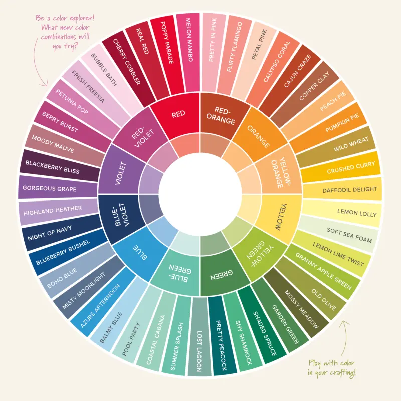
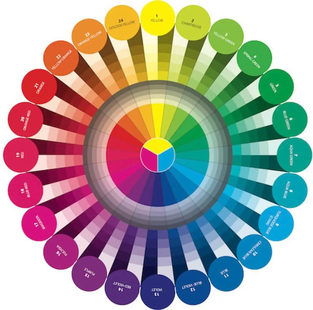
The color wheel is based on the traditional RYB (red, yellow, blue) color model, which serves as the foundation for color theory. It structures colors in a circular format to demonstrate the transition from one hue to another. At the center are the primary colors, which cannot be created by mixing other pigments. Surrounding them are secondary colors, created by mixing two primaries, and tertiary colors, formed by mixing a primary and an adjacent secondary.
This arrangement allows users to identify specific relationships between colors, known as color harmonies. These harmonies provide a scientific approach to choosing combinations that are pleasing to the eye. By visualizing these relationships, you can predict how colors will interact when placed side-by-side, whether you are painting a canvas, designing a website, or choosing an outfit.
Why use a color wheel for design
Designers rely on the color wheel to establish a mood or atmosphere in their work. Colors are broadly categorized into warm tones, like reds and yellows, which evoke energy, and cool tones, like blues and greens, which suggest calmness. Using the wheel ensures that your chosen palette maintains the desired emotional impact without feeling chaotic or disjointed.
Beyond mood, the wheel helps maintain visual balance and contrast. It prevents designs from looking flat by guiding the user toward complementary or analogous pairings. Whether you are a graphic designer or a home decorator, the wheel provides a reliable framework for decision-making.
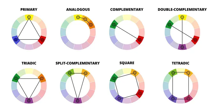
- Complementary: Colors directly opposite each other on the wheel, providing high contrast.
- Analogous: Colors located next to each other, creating a harmonious and serene feel.
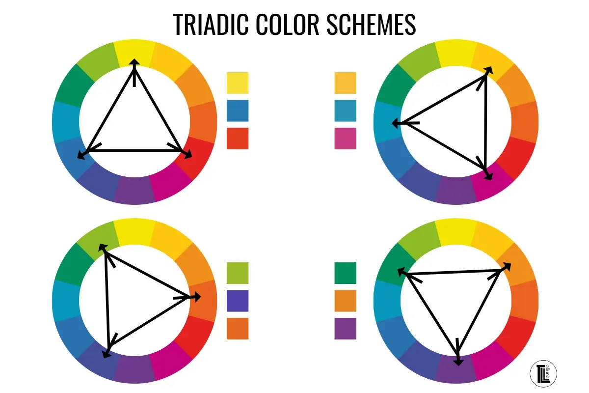
- Triadic: Three colors evenly spaced around the wheel, offering a vibrant, balanced palette.
- Monochromatic: Variations of a single hue, providing a sophisticated and unified look.
How to choose a color scheme
Selecting a color scheme is a systematic process that begins with identifying a base color. Once you have your primary focus, the color wheel helps you find supporting shades that enhance your design. You can use the wheel to experiment with different combinations before committing to a final selection.
- Select your dominant color to set the primary tone of the project.
- Choose a color harmony, such as complementary or split-complementary, to determine your secondary colors.
- Adjust the saturation and brightness of your chosen hues to add depth and prevent the design from appearing too uniform.
- Test the combination by placing the colors in a mock-up to see how they interact in a real-world application.
Common mistakes when using color
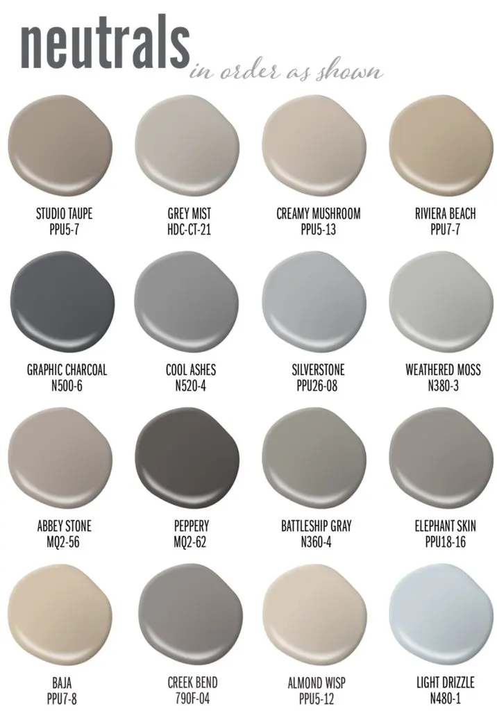
One frequent error is failing to account for the intensity of colors. Beginners often choose colors that are all at maximum saturation, which can create visual fatigue and make a design feel overwhelming. It is important to balance bold, saturated colors with more muted or neutral tones to give the eye a place to rest.
Another mistake is ignoring the context of the environment. A color that looks vibrant on a small swatch may appear aggressive when applied to a large wall or a full-screen background. Always consider the scale of your project and the lighting conditions where the colors will be viewed.
- Overusing high-contrast colors in small spaces, which can make them feel cluttered.
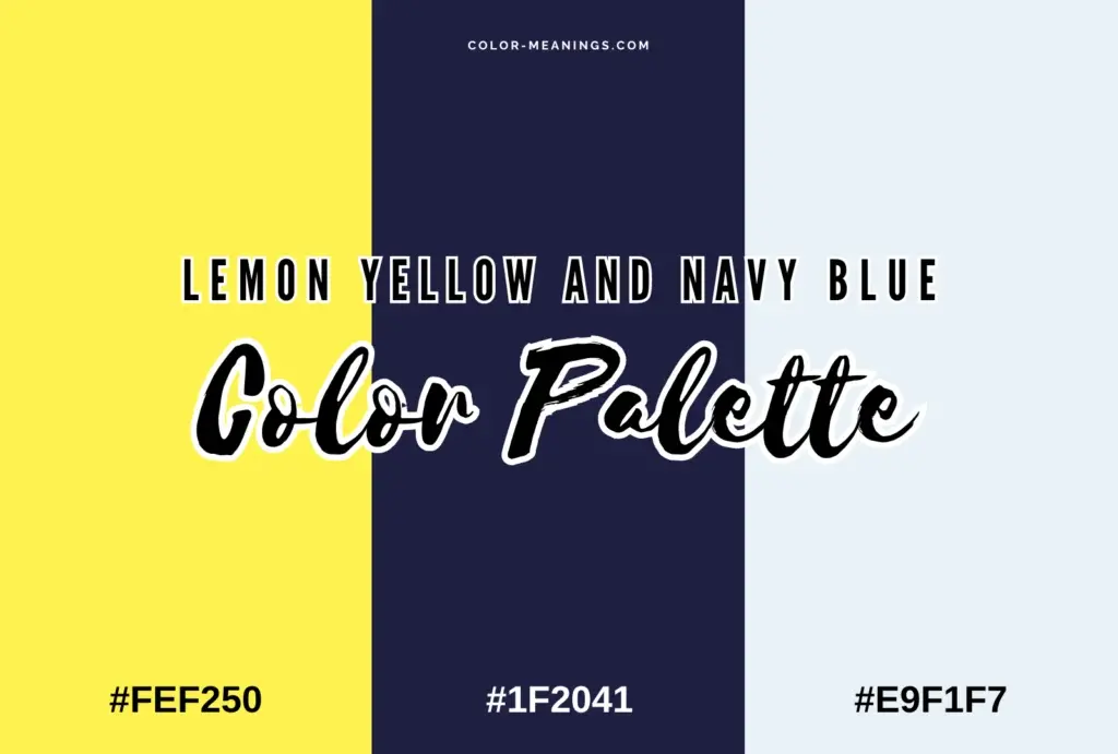
- Neglecting the 60-30-10 rule, which suggests using 60% of a dominant color, 30% of a secondary color, and 10% of an accent color.
- Choosing colors based solely on personal preference without considering the intended message or audience.
Best color wheel practices for beginners
For those new to color theory, the best approach is to start simple. Do not attempt to use too many colors at once; a palette of two or three colors is often more effective than a complex arrangement. By limiting your choices, you can focus on the relationships between the colors and learn how they influence the overall composition.
As you gain confidence, you can begin to incorporate more complex harmonies and experiment with different tints and shades. Keep a physical or digital color wheel handy as a reference guide during your creative process. With consistent practice, you will develop an intuitive sense of color that allows you to make professional, aesthetically pleasing choices for any project you undertake. Remember that color is subjective, but the wheel provides the objective structure needed to ensure your work is balanced, purposeful, and visually successful.
Key facts
- The color wheel was first developed by Sir Isaac Newton in 1666 by mapping the visible light spectrum onto a circle.
- Primary colors—red, yellow, and blue—are the foundation colors that cannot be created by mixing other pigments.
- Complementary colors sit directly opposite each other on the wheel to create high-contrast, vibrant visual effects.
- Analogous colors are located next to each other on the wheel and create a harmonious, serene aesthetic.
- A split-complementary scheme uses a base color plus the two colors adjacent to its direct opposite for balanced contrast.
- Designers use the wheel to ensure color balance, preventing designs from feeling chaotic or visually overwhelming.
The bottom line
The color wheel is an essential tool for artists, designers, and decorators to understand the relationships between colors. By utilizing established schemes like complementary or analogous palettes, you can create professional visual results with ease. Avoid the common mistake of overusing bright, saturated colors; instead, focus on balancing hues and values to ensure your finished work remains visually appealing, harmonious, and effective for your intended audience.
People also ask
How do I choose a color scheme for a room?
Start by picking one dominant color, then use the wheel to find a secondary color for balance. Use a triad scheme for a bold look or an analogous scheme for a calm, cohesive environment.
What is the difference between hue, saturation, and value?
Hue refers to the actual color name, saturation represents the intensity or purity of that color, and value describes how light or dark the color appears. These three elements help refine your final palette.
Can the color wheel help with digital design?
Yes, digital software tools often use the color wheel to help designers select hex codes that adhere to specific color theories. It ensures that text remains readable against background colors.
What are warm and cool colors?
Warm colors include reds, oranges, and yellows, which evoke energy and heat. Cool colors include blues, greens, and purples, which are typically associated with tranquility and distance.
Why do some colors look bad together?
Colors often clash when they share similar values but lack a clear relationship on the wheel. Using too many high-intensity colors at once can also cause visual fatigue for the viewer.
Is the color wheel the same for light and paint?
No, light uses the RGB (Red, Green, Blue) additive model, while paint uses the RYB (Red, Yellow, Blue) or CMYK (Cyan, Magenta, Yellow, Key/Black) subtractive models. Each system has its own wheel structure.
This answer was created with the help of AI research tools and reference sources. Spotted an error? Let us know — we correct mistakes quickly. See our editorial policy.