What is the history of the color blue in art?
Short answer
Blue was historically the most expensive and elusive pigment in art due to the scarcity of lapis lazuli. Early civilizations utilized synthetic Egyptian blue, but true brilliance remained rare until the Renaissance. Over centuries, chemical innovations transformed blue from a luxury reserved for royalty into an accessible, versatile staple for modern artists.
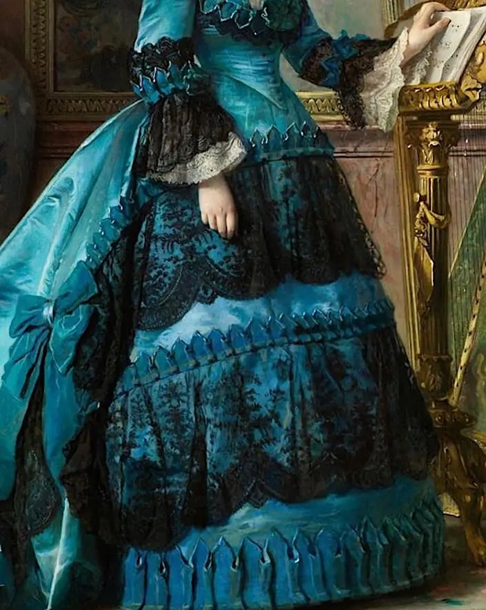
On this page
Why was blue so expensive in art history?
For much of human history, blue was a rare and precious commodity. Unlike earth tones like ochre or iron oxide, natural blue pigments were difficult to source. The most prized variety, ultramarine, was derived from the semi-precious stone lapis lazuli, which was mined exclusively in the mountains of modern-day Afghanistan. Transporting this stone across the Silk Road to Europe made it incredibly costly, often exceeding the price of gold.
Because of this expense, Renaissance painters typically reserved ultramarine for the most significant subjects. It was most commonly used to depict the robes of the Virgin Mary, signifying her status and divinity. Artists often required patrons to pay for the pigment upfront, or they used cheaper alternatives like azurite, which was more abundant but less stable. This economic barrier meant that blue was not just a color, but a visual marker of extreme wealth and spiritual importance.
How did ancient civilizations create blue pigments?
Before the widespread trade of lapis lazuli, ancient cultures engineered their own solutions. The Egyptians are credited with creating the world's first synthetic pigment, known as Egyptian blue, around 2500 BCE. By heating a mixture of silica, copper, and calcium, they produced a durable, glass-like substance that could be ground into a vibrant powder. This innovation allowed blue to be used in tomb paintings, ceramics, and statuary across the Mediterranean.
Other cultures turned to botanical sources, such as woad and indigo. While these dyes were effective for textiles, they were notoriously difficult to use in traditional painting because they lacked the opacity of mineral pigments. Artists had to develop complex binding techniques to make these organic blues adhere to surfaces. These early methods laid the groundwork for chemical experimentation, proving that blue was a color worth pursuing despite the technical challenges of its synthesis.
- Woad: A European plant used since the Iron Age to produce a muted, earthy blue.
- Indigo: A tropical plant that provided a much deeper, more intense blue than woad.
- Egyptian Blue: A calcium copper silicate manufactured by heating mineral ingredients to high temperatures.
- Azurite: A natural copper carbonate mineral that was the most common blue in medieval European art.
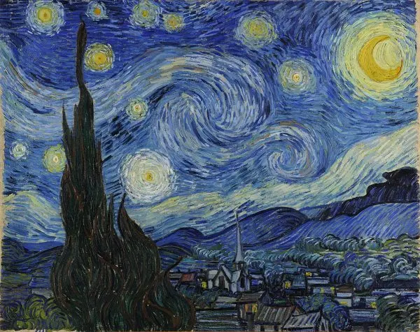
When did synthetic blue pigments change painting?
The 18th and 19th centuries marked a turning point in the history of color. In 1704, a German chemist accidentally created Prussian blue while attempting to make a red pigment. This was the first modern synthetic pigment, and its affordability revolutionized the art world. Suddenly, artists had access to a deep, reliable blue that did not require the exorbitant cost of lapis lazuli.
Following this breakthrough, the development of artificial ultramarine in 1826 further democratized the color. French chemist Jean-Baptiste Guimet successfully replicated the chemical structure of natural lapis lazuli, creating a pigment that was chemically identical to the expensive stone but a fraction of the price. This shift allowed Impressionist and Post-Impressionist painters to use blue with newfound freedom. Artists like Claude Monet and Vincent van Gogh began using blue not just for religious icons, but to capture the atmosphere, light, and emotional depth of the natural world.
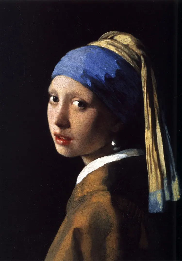
How do artists use blue effectively today?
Modern artists utilize a vast spectrum of blues, ranging from warm, violet-leaning shades to cool, greenish tones. Understanding the temperature of a blue pigment is essential for color mixing. Warm blues, such as cerulean, contain traces of yellow or red, while cool blues, like phthalo blue, lean toward green. Mastering this distinction prevents muddy colors when mixing greens or purples.
When working with blue, consider these practical techniques to ensure professional results:
- Test the transparency of your pigment; some blues are staining and can quickly overwhelm a palette.
- Use a limited palette to understand how your specific blue interacts with different yellows and reds.
- Consider the drying time, as some synthetic blues may remain tacky longer than others.
- Always clean brushes thoroughly, as high-tinting blues can easily contaminate other colors.
Common mistakes when painting with blue
A frequent error for beginners is over-relying on a single tube of blue for every shadow or sky. This often leads to a flat, monotonous appearance. Instead, artists should look for the subtle variations in temperature within a blue subject. A sky, for instance, rarely consists of one flat color; it often shifts from a warm, pale blue near the horizon to a deeper, cooler blue at the zenith.
Another common mistake is failing to account for the "tinting strength" of modern synthetic blues. Pigments like phthalo blue are incredibly powerful and can turn an entire mixture into an unusable dark shade with just a tiny amount. It is better to add these pigments gradually to a base color rather than adding the base to the blue. By exercising restraint and observing the subtle shifts in nature, artists can harness the full potential of this historically significant color to create depth, mood, and movement in their work.
Key facts
- Ancient Egyptians were the first to manufacture a synthetic pigment, "Egyptian blue," by heating silica, copper, and calcium around 2200 BCE.
- Lapis lazuli, a semi-precious stone mined in Afghanistan, was the primary source of ultramarine pigment until the 19th century.
- During the Middle Ages, ultramarine was more expensive than gold, leading artists to reserve it for the robes of the Virgin Mary.
- Prussian blue, discovered accidentally in 1704 by Johann Jacob Diesbach, became the first modern synthetic blue pigment.
- Yves Klein patented "International Klein Blue" in 1960, a matte ultramarine designed to maintain the pigment's intensity without a binder.
- To avoid muddy colors, always mix blue pigments with complementary oranges or yellows in small increments to control the saturation level.
The bottom line
The history of blue in art is a transition from a rare, precious luxury to a widely accessible tool for expression. From the synthetic innovations of the Egyptians to the industrial revolution of modern pigments, blue has evolved from a symbol of divinity to a versatile element of color theory. Understanding its rich, complex heritage allows artists to better utilize its psychological and aesthetic power today.
People also ask
Why was blue so rare in ancient art?
Blue is remarkably scarce in nature compared to earth tones, and creating a stable, vibrant blue pigment required advanced chemical knowledge. Most ancient civilizations lacked the technology to extract or synthesize blue, often relying on charcoal, ochre, or red iron oxides instead.
How did the Renaissance change the use of blue?
The Renaissance saw the rise of ultramarine as a status symbol, with patrons often specifying the amount of expensive pigment to be used in contracts. This led to a hierarchy where blue was reserved for the most sacred or wealthy subjects in a painting.
What is the difference between ultramarine and cobalt blue?
Ultramarine is a deep, warm blue with a slight reddish undertone, historically derived from lapis lazuli. Cobalt blue, introduced in 1802, is a cooler, brighter pigment that is more opaque and significantly more affordable for artists.
Why did Picasso have a "Blue Period"?
Between 1901 and 1904, Pablo Picasso used a monochromatic palette of blue and blue-green to express themes of poverty, loneliness, and melancholy. This period was influenced by the suicide of his friend Carlos Casagemas and the artist's own struggles in Paris.
How do I choose the right blue for my painting?
Choose a "warm" blue like ultramarine for shadows or receding backgrounds, and a "cool" blue like cerulean or phthalo for bright skies and water. Testing your pigments on a scrap canvas first helps you see how they interact with your specific white base.
What is the most common mistake when mixing blue paint?
Adding too much white or black to a blue pigment is a common error that creates a flat, chalky, or dull appearance. Instead, try adjusting the temperature by adding a touch of yellow to green the blue or a touch of red to warm it.
This answer was created with the help of AI research tools and reference sources. Spotted an error? Let us know — we correct mistakes quickly. See our editorial policy.