What colors make charcoal gray?
Short answer
Charcoal gray is created by mixing black with white, often tinted with small amounts of blue or brown to achieve depth. Because charcoal is a neutral dark tone, artists typically combine complementary colors—such as orange and blue—to create a rich, chromatic black that serves as a sophisticated base for gray.

On this page
What colors make charcoal gray?
At its core, charcoal gray is a desaturated, dark shade of gray that leans toward black. While a basic mix of black and white paint produces a standard gray, this often results in a flat, lifeless color. To achieve the nuanced, complex look of charcoal, artists frequently mix complementary colors like burnt umber and ultramarine blue. This combination creates a "chromatic black" that feels more natural and organic than a tube of pure carbon black.
When you mix these complementary colors, they neutralize each other, effectively canceling out the vibrancy of both pigments. By adjusting the ratio of these colors, you can shift the charcoal toward a warmer or cooler undertone. Adding a touch of white to this mixture lightens the value, revealing the subtle blue or brown undertones that define authentic charcoal gray. This method provides far more versatility than simply diluting black paint.
How to mix charcoal gray with paint
Achieving the perfect charcoal shade requires a methodical approach to color theory and pigment ratios. Start with a small amount of dark pigment and gradually introduce the lighter components to maintain control over the final value. If you are working with acrylics or oils, the following steps will help you establish a consistent, professional-grade charcoal gray for your projects:
- Start with a base of ultramarine blue or a deep, dark brown like burnt umber.
- Slowly add a small amount of the opposite color to neutralize the intensity.
- Incorporate a tiny amount of black pigment if you require a deeper, more shadow-like tone.
- Add white paint in very small, incremental amounts until you reach the desired level of lightness.
- Test the color on a scrap piece of paper or canvas, as colors often dry differently than they appear when wet.
Why charcoal gray looks different in light
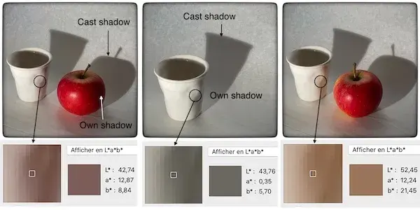
The appearance of charcoal gray is highly dependent on the light source and the surrounding environment. Because charcoal is a dark, neutral color, it absorbs a significant amount of light, making it sensitive to the color temperature of its surroundings. Under cool, fluorescent lighting, a charcoal gray mixed with blue undertones will appear sharper and more intense. Conversely, in warm, incandescent light, the same color may appear softer and more muted.
This phenomenon occurs because gray acts as a chameleon in a composition. If you place a charcoal gray next to a vibrant yellow, the gray will appear to take on a slight violet tint due to simultaneous contrast. Understanding how your charcoal gray interacts with adjacent colors is essential for achieving balance in painting or interior design. Always view your color samples in the specific lighting conditions where they will be displayed to ensure the intended effect is achieved.
Common mistakes when mixing charcoal gray
Many beginners struggle with charcoal gray because they rely too heavily on black paint. Using pure black straight from the tube often leads to a "muddy" or "dead" appearance, as it lacks the chromatic depth found in nature. Another common error is adding too much white too quickly. Once you add white to a dark mixture, it is difficult to darken it again without using a large amount of additional pigment, which can lead to wasted materials.
- Avoid over-mixing the pigments, which can lead to a flat, uniform color that lacks character.
- Do not ignore the importance of the color’s temperature; always decide if you want a warm (brown-leaning) or cool (blue-leaning) charcoal before you begin.
- Refrain from using cheap, low-pigment paints, as these often contain fillers that make the gray look chalky or thin.
- Steer clear of using too many different colors at once, as this often results in an unpredictable, muddy brown rather than a clean charcoal.
Best tools for color mixing
To achieve professional results, the quality of your tools is just as important as the pigments themselves. Using a glass or plastic palette allows you to see the true color of your mixture without the interference of a wooden surface. A stainless steel palette knife is superior to a brush for mixing, as it prevents paint from getting trapped in the bristles and allows for a more thorough, consistent blend of the pigments.
When selecting your pigments, aim for high-quality artist-grade paints with high pigment loads. These paints offer better tinting strength, meaning you need less product to achieve a deep, rich charcoal. If you are working digitally, the process is simpler but relies on the same principles of hue, saturation, and value. In digital software, you can achieve charcoal by selecting a dark neutral and reducing the saturation to near zero, then adjusting the brightness until the color matches your target charcoal gray.
Key facts
- Charcoal gray is a neutral, dark shade created by mixing black with a small amount of white, often tinted with blue or brown.
- To achieve a "cool" charcoal, mix black paint with a touch of ultramarine blue or phthalo blue.
- To achieve a "warm" charcoal, incorporate a small amount of burnt umber or raw sienna into your black base.
- Always start with a large amount of white or a neutral gray base and add black incrementally to avoid over-darkening the mixture.
- Avoid using pure tube black if you want depth; mixing complementary colors like burnt umber and ultramarine creates a more complex, "chromatic" black.
- Test your color on a scrap piece of paper and let it dry completely, as acrylics and oils often shift in value once the binder sets.
The bottom line
Charcoal gray is a versatile, sophisticated neutral achieved by balancing black with white and subtle chromatic undertones. Whether you prefer a cool blue-leaning shade or a warm, earthy variant, the key lies in incremental mixing and testing. By avoiding over-saturation and understanding how light interacts with your chosen finish, you can master this timeless color for any artistic project or interior design application.
People also ask
Is charcoal gray the same as slate gray?
No, slate gray typically contains more blue or green undertones, whereas charcoal gray is primarily a deep, smoky neutral based on black.
Why does my charcoal mixture look muddy?
Muddy colors occur when you mix too many complementary colors together or use low-quality, opaque pigments that lack transparency.
Can I use charcoal gray for interior walls?
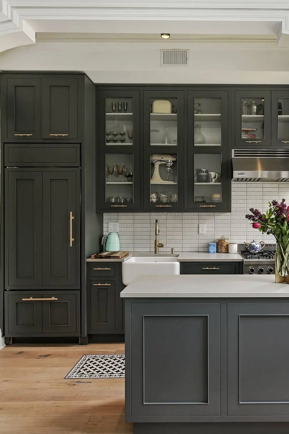
Yes, charcoal gray is a popular choice for accent walls because it provides a sophisticated, moody backdrop that makes lighter furniture stand out.
How do I lighten charcoal gray without making it look chalky?
Instead of adding pure white, which can create a flat, chalky appearance, try adding a tiny amount of yellow or a warm gray to maintain richness.
What is the difference between charcoal and graphite?
Charcoal is a matte, carbon-based pigment often used in drawing, while graphite is a crystalline form of carbon that has a metallic, reflective sheen.
Does the surface texture affect how charcoal gray looks?
Absolutely, as matte surfaces absorb light and make the color appear darker, while glossy surfaces reflect light and make the gray seem lighter.
This answer was created with the help of AI research tools and reference sources. Spotted an error? Let us know — we correct mistakes quickly. See our editorial policy.