What colors make a shadow color?
Short answer
Shadows are rarely pure black or gray; they are typically desaturated, cooler versions of the object's local color. To mix a realistic shadow, combine the object's base hue with its complementary color to neutralize it, then add a touch of blue or violet to shift the temperature toward a cooler, more natural tone.
On this page
Why do shadows have color?
Shadows are not simply the absence of light; they are areas where direct illumination is blocked, leaving only reflected ambient light to reach the surface. Because ambient light often picks up colors from the surrounding environment—such as the blue of the sky or the green of nearby foliage—shadows inherit these subtle chromatic influences. This phenomenon, known as color interaction, ensures that shadows feel integrated into a scene rather than appearing as flat, dead patches of black paint.
In physics, shadows are influenced by the color temperature of the light source. Warm sunlight typically casts shadows that lean toward cool, bluish tones, while cool indoor lighting often results in warmer, brownish shadows. By observing the environment, artists can identify these shifts in temperature. Understanding that shadows are "colored" rather than "black" is the fundamental leap required to transition from basic drawing to sophisticated, realistic color theory in painting and design.
How to mix shadow colors for painting
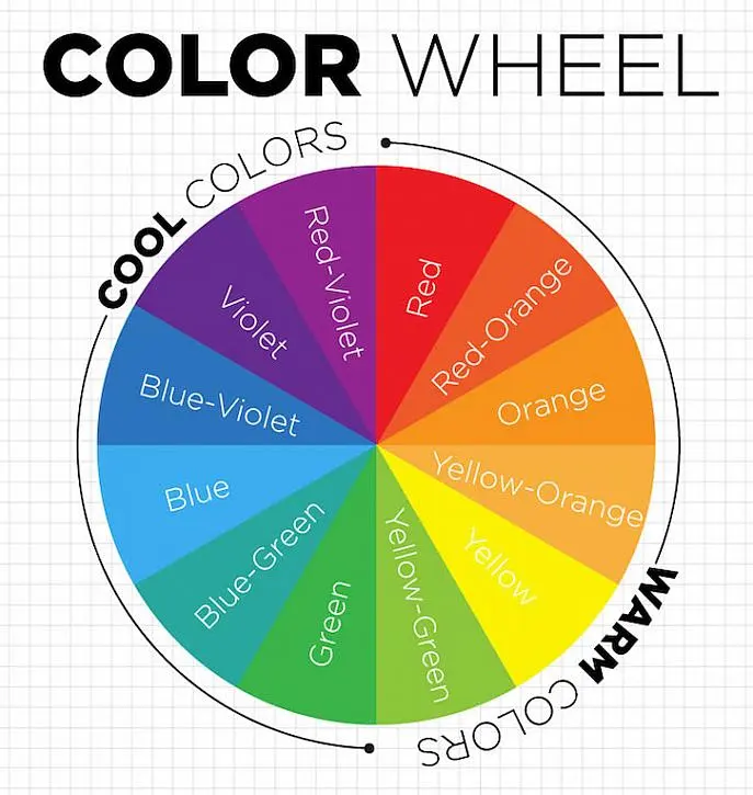
Mixing an effective shadow color requires balancing the base hue with its opposite on the color wheel to reduce its intensity. This process, called desaturation, prevents the shadow from looking like a vibrant, distracting color while maintaining its relationship to the object. Once the color is neutralized, you can adjust the temperature to match the lighting conditions of your specific composition.
Follow these steps to mix a professional-grade shadow:
- Identify the base color of the object you are painting.
- Mix in a small amount of the object's complementary color (the color directly across from it on the color wheel).
- Add a touch of blue, violet, or cool gray to shift the temperature toward a cooler tone.
- Test the mixture against your base color to ensure it is darker and less saturated.
Best tools for identifying shadow hues
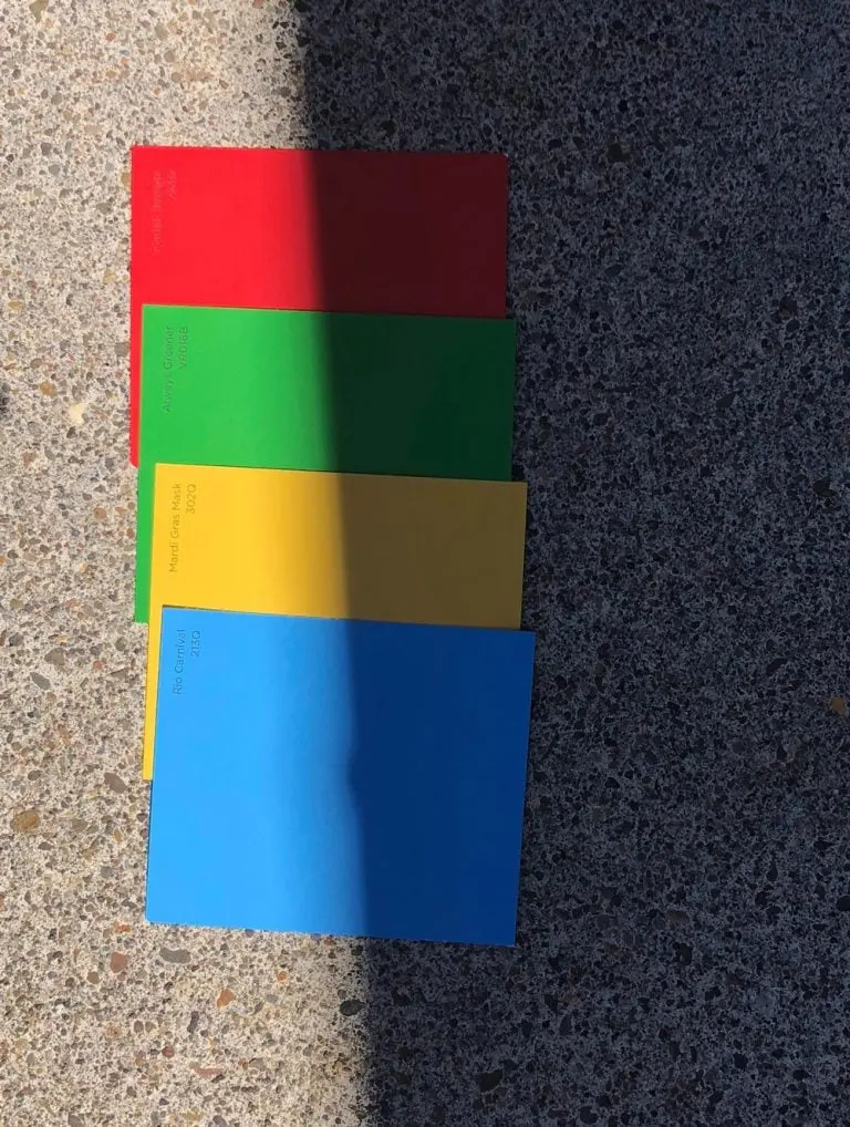
To accurately perceive shadow colors, you must learn to look past the "local color"—the color an object appears to be in neutral, white light. Many artists use a viewfinder or a small piece of gray card with a hole cut in the center to isolate colors from their surroundings. This technique removes the brain's tendency to "correct" colors, allowing you to see the actual hue present in a shadow.
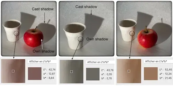
Digital tools also offer significant advantages for learning color relationships. Using a digital color picker on a high-quality photograph allows you to analyze the exact RGB or HSL values of a shadow. You will frequently find that even the darkest shadows contain high levels of blue or purple, confirming that true black is rarely found in nature. By practicing with these tools, you train your eyes to recognize the subtle chromatic shifts that occur in everyday light.
Common mistakes when painting shadows
A frequent error is relying on black paint straight from the tube to create shadows. Pure black often looks flat, muddy, and disconnected from the rest of the canvas because it lacks the chromatic depth found in natural light. When you use black without modification, you create a "hole" in your painting that draws the eye away from the focal point. Always mix your darks using primary colors or earth tones to ensure they harmonize with the light.
Another mistake is making shadows too uniform in color. Shadows are rarely a single, flat shade; they often contain "reflected light" where color bounces back into the shadow from nearby surfaces. For example, a shadow cast on a red floor will likely have a reddish glow on its edge. Avoid these pitfalls by:
- Avoiding the use of pure, unmixed black paint.
- Checking for color shifts at the edges of the shadow.
- Ensuring the shadow's value (darkness) is significantly lower than the illuminated areas.
How to use light to influence shadow color
The color of your light source dictates the overall temperature of your shadows. In a landscape, the sun acts as a warm light source, which pushes shadows toward the cool end of the spectrum. Conversely, if you are painting a scene lit by a warm candle or a yellow lamp, the shadows will appear cooler by contrast. Mastering this push-and-pull relationship between light and shadow is essential for creating a sense of three-dimensional volume.
To master this balance, consider the time of day and the environment. During the "blue hour" of twilight, the ambient light is cool, which can actually make shadows appear warmer than the light source itself. By constantly questioning the source of your light and the reflective qualities of the surfaces around your subject, you can create shadows that feel alive. This level of attention to detail transforms a simple illustration into a compelling, believable representation of reality that resonates with the viewer's own experiences of light.
Key facts
- Shadows are rarely pure black; they contain reflected light and ambient color from the surrounding environment.
- To create a realistic shadow, mix your base color with its complement (the color directly opposite on the color wheel).
- Adding a touch of blue or violet to a neutral gray makes a shadow appear "cool," which is common in outdoor daylight.
- Avoid using pure black paint to darken colors, as it often makes the result look muddy or flat.
- Warm light sources, such as sunset or candlelight, produce shadows that lean toward cool, desaturated blues or greens.
- Use a "chromatic black" by mixing deep ultramarine blue and burnt umber to create a rich, versatile shadow tone.
The bottom line
Creating realistic shadows is less about using black and more about understanding the relationship between light and color. By utilizing complementary colors, you can add depth and temperature to your work. Always observe the ambient light in your environment, as shadows act as mirrors for the colors around them. Mastering these subtle shifts in hue will elevate your art from flat illustrations to professional, dimensional compositions.
People also ask
Why do shadows sometimes look blue?
Shadows often appear blue because they are illuminated by the ambient light of the sky rather than the direct light source. This phenomenon is particularly noticeable in snow or on bright, clear days.
Should I use white to lighten a shadow?
You should generally avoid using white to lighten shadows, as it creates a chalky, opaque look that kills transparency. Instead, use more of the base color or a lighter, warmer hue to maintain the shadow's depth.
What is the difference between a core shadow and a cast shadow?
A core shadow is the darkest area on the object itself, while a cast shadow is the shape projected onto a surface. Both require careful color observation to reflect the local environment.
How do I keep my shadow colors from looking muddy?
Muddy colors occur when you mix too many complementary colors together at once. Stick to a limited palette and ensure your brushes are clean to maintain color clarity.
Do indoor shadows have different colors than outdoor shadows?
Indoor shadows are influenced by artificial light and bounce light from walls or furniture. They often appear warmer or more neutral compared to the cool, expansive shadows found outdoors.
Can I use purple to shade yellow objects?
Yes, purple is the complement of yellow and is the most effective color for creating a natural-looking shadow. It provides a vibrant contrast that makes the yellow appear more luminous.
This answer was created with the help of AI research tools and reference sources. Spotted an error? Let us know — we correct mistakes quickly. See our editorial policy.