What does the color yellow mean in art?
Short answer
Yellow represents a spectrum of meanings in art, ranging from divinity, warmth, and prosperity to betrayal, sickness, and madness. As the most luminous color in the visible spectrum, it commands immediate attention. Artists use it to evoke joy, highlight focal points, or introduce psychological tension depending on the specific hue and context.
On this page
Why artists use yellow in paintings
Yellow is the most visible color to the human eye, making it a powerful tool for directing a viewer’s gaze. In religious art, particularly during the Middle Ages and the Renaissance, gold and yellow were used to represent divine light, holiness, and the radiance of heaven. Artists often applied gold leaf to halos to signify a subject’s proximity to the sacred, elevating the status of figures like the Virgin Mary or Christ.
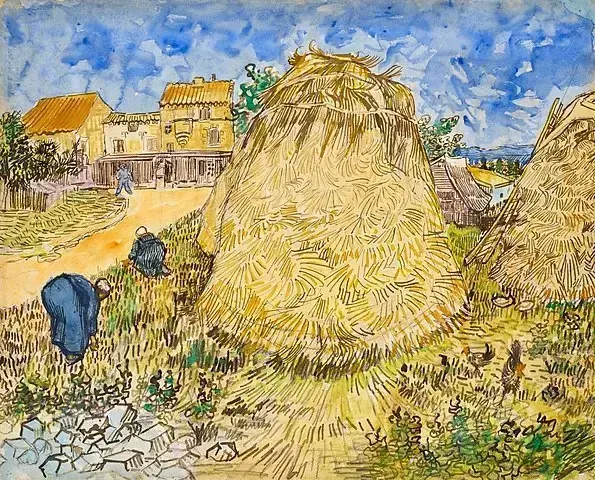
Beyond the spiritual, yellow is intrinsically linked to the sun and warmth. Impressionist painters, such as Claude Monet and Vincent van Gogh, utilized vibrant yellows to capture the intensity of natural light and the heat of summer landscapes. By placing yellow next to its complementary color, violet, artists can create a high-contrast effect that makes the composition appear to vibrate with energy. This technique remains a fundamental principle for creating depth and luminosity in contemporary color theory.
How color symbolism changes over time
The meaning of yellow has shifted dramatically throughout history, often oscillating between positive and negative associations. In many ancient cultures, it was a color of status and power, reserved for royalty or high-ranking officials. However, by the late Middle Ages in Europe, yellow began to take on darker connotations. It was frequently used in iconography to identify social outcasts, such as Judas Iscariot, who was often depicted wearing yellow robes to signify his betrayal of Christ.
This duality persists in modern visual language. While we associate yellow with happiness, caution, and optimism, it can also signal decay or toxicity. Consider these common historical shifts:
- Ancient Egypt: Yellow represented gold and eternal life, associated with the skin of the gods.
- Medieval Europe: Yellow became a marker for outsiders, including those suffering from the plague or religious minorities.
- 19th Century: The rise of synthetic pigments like Chrome Yellow allowed artists to experiment with bolder, more unsettling shades.
- Modern Era: Yellow is standardized as a color of warning, seen in road signs and hazard markers.
Best techniques for mixing yellow paint
Working with yellow requires careful preparation because it is the most transparent and delicate of the primary colors. Because yellow pigments often have low tinting strength, they are easily overwhelmed by darker colors like blue or red. To maintain the brilliance of a yellow hue, artists should always start with a clean palette and a fresh brush. Even a tiny trace of black or purple can turn a bright yellow into a muddy, dull olive tone.
If you are looking to create a specific mood, follow these steps to achieve the right consistency and shade:
- Start with a high-quality, opaque yellow pigment like Cadmium Yellow for a solid, light-fast base.
- Mix in small amounts of white to increase the opacity and "glow" of the color.
- Use thin glazes of transparent yellow over a white ground to create a stained-glass effect.
- Experiment with warm (red-leaning) yellows for foreground elements and cool (green-leaning) yellows for distant, atmospheric light.
Common mistakes when using yellow
The most frequent error beginners make is over-mixing yellow with other colors, which inevitably leads to a "dirty" appearance. Because yellow is so light, it acts as a sponge for other pigments; if you add too much blue, you will lose the yellow entirely and be left with a flat green. To avoid this, always add the darker color into the yellow in tiny increments rather than the other way around.
Another mistake is failing to consider the surrounding colors. Yellow is highly reactive to its environment, meaning it will shift in appearance depending on what is placed next to it. If you place a bright yellow next to a neutral gray, the yellow will appear much more intense than if it were placed next to an orange. Always test your color swatches on a scrap piece of canvas before applying them to your final work. This ensures the yellow maintains the intended temperature and brightness throughout the painting process.
How to use yellow for emotional impact
Yellow is an effective tool for manipulating the viewer's emotional response within a composition. Because it is physically stimulating, it can be used to create a sense of urgency or high-energy chaos. Van Gogh famously used yellow to express his internal psychological state, particularly in his later works where the color takes on a frantic, almost overwhelming quality. By saturating a canvas with yellow, an artist can evoke feelings of intense heat, sensory overload, or even madness.
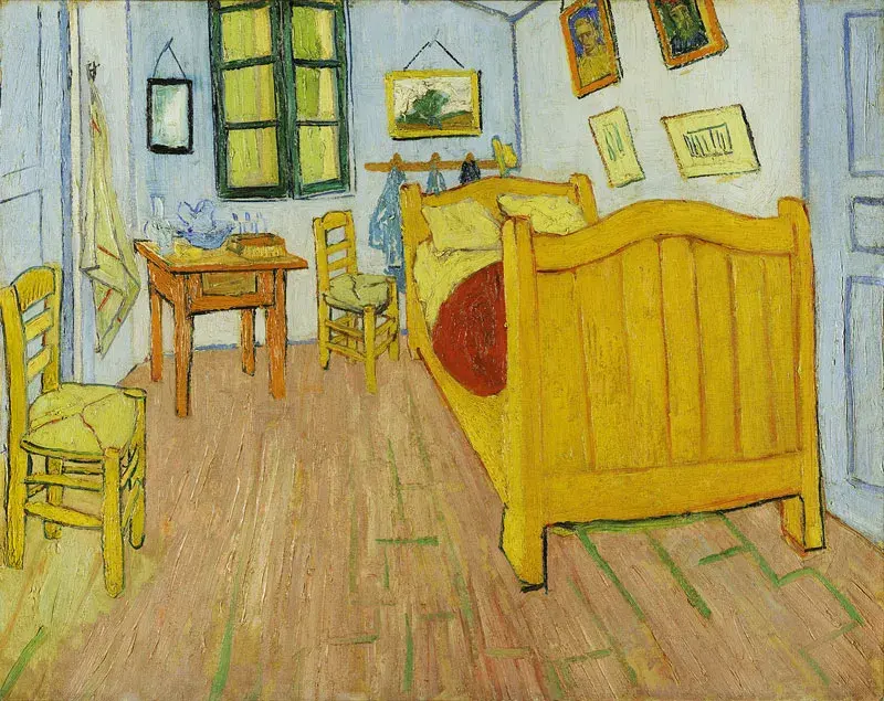
Conversely, muted, earthy yellows—such as ochre or raw sienna—provide a sense of stability, harvest, and groundedness. These shades are frequently used in portraiture or interior scenes to create a warm, inviting atmosphere. When choosing a yellow for your work, consider the following emotional goals:
- Use bright, saturated yellows to draw attention to a focal point or convey joy.
- Use pale, creamy yellows to suggest softness, morning light, or vulnerability.
- Use deep, golden yellows to evoke feelings of wealth, maturity, or the passage of time.
- Use acidic, greenish-yellows to create feelings of discomfort, sickness, or artificiality.
Key facts
- Yellow is the most luminous color in the visible spectrum, making it the first color the human eye processes.
- Historically, artists used yellow ochre, a natural earth pigment, as one of the earliest colors in cave paintings dating back 17,000 years.
- In color theory, yellow is a primary color that represents warmth, energy, and optimism, though it can also signal caution or decay.
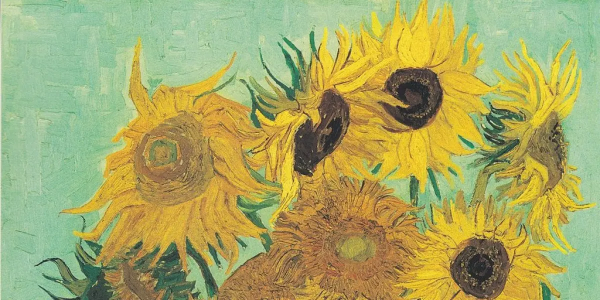
- Vincent van Gogh frequently used chrome yellow in his Sunflowers series (1888) to evoke intense emotional vitality and light.
- To mix a vibrant yellow, avoid adding too much blue, which quickly turns the hue into a muddy green or olive.
- When painting, apply yellow over a white primer to maintain its brilliance, as yellow pigments are often transparent and lose intensity over dark backgrounds.
The bottom line
Yellow is a powerful, high-energy tool in an artist's palette, serving as both a source of luminosity and a complex symbol of cultural history. By understanding its transparency and optical intensity, artists can manipulate depth and emotional resonance in their work. Whether used to capture the warmth of sunlight or to denote symbolic meaning, yellow remains a vital, attention-grabbing primary color in visual storytelling.
People also ask
Why is yellow sometimes associated with cowardice or betrayal in art?
During the Middle Ages and Renaissance, yellow became linked to negative traits like deceit or heresy. This association often stemmed from the use of "saffron" or "dirty" yellow shades to mark outcasts or Judas Iscariot in religious paintings.
How do I choose the right shade of yellow for a composition?
Consider the temperature of the color; cool yellows contain a hint of green, while warm yellows lean toward orange. Use cool yellows for highlights and warm yellows to create a sense of sunlight or heat.
Does yellow have different meanings in Eastern and Western art?
Yes, in many Western traditions, yellow is associated with light and divinity. Conversely, in ancient Chinese culture, yellow was the imperial color, representing the center of the universe and the earth.
Why does yellow paint often look different once it dries?
Many yellow pigments are prone to shifting as they cure, especially oil-based paints which can yellow further due to the linseed oil binder. Always test your paint on a scrap surface to see how it looks once fully dry.
Can yellow be used to create depth in a painting?
Because yellow is high-value and advances toward the viewer, it is excellent for creating focal points. Use it sparingly in the foreground to draw the eye, but avoid overusing it as it can overwhelm cooler background colors.
What is the most common mistake when using yellow in a painting?
A frequent error is applying yellow directly over a dark base without a white underpainting. This causes the pigment to appear dull or murky because yellow lacks the opacity to cover darker tones effectively.
This answer was created with the help of AI research tools and reference sources. Spotted an error? Let us know — we correct mistakes quickly. See our editorial policy.