What colors make blue?
Short answer
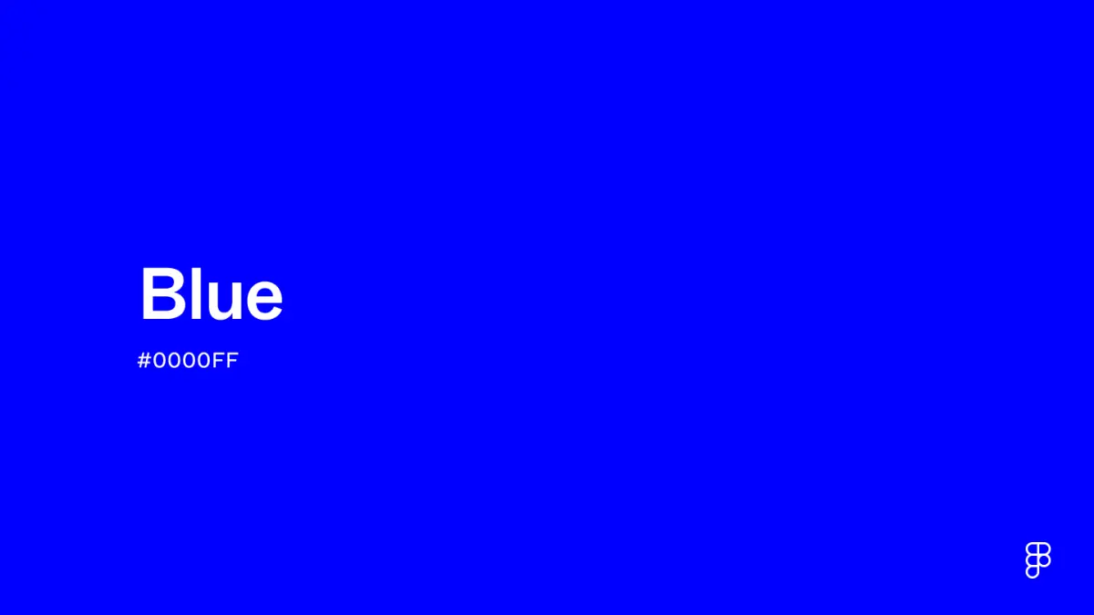
Blue is a primary color in traditional art theory, meaning it cannot be created by mixing other pigments. While you can mix colors to create shades like teal or violet, you cannot produce a pure blue from red, yellow, or green. To obtain blue, you must purchase it as a pre-mixed pigment.
On this page
Why can't I mix other colors to make blue?
In the traditional RYB (red, yellow, blue) color model used by painters, blue is considered a primary color. This means it exists as a foundational building block that cannot be derived from combining other hues. Because pigments function by absorbing specific wavelengths of light and reflecting others, mixing two colors essentially subtracts light from the spectrum. When you combine red and yellow, you get orange, but no combination of these or other secondary colors will result in a true blue.
The physics of light explains why this limitation exists. Light-based color models, such as the RGB (red, green, blue) system used in digital screens, treat blue as a fundamental wavelength of the visible spectrum. Since blue light has a shorter wavelength than red or green, it cannot be synthesized by overlapping those longer wavelengths. Whether you are working with physical paint on a canvas or digital pixels on a computer, blue remains an irreducible starting point for creating the rest of the color wheel.
How to create different shades of blue?
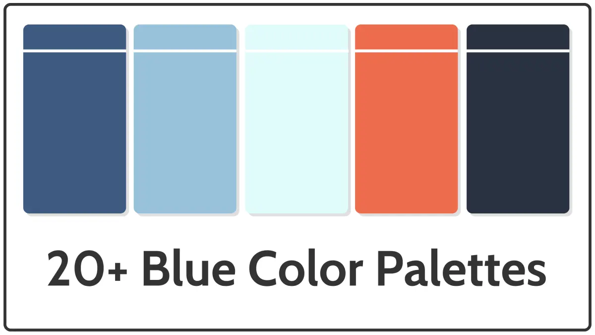
While you cannot create blue from scratch, you can modify existing blue pigments to achieve various depths and tones. By adding other colors to a base blue, you can shift its temperature or intensity to match specific artistic needs. This process allows for the creation of complex palettes, such as deep navy, soft sky blue, or muted slate.
- Start with a small amount of your base blue paint on your palette.
- Add a tiny touch of white to create a lighter, pastel tint or a "cerulean" effect.
- Incorporate a small amount of black or burnt umber to deepen the blue into a dark navy or midnight shade.
- Mix in a hint of yellow to shift the blue toward a vibrant, greenish turquoise or teal.
- Add a small amount of red or magenta to push the blue toward a warmer, violet-leaning indigo.

What are the best blue pigments for beginners?
When starting a painting project, selecting the right blue is essential for achieving accurate color mixtures. Most art supply stores offer a variety of blues, each with unique properties regarding transparency and temperature. Understanding these differences helps you avoid muddy mixtures when you begin combining your colors for landscapes or portraits.
- Ultramarine Blue: A warm, deep blue that leans slightly toward violet; it is excellent for mixing purples and dark shadows.
- Phthalo Blue: A very intense, cool blue that leans toward green; it is highly transparent and powerful, meaning a little goes a long way.
- Cerulean Blue: A bright, semi-opaque blue that is perfect for painting skies and water.
- Cobalt Blue: A balanced, neutral blue that is widely considered the standard for general color mixing.
Always test your pigments on a scrap piece of paper before applying them to a final canvas. Because Phthalo blue is so potent, it can easily overpower other colors, so introduce it to your mixture in very small increments to maintain control over your final shade.
Common mistakes when mixing blue?
The most frequent error artists make is adding too much of a secondary color to their blue, which often results in a "muddy" or gray appearance. This occurs because mixing complementary colors—such as blue and orange—neutralizes the color, effectively canceling out the vibrancy. If you find your blue mixture turning gray, you have likely introduced too much of its opposite color on the color wheel.
Another common mistake is failing to account for the temperature of the blue you are using. If you attempt to mix a vibrant green by adding yellow to an ultramarine blue, the result will often look dull because ultramarine contains a hint of red. To get a clean, bright green, you must use a cool, green-leaning blue like Phthalo. Always check the label on your paint tube for the pigment name, as this will tell you if the blue is predisposed to lean toward red or green.
How to use blue in color theory?
Blue is classified as a cool color, which makes it ideal for creating a sense of distance or calm in a composition. In atmospheric perspective, objects that are further away from the viewer appear paler and bluer due to the scattering of light through the atmosphere. By utilizing different blues in the background of a painting, you can create a realistic sense of depth that draws the eye toward the focal point.
- Use cool, desaturated blues for background elements to push them visually backward.
- Use warmer, more saturated blues for foreground objects to bring them closer to the viewer.
- Balance your blue tones with warm colors like orange or yellow to create a high-contrast, visually stimulating image.
- Avoid using blue exclusively in a piece, as it can feel cold or somber; incorporate warm highlights to add life and energy.
By mastering the temperature and saturation of your blues, you can manipulate the viewer's perception of space and mood within any artistic work.
Key facts
- Blue is a primary color in the subtractive color model, meaning it cannot be created by mixing other pigments.
- In the additive color model used for screens, blue is also a primary color generated by light, not by mixing other hues.
- If you are painting and need a specific shade of blue, you can adjust the tone by adding small amounts of white, black, or complementary colors.
- Adding a tiny amount of red to blue creates a violet or purple hue, while adding yellow creates green.
- Complementary colors, such as orange, will neutralize blue and turn it into a muddy gray or brown if too much is added.
- Always add dark colors to light colors gradually to maintain control over the final shade.
The bottom line
Blue is a fundamental primary color that cannot be synthesized by mixing other pigments or light sources. While you cannot create blue from scratch, you can manipulate its appearance by adding white to create tints, black to create shades, or other colors to shift its hue toward green or violet. Understanding these basic color interactions is essential for achieving the specific tones required in any artistic project.
People also ask
Can I make blue by mixing red and yellow?
No, mixing red and yellow creates orange. Blue is a primary color and cannot be produced by combining other paint colors.
How do I make a lighter shade of blue?
To make a lighter blue, often called a tint, add small amounts of white paint to your blue base. Add the white gradually until you reach the desired brightness.
What happens if I mix blue and green?
Mixing blue and green results in colors like teal, turquoise, or aquamarine. These are known as tertiary colors because they sit between the primary and secondary colors on the color wheel.
Why does my blue paint turn brown when I mix it?
Your blue is likely turning brown because you have added too much of its complementary color, which is orange. Mixing opposite colors on the color wheel cancels out their saturation, resulting in a neutral brown or gray.
Is blue a primary color in every color system?
Blue is a primary color in both the RYB model used in art and the RGB model used in digital displays. However, in the CMYK printing model, cyan is used instead of traditional blue to achieve a wider range of colors.
How can I make a darker blue?
You can darken blue by adding a very small amount of black or a dark complementary color like burnt umber. Be careful with black paint, as it can quickly overwhelm the blue and make it look dull.
This answer was created with the help of AI research tools and reference sources. Spotted an error? Let us know — we correct mistakes quickly. See our editorial policy.