What is a color palette in design?
Short answer
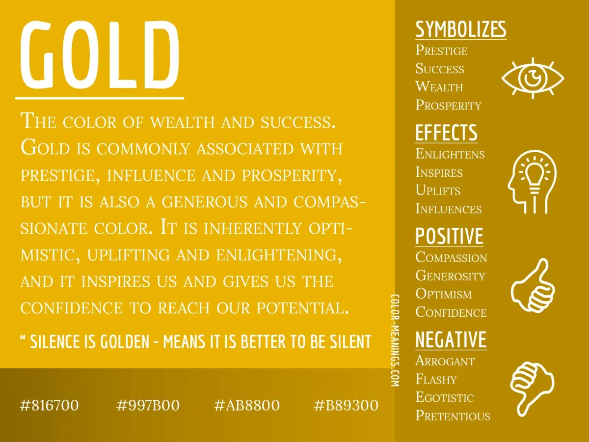
A color palette is a curated selection of colors used in a design project to create visual harmony, establish brand identity, and guide user perception. By limiting the number of hues, designers ensure consistency across digital and physical media, effectively communicating mood and functionality while preventing visual clutter in complex layouts.
On this page
What is a color palette used for?
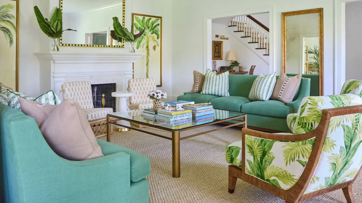
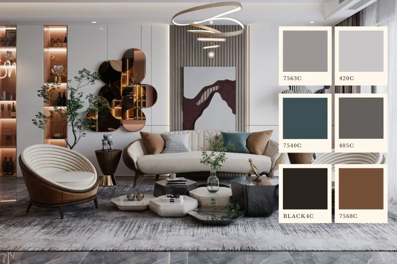
A color palette serves as the foundational visual language for any design project. It acts as a cohesive set of colors that work together to evoke specific emotions and reinforce a brand’s personality. In professional design, palettes are not chosen based on personal preference alone; they are strategically selected to ensure accessibility, legibility, and psychological impact. By defining a specific range of shades, designers maintain consistency across diverse platforms, from printed brochures to mobile applications.
The primary objective of a palette is to create a sense of order and hierarchy. When colors are carefully curated, they help direct the viewer’s eye toward important information, such as call-to-action buttons or key headlines. Without a defined palette, a design often feels disjointed, confusing, or unprofessional. Whether a project requires a bold, high-contrast look or a subtle, minimalist aesthetic, the palette provides the necessary boundaries to keep the design focused and effective throughout its lifecycle.
How to create a color palette for beginners
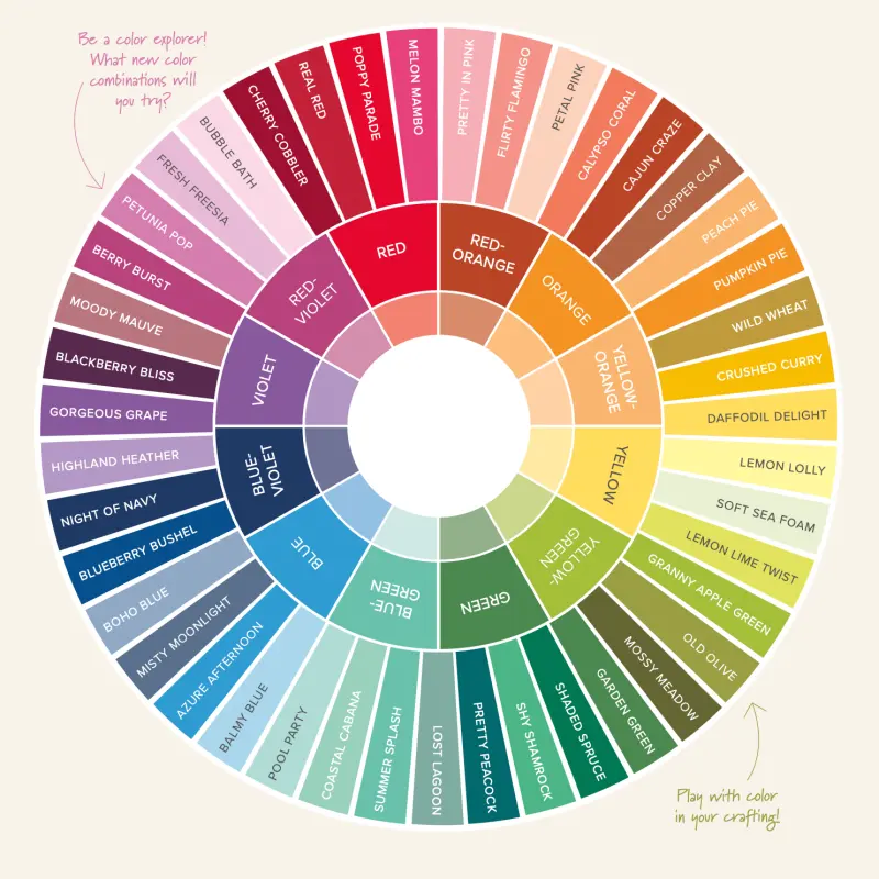
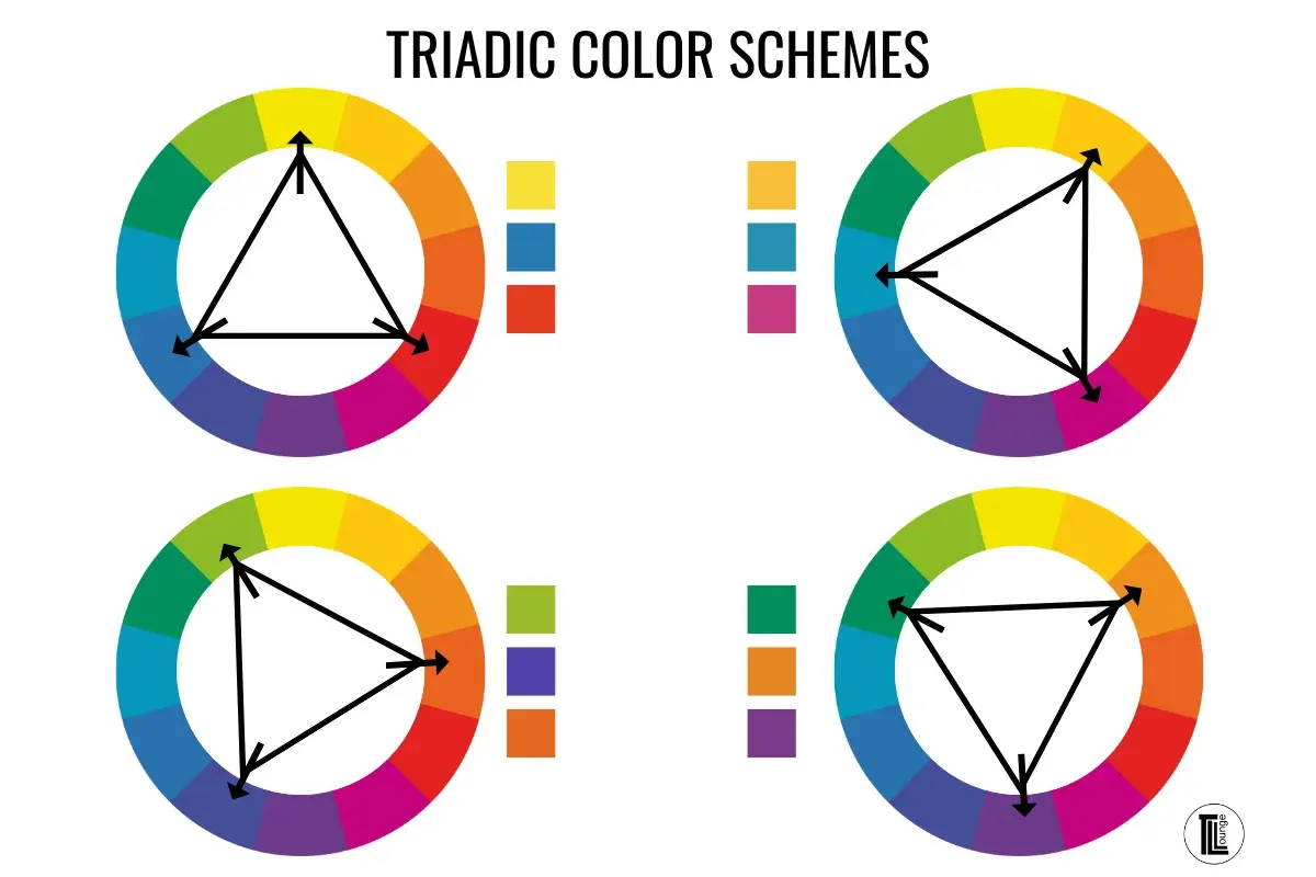
Creating a functional palette begins with understanding the color wheel and the relationships between hues. Beginners should start by selecting a primary color that represents the core message of the project. From there, they can use mathematical formulas—known as color harmonies—to select complementary, analogous, or triadic colors that naturally look good together. These formal structures provide a reliable starting point for anyone who is not yet confident in their color intuition.
To build an effective palette, follow these steps:
- Choose a dominant color that will occupy the most space in your design.
- Select one or two secondary colors to provide contrast and support the primary hue.
- Add a neutral color, such as gray, beige, or white, to serve as a background or text color.
- Include an accent color, which should be used sparingly to draw attention to specific elements.
- Test the palette against a white or black background to ensure the contrast ratio remains high enough for accessibility.
Why color psychology matters in design
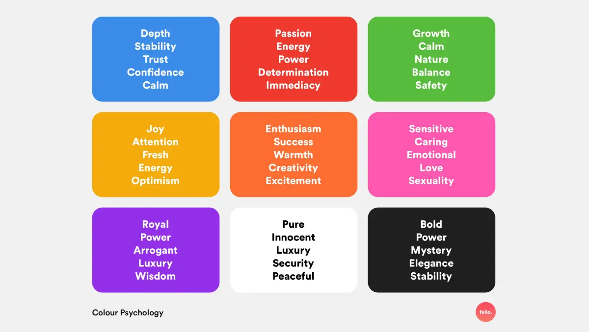
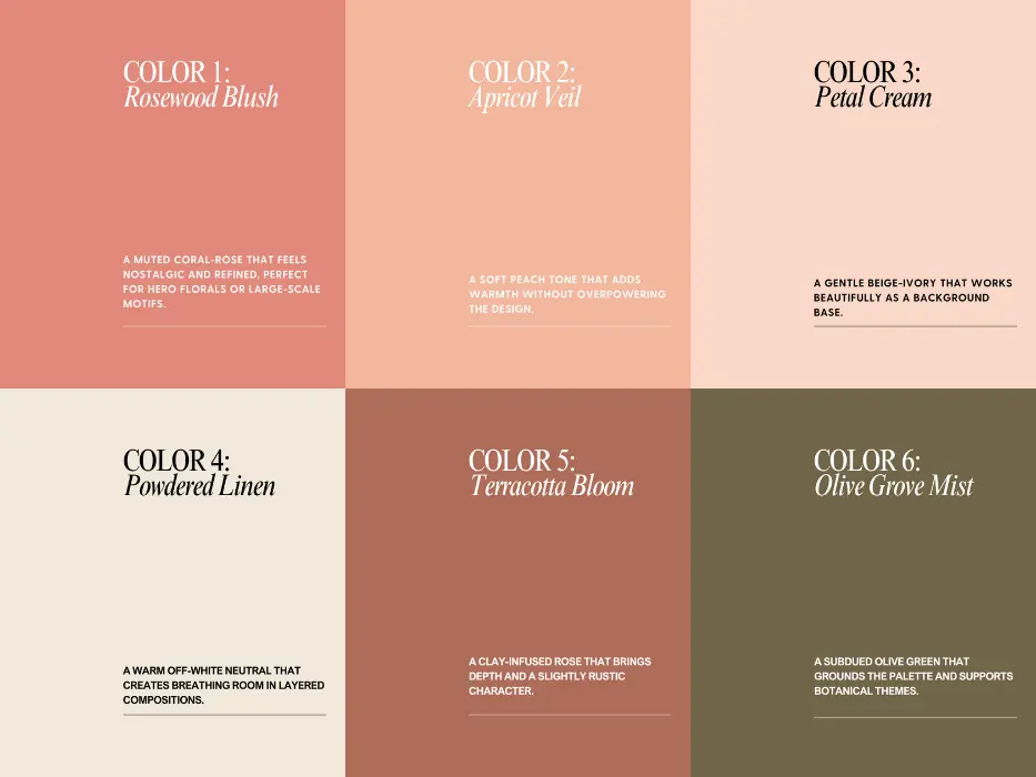
Color psychology explores how different hues influence human behavior and emotional responses. For instance, blue is frequently used by financial institutions and tech companies because it conveys trust, stability, and intelligence. In contrast, red is often used to grab attention, stimulate appetite, or signal urgency. Understanding these associations allows designers to align their color choices with the specific goals of their project, ensuring that the visual message resonates with the intended audience.
Cultural context also plays a significant role in how colors are perceived globally. While white represents purity in many Western cultures, it is associated with mourning in parts of Asia. Designers must be aware of these nuances when creating palettes for international audiences. By conducting research into the target demographic’s cultural background, designers can avoid unintended negative connotations and ensure that their color strategy is both respectful and effective in every market they intend to reach.
Common mistakes when choosing colors
One of the most frequent errors in design is using too many colors, which leads to visual chaos and dilutes the brand’s impact. A palette that is overly complex makes it difficult for the user to understand the design hierarchy. Another common mistake is ignoring accessibility standards. If the contrast between the text and the background is insufficient, the design becomes unreadable for individuals with visual impairments. Designers should always prioritize clarity over decorative flair.
To avoid these pitfalls, keep the following guidelines in mind:
- Limit your primary palette to three or four colors to maintain a clean look.
- Use tools like contrast checkers to ensure your text colors meet WCAG (Web Content Accessibility Guidelines) requirements.
- Avoid relying solely on color to convey information, as colorblind users may not be able to distinguish between certain shades.
- Test your palette in different lighting conditions and on various screen types to ensure the colors remain consistent and vibrant.
- Do not forget to include shades and tints of your chosen colors to provide depth and flexibility for complex layouts.
How to use color palettes in branding
A brand’s color palette is one of its most recognizable assets, often becoming synonymous with the company itself. Think of the iconic red and white of Coca-Cola or the distinct blue of Tiffany & Co. These palettes are carefully documented in brand style guides, which dictate exactly how and where each color should be used. This strict adherence ensures that the brand remains instantly identifiable, regardless of whether the customer is viewing a billboard, a website, or a product package.
Consistency is the ultimate goal of a professional branding palette. When a brand uses the same colors consistently over years, it builds familiarity and trust with the consumer. Designers must ensure that the palette is versatile enough to handle various applications, from small social media icons to large-scale signage. By maintaining these standards, a brand reinforces its identity and creates a lasting impression that transcends individual marketing campaigns, ultimately strengthening its position in a competitive marketplace.
Key facts
- A color palette is a curated selection of colors used consistently across a design project to create visual harmony.
- The 60-30-10 rule suggests using a primary color for 60% of the design, a secondary color for 30%, and an accent color for 10%.
- Complementary colors, which sit opposite each other on the color wheel, create high-contrast, vibrant designs.
- Analogous palettes use colors adjacent to each other on the wheel to produce a calm, cohesive, and professional aesthetic.
- Accessibility guidelines recommend ensuring a high contrast ratio between text and background colors for readability.
- Limiting a palette to three to five colors prevents visual clutter and helps establish a strong brand identity.
The bottom line
A well-constructed color palette is the foundation of effective visual communication, directing user attention and establishing emotional resonance. By adhering to principles like the 60-30-10 rule and prioritizing accessibility, you can create designs that are both beautiful and functional. Remember that simplicity is key; a limited, intentional selection of colors will always outperform a disorganized collection, ensuring your work remains professional, memorable, and easy to navigate.
People also ask
How many colors should be in a professional color palette?
Most professional designs utilize three to five colors. This range provides enough variety to create depth and hierarchy without overwhelming the viewer.
What is the difference between a warm and cool color palette?
Warm palettes feature reds, oranges, and yellows, which evoke energy and passion. Cool palettes use blues, greens, and purples to convey calmness, professionalism, and trust.
How do I choose colors that work well together?
Use a color wheel to apply color theory principles like monochromatic, complementary, or triadic schemes. These mathematical relationships ensure that chosen colors are aesthetically balanced.
What is the most common mistake when creating a palette?
The most frequent error is ignoring contrast, which makes text difficult to read. Always test your color combinations against accessibility standards to ensure they are legible for all users.
Can I change my color palette later?
While you can update a palette, doing so frequently dilutes brand recognition. It is best to stick to a consistent set of colors to build long-term visual authority.
What tools help designers generate color palettes?
Designers often use digital tools like Adobe Color or Coolors to generate palettes based on specific hex codes. These platforms allow users to extract colors from images or explore trending combinations.
This answer was created with the help of AI research tools and reference sources. Spotted an error? Let us know — we correct mistakes quickly. See our editorial policy.