What is color psychology?
Short answer
Color psychology is the study of how different hues influence human behavior, mood, and decision-making processes. While subjective, colors often trigger universal emotional responses based on cultural, biological, and evolutionary factors. Businesses and designers utilize these principles to influence consumer perception, enhance productivity, and create specific atmospheres in physical and digital environments.
On this page
How does color psychology affect human behavior?
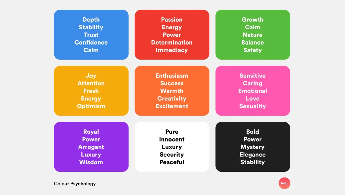
Color psychology operates on the principle that visual stimuli can trigger physiological and psychological changes. Research suggests that warm colors, such as red and orange, often increase heart rates and create a sense of urgency or excitement. Conversely, cool tones like blue and green are frequently associated with calmness and stability, often lowering stress levels in clinical or office settings. These reactions are not purely biological; they are deeply rooted in historical and cultural contexts that shape how we interpret specific shades.
The impact of color is also heavily influenced by personal experience and context. A color that signifies safety in one culture might represent danger or mourning in another. For instance, while white is associated with purity and weddings in many Western societies, it is traditionally linked to death and funerals in several Eastern cultures. Understanding these nuances is essential for anyone attempting to use color to influence behavior. Designers must consider the target audience's background to ensure their color choices communicate the intended message effectively.
Why do brands use specific colors in marketing?
Companies use color strategically to build brand identity and influence consumer purchasing decisions. By selecting a specific palette, a brand can communicate its values without using a single word. For example, many financial institutions utilize blue to project trustworthiness and security, while fast-food chains often employ red and yellow to stimulate appetite and encourage quick turnover. This practice, known as color branding, relies on the idea that consumers form immediate emotional connections with a logo or storefront based on its hue.
Studies have shown that color can account for up to 90% of an initial snap judgment about a product. To leverage this, marketers focus on:
- Establishing brand recognition through consistent color usage across all platforms.
- Creating emotional resonance that aligns with the target demographic’s desires.
- Improving readability and user experience on websites to reduce bounce rates.
- Differentiating products from competitors on crowded store shelves.
How to choose the right colors for your space
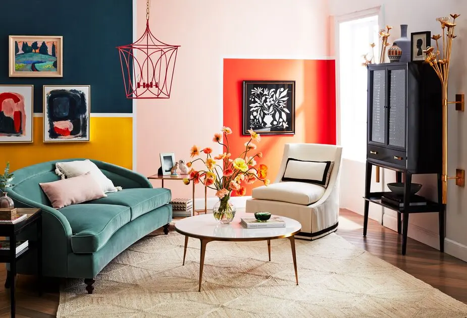
When designing a home or workspace, color selection should align with the intended function of the room. Bedrooms often benefit from muted, cool tones that promote relaxation and sleep, while home offices may perform better with energizing colors that foster focus. Before painting or decorating, it is helpful to test samples in different lighting conditions, as natural and artificial light can significantly alter how a color appears on a wall or surface.
Follow these steps to select an effective color scheme for any room:
- Identify the primary purpose of the space, such as working, relaxing, or socializing.
- Choose a base color that reflects the desired mood or energy level.
- Select two secondary colors to provide contrast and visual interest.
- Apply the 60-30-10 rule: 60% of the room should be the dominant color, 30% a secondary color, and 10% an accent color.
- Evaluate how the colors interact with existing furniture and natural light throughout the day.
Common mistakes when using color psychology
A frequent error is assuming that color psychology is a universal science with rigid, predictable outcomes. Many people rely on simplified charts that claim specific colors always produce specific results, ignoring the importance of shade, saturation, and cultural context. For example, a bright, neon green might feel energetic and modern, while a muted, olive green might feel earthy and stagnant. Failing to account for these variations often leads to disjointed designs that fail to evoke the intended emotional response.
Another common mistake is ignoring the role of color harmony and balance. An overabundance of high-intensity colors can lead to visual fatigue, causing discomfort rather than excitement. Conversely, a space with no color contrast can feel bland and uninspiring. To avoid these pitfalls, consider the following:
- Avoid using too many competing colors, which can overwhelm the viewer.
- Do not ignore the importance of neutral colors, which provide necessary balance.
- Check for accessibility issues, such as ensuring high contrast for text readability.
- Remember that trends change, so prioritize timeless combinations over temporary fads.
What is the history of color psychology?
The formal study of color’s impact on the mind began in earnest during the early 19th century. Johann Wolfgang von Goethe published his "Theory of Colours" in 1810, arguing that color perception was a subjective experience rather than a purely physical phenomenon. This work challenged the prevailing scientific views of the time, which focused exclusively on the physics of light. Later, Carl Jung explored the symbolic and therapeutic meanings of color, suggesting that colors could reflect the unconscious mind and aid in psychological healing.
Throughout the 20th century, the field expanded as marketing and interior design professionals sought empirical data to support their creative choices. Today, color psychology is an interdisciplinary field that integrates neuroscience, sociology, and art history. While it remains a complex subject with many variables, the ongoing research continues to provide valuable insights into how humans perceive and interact with the visual world. By combining historical theory with modern data, professionals can continue to craft environments and messages that resonate deeply with the human experience.
Key facts
- Color psychology is the study of how colors influence human behavior, mood, and physiological responses.
- Blue is frequently associated with trust and productivity, making it a standard choice for corporate branding and office environments.
- Red can trigger physical reactions, such as increased heart rate, and is often used to grab attention or stimulate appetite.
- Cultural context significantly alters color perception; for example, white represents purity in Western cultures but is associated with mourning in many Eastern traditions.
- Warm colors like yellow and orange are perceived as energetic and welcoming, while cool colors like green and blue are typically viewed as calming.
- When choosing colors for a workspace, opt for soft blues or greens to reduce eye strain and promote focus during long tasks.
The bottom line
Color psychology provides a framework for understanding how visual stimuli impact our emotional and physical states. By leveraging these associations, you can intentionally influence the atmosphere of your home or the effectiveness of your branding. However, success requires balancing universal color trends with personal experience and cultural context. Ultimately, color is a powerful tool for communication that shapes our daily interactions with the world around us.
People also ask
Does color psychology actually influence consumer purchasing decisions?
Yes, research suggests that up to 90% of snap judgments about products can be based on color alone. Brands use specific palettes to evoke desired emotional responses that align with their target market's values.
Can painting a room a certain color improve my mental health?
While color is not a substitute for medical treatment, it can influence your mood. Cooler tones like light blue or sage green are often recommended for bedrooms to promote relaxation and lower stress levels.
Why do fast-food restaurants often use red and yellow in their logos?
These colors are believed to stimulate the appetite and create a sense of urgency. The combination is highly visible and encourages customers to eat quickly and move on, which increases turnover.
Is it true that black is always associated with negativity?
No, the meaning of black is highly contextual. While it can signify death or mourning, it is also widely used in fashion and luxury branding to represent sophistication, elegance, and power.
How does lighting affect the way we perceive color?
Lighting is critical because it changes the hue and intensity of a color. Natural daylight reveals the truest color, while fluorescent or warm incandescent bulbs can shift the appearance of a room significantly.
What is the most common mistake people make when using color psychology?
The biggest error is ignoring personal preference and cultural background. A color that is scientifically proven to be "calming" may still cause anxiety for an individual who has a negative personal association with it.
This answer was created with the help of AI research tools and reference sources. Spotted an error? Let us know — we correct mistakes quickly. See our editorial policy.