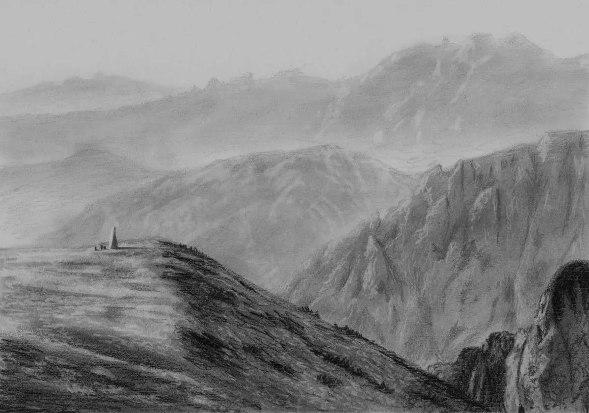
What is balance in art?
Short answer
Balance in art is the distribution of visual weight within a composition. It ensures that no single part of an artwork overpowers the others, creating a sense of stability and harmony. Artists achieve this through the careful arrangement of elements like color, shape, size, and texture to guide the viewer’s eye.
On this page
What is visual weight in art?
Visual weight refers to the perceived "heaviness" or "lightness" of elements within a frame. Just as a physical object has mass, a shape or color can attract more attention than others based on its characteristics. For instance, a large, dark-colored shape naturally carries more visual weight than a small, pale, or transparent one. Artists manipulate these weights to prevent a composition from feeling lopsided or chaotic.
Understanding this concept is essential for any creator, as it dictates where the viewer looks first. If one side of a canvas contains high-contrast, complex patterns while the other remains empty, the composition will feel unbalanced. To achieve equilibrium, artists must distribute these heavy elements strategically. Consider these factors that increase visual weight:
- High contrast between light and dark values.
- Warm colors, which tend to advance toward the viewer.
- Complex or intricate textures compared to smooth, flat areas.
- Larger physical dimensions relative to other objects in the scene.
How to create symmetrical balance
Symmetrical balance, often called formal balance, occurs when elements are mirrored on either side of a central axis. This technique creates a sense of order, permanence, and dignity, which is why it is frequently used in architecture and classical portraiture. The human brain naturally finds symmetry comforting because it is predictable and easy to process.
To implement this, imagine a vertical or horizontal line running through the center of your canvas. You then place identical or near-identical elements on both sides of that line. While perfect symmetry can sometimes feel static or boring, it remains the most reliable way to achieve a stable composition. Examples include the perfectly centered facade of the Parthenon or the balanced composition of Leonardo da Vinci’s "The Last Supper."
- Draw a light guideline through the center of your work.
- Place your primary focal point directly on or near that line.
- Mirror the secondary elements on the left and right sides.
- Check for subtle variations that might disrupt the overall symmetry.
How to achieve asymmetrical balance
Asymmetrical balance, or informal balance, is more dynamic and modern than symmetry. It involves balancing different elements that have equal visual weight but are not mirror images of one another. For example, a large, light-colored shape on one side of a painting might be balanced by a small, dark, and highly detailed shape on the opposite side. This approach keeps the viewer’s eye moving throughout the entire piece.
This method requires a more intuitive approach to composition. Because there is no central mirror line, the artist must rely on the "tug-of-war" between various visual elements. It is often used in landscape painting and abstract art to create a sense of tension and movement. By varying the size, color, and placement of objects, you can create a composition that feels active yet grounded.
- Use a large, simple shape to balance a smaller, complex shape.
- Place a dark object far from the center to balance a lighter object closer to the center.
- Use negative space to offset dense clusters of detail.
- Adjust the positions until the composition feels "settled" rather than falling off the page.
Why radial balance is used
Radial balance occurs when elements radiate outward from a central point, like the spokes of a wheel or the petals of a flower. This type of balance is highly effective at drawing the viewer’s eye directly to the center of the artwork. It is commonly found in nature, such as in the structure of a sunflower, and in cultural symbols like mandalas or stained-glass rose windows.
Artists use radial balance to create a sense of focus or to emphasize a specific subject. Because the eye is naturally drawn to the center, this technique is powerful for storytelling or religious iconography. It creates a feeling of expansion and energy that is difficult to achieve with linear or asymmetrical layouts. When designing with this method, ensure that the surrounding elements maintain a consistent distance from the center to keep the balance intact.
- Identify the center point of your composition.
- Arrange your main subjects or patterns to emanate from that point.
- Maintain consistent spacing between elements to prevent overcrowding.
- Use color or value to reinforce the circular flow of the design.
Common mistakes when balancing art
A frequent error is failing to consider the impact of negative space. Beginners often try to fill every inch of the canvas, which leads to visual clutter and a loss of balance. Negative space, or the empty areas around objects, acts as a "breathing room" that allows the viewer to process the visual weight of the main subjects. Without it, the composition becomes heavy and overwhelming.
Another common mistake is ignoring the "center of gravity" in a piece. Even in asymmetrical works, there must be an underlying structure that holds the elements together. If all the heavy elements are pushed to the corners, the center will feel hollow, and the artwork will appear to be drifting apart. Always evaluate your work from a distance to see if it feels anchored. If the piece feels like it is tilting, try shifting a single high-contrast element toward the opposite side to restore equilibrium.
Key facts
- Balance is the distribution of visual weight in a composition, ensuring no single part overpowers others.
- Symmetrical balance creates a mirror image, often conveying stability, formality, and order.
- Asymmetrical balance uses different elements of equal visual weight to create a dynamic, modern feel.
- Radial balance radiates from a central point, frequently seen in mandalas or circular architectural designs.
- Color intensity, size, and texture all contribute to visual weight; a small, bright red object can balance a large, dull gray one.
- Negative space is a vital tool for balance, as it provides "breathing room" and prevents a composition from feeling cluttered.
The bottom line
Balance is the fundamental principle of arranging visual elements so that a composition feels stable and intentional. Whether you choose the predictable harmony of symmetry or the energetic tension of asymmetry, the goal is to guide the viewer's eye across the entire work. By manipulating color, size, and negative space, you can transform a chaotic collection of shapes into a cohesive, professional, and visually satisfying masterpiece.
People also ask
How can I tell if my artwork is unbalanced?
If your eyes feel pulled toward one corner or side of the canvas without relief, the piece is likely unbalanced. Squinting at your work can help you see the overall distribution of dark and light values rather than getting distracted by details.
Does balance mean that both sides of the canvas must be identical?
No, that is only true for formal symmetry. Asymmetrical balance is often more engaging because it uses contrast and placement to achieve equilibrium without needing exact duplication.
What is the easiest way to achieve balance in a painting?
Start by sketching a rough composition and identifying your focal point. Place your most intense color or highest contrast near that point, then distribute smaller secondary elements to anchor the rest of the space.
Can an abstract painting be balanced?
Yes, abstract art relies heavily on balance to keep the viewer’s eye moving across the canvas. Artists use line, shape, and color density to create a sense of harmony even when there is no recognizable subject matter.
What is the biggest mistake beginners make with balance?
The most common error is "cluttering" one side of the image while leaving the other side empty. Beginners often forget that empty space has its own weight and should be used intentionally to balance out dense areas.
Is there a mathematical way to ensure balance?
The Rule of Thirds is a practical grid system that helps artists place elements at intersections to create natural, balanced compositions. By dividing the canvas into nine equal segments, you can avoid placing the subject in a way that feels static or off-center.
This answer was created with the help of AI research tools and reference sources. Spotted an error? Let us know — we correct mistakes quickly. See our editorial policy.