What are triadic colors?
Short answer
Triadic colors are a trio of hues spaced evenly around the 12-part color wheel. By selecting three colors that form an equilateral triangle, you create a vibrant, balanced, and high-contrast palette. This scheme is widely used in art, graphic design, and interior decorating to achieve a sense of visual harmony and energy.
On this page
What are triadic colors?
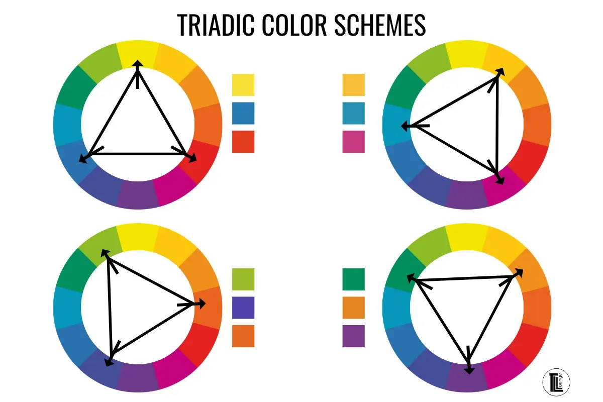
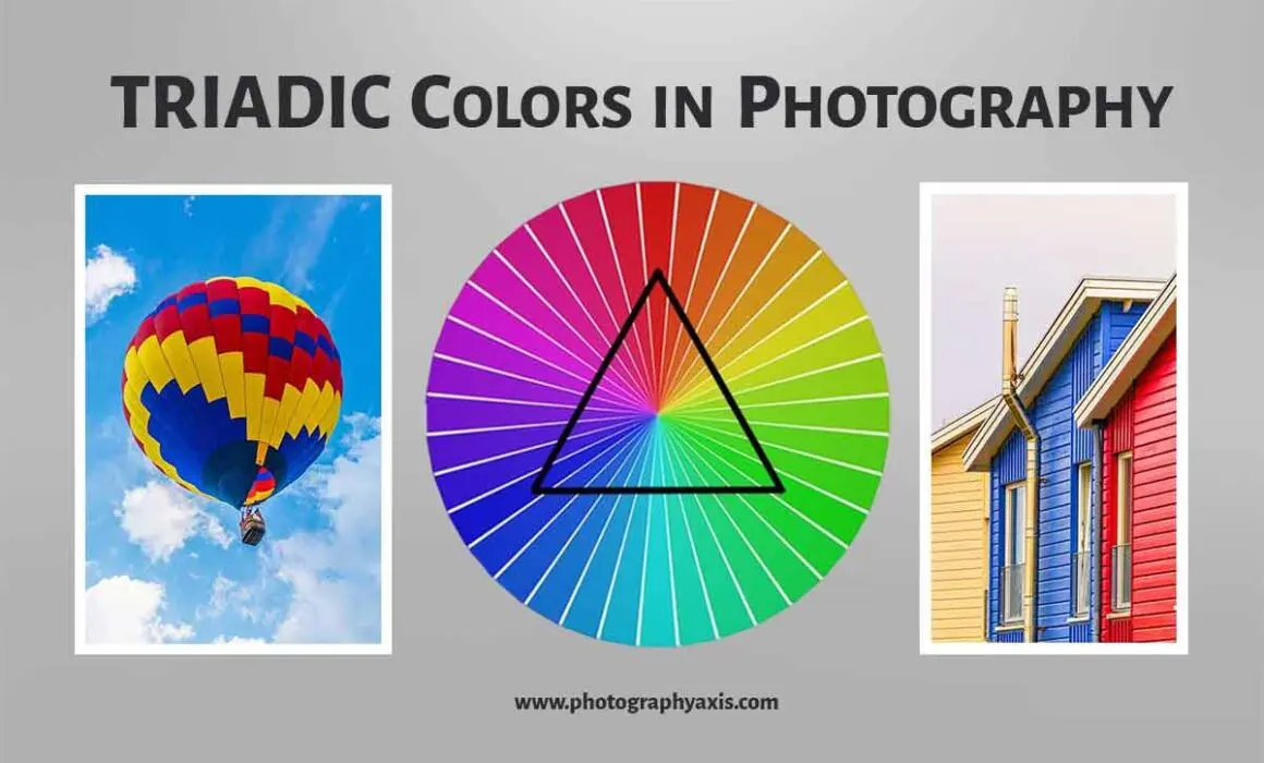
Triadic color schemes are defined by their geometric relationship on the traditional color wheel. To identify a triad, you choose one base color and then select two others that are exactly 120 degrees apart from it. Because these colors are distributed symmetrically, they naturally possess a balanced tension that appeals to the human eye. This arrangement ensures that no single color dominates the composition, allowing for a dynamic interplay between the three chosen hues.
The primary colors—red, yellow, and blue—form the most recognizable triadic scheme. However, this concept extends to secondary and tertiary colors as well, such as orange, green, and purple. By shifting the triangle around the wheel, designers can generate endless combinations that range from bold and primary to soft and muted. Understanding this mathematical spacing is the foundational step for anyone looking to move beyond monochromatic or analogous color palettes in their creative work.
How to create a triadic color palette
Creating a balanced triadic palette requires a systematic approach to ensure the colors work together rather than competing for dominance. You can start by using a standard 12-hue color wheel, which is divided into primary, secondary, and tertiary segments. By placing an equilateral triangle template over the center of the wheel, you can instantly reveal the three colors that belong to a specific triad.
- Select your dominant base color, which will occupy the largest surface area in your design.
- Identify the two secondary colors located 120 degrees away on the wheel to provide contrast.
- Adjust the saturation and brightness of each color to prevent the palette from becoming visually overwhelming.
- Test the combination by applying the colors to a simple layout to see how they interact under different lighting conditions.
Following these steps allows you to maintain control over the intensity of your design. While the triad provides the structure, your personal adjustments to tint and shade determine the final mood.
Why use triadic colors in design
The primary advantage of a triadic scheme is its ability to provide high contrast while maintaining a sense of equilibrium. Because the colors are spread out across the spectrum, they avoid the monotony of colors that sit next to each other. This makes triadic palettes an excellent choice for branding, posters, and interior spaces where you want to grab attention immediately. The inherent energy of the scheme makes it feel lively and sophisticated.
Designers often utilize this method to create focal points within a composition. By using one color as the primary anchor and the other two as accents, you can guide the viewer's eye through a piece of art or a web interface. This technique is particularly effective in marketing, where the goal is to make a product stand out from a crowded background. When executed correctly, the result is a professional, polished aesthetic that feels both deliberate and naturally pleasing to the observer.
Common mistakes when using triadic colors
The most frequent error when working with triadic colors is applying them in equal proportions. Because all three colors are vibrant and distinct, using them in equal amounts can create a chaotic or "clashing" effect that is difficult to look at. This is often referred to as visual vibration, where the colors seem to blur or jump at the edges where they meet. To avoid this, always designate one color as the dominant force, another as the secondary support, and the third as a subtle accent.
Another common pitfall is ignoring the value of the colors. If all three colors in your triad have the same level of saturation and brightness, the composition will lack depth. You should experiment with tints—adding white—or shades—adding black—to create variety within the triad. This adjustment helps to ground the design and makes the color scheme feel more intentional. Without these variations, the palette can easily look like a child’s toy set rather than a cohesive design system.
Best practices for color balance
Achieving success with triadic colors relies heavily on how you manage the "weight" of each hue. A good rule of thumb is the 60-30-10 ratio, which suggests using 60% of your primary color, 30% of your secondary color, and 10% of your accent color. This distribution prevents the colors from fighting for attention and creates a clear hierarchy. When you apply this ratio, even the most intense triadic combinations become manageable and aesthetically pleasing.
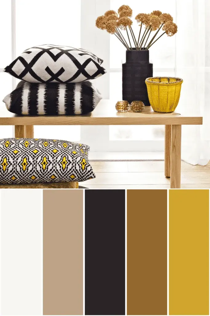
- Use neutral colors like white, gray, or black to bridge the gaps between your triadic colors.
- Limit the use of pure, fully saturated colors to small, impactful areas of your design.
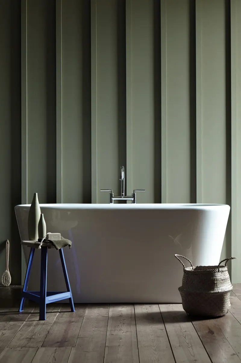
- Consider the context of your work; a triad for a playroom can be much brighter than a triad for a corporate office.
- Always view your palette in grayscale to ensure that the contrast between the colors is based on value rather than just hue.
By incorporating neutrals, you provide the eye with a place to rest, which is essential when working with high-energy color schemes. These practices ensure that your final output remains functional, readable, and visually compelling for your intended audience.
Key facts
- Triadic color schemes use three colors evenly spaced around the 12-hue color wheel.
- The most common example is the primary triad: red, yellow, and blue.
- Secondary triads are formed by combining primary colors to create orange, green, and violet.
- These schemes provide high visual contrast while maintaining a sense of balance and harmony.
- To use them effectively, choose one dominant color and use the other two as accents.
- Avoid using all three colors in equal amounts, as this often results in a chaotic or overwhelming design.
The bottom line
Triadic color schemes offer a powerful way to create vibrant, balanced designs by utilizing three equidistant hues from the color wheel. By establishing a clear hierarchy and incorporating neutral tones, you can harness the energy of these combinations without overwhelming the viewer. Whether in art, fashion, or interior design, mastering this technique allows for bold, harmonious palettes that capture attention while maintaining professional compositional integrity.
People also ask
Why do triadic colors look balanced?
Because the three colors are equidistant from each other on the color wheel, they form a perfect equilateral triangle. This geometric relationship ensures that no single color dominates the visual space, creating a stable and naturally pleasing composition.
How can I make a triadic scheme look less intense?
You can soften the impact by using muted, tinted, or shaded versions of the chosen colors. Instead of using pure, saturated hues, try incorporating pastels or deep, desaturated tones to create a more sophisticated and subtle palette.
Are triadic schemes suitable for professional branding?
Yes, many global brands use triadic schemes to appear vibrant and energetic. However, careful application is required to ensure the brand identity remains legible and does not appear overly cluttered or juvenile.
What is the difference between triadic and complementary colors?
A complementary scheme uses only two colors located directly opposite each other on the wheel. A triadic scheme adds a third color to the mix, which increases the complexity and potential for dynamic visual interest.
Can I use more than three colors in a triadic design?
While the core scheme relies on three hues, you can add neutrals like white, black, or gray to anchor the design. These neutral tones help separate the vibrant colors and prevent the overall composition from appearing too busy.
What is the most common mistake when using triadic colors?
The most frequent error is applying all three colors with equal intensity and surface area. This lack of hierarchy makes the design difficult for the eye to navigate, often resulting in a jarring or disjointed aesthetic.
This answer was created with the help of AI research tools and reference sources. Spotted an error? Let us know — we correct mistakes quickly. See our editorial policy.