What is the zorn palette?
Short answer
The Zorn palette is a limited oil painting color scheme consisting of only four pigments: yellow ochre, cadmium red, ivory black, and titanium white. Named after Swedish painter Anders Zorn, this restricted range allows artists to achieve a remarkably wide spectrum of natural skin tones and atmospheric effects through precise color mixing.
On this page
What is the Zorn palette?
The Zorn palette is a foundational color system that relies on a minimalist approach to oil painting. By limiting the selection to four specific pigments, the artist is forced to focus on value, temperature, and brushwork rather than relying on a complex array of pre-mixed tubes. This technique was famously utilized by the 19th-century Swedish portraitist Anders Zorn, who demonstrated that a full range of lifelike colors could be derived from a very narrow set of inputs.
The brilliance of this palette lies in its inherent harmony. Because every color on the canvas is mixed from the same four pigments, the resulting painting possesses a natural, unified quality that is difficult to achieve with a larger, more disparate selection of paints. It simplifies the decision-making process, allowing the artist to master the subtle relationships between light and shadow. This method is widely considered one of the most effective ways for painters to develop a professional understanding of color theory and tonal structure.
How to mix colors with the Zorn palette
Mixing with the Zorn palette requires an understanding of how these four specific pigments interact to create secondary and tertiary hues. Ivory black, when mixed with white, creates a cool, bluish-gray that serves as the basis for shadows and atmospheric depth. Yellow ochre and cadmium red act as the primary warm components, which can be shifted toward orange or muted toward brown depending on the proportions used.
To build your colors effectively, follow these fundamental mixing strategies:
- Create a neutral gray by mixing ivory black and titanium white.
- Develop warm skin tones by blending yellow ochre with cadmium red, then adding white to adjust the value.
- Achieve deep, rich earth tones by combining yellow ochre and ivory black, which produces a variety of olive and sage greens.
- Use the cadmium red as a tinting agent to warm up your grays or to create vibrant highlights in the cheeks or lips.
- Always test your mixtures on a palette scrap before applying them to the canvas to ensure the temperature matches your intended light source.
Why artists use the Zorn palette
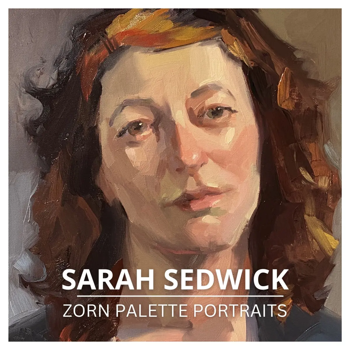
Many professional painters adopt the Zorn palette because it eliminates the confusion of "muddy" colors often caused by mixing too many pigments together. By restricting the palette, you ensure that every mixture remains clean and chromatic. This is particularly useful for portraiture, as the interaction between the black-and-white gray scale and the earth-toned warm colors perfectly mimics the complex, translucent nature of human skin.
Beyond portraiture, this palette is excellent for landscape painting and still life. The ability to create a wide range of grays allows for the depiction of distance and atmospheric perspective, while the warmth of the ochre and red provides enough punch to create focal points. It is a highly portable system that reduces the weight of an artist’s travel kit, making it an ideal choice for plein air painting where speed and efficiency are essential for capturing fleeting light conditions.
Common mistakes when using the Zorn palette
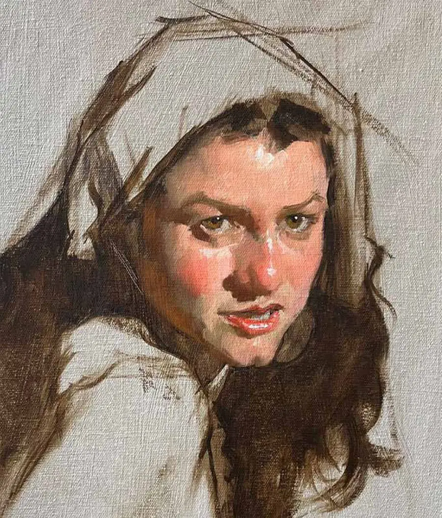
One of the most frequent errors beginners make is over-mixing their paint, which can lead to a flat, lifeless appearance. Because the palette is limited, it is essential to keep your mixtures somewhat distinct on the canvas to maintain visual interest. If you blend your colors too thoroughly, you lose the "vibration" that occurs when different tones sit side-by-side. Another common mistake is failing to use enough white; the Zorn palette requires a generous amount of titanium white to achieve the high-key values necessary for realistic skin highlights.
To avoid these pitfalls, keep the following tips in mind:
- Keep your brush strokes decisive and avoid excessive blending once the paint is on the canvas.
- Ensure your ivory black is of high quality, as cheap versions can be overly transparent and difficult to control.
- Pay close attention to the value of your colors; if your painting looks "dark," it is likely because you are not using enough white to push the values into the lighter range.
- Do not be afraid to use the colors in their near-pure state for small accents, as this provides a necessary contrast to the more muted mixtures.
Best practices for beginners
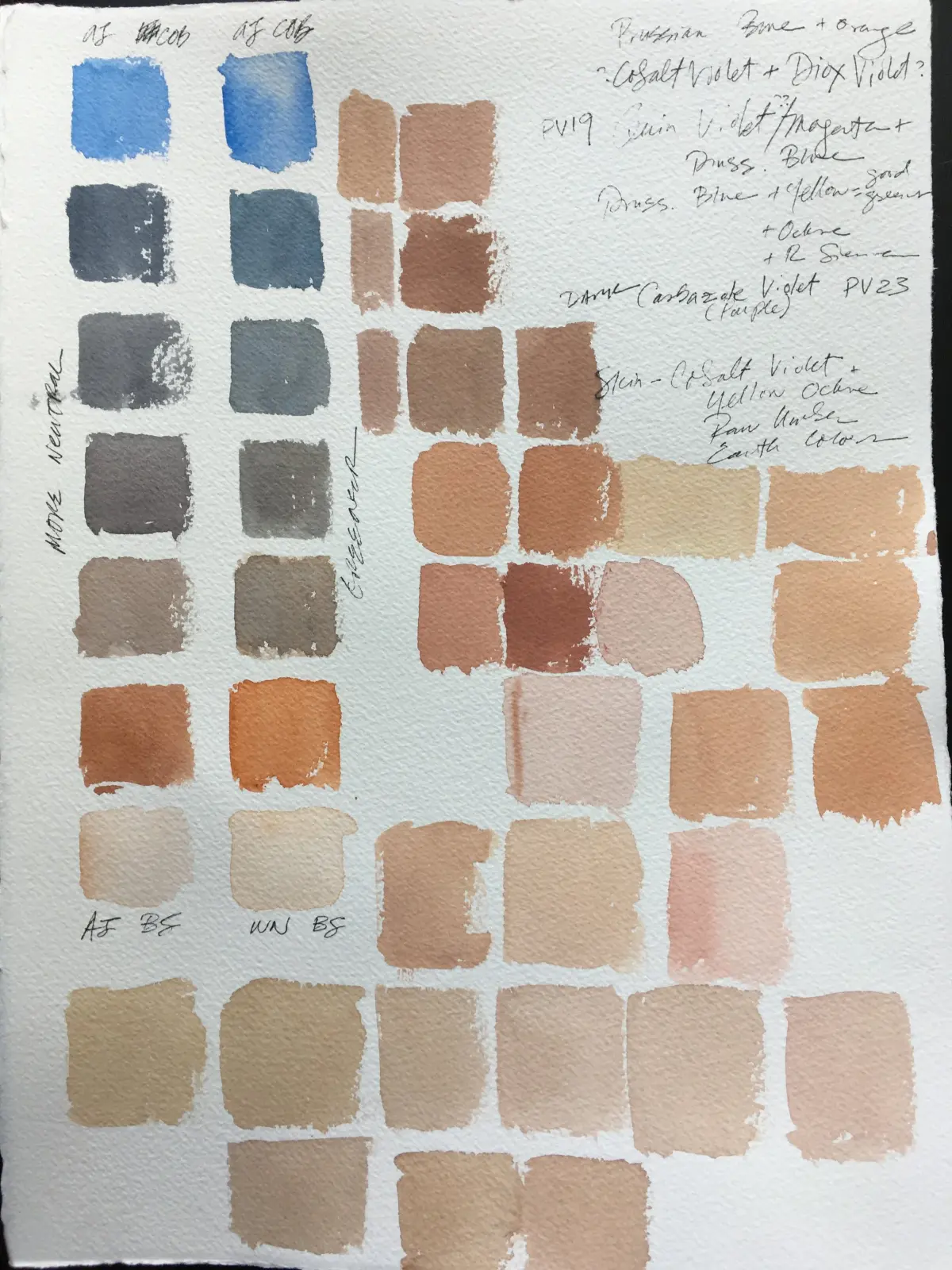
For those new to this system, the best way to learn is to perform a series of color charts. Start by creating a grid that shows the transition from ivory black to white, then add yellow ochre and cadmium red into the mix to see how the temperature shifts. This exercise provides a visual map that you can refer to while painting, helping you understand exactly how much of each pigment is needed to reach a specific target color.
When you begin your first full painting, focus entirely on the value structure first. Use the black and white to establish the "bones" of the image before introducing the ochre and red. By securing your light and shadow patterns early, you ensure that the painting will be structurally sound regardless of the colors you apply later. As you gain confidence, you will find that the Zorn palette is not a limitation at all, but a powerful tool that grants you complete control over the mood and light of your work.
Key facts
- The Zorn palette consists of only four colors: yellow ochre, cadmium red light, ivory black, and titanium white.
- It is named after the Swedish painter Anders Zorn (1860–1920), who frequently used this limited range for his portraits.
- Ivory black acts as a cool blue substitute, creating a range of greens and grays when mixed with yellow or white.
- This palette forces artists to focus on tonal values and temperature rather than relying on complex color mixing.
- Beginners should avoid adding extra colors too early, as the palette is designed to teach color harmony through limitation.
- To create a skin tone, mix yellow ochre and red, then neutralize the mixture with black and lighten it with white.
The bottom line
The Zorn palette is a powerful, minimalist tool that simplifies color theory by restricting the artist to four essential pigments. By mastering the interplay between yellow ochre, cadmium red, ivory black, and white, painters develop a keen eye for value and temperature. This disciplined approach ensures color harmony, helping artists create sophisticated, professional-looking works while avoiding the common pitfalls of overly complex and chaotic color mixing.
People also ask
Can I replace ivory black with another black?
Ivory black is preferred because it has a warm, brownish undertone that behaves like a dark blue when mixed. Using lamp black or carbon black may result in cooler, flatter grays that do not harmonize as well with the warm earth tones.
Is the Zorn palette suitable for landscape painting?
While famous for portraiture, this palette is excellent for landscapes, especially those with soft, atmospheric lighting. The limited range naturally creates a cohesive, harmonious mood that prevents the common mistake of over-saturating greens in nature.
Why is cadmium red light the specific red used?
Cadmium red light is an opaque, warm-leaning red that blends perfectly with yellow ochre to create natural-looking flesh tones. Other reds, such as alizarin crimson, are too cool and transparent, which would disrupt the earthy balance of the palette.
How do I achieve a "blue" in this palette?
There is no true blue, but mixing ivory black with white produces a range of cool, steel-blue grays. When these grays are placed next to warm yellow ochre or red, the optical illusion of blue becomes highly convincing to the viewer.
What is the biggest mistake beginners make with this palette?
The most common error is failing to utilize the full range of values from black to white. Beginners often keep their mixtures too mid-toned, which results in a muddy appearance rather than the vibrant, high-contrast look Zorn achieved.
Does this palette work for all skin tones?
Yes, the Zorn palette is remarkably versatile for various complexions by adjusting the ratios of the four pigments. By varying the amount of black to desaturate the red and yellow, you can create everything from deep shadows to bright highlights.
This answer was created with the help of AI research tools and reference sources. Spotted an error? Let us know — we correct mistakes quickly. See our editorial policy.