How do you paint skin tones in oil?
Short answer
Painting realistic skin tones in oil requires a limited palette of warm and cool colors. By mixing a base hue with white and adjusting the temperature using complementary colors, you can achieve depth. The process involves building layers from dark to light, carefully observing the subtle shifts in undertones across the face.
On this page
How to choose a skin tone palette
Achieving natural skin tones does not require a vast array of expensive pigments. A professional palette often centers on a few earth tones combined with primary colors to provide versatility. The Zorn palette, popularized by Swedish painter Anders Zorn in the late 19th century, remains the gold standard for beginners because it relies on only four colors: yellow ochre, cadmium red, ivory black, and titanium white. This limited set prevents the common pitfall of creating muddy or overly saturated colors that look artificial on canvas.
To expand your range, you can incorporate additional pigments once you understand color relationships. Adding burnt sienna or raw umber provides deeper shadows, while ultramarine blue or viridian green helps neutralize overly orange or red mixtures. Always test your mixtures on a scrap piece of canvas or paper before applying them to your painting. Remember that skin is translucent; layering thin, transparent glazes over an opaque base will create the luminous quality characteristic of human flesh.
How to mix skin tones accurately
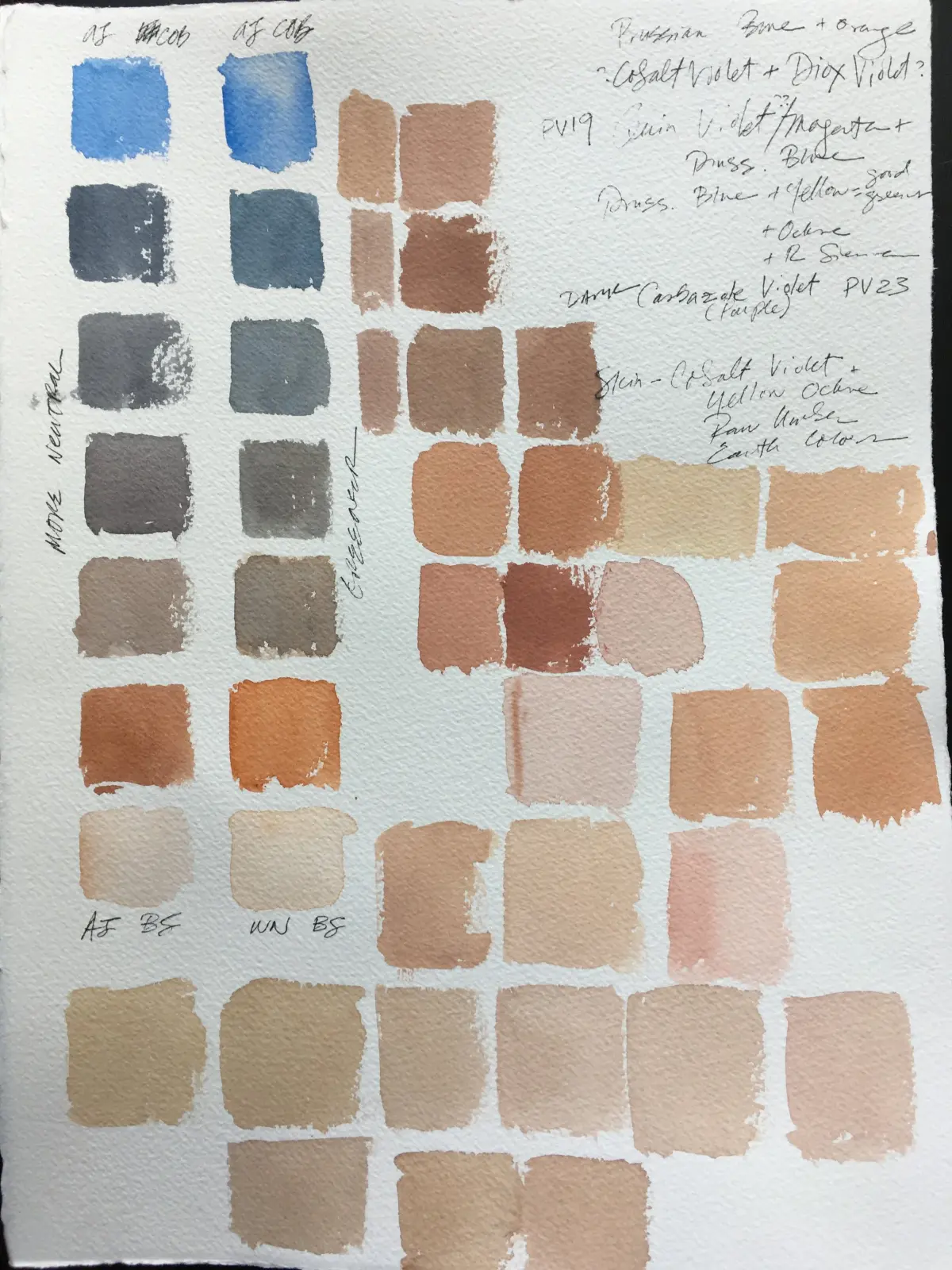
Mixing skin tones is an exercise in managing temperature and value rather than simply finding a "flesh" color. Start by creating a neutral base using your primary colors and white, then adjust it based on the specific subject. If the skin appears too yellow, add a tiny amount of red; if it looks too red, introduce a touch of green to neutralize the intensity. Always mix more paint than you think you need to ensure consistency throughout your painting session.
Follow these steps to build your mixtures:
- Establish your darkest shadow tones first using burnt umber or a mix of red and black.
- Create mid-tone mixtures that represent the local color of the skin in average light.
- Prepare highlight mixtures by adding white and a touch of yellow or blue depending on the light source.
- Keep your mixtures separate on the palette to prevent them from becoming a uniform, dull gray.
Best brushes and tools for beginners
The choice of brushes significantly impacts the texture and blending of your skin tones. Hog bristle brushes are excellent for blocking in large shapes and establishing the initial structure of the face. As you move toward finer details and soft transitions, switch to softer synthetic or sable brushes. These allow for delicate blending without leaving harsh brush marks, which is essential for capturing the soft contours of cheeks, noses, and eyelids.
Maintain a clean workspace to avoid contaminating your mixtures. Keep at least two jars of solvent—one for initial cleaning and one for final rinsing—to ensure your brushes stay pristine. Use a palette knife to mix your colors rather than your brushes, as this preserves the bristles and ensures a more thorough blend of pigments. Investing in a glass or wood palette that is large enough to accommodate multiple test patches will save you time and frustration during the painting process.
Why skin looks muddy or flat
A common frustration for oil painters is the appearance of "muddy" skin, which occurs when too many colors are mixed together or when wet paint is overworked. This happens when you attempt to blend colors directly on the canvas without sufficient medium or when you mix complementary colors too aggressively. If your painting begins to look gray or lifeless, stop immediately. Allow the layer to dry or scrape away the offending area before attempting to reapply fresh, clean pigment.
Flatness often results from a lack of value contrast. Skin is not a single, uniform color; it is a complex landscape of reflected light and deep shadows. To avoid this, observe your subject closely for:
- Reflected light in the shadows, often picking up colors from the surrounding environment.
- Subtle shifts in temperature between the forehead, nose, and chin.
- The transition lines between light and shadow, which should be soft rather than sharp.
- The presence of cool tones in the recessed areas like eye sockets or under the jaw.
Common mistakes when painting skin
Many beginners make the mistake of using pure white for highlights, which creates a chalky, artificial appearance. Instead, mix your highlight with a small amount of yellow or blue to harmonize it with the surrounding skin tones. Another frequent error is ignoring the "underpainting." Starting directly with flesh tones without establishing the underlying bone structure or shadow map often leads to a distorted final image. Always prioritize the underlying anatomy before focusing on surface-level color details.
Avoid these common pitfalls to improve your results:
- Over-blending: Excessive brushing destroys the vibrancy of the paint and creates a plastic-like texture.
- Ignoring edges: Use a mix of hard and soft edges to define features; soft edges are vital for the rounded planes of the face.
- Neglecting the neck and ears: These areas often contain different color temperatures than the face and require equal attention.
- Rushing the process: Oil paint requires patience, especially when working in layers, so allow sufficient drying time between applications to maintain clarity.
Key facts
- Start with a limited palette of four colors: titanium white, yellow ochre, cadmium red light, and ultramarine blue.
- Always mix your skin tones on the palette first, testing them against a neutral gray background rather than directly on the canvas.
- Avoid using pure black to darken skin tones; instead, mix burnt umber or a deep blue with your red to create a natural shadow.
- Apply paint in thin layers, moving from dark shadows to light highlights to maintain depth and luminosity.
- Keep your brushes clean between colors to prevent the mixture from turning into a muddy, dull gray.
- Use a "fat over lean" approach, ensuring each subsequent layer has slightly more oil content than the one beneath it to prevent cracking.
The bottom line
Mastering skin tones in oil painting requires a disciplined approach to color mixing and layering. By limiting your palette and focusing on the relationship between value and temperature, you can create realistic, luminous flesh tones. Avoid the common trap of over-blending, which leads to muddy results. With practice, you will learn to observe the subtle shifts in color that bring a portrait to life on canvas.
People also ask
How do I prevent my skin tones from looking muddy?
Muddy colors usually occur from over-mixing or using too many pigments at once. Limit your palette to a few essential colors and use gentle, deliberate strokes rather than constant blending.
Should I use black paint for shadows on skin?
Professional painters generally avoid using tube black because it can make skin look bruised or flat. Use a mixture of burnt umber and ultramarine blue to create a rich, transparent dark that mimics natural skin depth.
How do I match a specific person's skin complexion?
Focus on identifying the underlying temperature of the skin, whether it leans toward cool pinks or warm yellows. Match the value—the lightness or darkness—first, then adjust the hue by adding tiny increments of color.
What is the best brush type for painting skin?
Soft-haired brushes, such as synthetic sables or mongoose-style bristles, are ideal for blending skin tones smoothly. These brushes leave fewer visible marks, allowing for the subtle transitions required for realistic flesh.
How many layers are typically needed for a portrait?
A traditional approach often involves an initial underpainting followed by two or three layers of color. This layering process allows light to penetrate the paint and reflect off the white ground, creating a lifelike glow.
Why do my highlights look chalky?
Chalky highlights often result from adding too much white to your mixture. Try using a lighter yellow or a pale peach tone for the brightest areas instead of relying solely on titanium white.
This answer was created with the help of AI research tools and reference sources. Spotted an error? Let us know — we correct mistakes quickly. See our editorial policy.