What is hue in art?
Short answer
Hue is the property of a color that allows it to be classified as a specific family, such as red, blue, or yellow. It represents the pure pigment state of a color on the visible spectrum, independent of its lightness or saturation. In art, hue defines the primary identity of any chromatic visual element.
On this page
What is the definition of hue in art?
Hue is the fundamental term used to describe a color’s position on the visible light spectrum. When artists refer to a color as "red," "green," or "violet," they are identifying its hue. It is one of the three core properties of color, alongside value (lightness or darkness) and saturation (intensity or purity). While value and saturation can be altered by adding white, black, or gray, the hue remains the constant identifier of the color family.
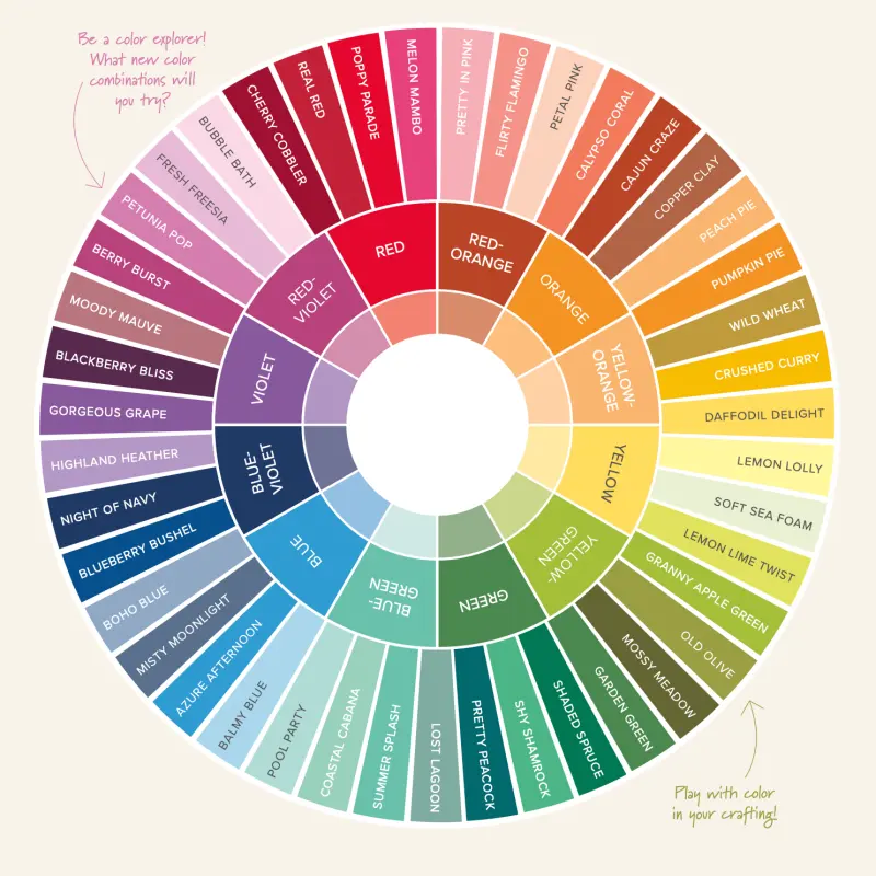
The concept of hue is best visualized through the color wheel, a circular diagram that maps the relationships between primary, secondary, and tertiary colors. By placing colors in a sequence based on their wavelength, artists can understand how hues transition into one another. For example, moving from red to yellow through orange demonstrates the shift in hue as the light wavelength changes. Understanding this classification is the first step in mastering color theory and creating harmonious compositions.
How to use the color wheel for hue selection
The color wheel serves as a practical map for choosing hues that work well together. Artists use specific formulas, known as color harmonies, to select combinations that are aesthetically pleasing. These harmonies rely on the mathematical placement of hues around the wheel to ensure balance and visual interest.
- Monochromatic: Using a single hue and varying its value and saturation.
- Analogous: Selecting three hues that sit side-by-side on the color wheel.
- Complementary: Choosing two hues located directly opposite each other, such as blue and orange.
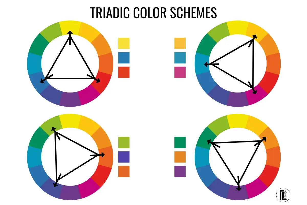
- Triadic: Picking three hues that are evenly spaced around the wheel, forming a triangle.
Using these structures prevents chaotic color choices. When you stick to these established relationships, your artwork gains a sense of intentionality. Beginners should start with a basic 12-part color wheel to practice identifying these relationships before moving on to more complex, multi-hue palettes.
Why hue, value, and saturation matter
Artists often confuse hue with value or saturation, leading to muddy or disjointed paintings. Hue is strictly the "name" of the color. Value refers to how light or dark that hue appears, while saturation describes how vivid or dull the color is. A bright fire-engine red and a muted, dusty rose are the same hue, but they differ significantly in saturation and value.
Failure to distinguish between these properties often results in colors that lack depth. If an artist only focuses on hue, the painting may look flat because it lacks contrast in value. Conversely, if an artist ignores saturation, the work might appear overly vibrant and aggressive. Mastering the interplay between these three dimensions allows for sophisticated color mixing and realistic rendering. You must learn to see the underlying hue even when a color has been darkened with black or lightened with white.

Common mistakes when mixing hues
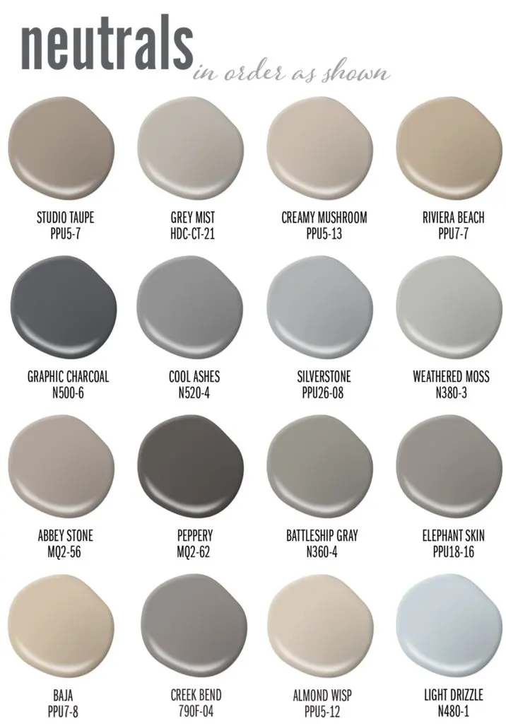
One of the most frequent errors is over-mixing pigments, which often results in a "dead" or muddy brown color. This happens when an artist mixes too many complementary hues together, effectively neutralizing the color. To avoid this, keep your mixtures simple and clean your brushes thoroughly between applications.
- Mixing too many hues at once, which creates a neutral gray or brown.
- Using black to darken a hue, which often shifts the hue toward a muddy green or blue.
- Failing to test colors on a scrap surface before applying them to the final canvas.
- Assuming that all tubes of "red" paint are the same hue, ignoring the subtle temperature shifts between warm and cool pigments.
To correct these mistakes, focus on using a limited palette. By restricting yourself to a few primary hues, you force yourself to understand how they interact. This discipline prevents the accidental creation of muddy colors and helps you maintain the vibrancy of your chosen hues throughout the entire piece.
How to identify hues in nature
Training your eye to identify hue is a skill that improves with observation. When looking at a landscape, do not just see "green" for the grass. Look closer to see if the green leans toward yellow or blue. This distinction between warm and cool hues is vital for creating the illusion of depth and atmosphere in a painting.
Warm hues, such as reds, oranges, and yellows, tend to advance toward the viewer, while cool hues, such as blues, greens, and purples, often recede into the background. By applying this knowledge, you can manipulate the viewer's perception of space within your work. Practice by isolating small sections of a scene and naming the specific hue, then compare it to the colors on your palette. Over time, this analytical approach will become second nature, allowing you to mix and apply color with professional precision and confidence.
Key facts
- Hue refers to the pure spectrum color, such as red, blue, or yellow, independent of its brightness or saturation.
- It is one of the three core properties of color, alongside value (lightness) and saturation (intensity).
- The traditional color wheel organizes hues in a circle to show the relationships between primary, secondary, and tertiary colors.
- Mixing two primary hues, like red and yellow, creates a secondary hue, such as orange.
- You can change the hue of a paint color by adding a small amount of a different pigment, but adding white or black only changes the value.
- When painting, avoid "muddy" colors by limiting the number of hues you mix together at one time.
The bottom line
Hue is the fundamental identity of a color, acting as the primary name we give to a specific wavelength of light. By mastering the color wheel and understanding how hues relate to one another, artists gain the power to create harmonious compositions or striking contrasts. Remember that while you can manipulate the lightness or intensity of a color, the underlying hue remains the anchor of your palette.
People also ask
How is hue different from saturation?
Hue identifies the color family itself, while saturation describes the intensity or purity of that color. A highly saturated color looks vivid and bright, whereas a low-saturation color appears dull or grayish.
What are primary hues?
Primary hues are the foundational colors that cannot be created by mixing other pigments together. In traditional art theory, these are red, yellow, and blue.
Can black and white change the hue of a color?
No, black and white only alter the value of a color. Adding white creates a tint, while adding black creates a shade, but the underlying hue remains the same.
What is a complementary hue?
A complementary hue is the color located directly opposite another on the color wheel. For example, blue is the complement of orange, and using them together creates high visual contrast.
How do artists use hue to create depth?
Artists use warm hues, like reds and oranges, to make objects appear closer to the viewer. Conversely, cool hues, such as blues and greens, tend to recede and make objects look further away.
Why does my paint color look different when it dries?
This often happens because the binder in the paint changes as it loses moisture, which can slightly shift the perceived value or saturation. However, the actual hue of the pigment remains constant regardless of the drying process.
This answer was created with the help of AI research tools and reference sources. Spotted an error? Let us know — we correct mistakes quickly. See our editorial policy.