What is the difference between value and tone in art?
Short answer
Value refers to the relative lightness or darkness of a color, independent of its hue, which creates the illusion of three-dimensional form. Tone, conversely, describes the overall mood or emotional quality of an artwork, often influenced by the selection of colors and the intensity of light used in a composition.
On this page
What is the definition of value in art?
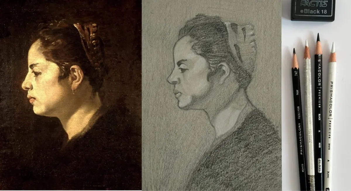
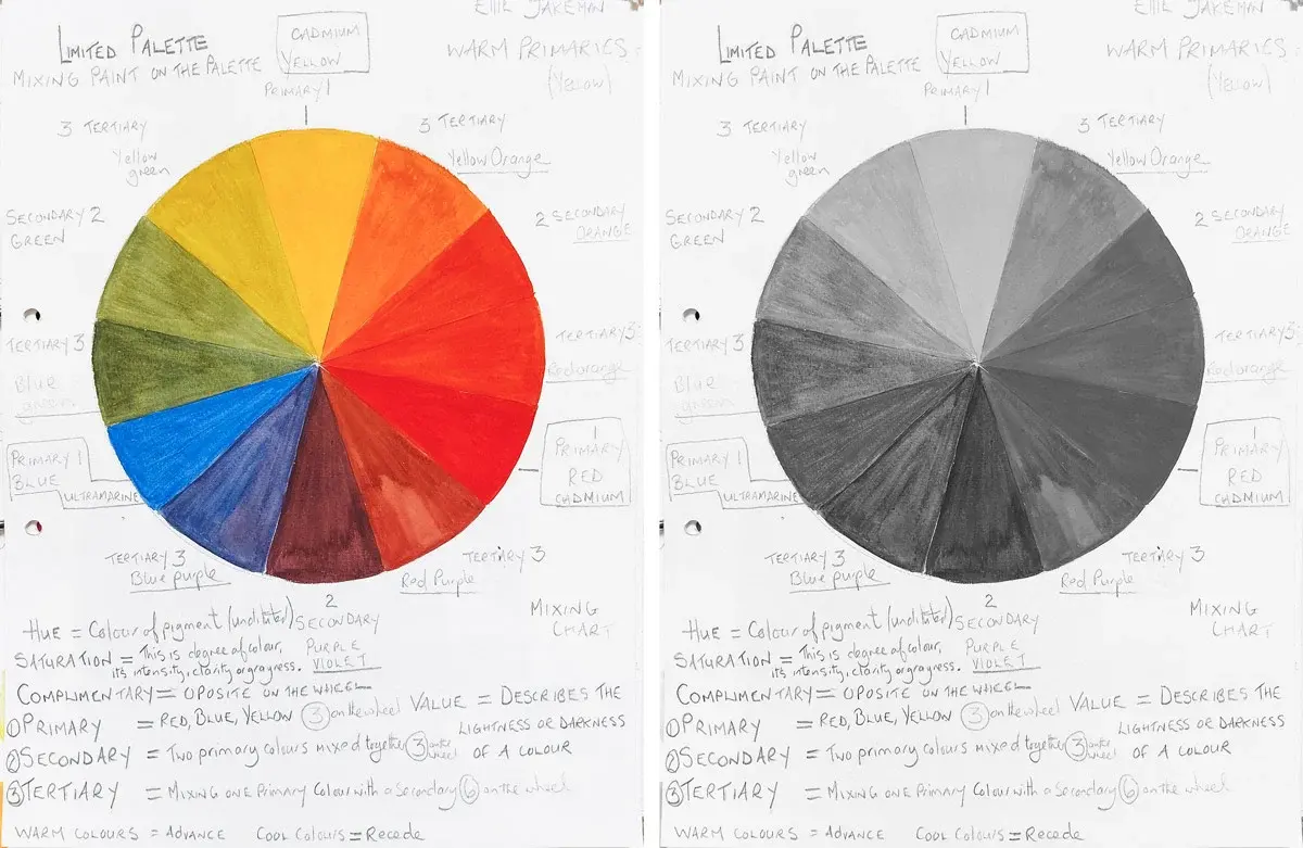
Value is the fundamental element of design that defines the range of light and dark within a work. In a traditional grayscale, value is measured on a scale from pure white to absolute black, with various shades of gray in between. Artists use these gradations to model objects, suggesting volume, depth, and the direction of a light source. Without a clear range of values, a drawing or painting appears flat and lacks structural integrity.
To understand value, consider the concept of contrast. High-contrast works utilize extreme differences between light and dark, which often creates a dramatic or punchy visual effect. Low-contrast works rely on subtle shifts, which can feel soft, atmospheric, or muted. By manipulating these values, an artist directs the viewer’s eye toward the focal point of a composition. Mastering value is essential for any artist, as it provides the scaffolding upon which color and texture are later applied.
How to distinguish tone from value
Tone is a broader term that encompasses the emotional or atmospheric character of a piece. While value is a technical measurement of light, tone is the psychological impact created by the artist's choices. A painting might have a "warm tone" due to the use of yellows and oranges, or a "melancholic tone" achieved through desaturated blues and grays. Tone is influenced by color temperature, saturation, and the overall harmony of the palette.
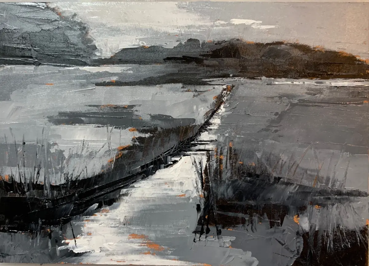
The relationship between the two is symbiotic. An artist might use a specific value structure to reinforce the intended tone. For example, a high-key painting—one that uses mostly light values—often conveys a sense of optimism or lightness. Conversely, a low-key painting, which relies on dark values, typically produces a somber or mysterious tone. Recognizing this distinction allows artists to move beyond simple representation and begin communicating complex moods to their audience.
How to practice value control in drawing
Developing a keen eye for value requires consistent practice. Beginners often struggle with "value compression," where the darkest shadows are not dark enough and the highlights are not bright enough, resulting in a muddy appearance. To improve your grasp of these relationships, follow these structured exercises:
- Create a five-step value scale using a graphite pencil, starting with white paper and ending with the darkest black you can achieve.
- Observe a simple object, such as a white egg, under a single light source to identify the highlight, mid-tone, core shadow, and reflected light.
- Use a viewfinder or squint your eyes when looking at your subject to simplify complex details into basic shapes of light and dark.
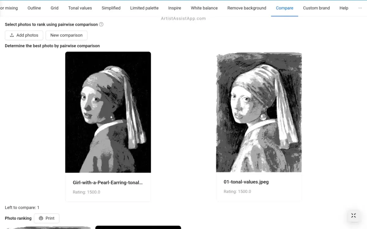
- Draw the same subject using only three values: white, mid-gray, and black, to force yourself to prioritize the most important structural information.
Why tone is important for visual storytelling
Tone acts as the narrative voice of a visual work. It sets the stage for how the viewer interprets the subject matter, regardless of the physical accuracy of the depiction. A portrait painted in cool, desaturated tones suggests detachment or sadness, while the same subject painted in vibrant, warm tones might feel energetic or intimate. By intentionally selecting a tonal range, an artist controls the emotional response of the viewer.
When developing a piece, consider the following elements that contribute to the overall tone:
- Color temperature: Warmer colors advance toward the viewer, while cooler colors tend to recede.
- Saturation: Highly saturated colors feel intense and modern, whereas muted, earthy tones feel historical or grounded.
- Lighting style: Diffused, soft lighting creates a gentle tone, whereas harsh, directional lighting creates a sense of tension.
- Brushwork: Visible, energetic strokes convey a different tone than smooth, blended surfaces.
Common mistakes when balancing value and tone
One frequent error is failing to maintain consistency across the entire composition. If the light source is inconsistent, the values will contradict each other, destroying the illusion of space. Another common mistake is ignoring the "middle values," which are necessary to transition smoothly between highlights and shadows. Without these transitions, the form of an object can look fragmented or broken rather than solid.
Furthermore, artists often neglect the impact of tone by choosing colors that clash with the intended mood. For instance, using overly bright, neon colors in a scene meant to represent a quiet, rainy morning will create a jarring, unintentional dissonance. To avoid these pitfalls, always step back from your work periodically to view it as a whole. Check that your darkest darks are placed correctly to anchor the composition and ensure that your color choices align with the emotional story you are trying to tell. Consistent evaluation ensures that your technical value structure and your expressive tone work together to create a cohesive, impactful piece of art.
Key facts
- Value refers exclusively to the relative lightness or darkness of a color or surface.
- Tone is a broader term that describes the overall quality, mood, or temperature of a color.
- Artists use a value scale of 1 to 10, where 1 is pure white and 10 is absolute black.
- Tonal shifts can change the "warmth" or "coolness" of a painting without necessarily altering its value.
- Squinting at a subject helps isolate value by blurring out distracting details and colors.
- A common mistake is using too many mid-tones, which results in a "muddy" or flat appearance.
The bottom line
Value and tone are essential tools for building depth and mood in art. Value provides the structural framework by defining light and shadow, while tone adds emotional resonance and color harmony. By mastering the range between white and black and understanding how to manipulate color temperature, you can transform a flat image into a dynamic, professional-looking piece that effectively communicates your artistic vision to the viewer.
People also ask
Does changing the value of a color change its tone?
Yes, because adding white to a color creates a tint, while adding black creates a shade, both of which alter the tone. These adjustments change how the color interacts with the light in the composition.
How can I practice seeing values correctly?
Try converting a color photograph of your subject into black and white using a digital editor. This removes the distraction of hue, allowing you to see the underlying structure of light and shadow clearly.
Is tone the same thing as hue?
No, hue refers to the pure pigment, such as red, blue, or yellow. Tone is the modification of that hue through the addition of gray, white, or black to adjust its intensity.
Why do my paintings look flat?
Flatness usually occurs when there is a lack of contrast between the lightest lights and the darkest darks. Ensure your composition includes a full range of values to create a sense of three-dimensional depth.
Can tone influence the emotional impact of an artwork?
Absolutely, as warm tones often evoke feelings of comfort or energy, while cool tones can suggest distance, melancholy, or calm. Artists choose specific tonal palettes to guide the viewer's emotional response.
What is a "local value"?
Local value is the natural lightness or darkness of an object when seen in even, neutral light. For example, a yellow lemon has a lighter local value than a dark blue plum.
This answer was created with the help of AI research tools and reference sources. Spotted an error? Let us know — we correct mistakes quickly. See our editorial policy.