What art style did Andy Warhol use?
Short answer
Andy Warhol is the preeminent figure of Pop Art, a movement that emerged in the 1950s. He utilized techniques such as silkscreen printing to replicate mass-produced imagery, including consumer products and celebrities. His work blurred the lines between fine art and commercial design, emphasizing repetition, vibrant color, and mechanical reproduction methods.

On this page
What is Pop Art?
Pop Art originated in the mid-1950s in Britain and the late 1950s in the United States, representing a sharp departure from the introspective nature of Abstract Expressionism. Artists like Warhol sought to challenge traditional notions of "high art" by incorporating themes from popular culture, advertising, and comic books. By elevating mundane objects—such as soup cans or detergent boxes—to the status of gallery-worthy subjects, Warhol helped democratize art.
This movement reflected the post-war economic boom and the rise of mass media. Warhol, in particular, was fascinated by the way television, magazines, and cinema shaped public perception. He believed that art should be accessible to everyone, not just an elite audience. By choosing recognizable icons, he ensured that his work resonated with the average person, effectively turning the gallery space into a mirror of the modern consumer landscape.
How to identify Warhol’s style
Warhol’s visual language is characterized by specific techniques that prioritize mechanical efficiency over traditional brushwork. The most recognizable element of his style is the use of photographic silkscreen printing. This process allowed him to transfer images onto canvas repeatedly, creating a sense of uniformity and detachment. He often used high-contrast colors, sometimes applying them in ways that intentionally bled outside the lines of the subject matter.
Key features of his aesthetic include:
- Bold, flat areas of color that lack traditional shading or depth.
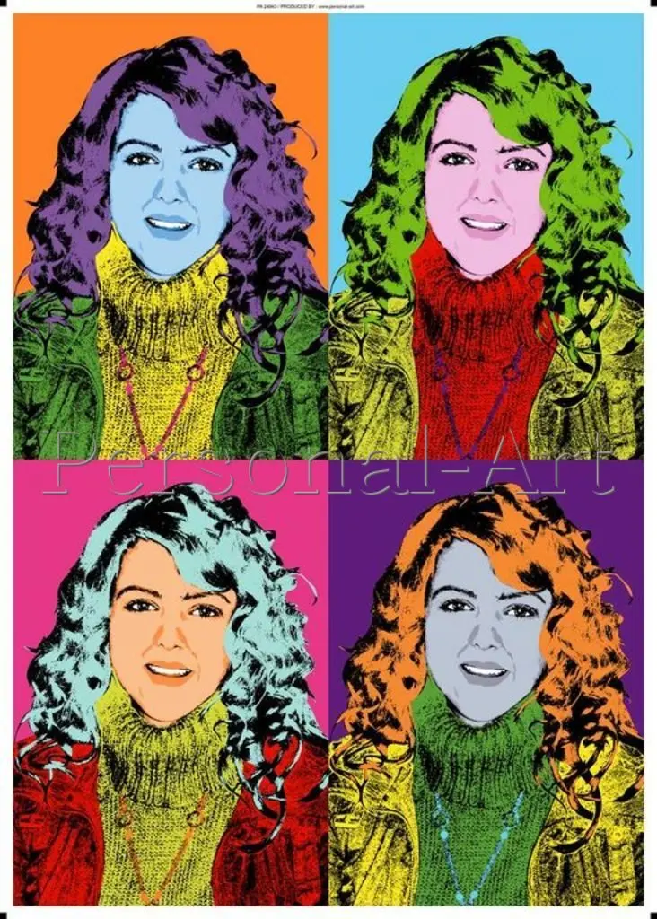
- Repetitive grids that mimic the layout of newspaper advertisements or film strips.
- The use of celebrities and public figures as subjects to explore the nature of fame.
- A "flat" look that emphasizes the surface of the image rather than the illusion of three-dimensional space.
- Intentional imperfections, such as misaligned screens or uneven ink distribution, which added a human touch to his mechanical process.
Why did Warhol use silkscreen printing?
Warhol adopted silkscreen printing, or serigraphy, because it allowed him to move away from the "artist’s hand." By delegating the physical labor to assistants in his studio, known as "The Factory," he transformed the act of painting into an industrial process. This approach was a philosophical statement: he wanted his art to look as though it had been produced by a machine, mirroring the mass-produced goods he depicted.
The efficiency of this method also allowed for mass production on a scale previously unseen in the art world. Warhol could produce dozens of variations of a single image, changing the color schemes to create different moods or associations. This repetition served to strip the subject of its original context, turning a portrait of Marilyn Monroe or a bottle of Coca-Cola into a generic, recognizable icon that could be consumed over and over again.
How to create art in the style of Warhol
Creating work inspired by Warhol requires a focus on bold simplification and high-contrast imagery. The goal is to strip away unnecessary detail and focus on the core silhouette or form of the subject. You can achieve this effect by following these steps:
- Select a high-contrast black-and-white photograph of a recognizable subject.
- Use photo-editing software to increase the contrast until the image consists of only two or three distinct tones.
- Print the image onto a transparency sheet to create a stencil or screen.
- Apply a base layer of flat, vibrant acrylic paint to your canvas.
- Once dry, overlay your image using a screen or a hand-cut stencil and apply a contrasting ink or paint color.
- Repeat the process in a grid pattern using different color combinations for each square.
Common mistakes when imitating Pop Art
A frequent error when attempting to emulate Warhol’s style is over-complicating the composition. Beginners often try to include too much detail or shading, which undermines the "flat" aesthetic that defines Pop Art. Warhol’s work is effective precisely because it is simple and iconic; adding too much nuance or realistic texture will cause the piece to lose its graphic impact.
Another common mistake is choosing subjects that lack cultural recognition. Warhol’s work relied heavily on the viewer’s pre-existing familiarity with the objects or people he portrayed. If the subject is obscure, the irony and commentary on mass media are lost. Furthermore, avoid using muted or "earthy" color palettes. Warhol’s work thrived on artificial, synthetic colors that felt manufactured and bold, so do not be afraid to use neon pinks, electric blues, or high-saturation yellows to achieve that signature mid-century commercial look.
Key facts
- Andy Warhol is the central figure of the Pop Art movement, which emerged in the 1950s and 1960s.
- He utilized the screen printing process to mass-produce images, treating art as a commercial commodity.
- His subject matter focused on consumer products like Campbell’s Soup cans and celebrities such as Marilyn Monroe.
- Warhol’s aesthetic is defined by bold, flat colors, high contrast, and repetitive imagery.
- When creating Pop Art, use high-contrast photographs and limit your color palette to three or four saturated hues.
- Avoid excessive detail or shading; the style relies on simplified shapes and strong outlines to mimic industrial printing.
The bottom line
Andy Warhol revolutionized the art world by embracing the aesthetics of mass production. By utilizing silkscreen printing to replicate iconic consumer goods and celebrity portraits, he transformed everyday imagery into high art. His style is characterized by bold colors, repetition, and a rejection of traditional artistic craft. Ultimately, Warhol’s work reflects the intersection of fame, commercialism, and the mechanical nature of modern visual culture.
People also ask
Why did Warhol choose to paint soup cans?
Warhol chose Campbell’s Soup cans because they represented the ubiquity of mass-produced consumer culture. He famously noted that he ate the same lunch every day for twenty years, making the product a universal symbol of American life.
Did Warhol paint his works by hand?
While Warhol used traditional painting techniques early in his career, he shifted to silkscreen printing to remove the "human touch." This mechanical process allowed him to create multiple versions of a single image quickly.
What was the name of his studio?
His studio was famously known as "The Factory." It served as a social hub for artists, musicians, and celebrities, functioning like an assembly line for his creative output.
How did Warhol influence modern advertising?
Warhol blurred the lines between high art and commercial graphic design. His focus on branding and repetition changed how companies approach visual identity and marketing campaigns today.
Is Pop Art considered fine art?
Initially met with skepticism, Pop Art is now firmly established as a major movement in art history. It challenged traditional notions of artistic genius by elevating everyday objects to the status of museum-quality work.
What materials do beginners need to try Pop Art?
Beginners need acrylic paints, heavy cardstock or canvas, and a screen printing frame or high-contrast stencils. Focus on simplifying your subject into basic shapes before applying vibrant, non-naturalistic colors.
This answer was created with the help of AI research tools and reference sources. Spotted an error? Let us know — we correct mistakes quickly. See our editorial policy.