What colors make emerald green?
Short answer
Emerald green is created by mixing a vibrant, cool-toned blue with a bright, slightly yellow-leaning green. To achieve the specific depth of emerald, you must incorporate a small amount of black or a deep violet to neutralize the brightness, resulting in a rich, jewel-toned pigment that mimics the natural gemstone.
On this page
How to mix emerald green paint
To create an authentic emerald green, start by selecting a base of phthalo green or viridian. These pigments offer the high-chroma, cool-toned foundation necessary for a jewel-toned effect. If you use a warm, earthy green like olive or sap green, your final result will look muddy rather than vibrant.
Once you have your base green, gradually introduce a cool blue, such as ultramarine or cerulean. Adding blue shifts the temperature of the green toward the cooler end of the spectrum, which is a defining characteristic of the emerald hue. Follow these steps to refine your mixture:
- Begin with a palette knife and a generous dollop of phthalo green.
- Add a small amount of cool blue, mixing thoroughly until the color shifts.
- Introduce a tiny touch of black or deep violet to darken the value without losing the saturation.
- Test the color on a white surface, as emerald green often appears darker when wet than when dry.
Why emerald green is difficult to match
The primary challenge in mixing emerald green lies in maintaining its high saturation while simultaneously darkening its value. Many beginners mistakenly add too much black, which immediately dulls the pigment and turns it into a flat, forest green. Emerald green requires a delicate balance between brilliance and depth, which is rarely achieved in a single step.
Another common issue is the "mud" factor caused by mixing complementary colors. Because green and red are opposites on the color wheel, adding any red-toned pigment will neutralize the green and create a brownish or gray tint. If your mixture starts to look dull, it is likely because a warm yellow or a reddish blue has contaminated the palette. Always ensure your brushes are cleaned thoroughly before blending, as even a trace of leftover warm pigment can compromise the clarity of the emerald shade.
Best tools for color mixing
For the best results, use professional-grade acrylics or oils with high pigment loads. Student-grade paints often contain fillers that make it impossible to achieve the intense, crystalline quality of a true emerald. A glass palette is also recommended because it is non-porous and allows you to see the true transparency of your color layers without interference from the surface.
When mixing, use a metal palette knife rather than a brush. Brushes tend to trap pigment in the bristles, leading to inconsistent color distribution and wasted material. A palette knife allows for a clean, uniform blend that ensures the blue and green particles are fully integrated. Consider the following tools for your studio:
- High-pigment phthalo green (blue shade)
- Ultramarine blue or cobalt blue
- A small tube of lamp black or dioxazine purple
- A stainless steel palette knife
- A clean, white mixing surface to accurately judge color depth
How to adjust emerald green shades
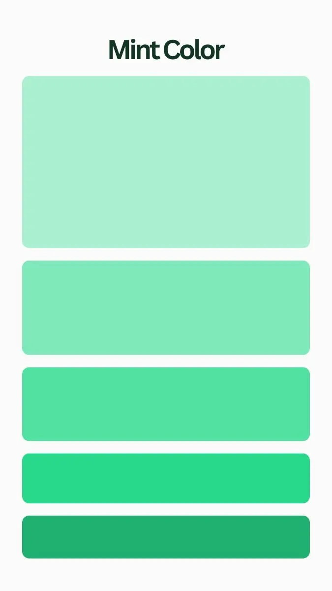
Once you have achieved your base emerald, you may want to adjust it for specific artistic applications. If you need a lighter, more luminous emerald for highlights, add a very small amount of white. However, be cautious, as white paint contains titanium dioxide, which can quickly turn a deep jewel tone into a pastel or mint green.
To deepen the shade for shadows, avoid using more black. Instead, try adding a tiny amount of deep violet or indigo. These colors add depth while maintaining the cool, jewel-like temperature of the emerald. If the color becomes too cool, a microscopic amount of lemon yellow can bring back a hint of warmth without destroying the emerald identity. Always perform these adjustments in small increments, as it is much easier to darken a light color than it is to brighten a color that has become too dark or muddy.
Common mistakes when mixing green
The most frequent error is neglecting the importance of color temperature. Many artists treat all greens as interchangeable, but emerald green specifically requires cool-toned components. Using a warm yellow, such as cadmium yellow, will result in a grassy or lime green that lacks the sophisticated, deep-sea quality of a gemstone. Always verify that your blue and green pigments are labeled as "cool" or "blue-shade" before beginning your mix.
Another mistake is failing to account for the drying shift. Many acrylic paints darken significantly as they dry, which can lead to a final result that looks black rather than emerald. To avoid this, mix your color slightly lighter than your target shade. Additionally, avoid over-mixing your colors. If you stir the paint for too long, the pigments can become overworked and lose their individual brilliance, resulting in a flat, lifeless appearance. By keeping your mixing process intentional and concise, you preserve the vibrancy of the pigments and achieve a professional, jewel-toned finish that remains true to the emerald color profile.
Key facts
- Emerald green is a cool-toned, saturated green created by mixing a primary blue with a primary yellow.
- For the most vibrant emerald, use a cool yellow like lemon yellow and a cool blue like phthalo blue.
- Adding a tiny touch of white can increase the brightness, but too much will turn the mixture into a pastel mint.
- To darken emerald green without making it muddy, add a very small amount of black or a complementary red.
- Avoid mixing warm yellows (like cadmium yellow) or warm blues (like ultramarine) as they create olive or earthy greens.
- Always add the darker color to the lighter color incrementally to maintain control over the final hue.
The bottom line
To achieve the perfect emerald green, prioritize cool-toned pigments by combining a lemon yellow with a phthalo or cyan blue. This specific combination ensures the resulting hue remains vibrant rather than earthy. Always mix your colors gradually, starting with the yellow and adding the blue bit by bit. By avoiding warm undertones and complementary colors, you can maintain the signature brilliance of this classic jewel tone.
People also ask
How do I make emerald green darker?
You can deepen emerald green by adding a tiny amount of black paint or a touch of deep red. Be careful, as red is the complementary color of green and will quickly turn your mixture into a brownish-gray if you add too much.
Why does my emerald green look muddy?
Muddy colors usually occur when you mix all three primary colors together or use paints with heavy brown undertones. Stick to cool-toned yellows and blues to keep the green crisp and avoid mixing in complementary colors accidentally.
Is emerald green a primary or secondary color?
Emerald green is a secondary color because it is created by mixing the primary colors blue and yellow. It sits between blue and yellow on the color wheel, specifically occupying a space in the cool spectrum.
What is the difference between emerald and forest green?
Emerald green is a bright, jewel-toned color with a cool, blue-leaning base. Forest green is much darker and contains more yellow and black pigments, giving it an earthy, muted appearance compared to the vividness of emerald.
Can I use emerald green in digital design?
Yes, in digital spaces, emerald green is defined by specific hex codes such as #50C878. These codes represent the precise balance of red, green, and blue light required to display the color on a screen.
How do I lighten emerald green without losing its intensity?
To lighten the color while keeping it vibrant, use a very small amount of white or a transparent glazing medium. Using too much white will desaturate the pigment and shift the color toward a soft, milky teal.
This answer was created with the help of AI research tools and reference sources. Spotted an error? Let us know — we correct mistakes quickly. See our editorial policy.