How do you paint strawberries with watercolor?
Short answer
Painting strawberries with watercolor requires a layered approach, beginning with a light yellow or pale red base. By preserving white highlights and building depth through successive glazes of crimson and carmine, you achieve a realistic, juicy appearance. Careful attention to the texture of the seeds and the green leafy calyx is essential.
On this page
What supplies do I need for watercolor strawberries?
To achieve professional results, you need high-quality materials that allow for smooth color transitions. Start with cold-press watercolor paper, which has a slight texture that helps capture the organic, bumpy surface of a strawberry. You will need a set of professional-grade watercolor paints, specifically focusing on warm reds like Cadmium Red, Alizarin Crimson, and a touch of Aureolin yellow for the highlights.
For brushes, a round brush in sizes 4 and 8 is sufficient for most of the work. The size 8 is excellent for laying down the initial washes, while the size 4 allows for the precision required to paint the tiny seeds and the delicate stem. Keep two jars of water nearby: one for rinsing dirty brushes and one for clean water to mix fresh colors. A small piece of masking fluid or a white gouache pen is also helpful for creating sharp, bright highlights on the skin of the fruit.
How to sketch and prepare the paper
Before applying any pigment, a light, accurate sketch is the foundation of your painting. Use a hard lead pencil, such as an H or 2H, to draw the outline of the strawberry. Keep your lines very faint so they do not show through the transparent watercolor layers. Focus on the heart-shaped silhouette and the irregular distribution of the seeds, which are not perfectly symmetrical.
Once the sketch is complete, you may choose to use masking fluid to protect the areas where the light hits the strawberry. This preserves the white of the paper, ensuring the highlights remain crisp and bright. Follow these steps to prepare your workspace:
- Tape your paper to a flat board to prevent buckling when it gets wet.
- Lightly erase any dark graphite lines that might smear.
- Test your paint consistency on a scrap piece of paper to ensure the color is transparent enough for layering.
- Ensure your brushes are clean and your water is fresh to avoid muddying the vibrant red tones.
How to layer colors for a realistic look
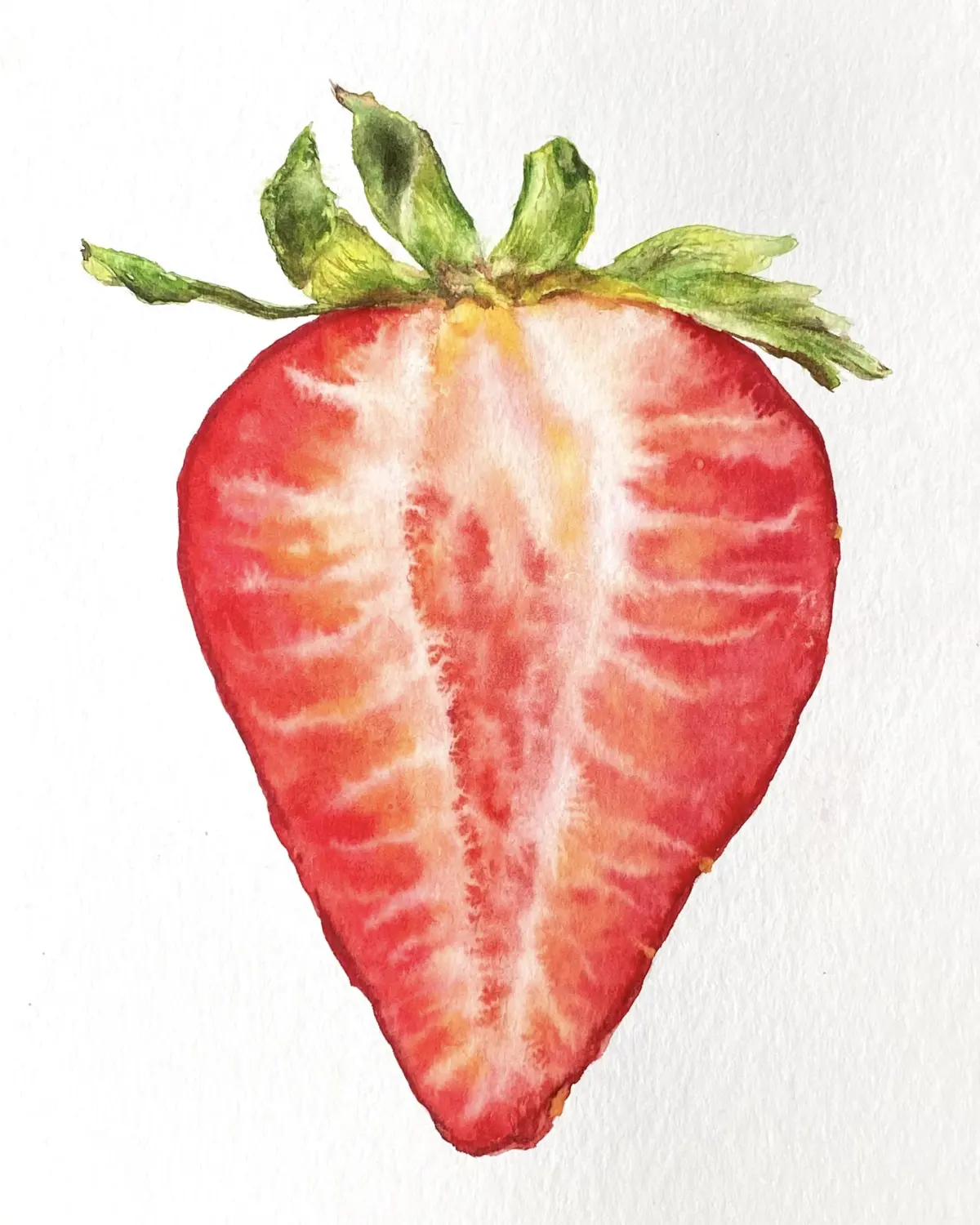
The key to a realistic strawberry is building depth through multiple transparent layers, known as glazing. Start by applying a very thin, watery wash of yellow or pale orange over the entire fruit, excluding the leaves. This underpainting provides a warm glow that will shine through the subsequent red layers, making the fruit look juicy and ripe.
Once the first wash is completely dry, apply your first layer of red. Use a diluted Alizarin Crimson to establish the shadows and the darker side of the fruit. As you add more layers, increase the concentration of the pigment. Always wait for each layer to dry before adding the next to prevent the paper from becoming overworked or fuzzy. Focus on the following areas to enhance realism:
- The base of the strawberry, which is typically darker.
- The area immediately surrounding each seed, which should be slightly shaded.
- The transition between the light and shadow sides, which should be soft and smooth.
How to paint the seeds and leaves
The seeds and the green leafy top, known as the calyx, provide the necessary contrast to the red body of the fruit. For the seeds, use a small, pointed brush to dab tiny, dark brown or deep red dots onto the surface. Do not make them perfectly uniform; real strawberries have seeds that vary in size and spacing. If you want them to look sunken, paint a tiny crescent shadow on the upper side of each seed.
The leaves require a mix of sap green and a touch of blue or brown to create a natural, earthy tone. Use quick, confident strokes to mimic the jagged edges of the calyx. Start with a light green wash and then add darker green to the areas where the leaves connect to the fruit. By varying the pressure of your brush, you can create thicker stems and thinner, tapering leaf tips that look organic and alive.
Common mistakes when painting strawberries
One of the most frequent errors is using too much water, which causes the colors to bleed uncontrollably and lose their shape. If your paint is too thin, the strawberry will look washed out and flat rather than plump and three-dimensional. Conversely, using too much paint without enough water can make the surface look chalky and opaque, hiding the natural luminosity that watercolor is known for.
Another common mistake is ignoring the direction of the light source. If you paint shadows on both sides of the strawberry, it will lose its volume and look like a flat cutout. Always identify where the light is coming from before you start your final shading. Finally, avoid over-blending your colors while they are still wet, as this often leads to muddy, brown tones. Allow the paper to dry naturally between layers to maintain the clarity and brilliance of your red pigments. By practicing patience and observing your reference closely, you will create a beautiful, vibrant piece of art.
Key facts
- Use a round brush, size 4 or 6, to maintain control over the strawberry’s organic, teardrop shape.
- Apply a light wash of permanent rose or cadmium red as a base layer before adding darker shadows.
- Leave small, unpainted white gaps to represent the natural highlights on the strawberry's glossy skin.
- Paint the seeds using a fine-tipped rigger brush with a mixture of burnt umber and deep red.
- Use a "wet-on-wet" technique for the body to achieve soft color transitions, then switch to "wet-on-dry" for crisp details.
- Avoid overworking the paper, as watercolor pigments can become muddy if brushed too many times while damp.
The bottom line
Painting strawberries in watercolor requires a balance between soft, layered washes and sharp, final details. By establishing a light base color, defining the form with shadows, and carefully adding the seed texture once the surface is dry, you can achieve a realistic look. Remember to preserve white space for highlights, as this provides the essential glossy finish that makes the fruit appear fresh and vibrant.
People also ask
What is the best paper for watercolor strawberries?
Use 140lb (300gsm) cold-press watercolor paper. Its slight texture helps hold the pigment in place and prevents the water from pooling uncontrollably.
How do I make the strawberry look three-dimensional?
Focus on light source consistency by keeping one side of the berry lighter and applying deeper, concentrated pigment to the opposite side. This creates a clear shadow that gives the fruit volume.
Should I paint the green leaves before or after the red fruit?
It is generally safer to paint the red fruit first and allow it to dry completely. This prevents the green pigment from bleeding into the red, which would create an unwanted brownish hue.
How do I create the tiny dots on a strawberry?
Use a small, pointed brush to dab tiny, irregular shapes onto the surface. Vary the spacing and size of these dots to mimic the natural, uneven distribution of seeds on real fruit.
Why do my colors look dull once they dry?
Watercolor pigments lighten significantly as they dry. To compensate, use a slightly higher concentration of paint than you think you need, especially for the darkest shadows.
How can I fix a mistake if I paint outside the lines?
While the paint is still wet, use a clean, damp brush to lift the pigment off the paper. If the paint is already dry, you may need to gently scrub the area with a stiff brush and water, though this can damage the paper surface.
This answer was created with the help of AI research tools and reference sources. Spotted an error? Let us know — we correct mistakes quickly. See our editorial policy.