Why is blue the most popular color?
Short answer
Blue is the most popular color globally because of its deep association with positive, stable elements in the natural world, specifically the sky and the ocean. Psychologically, humans perceive blue as calming, trustworthy, and non-threatening. These evolutionary preferences are reinforced by cultural conditioning, making blue a universally safe and preferred choice.
On this page
Why do humans prefer blue?
Evolutionary psychologists suggest that our preference for blue is rooted in "ecological valence theory." This theory posits that humans like colors based on the emotional experiences associated with the objects that share those colors. Because blue is linked to the clear sky and clean water—both essential for survival and positive experiences—we have developed a subconscious affinity for it. Unlike red, which can signal danger, blood, or fire, blue consistently represents stability and openness.
This preference appears to be cross-cultural. Studies conducted by researchers like Stephen Palmer and Karen Schloss have shown that even across diverse geographic locations, people consistently rank blue as their favorite color. While cultural nuances exist, the universal presence of the sky and water creates a shared human foundation for this aesthetic choice. It is a color that rarely triggers negative biological or emotional responses, making it a reliable favorite.
How does blue affect human psychology?
Blue is widely recognized for its ability to lower the heart rate and reduce feelings of anxiety. In environments where stress management is a priority, such as hospitals or corporate offices, blue is frequently used to promote a sense of calm and productivity. The color is perceived as "cool" and "distant," which helps individuals feel more collected and less overwhelmed by their immediate surroundings.
Beyond relaxation, blue is strongly linked to feelings of trust and reliability. This is why it is the dominant color in the financial and technology sectors. Companies use blue to signal that they are stable, professional, and secure. When you see a blue logo, your brain is being conditioned to associate that brand with dependability.
- Blue reduces cortisol levels, helping the body relax.
- It increases focus by minimizing visual distractions.
- It creates a perception of space, making small rooms feel larger.
Why is blue used in branding?
Marketing professionals utilize blue because it is the "safest" color for reaching a broad audience. Because it is rarely disliked, it minimizes the risk of alienating potential customers. Brands like IBM, Ford, and American Express have utilized blue for decades to reinforce their identities as established, trustworthy institutions. It effectively communicates that a company is not a passing trend but a permanent, reliable force.
When choosing a brand color, designers often lean toward blue to ensure longevity. While trends in color palettes change frequently, blue remains a constant. It acts as a neutral base that pairs well with almost any other color, allowing for versatility in advertising campaigns. By choosing blue, a business aligns itself with the global psychological preference for stability and integrity.
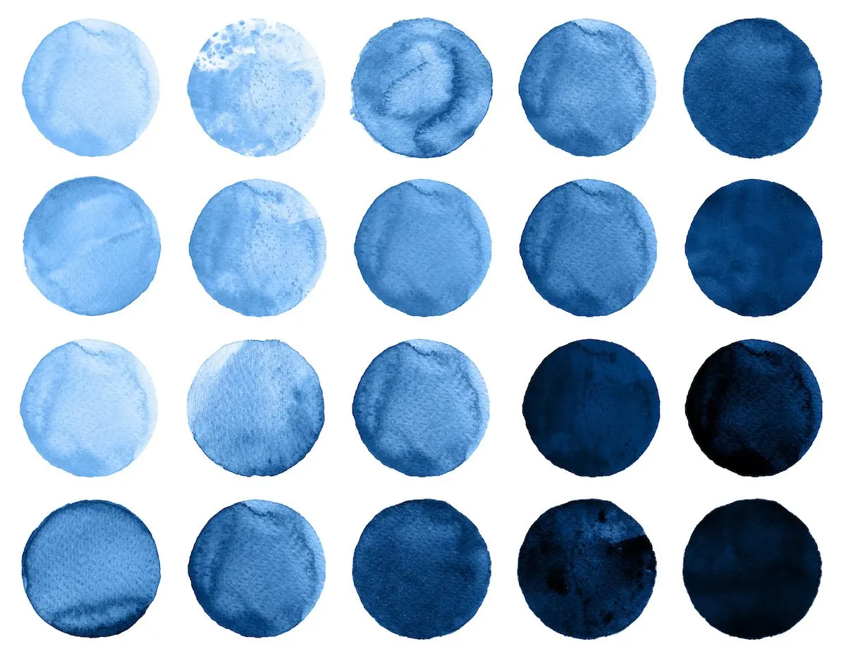
- Use navy blue for a sense of authority and tradition.
- Use sky blue for a sense of friendliness and accessibility.
- Use royal blue for a sense of energy and confidence.
How to use blue in interior design?
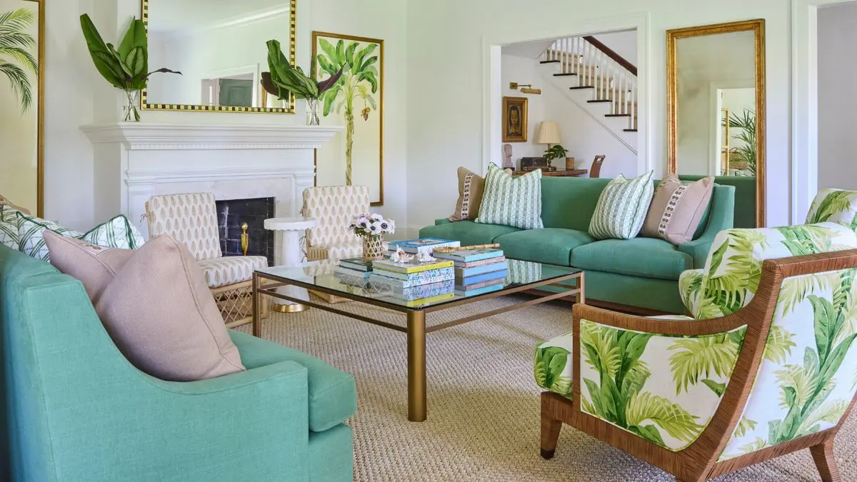
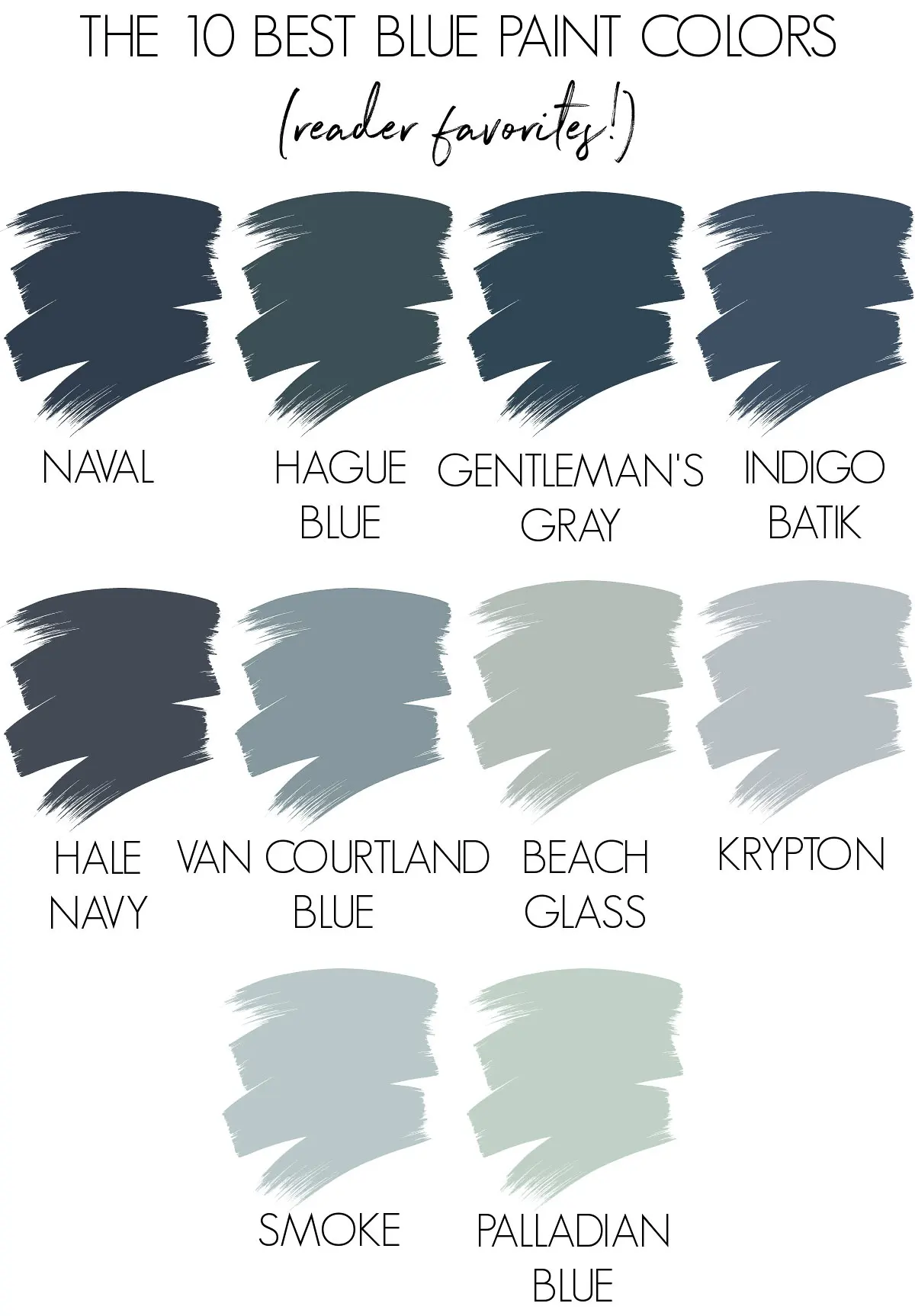
Using blue in your home can transform the mood of a room significantly. To achieve a balanced look, consider the size of the space and the amount of natural light it receives. Darker shades, such as midnight or navy, create a cozy, intimate atmosphere, which is ideal for bedrooms or libraries. Lighter shades, like powder blue, reflect more light and can make a cramped hallway or small kitchen feel airy and open.
A common mistake is using too much of a single shade, which can make a room feel cold or sterile. To avoid this, incorporate textures and complementary colors. Wood tones, metallic accents, or warm textiles like wool and velvet can ground the coolness of blue. If you are painting a room, always test a swatch on the wall for 24 hours to see how it shifts as the natural light changes from morning to evening.
Common mistakes when choosing colors?
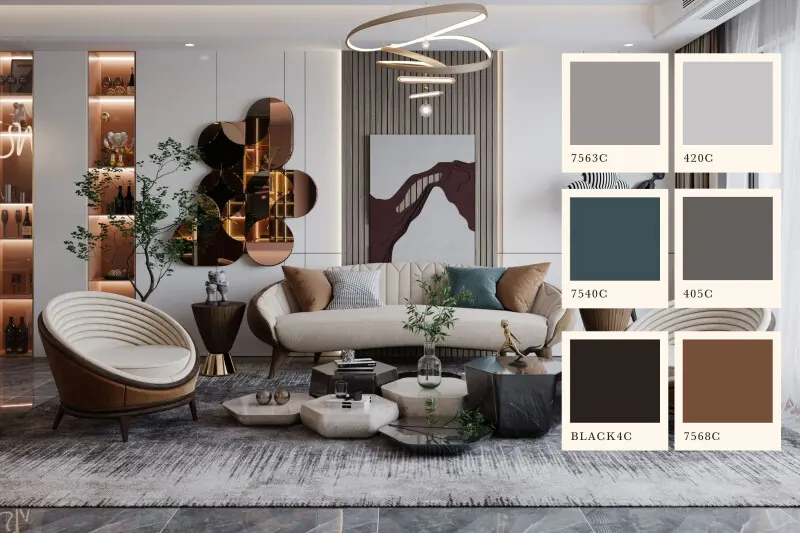
One of the most frequent errors people make is ignoring the "undertones" of a blue paint or fabric. Some blues lean toward green, while others lean toward purple. If you place a green-toned blue next to a warm yellow, the colors may clash, creating a jarring visual experience. Always compare your samples side-by-side to ensure the undertones harmonize rather than compete.
Another mistake is failing to consider the surrounding environment. If your room already has a lot of gray or white, a very bright blue might look overwhelming. Conversely, in a room with warm, earthy tones, a cool blue can act as a necessary "reset" for the eyes. Follow these steps to ensure your color choice is successful:
- Identify the primary mood you want the room to convey.
- Select three shades of blue and test them in different lighting conditions.
- Pair your chosen blue with at least one warm accent color to maintain balance.
- Evaluate the contrast between the blue and your existing furniture.
By following these guidelines, you can effectively leverage the psychological benefits of blue while avoiding the common pitfalls of interior design and personal branding.
Key facts
- Surveys conducted across dozens of countries consistently show that blue is the favorite color of 30 to 40 percent of the global population.
- Evolutionary psychologists suggest blue is preferred because it is associated with positive environmental features like clear skies and clean water.
- Unlike red or yellow, blue is rarely associated with negative natural phenomena, such as fire, blood, or toxic plants.
- In marketing, blue is frequently used by financial institutions and tech companies to convey a sense of reliability, trust, and professionalism.
- A 2010 study by researchers at the University of Sussex found that blue is the most common color used in corporate logos worldwide.
- When choosing blue for interior design, avoid using too many dark shades in small rooms, as this can make the space feel claustrophobic rather than calming.
The bottom line
Blue’s status as the world’s favorite color stems from a unique blend of evolutionary biology and cultural utility. By linking the color to life-sustaining elements like water and clear skies, humans have developed an innate preference for it. This universal appeal makes blue a powerful tool in design and branding, offering a reliable way to communicate trust, calm, and stability to a global audience.
People also ask
Why do people find the color blue calming?
Blue is associated with the vastness of the sky and the sea, which triggers a psychological response linked to openness and tranquility. Studies show that looking at blue can physically lower heart rates and reduce feelings of anxiety.
Does color preference change as people get older?
Research indicates that color preferences are relatively stable throughout adulthood, though they can shift slightly based on cultural experiences. Children often prefer bright primary colors, while adults tend to gravitate toward more muted or sophisticated shades of blue.
Are there any negative associations with the color blue?
While generally positive, blue can be perceived as cold, distant, or unappetizing in certain contexts. Because very few natural foods are blue, it is often considered an appetite suppressant in culinary settings.
How does culture influence the popularity of blue?
While blue is globally popular, its specific meaning varies; for example, it represents mourning in some cultures and divinity in others. Despite these differences, the positive association with nature remains a near-universal constant.
Why is blue so common in business branding?
Brands use blue to build trust and signal stability to consumers. It is a "safe" color that rarely alienates customers, making it an ideal choice for global companies seeking broad appeal.
Is blue the most popular color for clothing?
Yes, blue is the most popular color for clothing, particularly denim, which is a staple in most wardrobes. Its versatility allows it to be paired easily with almost any other color, enhancing its practical appeal.
This answer was created with the help of AI research tools and reference sources. Spotted an error? Let us know — we correct mistakes quickly. See our editorial policy.