What is the complementary color of blue?
Short answer
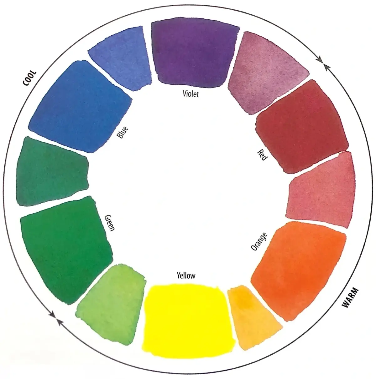
The complementary color of blue is orange. In traditional color theory, complementary colors sit directly opposite each other on the color wheel. When placed side-by-side, they create the strongest visual contrast, making each color appear more vibrant. This relationship is fundamental to art, design, and color science applications worldwide.
On this page
What is the color wheel and how does it work?
The color wheel is a circular diagram that maps the relationships between colors based on the laws of optics. Developed in its modern form by Sir Isaac Newton in 1666, the wheel organizes colors by their wavelength, starting with red and moving through the spectrum to violet. The primary colors—red, yellow, and blue—form the foundation of the wheel. By mixing these, secondary colors like orange, green, and purple are created.
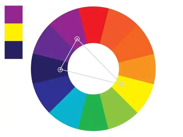
Complementary colors are defined as any two hues positioned directly across from one another on this wheel. Because these pairs contain the maximum possible contrast, they are often referred to as "opposite" colors. When you look at the wheel, you will find blue at one side and its direct counterpart, orange, exactly 180 degrees across. This geometric arrangement serves as a universal tool for artists and designers to create balance and tension within a composition.
Why do blue and orange look good together?
The visual impact of blue and orange stems from how the human eye and brain process light. Our eyes have photoreceptor cells called cones that are sensitive to different wavelengths of light. When we look at a blue object, those specific receptors are stimulated. If we then shift our gaze to a neutral surface, the brain experiences a "negative afterimage," where the opposite color—orange—appears briefly. This physiological reaction is known as successive contrast.
Because these two colors are opposites, they do not share any common wavelengths in the light spectrum. When they are placed next to each other, the brain perceives a heightened intensity in both hues. This phenomenon is highly effective in various fields:
- Fine art: Impressionist painters used this contrast to make shadows appear deeper and light appear brighter.
- Marketing: Advertisers use blue and orange to grab attention because the high contrast is impossible to ignore.
- Sports: Many team uniforms utilize this pairing to ensure high visibility on the field.
How to use complementary colors in design
Using complementary colors successfully requires a balance of intensity and proportion. If you use equal amounts of bright blue and bright orange, the result can be visually overwhelming or "vibrating" to the viewer. To create a professional look, designers often choose one color to be the dominant hue and use the other as an accent. This prevents the colors from competing for the viewer's attention and creates a more harmonious experience.
If you are beginning a project, follow these steps to incorporate blue and orange effectively:
- Select a base color, such as a deep navy blue, to cover approximately 70 percent of your space or canvas.
- Introduce the complementary orange as a secondary or accent color to highlight specific areas of interest.
- Adjust the saturation and value of the colors; for instance, use a pale, dusty blue with a vibrant, burnt orange to create a sophisticated, modern aesthetic.
- Use neutral colors like white, gray, or black to bridge the gap between the two intense opposites.
Common mistakes when pairing colors
One frequent error is failing to consider the "value" of the colors being used. Value refers to the lightness or darkness of a hue. If you choose a dark blue and a dark orange, the contrast may be lost because they share similar levels of brightness. This can make a design look muddy or confusing rather than sharp and intentional. Always ensure there is a clear difference in lightness between the two colors to maintain readability and impact.
Another common mistake is oversaturation. While bright, neon-like colors can be useful for specific high-energy projects, they are often fatiguing to the eye when used in large quantities. Beginners often assume that "complementary" means using the most intense version of both colors simultaneously. To avoid this, consider these adjustments:
- Desaturate one of the colors by adding gray or white to it.
- Use different textures to change how the light reflects off the blue and orange surfaces.
- Limit the use of the brighter color to small, strategic areas like buttons, text, or focal points.
How color theory differs in digital screens
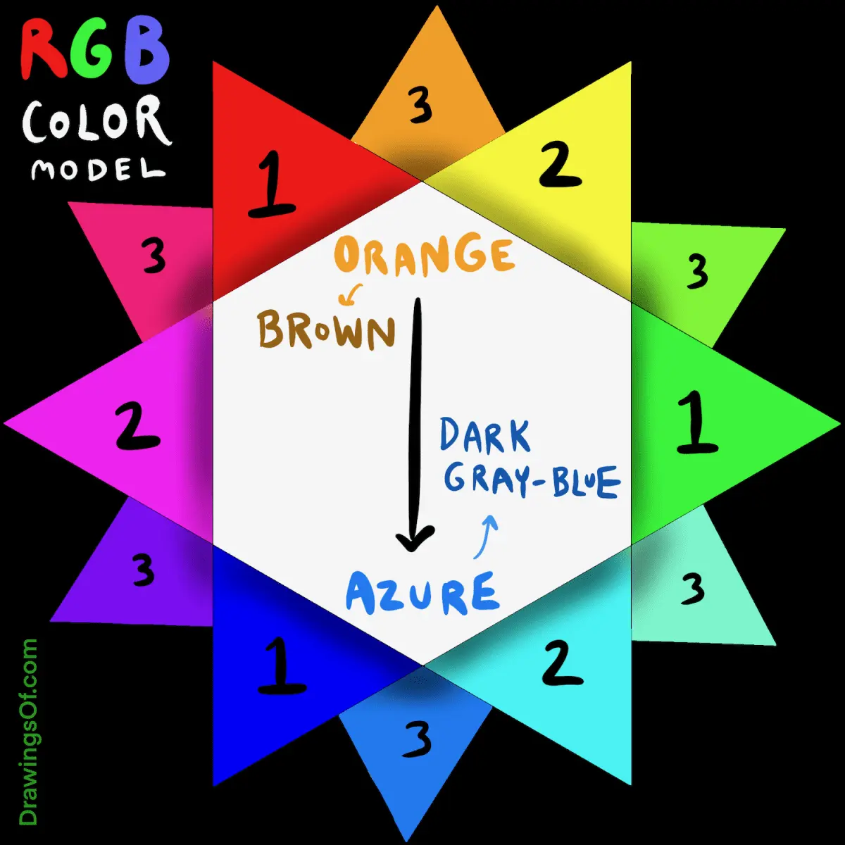
While traditional art uses pigments, digital screens use light to create colors via the RGB (Red, Green, Blue) model. In this digital space, the complementary color of blue is still technically orange, but the way it is generated is different. Screens emit light directly into the eye, which can make colors appear much more luminous than they would on paper. Designers working for web or mobile interfaces must account for how these colors render on various devices and brightness settings.
Because screens have a wider color gamut than printed ink, the orange you see on a monitor might look different when printed on a physical page. This is known as the difference between additive color (light) and subtractive color (pigment). When preparing designs for both print and digital, always check your color profiles to ensure the blue-orange contrast remains consistent across all mediums. By understanding these technical nuances, you can ensure your visual work remains professional, accurate, and visually compelling regardless of the final output format.
Key facts
- The complementary color of blue is orange, which sits directly opposite it on the traditional color wheel.
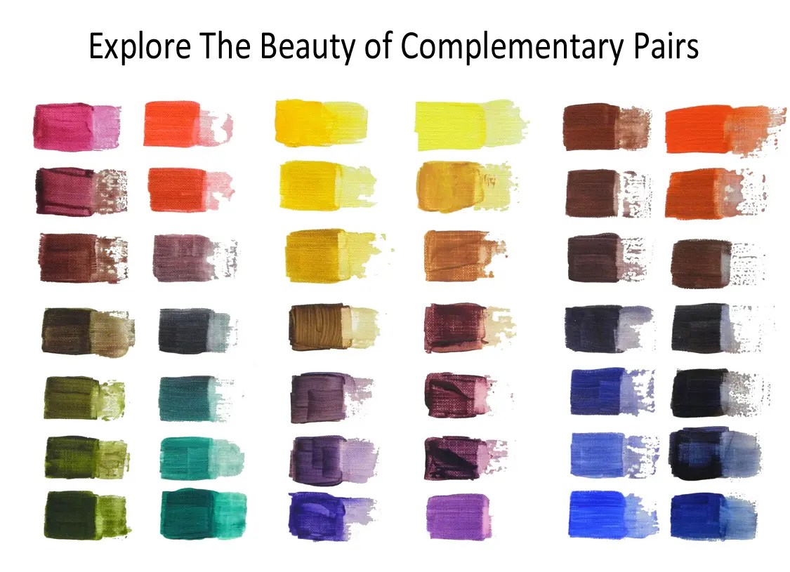
- In the RYB (Red-Yellow-Blue) color model used by painters, mixing blue and orange results in a neutral brown or gray.
- Complementary colors create the highest possible visual contrast, making each color appear more vibrant when placed side-by-side.
- Digital screens use the RGB (Red-Green-Blue) model, where the complementary color of blue is yellow.
- To create a custom orange for a blue painting, mix red and yellow pigments in varying ratios to adjust the warmth.
- A common mistake is using pure, unmixed complementary colors; instead, desaturate them slightly to prevent the colors from vibrating uncomfortably.
The bottom line
Understanding that orange is the complementary color of blue is essential for artists and designers aiming to create high-impact visual contrast. Whether you are painting on canvas or decorating a room, pairing these opposites draws the viewer's eye and adds dynamic energy to your work. By mastering the balance between these two hues, you can manipulate color temperature and intensity to achieve professional, harmonious results.
People also ask
Why do complementary colors look good together?
They create a high-contrast visual balance that is pleasing to the human eye. Because they occupy opposite positions on the color wheel, they stimulate different parts of the visual spectrum simultaneously.
How do I use complementary colors in interior design?
Use one color as the dominant base and the other as a subtle accent. For example, a blue room can be accented with orange throw pillows or artwork to add energy without overwhelming the space.
What is a split-complementary color scheme?
This scheme uses a base color along with the two colors adjacent to its complement. For blue, this would include yellow-orange and red-orange, providing a softer contrast than a direct complementary pair.
Do printers use the same complementary colors as painters?
No, printers use the CMYK (Cyan, Magenta, Yellow, Key/Black) model. In this system, the complement of cyan is red, which differs from the traditional RYB color wheel used in fine arts.
Can I mix complementary colors to make black?
Mixing blue and orange will create a dark, muddy neutral tone, but it rarely produces a true, deep black. Most artists prefer using a pre-mixed black pigment or combining primary colors to achieve a richer, darker shade.
How can I identify the complement of any color?
You can find a color's complement by looking at a standard color wheel and identifying the hue directly across from your target color. If you are working digitally, color picker tools often provide the exact hex code for the opposite hue.
This answer was created with the help of AI research tools and reference sources. Spotted an error? Let us know — we correct mistakes quickly. See our editorial policy.