What is the complementary color of turquoise?
Short answer
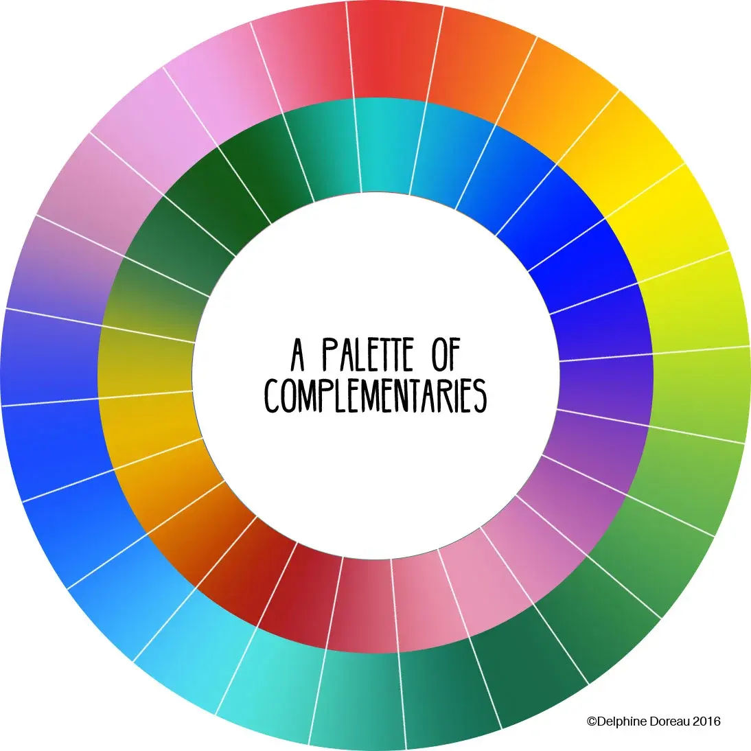
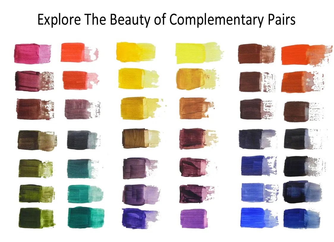
The complementary color of turquoise is red-orange. In color theory, complementary colors sit directly opposite each other on the color wheel. Because turquoise is a blue-green hue, its direct opposite is a warm, vibrant red-orange. This high-contrast pairing creates visual intensity, making both colors appear more vivid when placed side-by-side.
On this page
How the color wheel defines turquoise
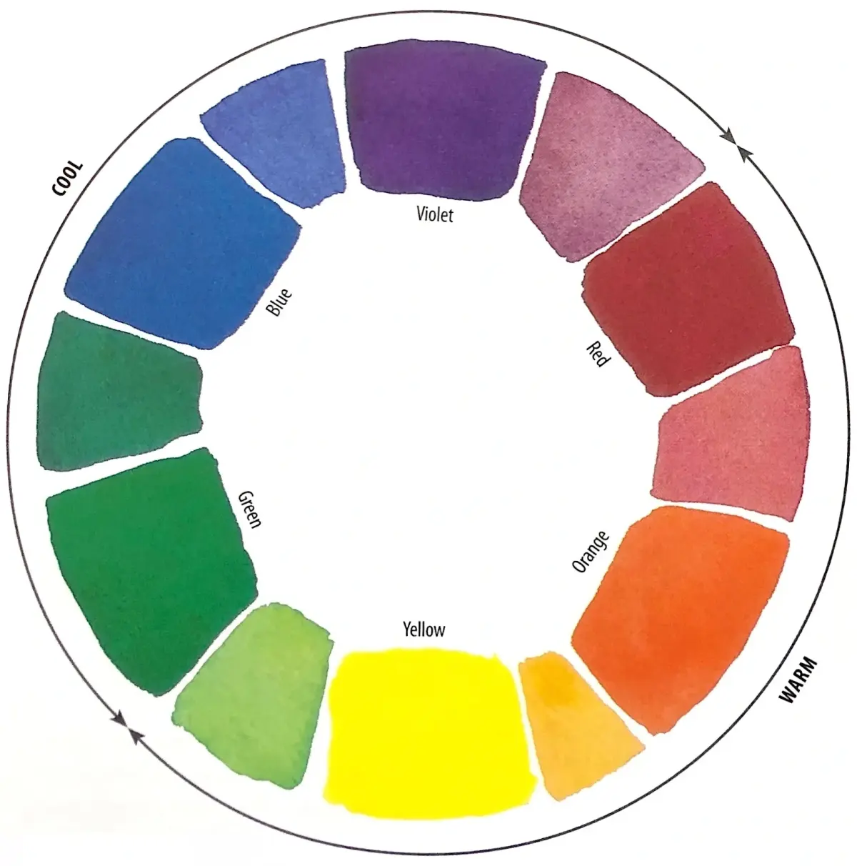
The color wheel is a circular diagram that organizes colors based on their chromatic relationship. Turquoise sits between blue and green, often categorized as a tertiary color. To find its complement, you must look at the exact point directly across the center of the wheel. This position is occupied by red-orange, a color that balances the cool, calming properties of turquoise with intense, energetic warmth.
Understanding this relationship is essential for artists and designers who want to create balance. When you combine colors that are opposite each other, they neutralize one another if mixed as pigments, resulting in a dull brown or gray. However, when placed next to each other, they create a phenomenon known as simultaneous contrast. This makes the turquoise look greener and the red-orange look redder, providing a striking visual pop that is often used in branding and interior design.
Why complementary colors create contrast
Complementary colors generate the highest level of visual tension because they share no common hues. Turquoise is a cool, receding color, while red-orange is a warm, advancing color. When these two are paired, the human eye perceives a sharp boundary between them. This is why the combination is frequently used in sports team uniforms, advertising posters, and high-fashion accessories to ensure the design stands out from its environment.
Using these colors effectively requires an understanding of saturation and value. If you use a bright, neon turquoise, a muted or dark red-orange might be necessary to prevent the colors from vibrating uncomfortably against each other. Conversely, using a desaturated turquoise allows for a bolder, more saturated red-orange to act as an accent. This dynamic interaction is the foundation of many iconic color palettes found in nature, such as the vibrant plumage of tropical birds or the contrast of desert flora against a clear sky.
How to use turquoise and red-orange in design
Applying this color scheme to your own projects can transform the mood of a space or a graphic layout. You do not need to use the colors in equal amounts to achieve a professional look. Often, the most successful designs use one color as the primary base and the other as a strategic accent.
- Choose a dominant color: Use a neutral shade or one of the two complements as your primary background.
- Apply the accent: Use the opposite color for buttons, text highlights, or decorative pillows.
- Adjust the intensity: Modify the brightness or darkness of the colors to ensure they do not clash.
- Test the balance: View your composition from a distance to see if one color overwhelms the other.
By following these steps, you can create a harmonious environment that feels intentional rather than chaotic. Remember that the goal is to guide the viewer’s eye toward specific focal points using the natural tension provided by the complementary pairing.
Common mistakes when pairing colors
One of the most frequent errors people make is using both colors at full saturation and in equal proportions. This creates a "vibrating" effect that can be physically difficult to look at for long periods. If your goal is to create a professional, readable design, you should avoid placing large blocks of high-intensity turquoise directly against large blocks of high-intensity red-orange.
- Avoid using equal amounts of both colors, as this creates a visual struggle for dominance.
- Do not ignore the value contrast; ensure one color is significantly lighter or darker than the other.
- Steer clear of using these colors in small, intricate patterns that might blur together from a distance.
- Refrain from adding too many other colors to the mix, as this can undermine the impact of the complementary relationship.
By softening one of the colors or using a neutral bridge like white, gray, or black, you can mitigate the harshness while still benefiting from the vibrant contrast.
Best tools for finding color harmonies
Digital tools have made it easier than ever to find the perfect shade of red-orange to complement your specific turquoise. Many online color pickers allow you to input a hex code for your chosen turquoise, and they will automatically calculate the exact complementary hex code. These tools are invaluable for web designers and digital artists who need precise color matching to maintain consistency across different screen resolutions and devices.
Adobe Color and similar platforms provide interactive wheels that show not only the direct complement but also split-complementary and triadic schemes. These variations offer a more nuanced approach if you find that the direct red-orange is too aggressive for your project. By experimenting with these digital resources, you can explore how different shades of red-orange—such as terracotta, rust, or coral—interact with your turquoise base. This experimentation is the best way to develop a personal aesthetic and master the art of color theory in your creative work.
Key facts
- The direct complementary color of turquoise is red-orange.
- Complementary colors sit directly opposite each other on the traditional color wheel.
- Using opposites creates high visual contrast, making both colors appear more vibrant.
- Turquoise is a secondary color created by mixing blue and green.
- To find a complement, identify the color's position on the wheel and look 180 degrees across.
- Mixing a color with its complement results in a neutral gray or brown, a process known as desaturation.
The bottom line
The complementary color of turquoise is red-orange, positioned directly across from it on the color wheel. This pairing provides the highest possible contrast, making both hues appear more intense and energetic. When applying this in design or art, use one color as the dominant base and the other as a strategic accent to avoid visual fatigue while creating a balanced, professional, and visually engaging aesthetic result.
People also ask
How do I use complementary colors in interior design?
Use the primary color for the majority of the room and the complement as an accent. Avoid using both colors in equal amounts, as this can create a jarring or vibrating effect.
Is turquoise the same as cyan?
While similar, cyan is a pure primary color in the CMYK printing model. Turquoise contains more green than standard cyan, which shifts its exact complementary shade toward a warmer red-orange.
What happens if I mix turquoise and red-orange paint?
You will create a muted, neutral tone often described as a muddy gray or brown. This occurs because the colors cancel out each other's saturation.
Can I use split-complementary colors instead?
Yes, split-complementary schemes use the two colors adjacent to the complement. This provides high contrast while being softer and easier to balance than a direct complementary pairing.
Why do my eyes see a ghost image of the complement?
This is called a successive contrast effect. If you stare at a turquoise object for 30 seconds and then look at a white wall, your fatigued photoreceptors will project a red-orange afterimage.
Does the shade of turquoise change its complement?
Yes, the specific complement depends on the exact hue, saturation, and brightness. A darker, deeper turquoise will require a more muted, darker red-orange to maintain visual harmony.
This answer was created with the help of AI research tools and reference sources. Spotted an error? Let us know — we correct mistakes quickly. See our editorial policy.