What is the complementary color of red?
Short answer
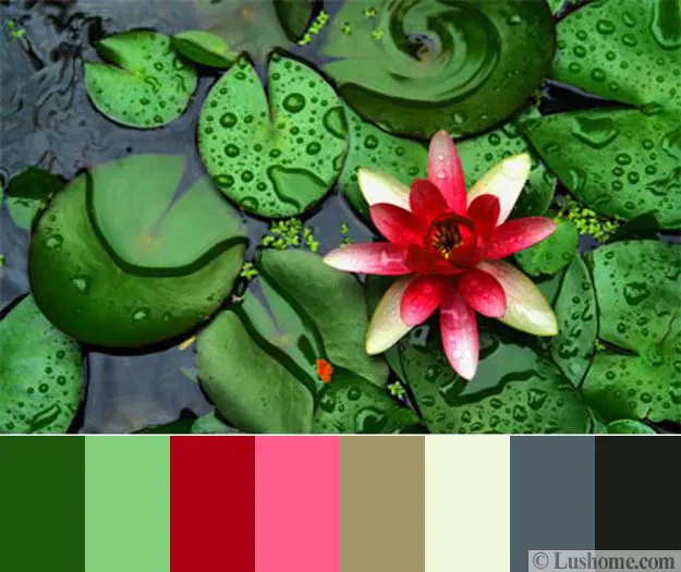
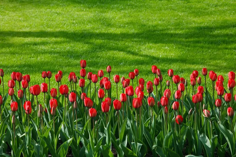
The complementary color of red is green. In traditional color theory, based on the RYB (red-yellow-blue) model, these two hues sit directly opposite each other on the color wheel. When placed side-by-side, they create the strongest possible visual contrast, making each color appear more vibrant and intense to the human eye.
On this page
What is the color wheel and how does it work?
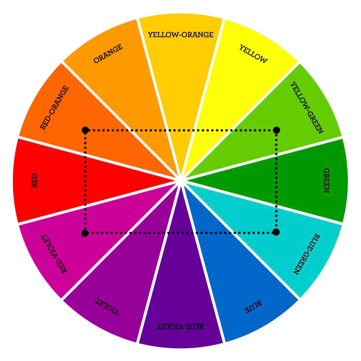
The color wheel is a circular diagram that represents the relationships between colors. It was first developed by Sir Isaac Newton in 1666 when he mapped the light spectrum onto a circle. By organizing colors in this geometric format, artists and scientists can easily identify which hues harmonize or contrast with one another. The wheel is divided into primary, secondary, and tertiary colors, forming the foundation of modern color theory used in design, painting, and printing.
At its core, the wheel functions as a tool to predict how colors interact. Complementary colors are defined as any two colors that are positioned directly across from one another. Because they share no common wavelengths, they provide the maximum level of contrast. When you look at a red object against a green background, your brain perceives a heightened level of clarity and excitement. This phenomenon is a fundamental principle used by professionals to create visually striking compositions that capture immediate attention.
How to use complementary colors in design
Using complementary colors effectively requires a balance between boldness and visual comfort. Because red and green are so intense, using them in equal proportions can often lead to a jarring effect that strains the eyes. Designers typically choose one color to act as the dominant shade while using the other as a subtle accent. This approach prevents the colors from competing for dominance, allowing the composition to feel intentional rather than chaotic.
To successfully incorporate these colors into your projects, follow these professional guidelines:
- Identify a primary focal point and use red or green to highlight it.
- Adjust the saturation or brightness of one color to soften the overall impact.
- Incorporate neutral tones like white, gray, or beige to provide a "breathing space" between the two intense hues.
- Consider the context, as red and green are strongly associated with holiday themes in many Western cultures.
Why do complementary colors create contrast?
The human eye perceives color through specialized cells called cones located in the retina. When you stare at a bright red object for an extended period, the red-sensitive cones become fatigued. If you then shift your gaze to a white surface, your eyes will briefly perceive a green "afterimage." This occurs because the brain is attempting to restore balance by signaling the green-sensitive cones to compensate for the overstimulated red receptors.
This physiological reaction is the scientific explanation for why complementary colors appear so vibrant when placed together. The brain is essentially working to resolve the visual tension created by the opposing wavelengths. By pairing red with green, you are working in harmony with the natural mechanics of human vision. This technique is frequently used in advertising and retail to make products stand out, as the human brain is biologically wired to notice the sharp transition between these two specific, opposing colors.
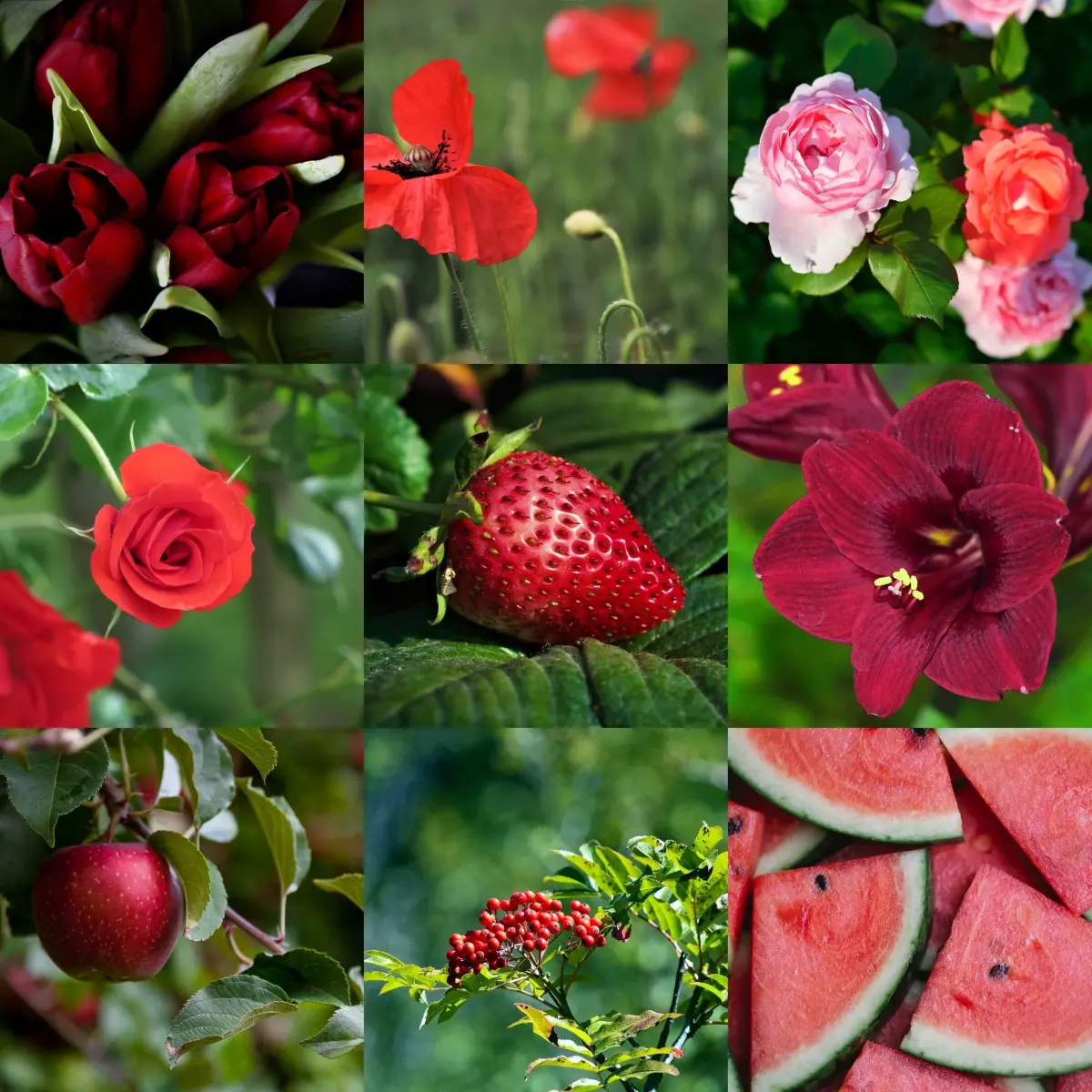
Common mistakes when pairing red and green
A frequent error in color application is the failure to consider the specific shade or tint of the red and green being used. Not all reds and greens are created equal; a bright, candy-apple red paired with a neon lime green can feel aggressive and difficult to look at. Conversely, pairing a deep, muted forest green with a soft, dusty rose can create a sophisticated and elegant aesthetic. Beginners often assume that any version of red and green will work together, leading to unbalanced results.
To avoid these common pitfalls, keep these tips in mind:
- Avoid using pure, high-saturation versions of both colors in equal amounts.
- Experiment with different values, such as pairing a dark maroon with a pale mint green.
- Use textures to disrupt the solid blocks of color, which helps soften the transition.
- Test your color scheme in the actual lighting conditions where it will be viewed.
How to mix complementary colors for painting
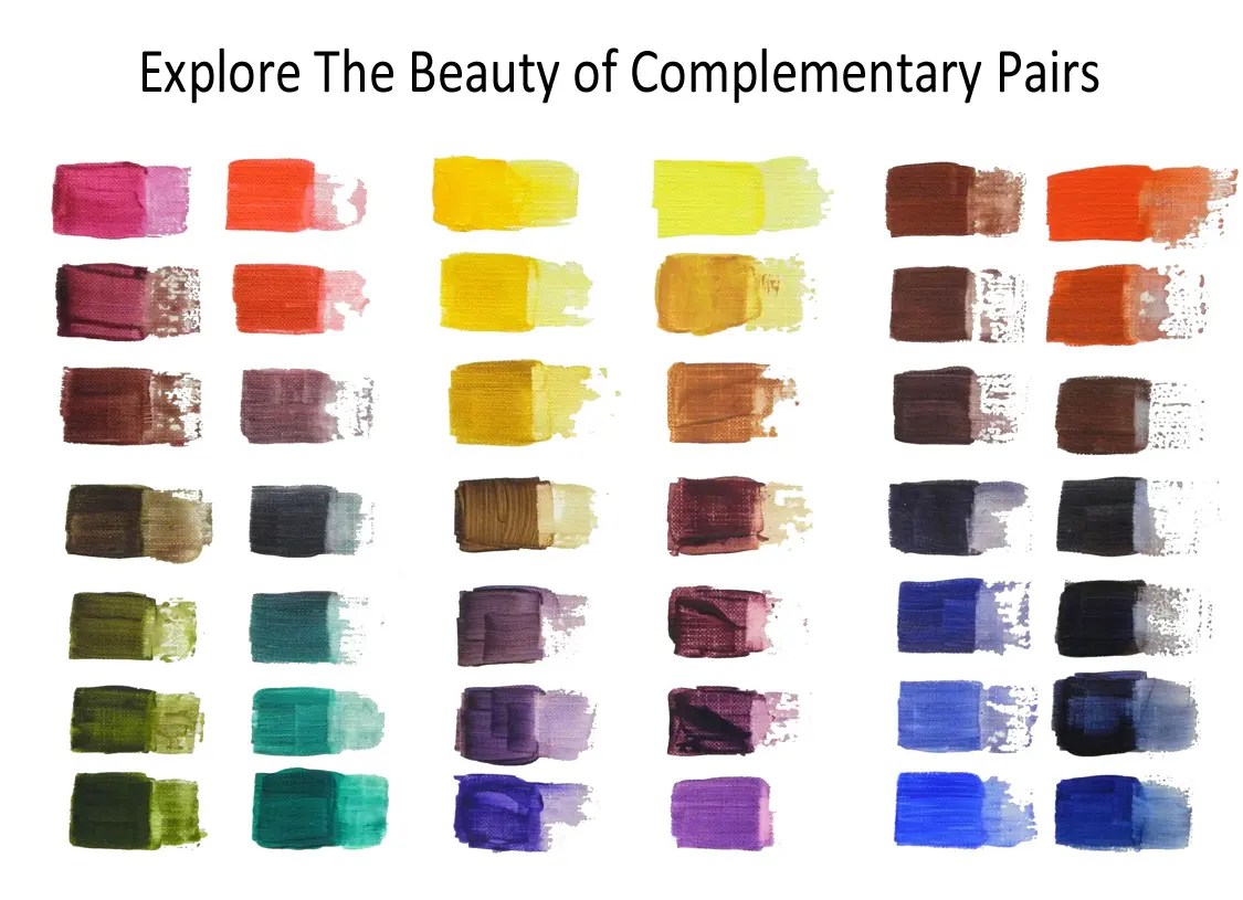
When mixing paint, combining red and green will result in a neutral, earthy tone. Because they are opposites, they effectively cancel each other out by absorbing the light that the other would reflect. This process is essential for artists who want to create shadows or muted tones rather than using harsh black paint. By adjusting the ratio of red to green, you can achieve a wide spectrum of browns, grays, and olives that add depth to a painting.
Mastering this mixture allows you to desaturate colors without losing their complexity. If a red appears too bright for a landscape, adding a small touch of green will instantly pull it back, creating a more natural, realistic appearance. This technique is a hallmark of professional painting, as it creates a sense of harmony that monochromatic or primary-only palettes often lack. By learning to control the balance between these two colors, you gain the ability to manipulate the mood and atmosphere of any visual work you create.
Key facts
- The complementary color of red is green, as they sit directly opposite each other on the traditional color wheel.
- When placed side-by-side, complementary colors create maximum visual contrast, making both colors appear more vibrant.
- Mixing a color with its complement results in a neutral gray or brown, a process often used to desaturate overly bright pigments.
- In the RGB color model used for digital screens, the complement of red is cyan, which is a mix of green and blue.
- Artists often use complementary colors to create focal points in a composition, as the human eye is naturally drawn to the high contrast.
- A common mistake is using equal amounts of both colors in a design, which can cause "vibration" or eye strain; instead, use one as the dominant color and the other as an accent.
The bottom line
Complementary colors are essential tools for anyone working with visual design or art. By pairing red with green, you create a striking contrast that commands attention. Understanding how these opposites interact allows you to enhance vibrancy, balance compositions, or mute colors that are too intense. Master this relationship to elevate your creative projects, ensuring your color choices feel intentional, professional, and visually compelling to the viewer.
People also ask
What are the three primary colors?
In traditional color theory, the primary colors are red, yellow, and blue. These colors cannot be created by mixing other pigments together and serve as the foundation for all other hues.
How do I find the complementary color of any hue?
You can identify a complement by looking at a standard 12-hue color wheel. Simply draw a straight line from your chosen color through the center to the opposite side.
Why do complementary colors look good together?
They provide the highest possible contrast in both hue and temperature. This balance satisfies the human visual system, which perceives the pairing as harmonious and dynamic.
Can I use complementary colors to fix a muddy painting?
Yes, adding a small amount of a color’s complement can neutralize its intensity. However, adding too much will turn the mixture into a dull, brownish-gray mud.
What is the difference between complementary and analogous colors?
Complementary colors are opposites on the color wheel, while analogous colors are neighbors. Analogous schemes, such as red, orange, and yellow, create a softer, more cohesive look.
Read the full answer →Are there different color wheels for different mediums?
Yes, the RYB model is standard for painting and fine arts. Digital displays use the RGB model, while professional printing utilizes the CMYK model, each yielding different complementary pairs.
This answer was created with the help of AI research tools and reference sources. Spotted an error? Let us know — we correct mistakes quickly. See our editorial policy.