What is the complementary color of yellow?
Short answer
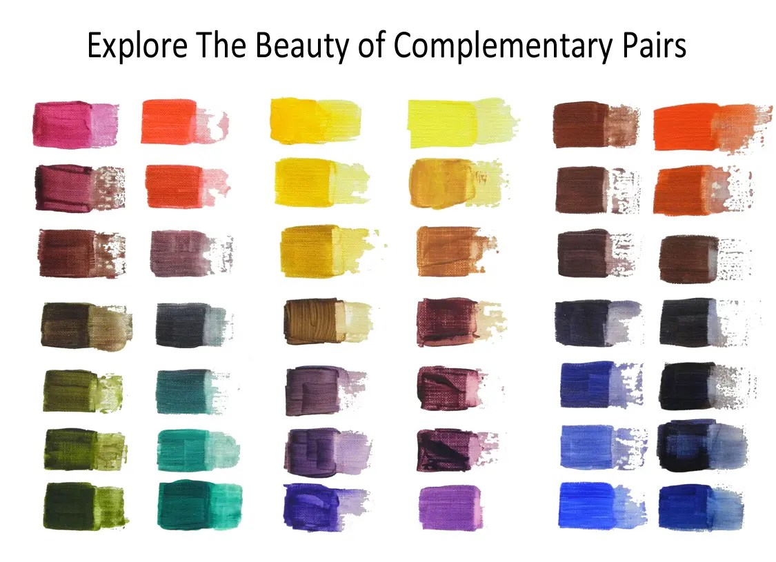
The complementary color of yellow is purple, or violet. In traditional color theory, complementary colors sit directly opposite one another on the color wheel. When placed side-by-side, they create the strongest possible visual contrast, making both colors appear more vibrant and intense to the human eye than when viewed in isolation.
On this page
What is the color wheel?
The color wheel is a circular diagram that maps the relationships between colors based on the primary, secondary, and tertiary hues. Developed by Sir Isaac Newton in 1666, the model organizes the visible spectrum into a sequence that helps artists and designers understand color harmony. At its core, the wheel functions as a tool for predicting how colors interact when placed together.
In the traditional RYB (Red, Yellow, Blue) model used by painters, yellow is a primary color. Directly across from it lies purple, which is a secondary color created by mixing red and blue. This geometric arrangement is essential for achieving balance in composition. By identifying these opposites, creators can manipulate the visual weight and temperature of a design. Understanding this layout is the first step toward mastering color theory and applying it to practical projects.
Why do yellow and purple contrast?
The human eye perceives contrast through the stimulation of photoreceptor cells in the retina. When you look at a yellow object, your eyes become saturated with that specific wavelength of light. If you then shift your gaze to a neutral surface, you may experience a "successive contrast" or an afterimage of purple. This physiological phenomenon occurs because the visual system seeks to maintain equilibrium by balancing out the dominant stimulus.
Beyond biology, the contrast between yellow and purple is a matter of color temperature and value. Yellow is typically perceived as a warm, advancing color, while purple is viewed as a cool, receding color. This inherent tension creates a dynamic energy that catches the viewer's attention immediately. Designers often use this combination to create focal points or to make specific elements stand out against a busy background. It is a fundamental technique for ensuring visual clarity in both fine art and commercial graphic design.
How to use complementary colors in design
Using complementary colors effectively requires a careful approach to saturation and proportion. If you use two highly saturated colors in equal amounts, the result can be jarring or difficult to read. Instead, consider these strategies to create a more sophisticated look:
- Use one color as the dominant background and the other as a subtle accent.
- Adjust the tint (adding white) or shade (adding black) of one color to reduce the intensity.
- Incorporate neutral colors like gray, white, or black to provide a "resting" space for the eye.
- Use the complementary color specifically for call-to-action buttons or important text to ensure high visibility.
By following these steps, you can harness the power of the yellow-purple relationship without overwhelming the viewer. The goal is to create harmony rather than chaos, allowing the contrast to serve the message of your work rather than distracting from it.
Common mistakes when pairing colors
One of the most frequent errors when working with yellow and purple is ignoring the relative value of the colors. Value refers to how light or dark a color is, regardless of its hue. If a bright yellow and a deep purple have the same value, they can create a vibrating effect that is physically uncomfortable to look at for extended periods. This issue often occurs in digital displays where high-contrast colors are placed directly against each other without proper spacing.
Another common mistake is failing to consider the surrounding environment or context. A color scheme that looks vibrant on a computer screen might appear muddy when printed on textured paper or fabric. Always test your color combinations in the medium you intend to use. Additionally, avoid using both colors in equal amounts across a large surface area. A successful design usually benefits from a 70/30 or 80/20 split, where one color clearly dominates the composition while the other provides a necessary, calculated pop of contrast.
Best ways to practice color theory
To truly understand the relationship between yellow and purple, you must engage in hands-on experimentation. Theoretical knowledge is helpful, but seeing how pigments mix or how digital filters alter color perception is far more instructive. Start by creating a simple color study using basic art supplies or digital design software to observe these interactions firsthand.
- Create a basic color wheel using primary paints to identify the exact position of purple relative to yellow.
- Paint two squares, one yellow and one purple, and place them side-by-side to observe the "vibration" effect.
- Take a photograph of a yellow object and use a photo editing app to invert the colors to see the resulting purple hue.
- Experiment with different shades of yellow, such as mustard or lemon, and pair them with various purples like lavender or plum to see how the mood of the composition shifts.
By consistently practicing these exercises, you will develop an intuitive sense for color balance. Over time, you will no longer need to rely on charts or diagrams to know which colors work well together, as your eye will naturally recognize the harmonious potential of complementary pairs.
Key facts
- The complementary color of yellow is purple, specifically a deep violet.
- Complementary colors are located directly opposite each other on the traditional RYB (red-yellow-blue) color wheel.
- When placed side-by-side, complementary colors create the strongest possible visual contrast.
- Mixing a color with its complement results in a neutral gray or brown, a process known as desaturation.
- Artists often use this pairing to make a yellow subject stand out against a dark, moody background.
- Avoid using pure yellow and pure purple in equal proportions, as the high contrast can cause visual vibration or eye strain.
The bottom line
The complementary color of yellow is purple, a pairing that offers the highest level of visual contrast on the traditional color wheel. Whether you are painting a canvas, designing a room, or creating digital graphics, understanding this relationship helps you manipulate vibrancy and balance. Use these opposites strategically to make focal points pop, but be careful to manage their intensity to avoid visual fatigue in your work.
People also ask
What happens if you mix yellow and purple paint?
Mixing these two colors results in a muddy, neutral brown or gray. This occurs because you are combining all three primary colors—red, blue, and yellow—which effectively cancels out the vibrancy of the original hues.
Why are complementary colors used in interior design?
Designers use them to create dynamic, high-energy spaces that feel balanced and intentional. A yellow accent piece, such as a pillow or lamp, will appear significantly brighter and more vivid when placed against a purple or plum-colored wall.
Is the complementary color of yellow different in digital design?
In the RGB (red-green-blue) color model used for screens, the complement of yellow is blue. This differs from the traditional RYB model because light behaves differently than physical pigment.
How can I tone down a yellow that is too bright?
You can neutralize an overly intense yellow by adding a tiny amount of purple paint to it. Start with a very small quantity, as the purple will quickly shift the yellow toward a muted tan or olive shade.
Do complementary colors always look good together?
While they provide high contrast, they can be overwhelming if used in large, equal amounts. It is usually best to use one color as the dominant base and the other as a small, strategic accent.
What are split-complementary colors?
This color scheme uses a base color along with the two colors adjacent to its complement. For yellow, this would involve pairing it with blue-violet and red-violet, which provides a sophisticated contrast without the intensity of a direct complement.
Read the full answer →This answer was created with the help of AI research tools and reference sources. Spotted an error? Let us know — we correct mistakes quickly. See our editorial policy.