What is the difference between complementary and analogous colors?
Short answer
Complementary colors sit directly opposite each other on the color wheel, creating maximum contrast and visual intensity. Analogous colors are positioned side-by-side, sharing a common hue to produce a harmonious, low-contrast effect. While complementary schemes feel vibrant and energetic, analogous palettes offer a sense of calm, unity, and natural balance.
On this page
What is the difference between complementary and analogous colors?
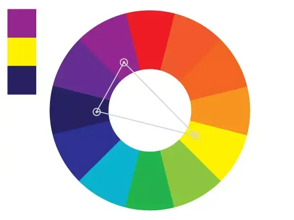
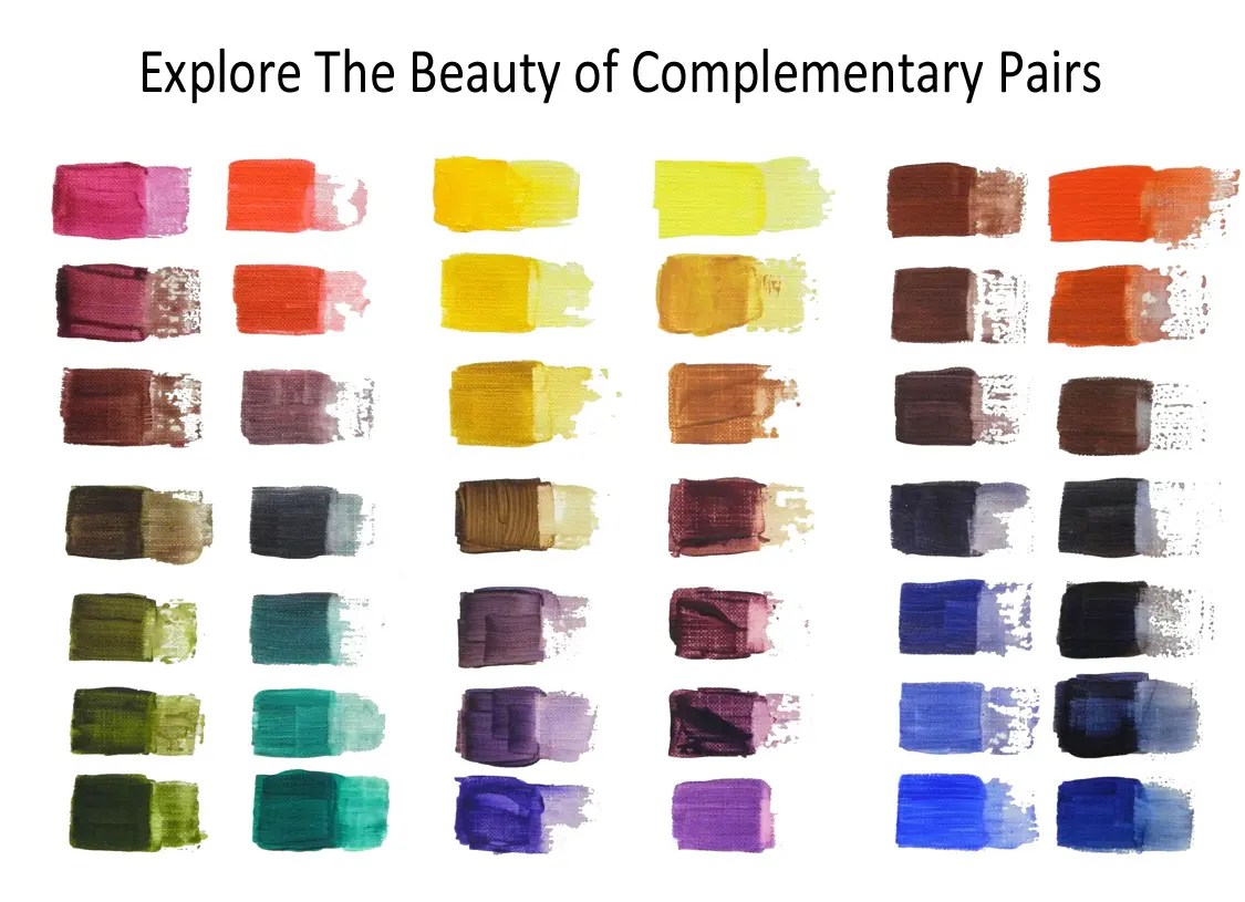
The fundamental distinction between these two color schemes lies in their spatial relationship on the traditional 12-hue color wheel. Complementary colors, such as blue and orange or red and green, are located at polar extremes. This positioning creates a high-energy interaction because the colors do not share any common pigments. When placed next to one another, they appear to vibrate or intensify, making them the primary choice for designers who want to create a focal point or grab immediate attention.
In contrast, analogous colors consist of a primary color and its immediate neighbors, such as yellow, yellow-orange, and orange. Because these hues share a common foundation, they blend seamlessly into one another. This relationship creates a sense of visual comfort and cohesion. While complementary schemes are defined by their "clash," analogous schemes are defined by their "flow." Understanding this difference allows artists and designers to control the emotional temperature of their work, shifting between high-impact drama and soothing tranquility.
How to use complementary colors effectively
Complementary colors are best used when you want a specific element to stand out against a background. Because of their inherent contrast, they are frequently employed in branding, sports uniforms, and warning signs. However, using them in equal proportions can be overwhelming to the viewer's eye. To manage this intensity, designers often use a "dominant and accent" strategy, where one color covers the majority of the space while the other is used sparingly for details.
- Choose a dominant color for the background or main subject.
- Identify its direct opposite on the color wheel.
- Apply the opposite color only to small, critical elements like buttons, text, or icons.
- Adjust the saturation or brightness of the accent color to prevent it from vibrating too aggressively against the base.
By following these steps, you maintain the energy of the contrast without sacrificing readability or aesthetic appeal. This method ensures that the viewer’s eye is naturally drawn to the most important information.
Why analogous color schemes feel harmonious
Analogous color schemes are pervasive in nature, which is why they often feel more organic and less forced than high-contrast pairings. Think of a sunset featuring shades of red, orange, and yellow, or a forest scene dominated by various greens and yellow-greens. Because these colors sit next to each other on the wheel, they share a common "undertone." This shared DNA makes it easier for the human eye to process the palette, resulting in a design that feels stable, professional, and easy to look at for extended periods.
When working with analogous colors, you should aim for a variety of values to prevent the design from looking muddy or flat. Even though the hues are similar, you can create depth by manipulating the lightness and darkness of each color. A common approach is to use a light tint, a mid-tone, and a dark shade within the same three-color family. This creates a sophisticated, monochromatic-adjacent look that feels rich and layered rather than simple or repetitive.
Common mistakes when choosing color palettes
A frequent error when using complementary colors is failing to account for color vibration. When two highly saturated complementary colors are placed directly against each other, the edges can appear to blur or flicker, causing eye strain. To avoid this, designers often introduce a neutral color—such as gray, white, or black—to act as a buffer between the two intense hues. This neutral space allows the eye to rest and prevents the colors from competing too aggressively for dominance.
When working with analogous schemes, the primary risk is a lack of contrast. If all three colors have the same level of saturation and brightness, the design can become visually boring or difficult to distinguish. To ensure your analogous palette remains engaging, incorporate these practices:
- Vary the saturation levels so one color is vibrant while the others are muted.
- Use a neutral color for text or essential structural lines.
- Ensure there is a clear difference in value between the background and the foreground elements.
Best practices for color selection in design
Whether you are choosing paint for a room or designing a website, the context of your work should dictate your choice of scheme. Complementary colors are ideal for "call to action" elements, such as a "Buy Now" button on a webpage or a warning sign on a factory floor. They demand movement and action. Analogous schemes are superior for environments where you want the user to linger, such as a bedroom, a spa, or a long-form article, as they promote a sense of relaxation and continuity.
To refine your skills, start by limiting your palette. Beginners often make the mistake of trying to use too many colors at once, which leads to visual clutter. Start with a two-color complementary pair or a three-color analogous set and master how they interact before adding more complexity. By observing how these colors appear in your daily environment—from the clothes you wear to the packaging in your kitchen—you will develop an intuitive sense of how to balance contrast and harmony to achieve your specific design goals.
Key facts
- Complementary colors sit directly opposite each other on the traditional 12-hue color wheel, such as blue and orange.
- Analogous colors are located side-by-side on the color wheel, typically forming a group of three, such as yellow, yellow-orange, and orange.
- Complementary schemes create high-contrast, vibrant visuals that command immediate attention from the viewer.
- Analogous schemes produce a serene, harmonious aesthetic that is naturally pleasing to the human eye.
- Use a 70/20/10 ratio when applying complementary colors to ensure one color remains dominant rather than creating visual fatigue.
- Avoid using equal amounts of intense complementary colors, as this can cause a vibrating effect that is difficult for the eye to focus on.
The bottom line
Understanding the distinction between complementary and analogous colors is essential for effective visual communication. Complementary schemes provide bold, high-energy contrast that draws the eye, making them ideal for accents or marketing. Conversely, analogous schemes offer a soft, unified appearance perfect for backgrounds or soothing environments. By mastering these two fundamental relationships, you gain the ability to control the mood and impact of any creative project.
People also ask
How do I choose a base color for my design?
Start by identifying the primary emotion you want to convey, such as excitement with reds or calm with blues. Once you have a base, you can use the color wheel to select either an analogous or complementary scheme to build your palette.
Can I use more than three colors in an analogous scheme?
While three is the standard, you can include four or five colors as long as they are strictly adjacent on the wheel. Keep the palette balanced by varying the saturation and brightness of each hue to maintain visual interest.
Why do my complementary colors look muddy when mixed?
Mixing two true complementary colors together creates a neutral gray or brown. If you want to darken a color without losing its identity, add a small amount of its complement rather than black.
Are there different types of color wheels?
Yes, the RYB (Red-Yellow-Blue) model is common in art, while the RGB (Red-Green-Blue) model is used for digital screens. The relationships between colors remain consistent across these models, though the specific hues may vary slightly.
What is a split-complementary color scheme?
This variation uses a base color and the two colors adjacent to its direct complement. It offers the high contrast of a complementary scheme but with more nuanced color variety and less visual tension.
How do I know if my color scheme is balanced?
Squint your eyes while looking at your design to blur the details. If one color dominates or if the composition feels lopsided, adjust the proportions of your colors until the overall distribution feels even and intentional.
This answer was created with the help of AI research tools and reference sources. Spotted an error? Let us know — we correct mistakes quickly. See our editorial policy.