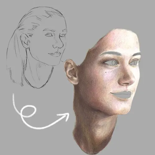
How do you color skin with colored pencils?
Short answer
Coloring skin with colored pencils requires layering light base tones followed by gradual shadows and highlights. Use a light touch to build pigment density, blending colors using a colorless blender or a light-colored pencil. Focus on identifying undertones, such as warm peach or cool olive, to achieve a realistic, multidimensional skin appearance.
On this page
How to choose the right colored pencils for skin tones
Selecting the appropriate medium is the foundation of realistic portraiture. Wax-based pencils, such as Prismacolor Premier, are generally preferred for skin because they are soft and blend easily, allowing for smooth gradients. Oil-based pencils, like Faber-Castell Polychromos, are harder and hold a sharper point, which is ideal for fine details like skin texture or small highlights. Beginners should start with a small set of neutral colors including creams, ochres, terracottas, and browns.
When building a palette, look for pencils that offer a range of values rather than just a variety of hues. You need a mix of light, medium, and dark tones to create depth. It is helpful to test your pencils on a scrap piece of paper first to see how they layer. Keep these tips in mind when selecting your supplies:
- Purchase a colorless blending pencil or a blending stump to soften transitions between colors.
- Ensure you have a high-quality sharpener to maintain fine points for layering.
- Avoid relying on a single "flesh" tone pencil, as skin is composed of many colors.
How to layer colors for realistic skin
Layering is the process of applying thin coats of pigment to build up the desired color intensity. Start with your lightest base color, applying it with very light pressure to avoid filling the paper's "tooth" too quickly. If you press too hard initially, the paper will become burnished, making it impossible to add further layers or depth. Gradually introduce mid-tones and shadows, working from the lightest areas toward the darkest.
To create a natural look, incorporate unexpected colors into your layers. Skin often reflects the environment, so adding subtle hints of blue, purple, or green in the shadows can make the portrait feel more alive. Use a circular motion or small cross-hatching strokes to distribute the pigment evenly. Follow these steps to build your layers effectively:
- Apply a light wash of your base color across the entire skin area.
- Identify the primary light source and leave the brightest spots nearly white.
- Gradually add mid-tones to the transition areas between light and shadow.
- Use darker shades to define the deepest shadows, such as under the chin or nose.
How to blend skin tones smoothly
Blending is essential to eliminate harsh lines and create a seamless transition between colors. You can use a colorless blender pencil, which contains the binder of the colored pencil without the pigment, to push the wax into the paper fibers. Alternatively, a small piece of cotton or a tortillon can be used to smudge the colors, though this can sometimes muddy the appearance if overdone. Always blend in the direction of the skin's contours to enhance the three-dimensional form.
If you find that your colors are not blending well, you may need to add another layer of a lighter color over the top. This technique, known as glazing, helps to unify the different shades and softens the overall appearance. Do not rush the blending process, as it is often the most time-consuming part of the work. If you are working on a large area, consider these factors:
- Work in small sections to keep the pigment fresh and workable.
- Keep your blending tool clean to avoid transferring unwanted colors onto your portrait.
- Use light pressure to avoid lifting the pigment off the paper entirely.
Common mistakes when coloring skin
One of the most frequent errors is using too much pressure early in the drawing process. This "burnishing" effect seals the paper, preventing you from adding the subtle variations needed for realistic skin. Another common mistake is failing to observe the actual colors present in the subject. Many people assume skin is a single flat color, but it is actually a complex interplay of reflected light and shadow. Ignoring the undertones of the skin can result in a flat, cartoonish appearance.
Additionally, beginners often neglect the importance of contrast. Without dark enough shadows, the skin will look washed out and lack volume. Conversely, failing to leave highlights makes the skin appear dull or dirty. Avoid these common pitfalls by checking your work against a reference photo frequently. If the skin looks flat, you likely need to deepen your shadows or brighten your highlights to increase the overall range of values.
How to add texture and final details
Once the base colors and shadows are established, you can focus on the fine details that make skin look authentic. Use a sharp, dark pencil to add pores, freckles, or fine lines in the areas where the skin is tight against the bone, such as the forehead or cheekbones. You can also use a white gel pen or a very sharp white pencil to add sharp highlights, such as the glint in the eyes or the reflection on the tip of the nose.
Final details should be applied sparingly to avoid cluttering the drawing. If you have made a mistake, a kneaded eraser can be used to gently lift off excess pigment. Remember that the goal is to suggest the texture of skin rather than drawing every single pore. By focusing on the subtle shifts in color and value, you can create a portrait that feels tactile and lifelike. Always step back from your work periodically to ensure the overall proportions and skin tones remain consistent across the entire face.
Key facts
- Start with a light base layer of peach or cream to establish the skin tone's foundation.
- Use cool-toned pencils like light blue or lavender for shadows to create depth and realism.
- Apply colors in light, circular strokes to avoid visible lines and ensure a smooth, blended appearance.
- Incorporate subtle hints of pink or rose in the cheeks and nose to mimic blood flow.
- Avoid using pure black for shading, as it often makes skin look muddy or bruised.
- Use a white pencil or a colorless blender to soften transitions between different color layers.
The bottom line
Achieving realistic skin tones requires a patient, layered approach that prioritizes subtle color variations over a single flat hue. By combining warm base layers with cool shadows and avoiding harsh black pigments, you can create depth and luminosity. Practice consistent, light pressure and utilize blending tools to unify your colors, ultimately transforming simple pencil marks into a lifelike, vibrant representation of human skin.
People also ask
Should I use wax-based or oil-based pencils for skin tones?
Wax-based pencils are softer and blend more easily, making them ideal for smooth skin textures. Oil-based pencils are harder and hold a sharp point longer, which is useful for detailed features like eyes or fine pores.
How do I create darker skin tones without making them look gray?
Build up dark skin tones by layering deep browns, burnt umbers, and dark purples rather than just using black. Adding a touch of warm orange or deep red underneath prevents the final result from appearing flat or dull.
Can I use baby oil to blend colored pencils?
Yes, applying a tiny amount of baby oil with a cotton swab can dissolve the wax or oil binder in the pencils. This creates a paint-like finish, but be careful not to oversaturate the paper to avoid bleeding.
What paper works best for drawing skin?
A medium-tooth paper is generally preferred because it has enough texture to grab the pigment but is smooth enough for blending. Avoid extremely rough watercolor paper, as the texture can make skin look pitted or unnatural.
How do I fix a mistake if I press too hard?
Use a kneaded eraser to gently lift excess pigment from the surface of the paper. If the color is already burnished, you may need to layer a lighter, opaque color over the top to neutralize the intensity.
Why does my skin coloring look streaky?
Streaking often occurs when you apply heavy pressure or use inconsistent stroke directions. Always work in light, overlapping circular motions and build your color intensity gradually through multiple thin layers.
This answer was created with the help of AI research tools and reference sources. Spotted an error? Let us know — we correct mistakes quickly. See our editorial policy.