How do you color roses with colored pencils?
Short answer
Coloring roses with colored pencils requires building depth through layering and pressure control. Start with light base tones, gradually adding shadows with darker hues. Use circular motions to blend pigments, preserve white highlights for realism, and finish by refining edges with a sharp pencil to achieve a vibrant, three-dimensional floral appearance.
On this page
How to choose the best colored pencils for roses
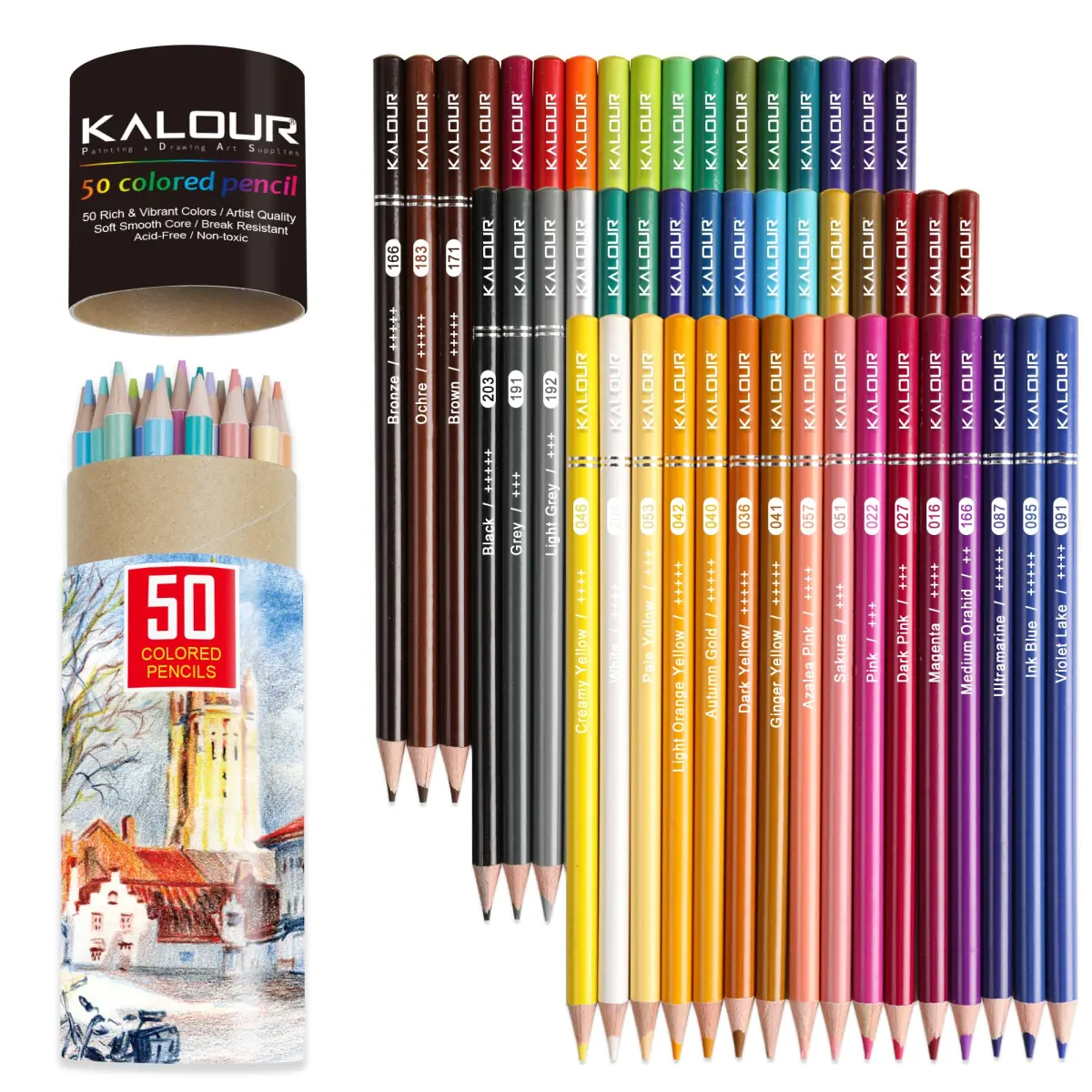
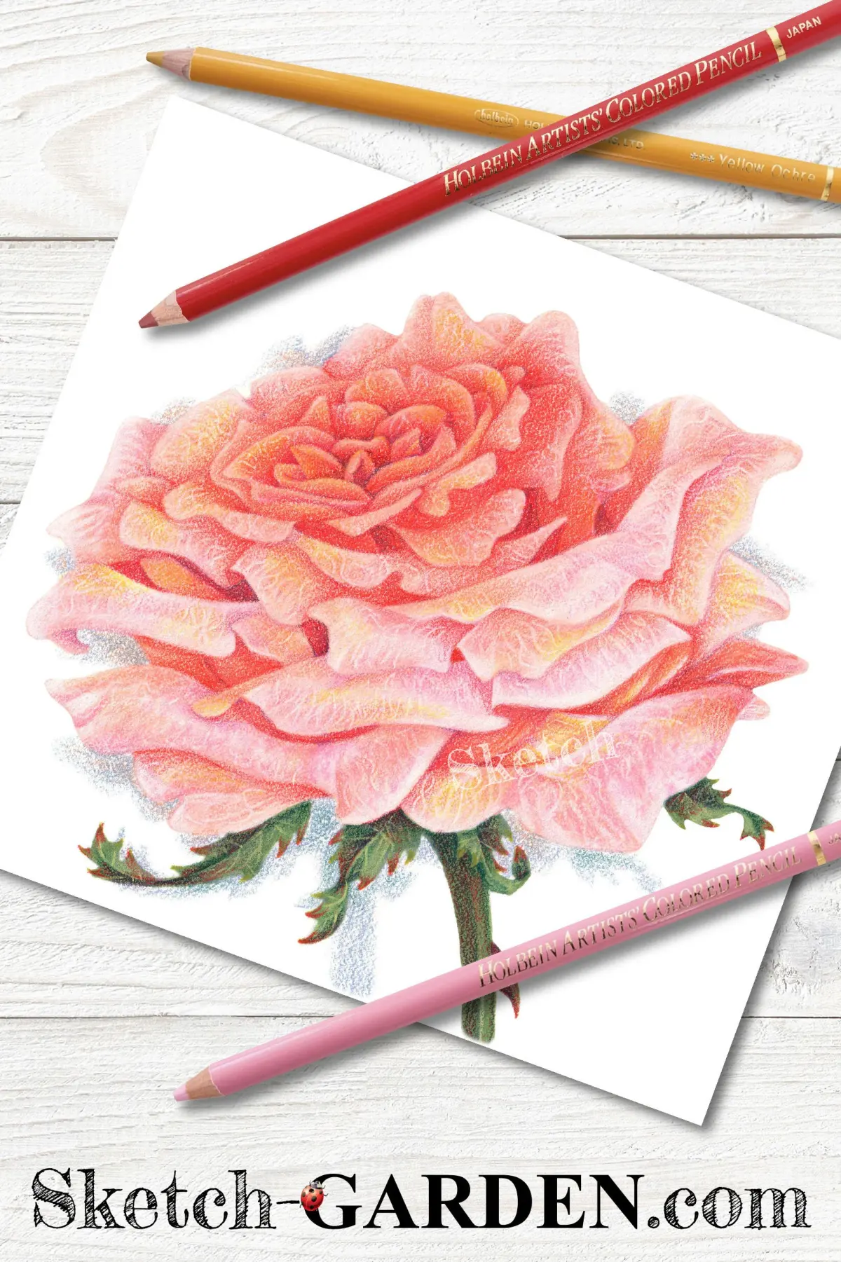
Choosing the right medium is the foundation of realistic floral art. Wax-based pencils, such as Prismacolor Premier, are preferred by many artists because they are soft and blend easily, allowing for smooth transitions between petal colors. Oil-based pencils, like Faber-Castell Polychromos, are harder and hold a sharp point longer, which is ideal for adding fine details and veins to the petals. Beginners should start with a set of at least 24 colors to ensure they have enough variety to create gradients.
When selecting your palette, consider the specific variety of rose you are drawing. A red rose requires more than just one shade of red; you will need a range of crimsons, maroons, and even deep purples or blues for the shadows. High-quality pencils contain more pigment, which allows for richer color saturation without the need to press down too hard. Avoid student-grade pencils, as they often contain more binder than pigment, making it difficult to layer colors effectively on the paper.
How to layer colors for realistic petals
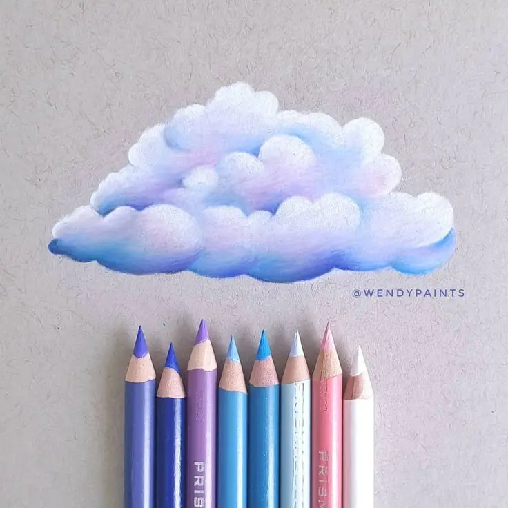
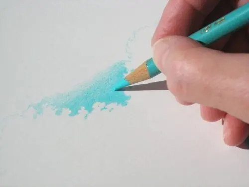
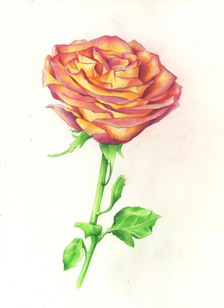
Layering is the process of applying multiple thin coats of pigment to build up intensity and depth. Begin by applying your lightest color across the entire petal, using very light pressure. This creates a base that helps subsequent layers adhere to the paper's "tooth." Gradually introduce mid-tones, focusing on the areas where the petal curves away from the light source.
To achieve a professional look, follow these steps for layering:
- Apply a light base coat to define the overall shape.
- Use a mid-tone to establish the local color of the rose.
- Apply darker shades in the recesses and shadows to create volume.
- Use a white or colorless blender pencil to soften transitions between colors.
- Add final highlights using a sharp white pencil or an eraser to lift color.
By working from light to dark, you maintain control over the drawing. If you start with the darkest colors, it becomes nearly impossible to lighten the area later, which often leads to a flat, muddy appearance.
How to create depth and shadows in roses
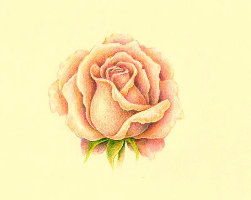
Shadows are essential for making a rose look three-dimensional rather than flat. Observe your reference image closely to identify the light source; the petals furthest from the light will naturally have the deepest shadows. Use complementary colors to darken your reds or pinks instead of simply using black. For example, a touch of dark green or blue in the deepest shadows of a red rose creates a more vibrant and realistic effect than black, which can make the drawing look dull.
When shading, think of the rose as a series of overlapping cylinders or spheres. The edges of the petals should be crisp, but the areas where they curve should have soft, gradual transitions. Use a light touch and build the shadow slowly, checking your progress frequently. If the color becomes too intense, you can use a kneaded eraser to gently lift some of the pigment. Remember that the deepest shadows are often found at the base of the petals, near the center of the rose.
Common mistakes when coloring roses
One of the most frequent errors is pressing too hard with the pencil too early in the process. This "burnishes" the paper, filling its texture with wax or oil and preventing you from adding more layers later. Always start with a light touch and only increase pressure once you are satisfied with the color placement. Another common mistake is neglecting the white highlights, which are crucial for showing the texture of the petal and the way light reflects off its surface.
Avoid these pitfalls to improve your results:
- Over-blending, which can result in a muddy, greyish appearance.
- Using a single color for an entire petal, which removes all sense of form.
- Forgetting to sharpen your pencils frequently, which leads to imprecise lines and loss of detail.
- Ignoring the direction of the petal's growth, which makes the drawing feel unnatural.
By practicing patience and keeping your pencils sharp, you can avoid these common issues and create more refined, professional-looking floral drawings.
How to finish and protect your rose drawing
Once you have finished layering and detailing, take a step back to evaluate the entire piece. Check for any areas that need more contrast or spots where the paper texture is still showing through too much. You can use a colorless blender to smooth out any remaining visible pencil strokes, creating a polished, painterly finish. If you want to add extra brilliance, you can use a white gel pen to add sharp, bright highlights on the very tips of the petals.
After completing your work, consider applying a fixative spray to protect the drawing from smudging and fading. Choose a fixative specifically designed for colored pencils, and apply it in a well-ventilated area using thin, even coats. Store your finished artwork in a portfolio or behind glass to prevent dust and moisture from damaging the pigments over time. Proper storage ensures that your hard work remains vibrant for years to come, preserving the delicate beauty of the rose you have captured on paper.
Key facts
- Use high-quality, wax-based or oil-based pencils to ensure smooth blending and layering.
- Start with a light base layer of color before applying darker tones to define shadows.
- Apply a colorless blender pencil to merge pigment particles and create a soft, painted appearance.
- Use a sharp point to add fine details like vein patterns on the petals.
- Leave small areas of white paper untouched to represent the brightest highlights on curved petals.
- Work from the center of the rose outward, as this mimics the natural growth pattern of the flower.
The bottom line
Achieving a realistic rose with colored pencils requires a patient approach centered on layering and blending. By building up color from light base tones to deep, saturated shadows, you create the necessary volume and texture. Remember to preserve white highlights and use a blender pencil for a smooth finish. With consistent practice and careful observation of light sources, you can master the delicate transition of petal colors.
People also ask
Can I use watercolor pencils for roses?
Yes, watercolor pencils allow you to apply dry pigment and then activate it with a damp brush for a fluid look. This technique is excellent for creating soft, petal-like gradients.
How do I create depth in a rose?
Depth is achieved by using a range of values, from light tints to deep shades. Use a dark purple or brown to shade the deepest folds of the petals, which pushes them back visually.
What paper is best for colored pencil drawings?
Choose a paper with a slight "tooth" or texture, such as Bristol vellum or heavy-duty drawing paper. A smooth surface may not hold enough layers of pigment to achieve a realistic finish.
Should I use a circular motion when coloring?
Circular strokes help fill the texture of the paper evenly without leaving harsh lines. This motion is particularly effective for the rounded, soft edges of rose petals.
How do I prevent the colors from looking muddy?
Avoid pressing too hard with dark colors early in the process, as this fills the paper's tooth prematurely. Layer lighter colors first and save the darkest values for final accents.
How do I fix a mistake if I press too hard?
Use a kneaded eraser to gently lift excess pigment from the paper. If the color is heavily burnished, a battery-operated eraser can help remove stubborn layers without damaging the surface.
This answer was created with the help of AI research tools and reference sources. Spotted an error? Let us know — we correct mistakes quickly. See our editorial policy.