How do you color leaves with colored pencils?
Short answer
Coloring leaves with colored pencils requires layering multiple hues to achieve natural depth. Begin with a light base layer, then apply darker shades to the veins and edges. Use a colorless blender or a light pencil to burnish the colors together, creating a smooth, realistic texture that mimics organic foliage.
On this page
How to choose the best colored pencils for leaves
Selecting the right materials is the foundation of realistic leaf illustration. Professional-grade wax-based pencils, such as Prismacolor Premier, are ideal because their soft core allows for easy layering and blending. Oil-based pencils, like Faber-Castell Polychromos, offer a harder lead that is perfect for fine detail work on veins and jagged leaf edges without breaking.
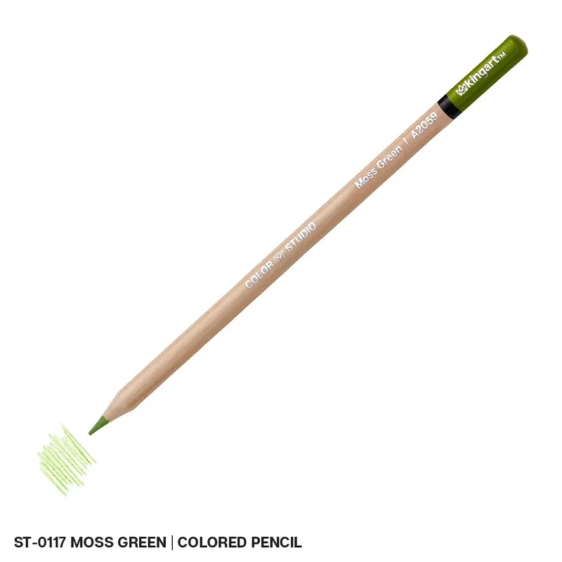
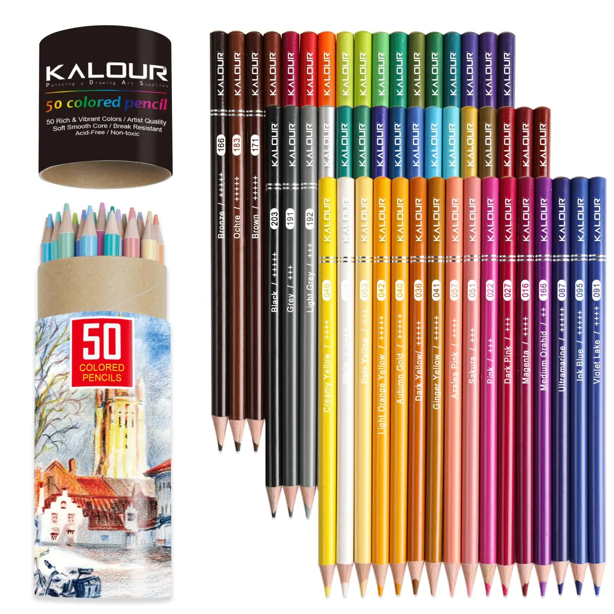
When building your collection, prioritize a diverse palette of greens. Nature rarely features a single shade, so include lime, olive, forest, and blue-green tones. You should also incorporate warm earth tones like ochre, burnt sienna, and deep brown to represent the transition of seasons or the natural decay often found on fallen leaves.
- Wax-based pencils: Best for vibrant, buttery blending and coverage.
- Oil-based pencils: Best for precise lines and maintaining a sharp point.
- Hardness levels: Use harder pencils for initial sketches and softer ones for final saturation.
How to layer colors for a realistic leaf
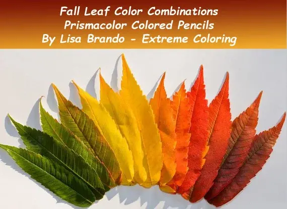
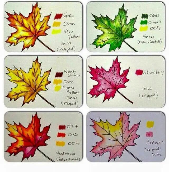
Real leaves possess complex color gradients that change based on light exposure. To replicate this, start by applying a very light pressure layer of your lightest yellow or lime green across the entire surface. This base layer acts as a foundation, ensuring that no white paper shows through your final, darker applications.
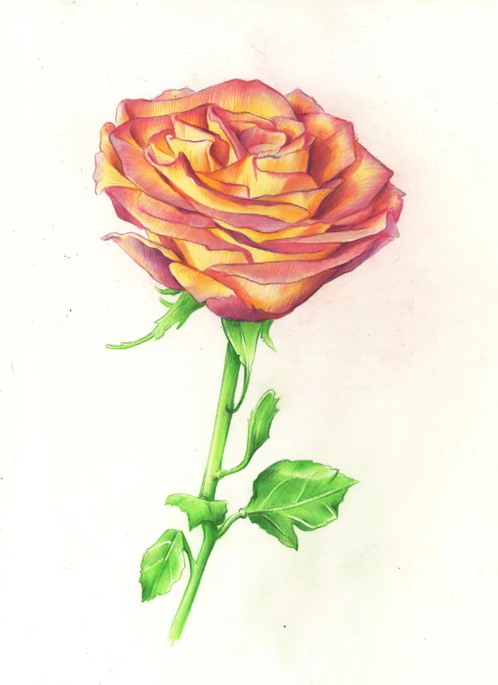
Once the base is established, gradually introduce darker greens, moving from the center vein toward the outer edges. Use a circular motion to avoid harsh streaks, keeping your pencil strokes light and consistent. By overlapping different shades, you create optical depth that makes the leaf appear three-dimensional rather than flat.
- Apply a light base coat of yellow or light green.
- Add mid-tone greens to the center of the leaf.
- Use dark forest green or brown to shade the edges and veins.
- Burnish the entire surface with a light color to unify the tones.
How to draw leaf veins and texture
Veins are the defining structural elements of any leaf. To draw them effectively, use a sharp, harder pencil to lightly map out the primary midrib and the secondary veins before you begin heavy coloring. As you layer your colors, try to work around these lines, leaving them slightly lighter than the surrounding leaf tissue to create a natural highlight.
For added realism, use a colorless blender pencil to soften the transitions between the veins and the leaf body. If you want to create a textured, waxy appearance, use a white pencil to add tiny highlights where the light hits the leaf surface. This contrast between the dark, recessed veins and the bright, raised areas creates a convincing sense of volume.
- Keep your pencil extremely sharp to maintain crisp lines.
- Use a light touch; you can always add more pigment, but removing it is difficult.
- Vary the pressure to create organic, irregular shapes rather than perfect, symmetrical lines.
Why leaf colors look flat or muddy
A common frustration for beginners is the "muddy" look, which occurs when too many contrasting colors are layered without a clear plan. This usually happens when you mix complementary colors—such as red and green—too aggressively in one spot. To avoid this, always test your color combinations on a separate scrap piece of paper before applying them to your final drawing.
Another reason for flat results is the lack of a distinct light source. Every leaf should have a "highlight" side and a "shadow" side. If you color the entire leaf with the same intensity, it will lose its form. Always identify where the light is coming from and ensure your darkest shadows are placed on the side opposite that light source.
- Avoid pressing too hard, as this fills the paper's "tooth" and prevents further layering.
- Use a kneaded eraser to lift pigment if a section becomes too dark or saturated.
- Keep your workspace clean to prevent graphite dust from smudging your colors.
Common mistakes when coloring leaves
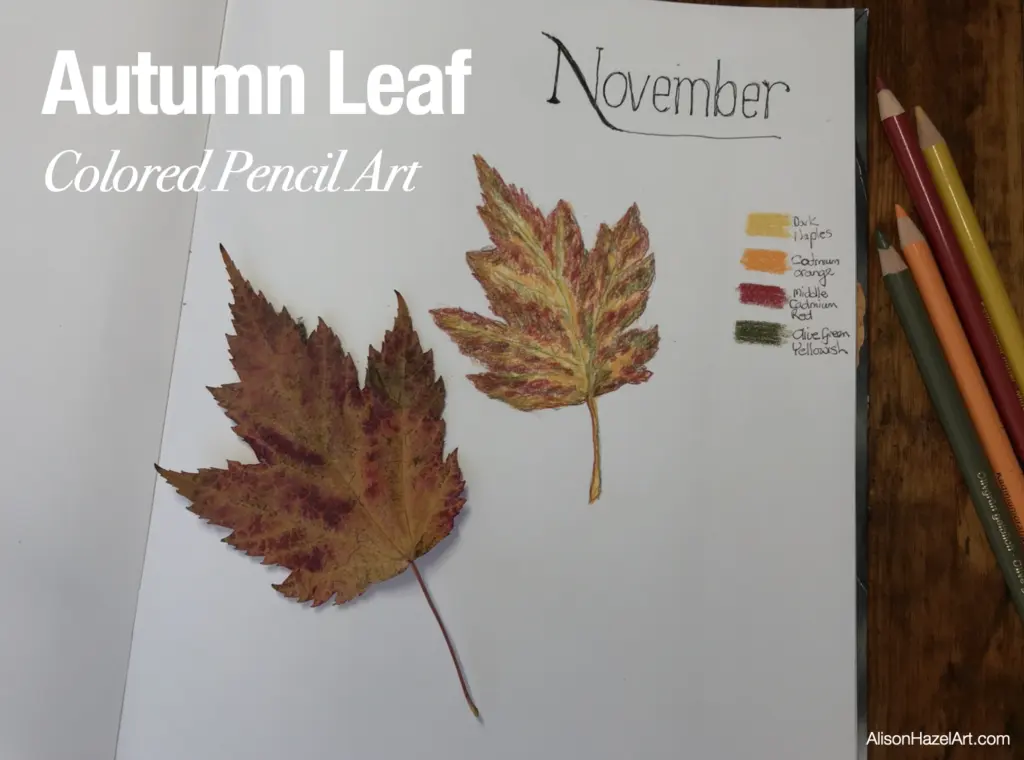
Many artists fail to observe the actual structure of leaves, leading to drawings that look like simple green ovals. Take time to look at real leaves or high-resolution photographs to study how the edges serrate or how the stem connects to the blade. Understanding the anatomy of a leaf is just as important as the coloring technique itself.
Another frequent error is neglecting the stem and the underside of the leaf. The stem often requires a different color palette, such as browns or purples, to distinguish it from the leaf blade. By paying attention to these small, peripheral details, you elevate your work from a basic sketch to a professional-level botanical study. Consistent practice with these techniques will allow you to capture the intricate beauty of nature with precision and artistic flair.
Key facts
- Use wax-based pencils for smooth blending or oil-based pencils for more precise, layered detail.
- Apply a light base layer of yellow or light green before adding darker veins or edges to create depth.
- Use a colorless blender pencil or a small amount of baby oil on a cotton swab to soften harsh pencil strokes.
- Keep your pencils sharp to ensure you can reach the fine, intricate details of the leaf's serrated edges.
- Utilize a light touch, building up color gradually in layers rather than pressing hard, which can create waxy buildup.
- Observe a real leaf to identify the "vein pattern," as leaves rarely have uniform color distribution.
The bottom line
Achieving a realistic leaf illustration requires patience and a layered approach. By starting with light base tones and gradually building depth with darker veins and shadows, you create a three-dimensional effect. Focus on observing natural color variations and maintaining sharp pencil points for fine details. With the right paper and a light touch, you can transform simple shapes into vibrant, lifelike botanical studies.
People also ask
How do I create realistic leaf veins?
Use a sharp, light-colored pencil to lightly score the paper where the veins should be before coloring. When you shade over these areas, the indentations will remain lighter, mimicking the natural appearance of veins.
What is the best paper for colored pencil leaf drawings?
Choose a paper with a slight "tooth" or texture, such as Bristol vellum or high-quality drawing paper. This texture helps the pencil pigment grip the surface, allowing for better layering and blending.
How can I make a leaf look glossy?
Leave small, white uncolored spots on the leaf surface to represent highlights where light reflects. Surround these spots with darker greens or browns to increase the contrast and create a shiny, realistic effect.
Should I use a solvent to blend my colors?
Solvents like Gamsol or mineral spirits can dissolve the binder in colored pencils for a paint-like finish. Use them sparingly with a small brush to avoid saturating the paper and causing it to buckle.
How do I choose the right color palette?
Look for natural variations by using at least three shades of green, such as lime, forest, and olive. Adding a touch of brown or ochre near the stem helps anchor the leaf and adds biological realism.
What is the most common mistake when coloring leaves?
Many beginners color the entire leaf a single flat shade of green. To avoid this, always vary your pressure and combine multiple hues to capture the natural light and shadow present on a curved leaf.
This answer was created with the help of AI research tools and reference sources. Spotted an error? Let us know — we correct mistakes quickly. See our editorial policy.