How do you draw depth?
Short answer
Drawing depth requires manipulating two-dimensional space to simulate three-dimensional reality. You achieve this by utilizing linear perspective, overlapping forms, varying scale, atmospheric haze, and controlled shading. By mastering these geometric and optical principles, artists can guide the viewer’s eye across a flat surface, creating the illusion of distance, volume, and immersive space.
On this page
How to use linear perspective
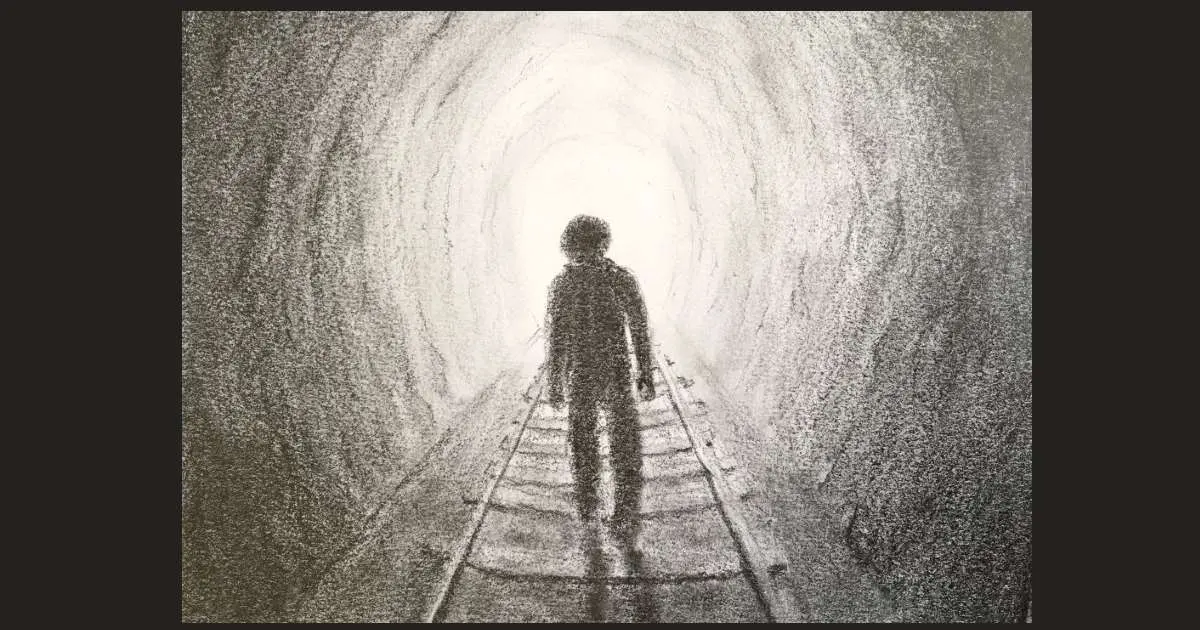
Linear perspective is a mathematical system used to create the illusion of depth on a flat surface. Developed during the Italian Renaissance by architects like Filippo Brunelleschi around 1415, it relies on the concept that parallel lines appear to converge at a single point on the horizon line, known as the vanishing point. By establishing this point, you can accurately map the recession of objects into the distance.
To apply this technique, follow these steps:
- Draw a horizontal line across your paper to represent the horizon or eye level.
- Mark a vanishing point anywhere on that line.
- Draw lines from the corners of your objects toward the vanishing point to create receding edges.
- Keep all vertical lines perfectly perpendicular to the horizon to maintain structural integrity.
This method is essential for drawing architecture, roads, or any environment where man-made structures define the space. Mastering this allows for precise control over how far away an object appears.
Why overlapping creates depth
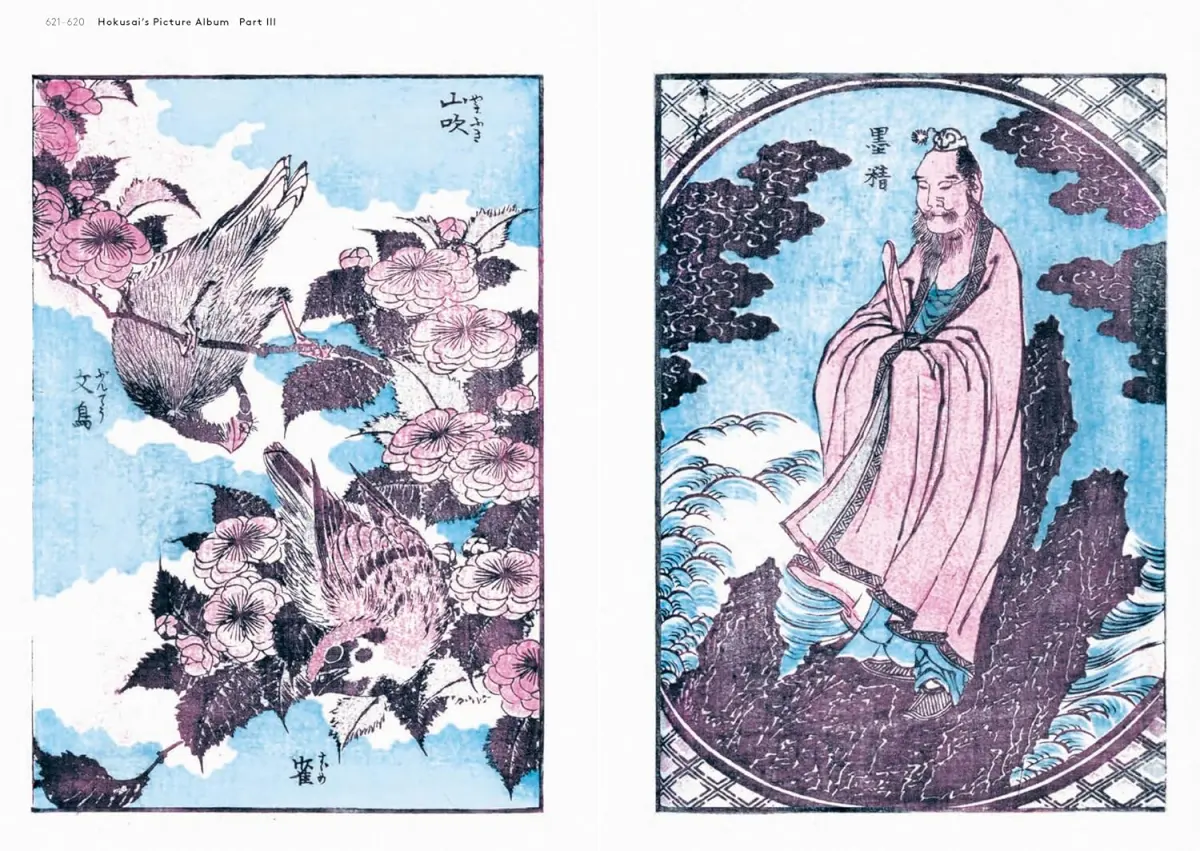
Overlapping is the most intuitive way to signal distance to the human brain. When one object partially obscures another, the brain automatically interprets the complete shape as being closer to the viewer. This technique requires no complex geometry, making it an excellent starting point for beginners who want to establish a sense of layered space quickly and effectively.
To use overlapping effectively, consider these principles:
- Place larger, more detailed objects in the foreground to establish proximity.
- Partially hide distant objects behind foreground elements to create a sense of scale.
- Use varying degrees of overlap to indicate how much space exists between objects.
- Ensure that the objects being overlapped maintain their relative proportions to avoid confusion.
By layering shapes, you create a hierarchy of distance. This simple visual cue tells the viewer exactly which objects occupy the front, middle, and back of your composition, instantly transforming a flat image into a structured scene.
How shading adds volume
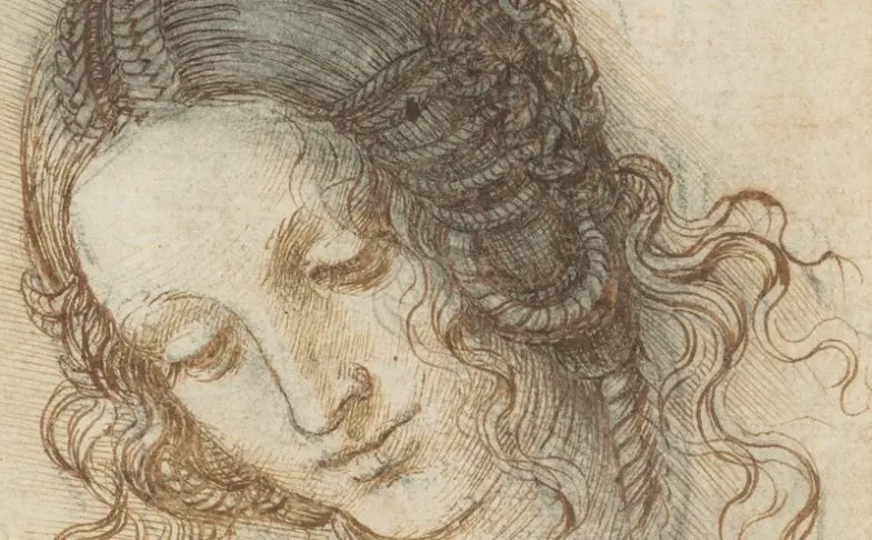
While perspective handles the placement of objects, shading provides the volume necessary to make them look solid rather than flat. Light hitting an object creates a gradient of tones, including highlights, mid-tones, core shadows, and cast shadows. By carefully rendering these transitions, you convince the viewer that the object occupies physical space and has a distinct weight and form.
When applying shading to create depth, keep these tips in mind:
- Identify your light source early; all shadows must point away from this light.
- Use a full range of values, from the brightest white of the paper to the darkest charcoal or graphite.
- Soften transitions on rounded surfaces to suggest curvature and depth.
- Cast shadows anchor objects to the ground, preventing them from appearing as if they are floating in mid-air.
Consistent shading helps define the planes of an object. When you accurately depict how light wraps around a form, you emphasize its three-dimensional nature, making it pop forward from the background.
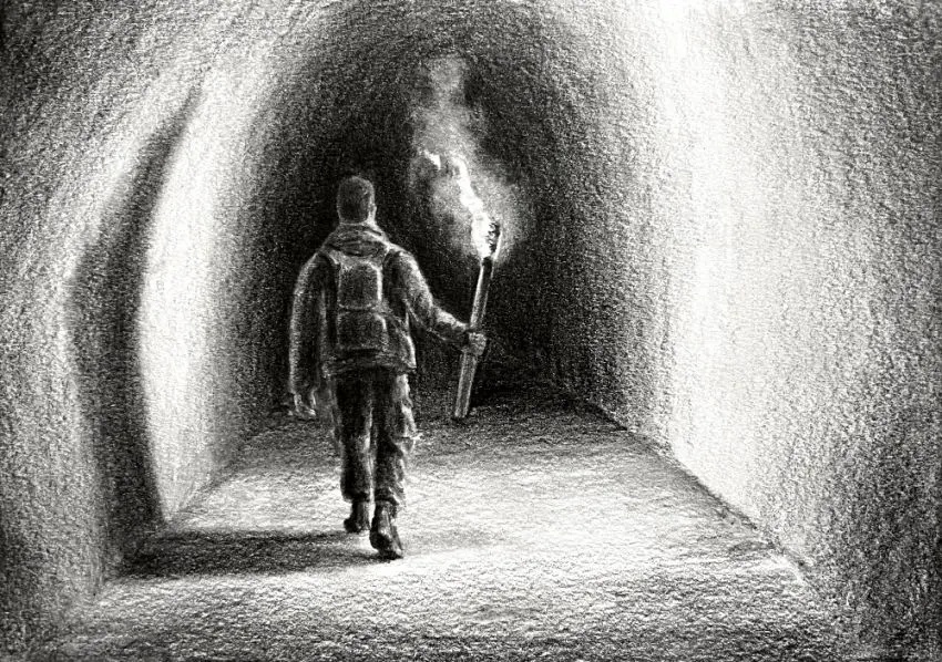
Best techniques for atmospheric perspective
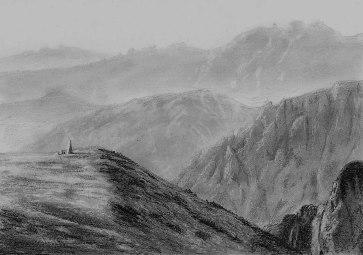
Atmospheric perspective, also known as aerial perspective, mimics the way our eyes perceive distance in nature. As objects move further away, they lose contrast, detail, and color intensity due to the particles and moisture in the atmosphere. Leonardo da Vinci famously documented this in his notebooks, noting that distant mountains appear bluer and less distinct than those close to the observer.
To achieve this effect, follow these guidelines:
- Reduce the contrast between light and dark areas as objects recede into the background.
- Use cooler, desaturated colors for distant elements, as warm colors tend to advance toward the viewer.
- Simplify the details of background objects, focusing only on broad shapes rather than intricate textures.
- Lighten the overall value of distant objects, making them appear closer to the color of the sky.
By softening the edges of distant mountains or buildings, you create a powerful sense of vast, open space. This technique is particularly effective in landscape art to suggest miles of depth.
Common mistakes when drawing depth
Even experienced artists often struggle with maintaining consistent depth across a complex composition. One of the most frequent errors is "foreshortening failure," where the proportions of an object become distorted in a way that breaks the illusion of space. Another common issue is using uniform line weight; thick, dark lines in the background will pull distant objects forward, effectively flattening the entire image.
Avoid these common pitfalls to improve your work:
- Do not make background objects too dark, as high contrast draws the eye forward.
- Ensure that your horizon line remains consistent; shifting it mid-drawing will confuse the perspective.
- Avoid placing all objects on a single, flat plane; stagger their placement to create a dynamic sense of depth.
- Watch for "tangents," where the edges of two objects touch perfectly, creating an unintentional flat line that ruins the sense of separation.
By remaining mindful of these errors, you can ensure that your drawing remains cohesive. Depth is not just about one technique, but the harmonious integration of perspective, light, and atmospheric effects.
Key facts
- Linear perspective uses a horizon line and vanishing points to create the illusion of distance on a flat surface.
- Overlapping occurs when one object partially obscures another, signaling to the brain that the former is closer.
- Atmospheric perspective dictates that objects further away appear lighter, less detailed, and cooler in color.
- Foreshortening compresses the length of an object as it angles toward the viewer to convey three-dimensional volume.
- Diminution is the principle that objects of the same size appear smaller as they move toward the horizon.
- Value contrast, such as placing dark shadows against bright highlights, creates a sense of physical mass and depth.
The bottom line
Drawing depth is the art of translating a three-dimensional world onto a two-dimensional plane using specific visual cues. By mastering linear perspective, overlapping, and value shifts, you can effectively guide the viewer’s eye through a scene. Remember that atmospheric effects and consistent lighting are just as important as structural geometry. With practice, these techniques transform simple sketches into immersive, realistic images that possess genuine spatial volume.
People also ask
What is the difference between one-point and two-point perspective?
One-point perspective uses a single vanishing point on the horizon line, typically used for objects facing the viewer directly. Two-point perspective uses two vanishing points, allowing artists to depict objects at an angle, such as the corner of a building.
Read the full answer →How can I make colors look further away?
You can use atmospheric perspective by desaturating colors and shifting them toward blue or gray tones. Distant objects lack the high contrast and intense saturation found in the foreground.
Why do my drawings look flat?
Drawings often look flat when they lack overlapping, consistent light sources, or size variation. Ensure that objects diminish in size as they recede and that shadows are used to define the volume of forms.
Read the full answer →What is a horizon line?
The horizon line represents the viewer's eye level in a composition. All parallel lines that recede into the distance will eventually converge at a point located on this horizontal axis.
How do I draw a sphere to look 3D?
To give a sphere depth, you must apply a consistent light source to create a highlight, a mid-tone, a core shadow, and a cast shadow. This range of values mimics how light wraps around a curved surface.
What is the most common mistake when drawing depth?
A common error is neglecting the scale relationship between objects. If foreground and background objects are drawn at similar sizes without overlapping, the viewer loses the sense of spatial hierarchy.
This answer was created with the help of AI research tools and reference sources. Spotted an error? Let us know — we correct mistakes quickly. See our editorial policy.